

Built to Travel: How Investor Presentations Work in the Room and Out of It


An investor presentation rarely stays in one place. It is walked through at a conference table, sent ahead of a call, forwarded to a colleague, and reopened a quarter later. The firms whose pitchbooks and fundraising decks hold up across all of these moments have usually made a few deliberate decisions early: what the story is, what carries the argument, and what can sit one layer deeper.
One managing partner walked us through the life of his firm's deck: shared on screen, printed and bound for in-person meetings, then passed along internally to colleagues who had never heard the story. He wanted it to resonate with that last reader as much as the first.
This piece looks at five themes we hear regularly when firms start rethinking their investor presentation, and how each can be approached as a communication question rather than a formatting one.
Why Investor Decks Gather Material Over Time
Each new fund, strategy, and proof point adds something to the deck, and few teams have time to distill and refine regularly. One manager preparing a later fund described a working presentation that had picked up pieces from each earlier raise. Every piece made sense on its own, but together they no longer told a clear or compelling story.
The approach we often recommend is to choose one narrative first, then let the appendix carry the weight. A partner at the same firm framed it well: he was comfortable with detail living at the back, and anyone who wanted to look at every investment across every fund could find it there or in the data room. It simply did not need to open the deck.
A few starting points when consolidating a multi-fund presentation:
- Begin with the story the firm tells today, not with the most recent deck.
- Keep one primary view of the track record and move fund-by-fund detail to the appendix.
- Retire language written for an earlier fund unless it still earns its place.
- Organize the appendix so depth feels intentional rather than left over.
Designing a Pitchbook for the Reader Who Is Not in the Room
Many decks are built around a presenter but read afterward by people who were not in the meeting. One client observed that the people receiving their deck usually read it without the team present, so each page needs enough substance to deliver a takeaway. The same client added a newer wrinkle: some recipients now run a deck through an AI tool to summarize it, which raises the bar for slides that state their own conclusions clearly. Another team noted that their existing book relied on a voiceover to make sense. Each points to the same design question: can the slides carry the point on their own?
The two settings ask for different things, and a strong presentation serves both.
The goal is a deck where the same slide does both jobs, with a first section that works almost like a short presentation of its own.
When Several People Present One Story
Most investment firms share the stage. Each partner brings a different style, and the deck can offer a common spine. One firm noticed that the same portfolio page played out differently depending on who was presenting: one partner might spend real time on it, while another would cover the portfolio earlier and rarely reach it. The flow of the deck was quietly shaping each pitch.
Consistent section architecture, titles that state the conclusion, a repeatable layout for each type of page, and a shared vocabulary for strategy terms all help a presentation hold together when different people deliver different parts. When emphasis, pacing, and hierarchy are set in the design, presenters can bring their own voice without the audience having to reassemble the story. This matters most at annual meetings and investor days, where several contributors build sections in parallel.
Portfolio Companies as Evidence
A portfolio section can work as a catalog of everything the firm has done, or as an argument that uses selected examples to show the strategy in practice. Both have a place, and the second often makes the first stronger, because a few well-framed examples are easier to remember than a long list.
One partner called case studies his favorite part of the deck because they connect sourcing, value creation, and results in a single page. The harder question was which ones to feature, since some of the firm's best stories were also among its oldest. For each case study, it helps to ask:
The remaining companies can live in an organized appendix or the data room, available on request without competing with the core narrative.
One Presentation, Several Versions
Most firms end up with more than one version of their deck, because audiences and moments differ. One client described ending up with a slightly different version every time they met a new investor. Another partner described the familiar experience of working through a long book and reaching the end with two minutes left for questions. A core deck sized to the meeting gives that conversation room, and a shared core with modular layers makes the variety manageable.
The versions work best when built from the same templates and language, so an internal team can adapt them without rebuilding from scratch.
Clarity That Travels
Taken together, these themes describe an investor presentation as communication infrastructure rather than a file. It has to be consolidated enough to tell one story, clear enough to stand without a presenter, structured enough to support several voices, curated enough to let examples do real work, and modular enough to adapt as audiences change.
There is no single right shape for any of this. Fuller pages and lighter ones can both work when the choices are intentional. What matters most is that the presentation reflects how the firm actually thinks, and that it keeps making sense wherever it lands.
Darien Group builds investor presentations and pitchbooks for private equity, real estate and alternative investment managers. Learn more about our investor presentation work.
Read More

Most investor decks don't fail for a single reason.
Sometimes it is the design. The slides feel dated, inconsistent, or overly dense, and a cleaner visual system goes a long way.
But more often, the issue sits underneath that.
No one has made a clear decision about what the story actually is — so the deck tries to do everything at once. Strategy, track record, team, edge cases, caveats. It all gets layered in, slide by slide, until the presentation becomes harder to follow than it should be.
That's usually the moment when firms decide to “refresh the deck.”
And depending on the situation, that can mean very different things. In some cases, a design-led update is exactly what's needed. In others, the structure itself needs to be simplified, re-sequenced, and pressure-tested before design can really do its job.
The agencies below approach that spectrum from different angles. Some are pure design partners. Some operate more broadly across marketing and digital. And a smaller group works closer to the narrative itself.
If you're preparing for a fundraise or reworking core materials, understanding where your needs actually sit on that spectrum is what determines the right partner.
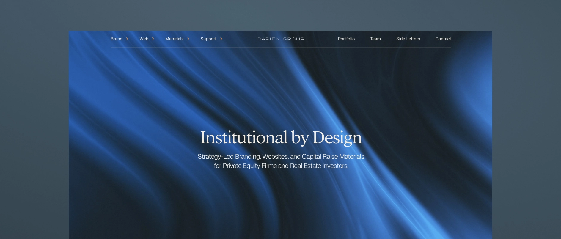
1. Darien Group: The Specialist Investor Presentation and Collateral Partner for All Capital Raising Firms
Darien Group is the only branding and communications firm built exclusively for investment managers. Our work centers on helping firms articulate a differentiated strategy, communicate clearly with LPs, and present a credible, cohesive identity across every touchpoint.
What makes Darien Group different:
Private-markets fluency
We work exclusively with investment managers. That specialization translates into deep understanding of fund strategy, value creation, LP expectations, GP-founder dynamics, and the nuances of middle-market fundraising.
Narrative-first strategy
Our team helps clients articulate why their strategy works - not just what they do. Positioning, messaging frameworks, and story architecture are designed specifically for LP, founder, and intermediary audiences.
Institutional investor materials
Pitchbooks, PPMs, AGM presentations, annual reports, quarterly updates, and fund overviews are built to an institutional standard, combining clarity, compliance alignment, and compelling structure.
Modular content & communication systems
We develop messaging frameworks and repeatable content structures that help investment managers communicate consistently. These systems align websites, pitch materials, and ongoing updates so a firm's story remains cohesive across every channel.
Boutique, high-touch model
Strategy, messaging, design, and execution are delivered by specialists who understand the expectations and pace of private-market teams.
Best for firms who need: a differentiated investment story, polished LP-ready materials across every touchpoint, full AGM support, and a partner with true fluency in investment management.
2. SlideGenius
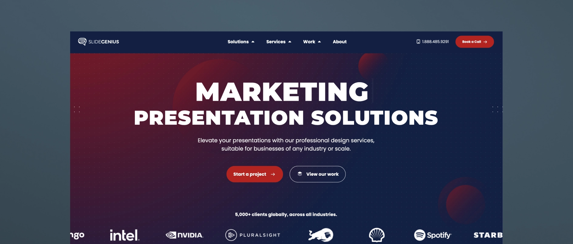
SlideGenius is a presentation design agency that produces pitch decks and sales materials across a broad range of industries. Their specialty is visual design and slide sequencing, structured around sales psychology to guide a viewer through a decision. They work with clients across sectors rather than focusing exclusively on investment managers.
Best for firms who need: a professionally designed deck produced efficiently, with a structured, repeatable process and design-forward execution.
3. Superside

Superside is a subscription-based, “always-on” design company that provides presentation design as one of many creative services — alongside branding, video, web design, illustration, and more — for scale-up and enterprise clients across industries. Their presentation work spans templates, PowerPoint and platform-specific design, pitch decks, and sales presentations, with access to motion design, illustration, and video production layered in as needed.
Best for firms who need: fast turnaround on high-volume design requests, flexible access to a broad range of creative services under one subscription, and a scalable design bench rather than a single point of strategic counsel.
4. Williams Lea
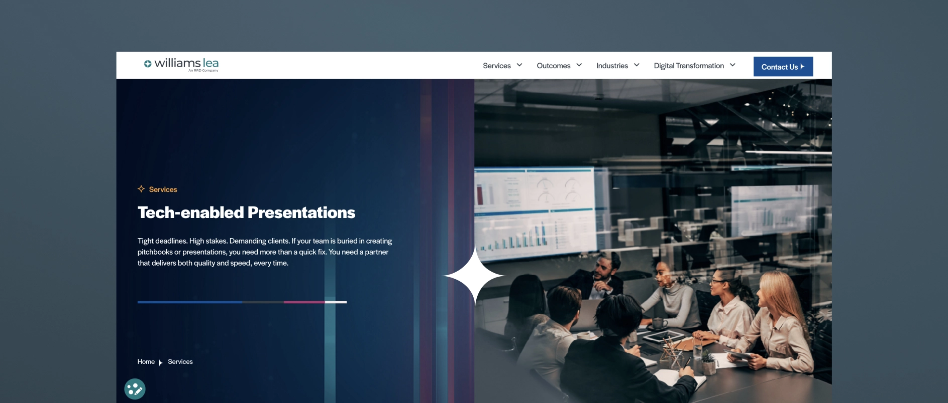
Williams Lea is a large, tech-enabled business process outsourcing (BPO) provider that offers high-volume pitchbooks and presentations as one line item alongside secretarial support, document processing, digital mail, billing support, and other back-office services. They serve financial, legal, and professional services firms specifically, and their presentation work centers on turning complex data into high-volume, tech-assisted pitchbook and PowerPoint output, often delivered under tight deadlines.
Best for firms who need: high-volume, fast-turnaround pitchbook production, execution capacity to supplement an internal team, and operational/formatting support across many other back-office functions.
5. MVP Design

MVP (MVP Marketing + Design) is a Midwest-based marketing and design firm that works specifically with private equity, M&A, and lower-middle-market firms on investor communications. Their MVP PitchMate℠ process is built around custom investor and annual meeting pitch decks, as well as CIP (confidential information presentation) work, aiming to translate complex information into clear PowerPoint visuals.
Best for firms who need: PE/M&A-specific pitch decks, LPAC and annual meeting presentations, and a firm that pairs design execution with some sector-specific investor-communications experience.
6. Investor Creative
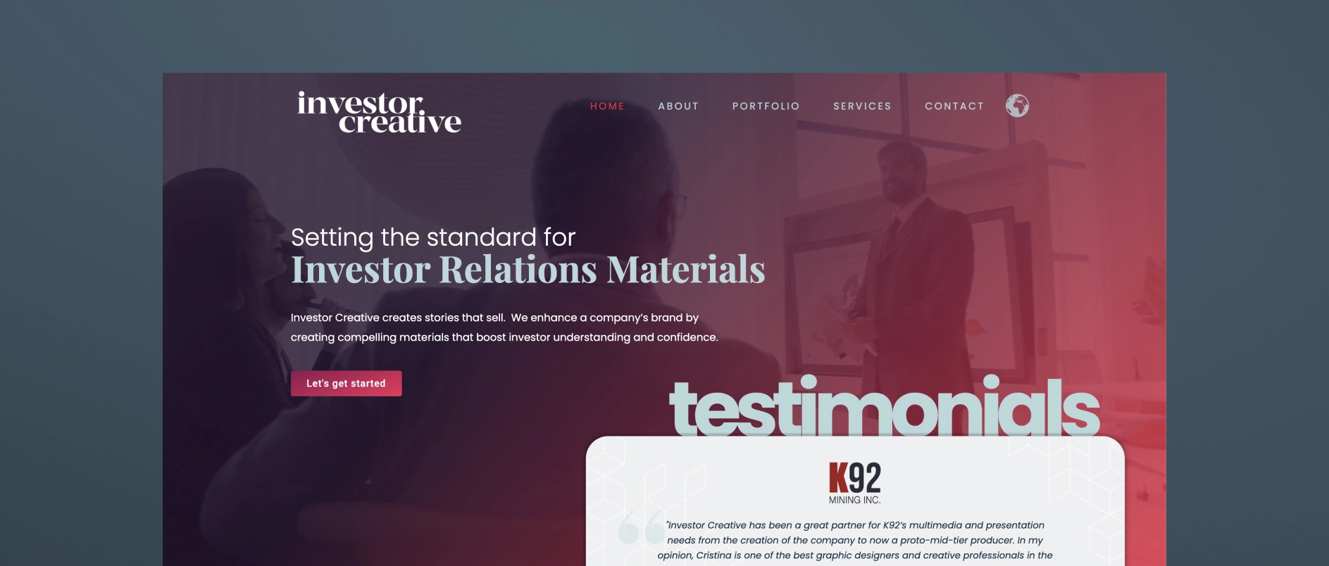
Investor Creative is a small, boutique investor relations design studio that creates presentations, websites, fact sheets, and branding materials for public and private companies. Their positioning is built around bridging the gap between a public company's limited in-house graphic capabilities and the learning curve required for a designer to understand investor appeal.
Best for firms who need: a single experienced designer who understands IR materials, presentation, and website refreshes for small-cap or junior public companies (especially resource/mining issuers), and an affordable, personal, long-term design relationship rather than a full-service agency team.
7. M'Idea Hub
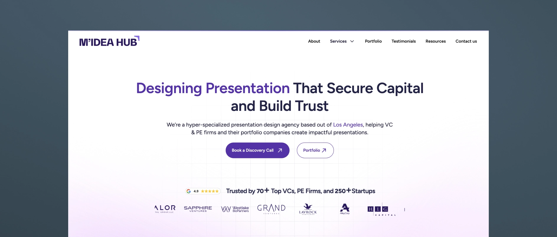
M'Idea Hub is a Los Angeles-based, boutique presentation design agency positioned specifically around VC and PE investor communications. They combine strategy, storytelling, and high-fidelity design to create fund decks, LP updates, and AGM presentations.
Best for firms who need: fund decks, LP updates, and AGM presentations for VC and PE firms that want a specialist design-and-narrative partner without a broader branding/website scope.
8. Stinson Design
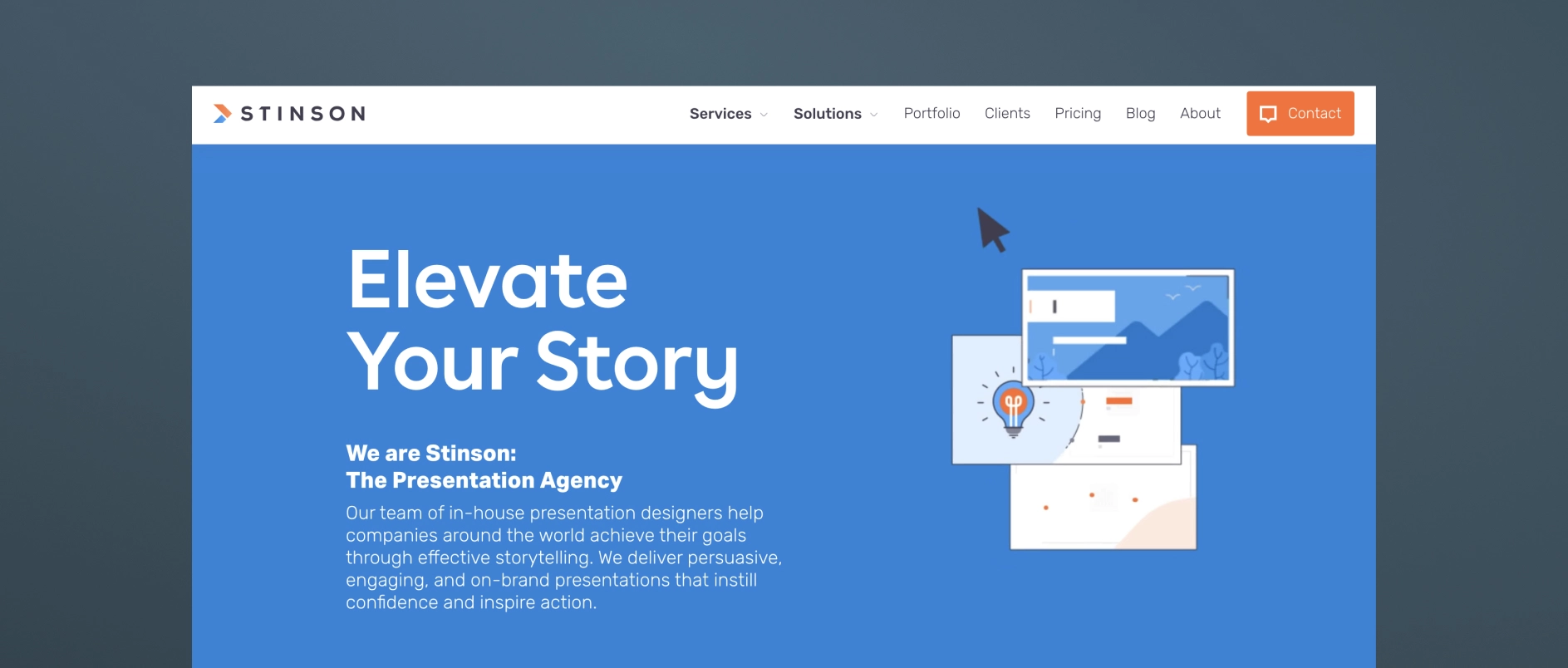
Stinson Design is a presentation design agency (Toronto-based) that has built meaningful experience in financial services and investor presentations, though it's not exclusively focused on the PE/institutional-LP niche. They've carved out a niche in investor presentations and financial storytelling, with a portfolio reflecting experience in capital markets and investment management, and clean, data-forward design suited to a financially literate, skeptical audience.
Best for firms who need: strong data-storytelling and design craft for roadshow decks, fund launch presentations, annual investor materials, or data-heavy financial analyses, from a team with real financial-sector reps but a more generalist client base overall.
9. PitchLift
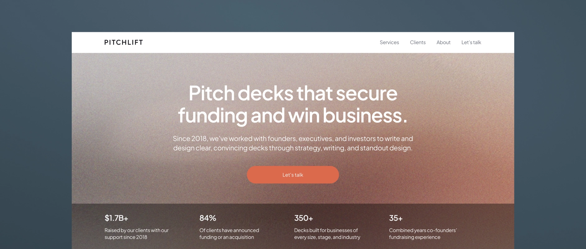
PitchLift is a small, boutique fundraising and presentation agency based in Austin and Barcelona. Their services cover graphic design, financial modeling, branding, one-pagers, and investor planning.
Best for firms who need: startups and growth-stage companies (with some enterprise/fund work) needing a lean, strategy-plus-design partner.
10. Van York Agency
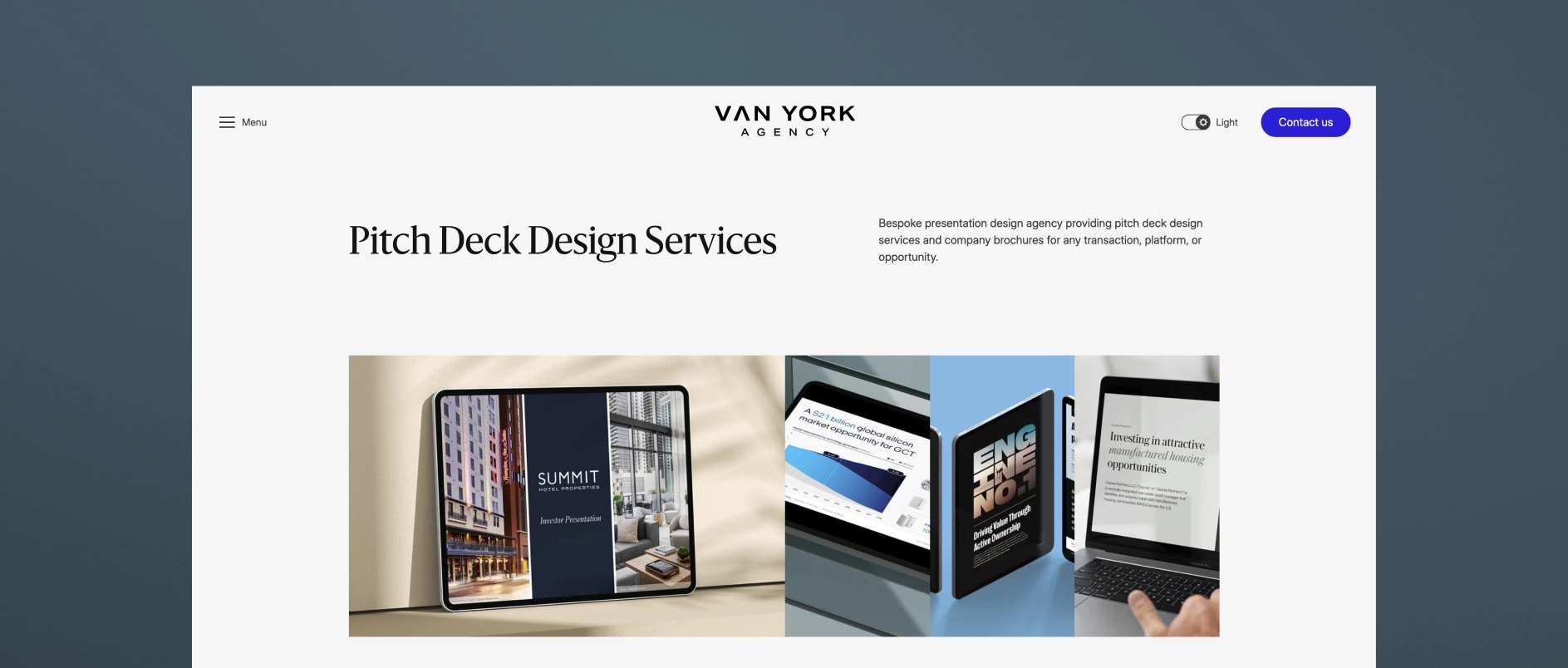
Van York is a Vancouver-based presentation and brand design agency built around end-to-end investor and B2B communications. Services span capital markets decks (IPO, SPAC, PIPE, private placement), private capital decks (seed through Series D, M&A, JV), investor relations materials (earnings, investor day, analyst day), and B2B sales/RFP decks — offering research-through-design presentation support in one shop, with fast-turnaround options.
Best for firms who need: capital markets, PE/real estate, and B2B firms needing research-through-design presentation support in one shop, with fast-turnaround options.
Darien Group works exclusively with investment management firms on brand strategy, visual identity, and digital presence. Contact us to discuss where your firm's design stands.

What Is a Private Equity Pitchbook?
A private equity pitchbook is a structured presentation that communicates a firm’s investment strategy, track record, and differentiators to prospective limited partners (LPs). While historically modeled on investment banking templates, the modern pitchbook must address a different audience, serve a different purpose, and compete for limited attention. Its function is not to document every aspect of the firm but to persuade decision-makers quickly and memorably.
Why Most Private Equity Pitchbooks Fail?
Most private equity pitchbooks remain dense, overloaded, and shaped by outdated merger-and-acquisition deck structures. This density undermines clarity by stacking multiple ideas per slide, layering excessive bullet points, and overstuffing executive summaries. Senior LPs often skim rather than read linearly, judging relevance in the first one or two slides. A cluttered opening signals low differentiation, reducing engagement. The belief that more content equates to more credibility persists, yet it often drives the real message out of reach.
How Does Attention Shape Pitchbook Design?
Attention is the primary constraint in capital-raising conversations. Experienced investment consultants and LPs rarely process a pitchbook in sequence. Instead, they flip for points of interest, looking for a compelling hook—a unique sourcing method, an operational edge, or an investment thesis that feels distinct. Overloading early slides with every nuance of the strategy dilutes these hooks. A persuasive deck emphasizes the two or three core ideas that matter most and pushes peripheral details into supporting materials.
What Can Private Equity Learn From Venture Capital Pitchbooks?
Venture capital pitchbooks tend to be lighter, more focused, and easier to navigate. They present one idea per slide, maintain generous spacing, and often run 80 to 100 slides without feeling burdensome. Because each slide is concise, these decks can be consumed in under 20 minutes. By contrast, a 35-slide private equity pitchbook crammed with dense text may require an hour to process. The VC approach prioritizes narrative flow, visual clarity, and pace—principles that can make private equity materials more engaging and memorable.
How Should a Private Equity Pitchbook be Rebuilt?
Effective pitchbook redesign begins with deconstruction, not aesthetics. This process includes interviewing the deal team, identifying areas of traction, and isolating specific elements of the strategy that make the firm stand out. These differentiators—such as a proprietary sourcing pipeline or a distinctive portfolio operations model—become the organizing spine of the narrative. Word count is often reduced by 30 to 50 percent, and each slide is rebuilt to carry a single, clear point. This structural clarity increases retention and accelerates investor understanding.
Why Does Density Matter More than Slide Count?
Placement agents sometimes insist on a 12-slide limit, believing it enforces focus. In practice, this can lead to compressing 40 slides of information into 12, creating visual and cognitive overload. Dense slides with multiple sections, nested bullet points, and full paragraphs of text are harder to process and remember. A clean slide with one sharp headline, a focused insight, and a single visual does more persuasive work than compressed text blocks, but achieving this restraint requires editorial discipline.
Which Metrics Prove a Pitchbook is Working?
An effective private equity pitchbook demonstrates its value in the fundraising process. Early-stage metrics include faster-moving first meetings, deeper follow-up conversations, and reduced need to re-explain the strategy. Later indicators include higher LP conversion rates and shorter diligence cycles. When the narrative lands, the firm’s positioning is consistently understood and repeated by LPs—often verbatim—which signals message stickiness.

Almost every private equity pitchbook has a value creation slide, and many of them look alike: a row of icons labeled operational improvement, add-on acquisitions, talent, pricing, and digital transformation. Each item is reasonable, but they also could describe almost any firm in the market. An investor reading that slide learns what the firm says it can do, but not yet what it has done.
The more persuasive approach is to let the portfolio make the case. A capability becomes credible when it shows up in concrete evidence: a specific result, tied to a specific decision, told through case studies that show what the firm actually did. That principle holds no matter the position a firm holds, from control investments to minority stakes and credit, as long as each claim is matched to the role behind it.
Why Capability Lists Rarely Persuade
A capability list answers the question “what do you do?” Investors evaluating a manager are usually asking a harder one: “What difference did you make, and will you make it again?” A list of levers can’t answer that, because it describes intent rather than evidence.
We heard this directly in a recent working session with a client preparing materials for a newly refocused strategy. Looking at a draft slide of value creation levers, one partner wondered how many LPs see a page like that from a GP and come away knowing nothing about how the firm’s best deals actually came together. A colleague added that without case studies behind them, the categories don’t carry much weight. Together, we’re working with the client to tie each lever to a real example.
There is also a differentiation problem. When value creation is presented as a menu, the menu tends to converge across firms, and it becomes one of the slides investors skim rather than study. The firms that stand out usually make a narrower claim and support it thoroughly: these are the two or three things we do repeatedly, and here is where you can see them working.
From Capability to Evidence
The shift from telling to showing is less about adding content than about changing what each statement is attached to. The chart below outlines how the same idea can read in each mode:
The value creation section often works best as a short framing statement followed by examples, rather than a framework slide followed by nothing.
Our conversation with the firm preparing for its refocused strategy surfaced something else worth showing. As the partners reflected on their strongest outcomes, many traced back to how a deal was found and structured at entry, well before any operating playbook began. That is a useful reminder that the evidence doesn’t always start at close. Where it is genuinely part of the story, how the firm entered an investment can belong in this section too.
Building a Case Study That Proves Something
Case studies carry most of the weight here, and they tend to be most effective when they follow a consistent shape:
- The starting point: what the business looked like at entry, and what the firm saw that others might have missed.
- The firm’s role: what the team actually did, stated plainly.
- What changed: operating progress, described in specific but appropriate terms.
- What it shows: the one point about the strategy this example is meant to prove.
That last element is often the one missing. A case study that ends with an outcome is informative. One that ends with what the outcome demonstrates is persuasive because it connects back to the firm’s broader argument.
There is also a choice about structure. Some firms pair each lever with its own example. Others build a single case study that shows several levers working together at one company, such as new leadership hires, systems integration, and an acquisition program. When one investment genuinely reflects the full playbook, that approach can be the more memorable of the two.
Any language that attributes results to the firm’s involvement should be worded with care and reviewed with compliance, particularly where outcomes reflect many contributors, including the management team itself.
When the Firm Was Not in the Driver's Seat
Minority and debt positions raise a fair question for any deck: if the firm did not control the business, what can it credibly claim? The answer is usually more than firms expect, provided the claim matches the role.
In these positions, a firm's contribution often shows up in different places: how the investment was selected and structured, the governance rights it negotiated, its participation on a board or advisory committee, the resources it offered management, and how it monitored and protected the position. These are genuine expressions of judgment. They are simply not the same as running the operating playbook.
Consider a firm that held a minority stake alongside a larger sponsor. Rather than presenting the company's overall growth as its own, the deck could focus on the piece the firm genuinely shaped, such as an introduction that led to a key commercial hire or the board's push toward a particular add-on. The headline result might be smaller, but the claim holds up under scrutiny, and that is what investors remember.
The chart below outlines how the framing can shift by position type:
The most common misstep is presenting every investment in control language. A precise, modest claim about a minority position usually reads as more credible than an expansive one.
Keeping the Story Consistent Across a Mixed Portfolio
For firms with a mixed portfolio, consistency becomes its own credibility signal. A few practices tend to help:
- Label each case study’s position type and the firm’s role in the same place every time.
- Use the same case study structure across position types, so differences in role are visible rather than hidden.
- Choose examples that each prove a different part of the strategy, rather than several that prove the same point.
- Let the core thesis connect them all so the portfolio reads as a single approach expressed through different structures.
Evidence Over Inventory
Investors do not need a firm to do everything. They need to see clearly what it does well and believe it can do it again. Presenting value creation through outcomes and calibrating every claim to the firm’s actual role accomplishes both.
The strongest value creation sections are often the most restrained. They make fewer claims, attach each one to evidence, and let the investor draw the conclusion the firm would have stated anyway.
Darien Group helps private equity firms show value creation through evidence rather than claims. Learn more about our investor presentation work.
Private equity firms spend significant time refining their LP materials, yet founder-facing pitch decks are often treated as a secondary asset. In many cases, the same core presentation is reused across audiences with only minor adjustments. While this approach may feel efficient internally, it rarely aligns with how founders actually evaluate potential partners.
The result is not a lack of professionalism or effort, but a mismatch between intent and impact. Founder pitch decks frequently fail not because they are poorly designed, but because they are built for the wrong audience.
Why Founder Audiences Are Different
Founders do not approach a first meeting with a private equity firm as a financial exercise alone. While financial outcomes matter, the initial evaluation is more qualitative. Founders are assessing whether a firm understands their business, respects the complexity of what they have built, and has a credible perspective on the company’s future.
LP decks are designed to demonstrate discipline, track record, and process. Founder decks must do something else entirely. They need to communicate alignment, judgment, and long-term intent. When firms rely on institutional materials to do that work, the message often falls flat.
The Hidden Gap Between Conversation and Materials
One of the most common issues with founder pitch decks is internal inconsistency. Partners and senior team members tend to lead conversations with a set of themes that feel natural and compelling in person. These points emerge through experience—what resonates, what differentiates the firm, and what founders respond to over time.
However, those themes are often absent from the written materials. Decks become static documents that lag behind how the firm actually presents itself in meetings. Over time, a gap forms between what is said and what is shown. While this disconnect may not be obvious internally, it is immediately apparent to founders encountering the firm for the first time.
What Founder Pitch Decks Are Actually Meant to Do
A founder pitch deck is not meant to be comprehensive. Its purpose is not to explain every capability or document every investment outcome. Instead, it should create clarity around how the firm thinks, how it operates, and what kind of partner it intends to be.
Effective founder decks prioritize narrative over volume. They focus on a small number of ideas that matter and articulate them clearly. Rather than listing services or value creation initiatives, they frame a point of view—about growth, ownership transitions, and partnership dynamics—that founders can engage with.
Rethinking Case Studies for Founder Audiences
Case studies are often included in founder decks, but rarely in a form that serves their intended audience. Traditional case study formats tend to mirror banker materials, emphasizing transaction details and financial metrics. While those elements have their place, they do little to address the questions founders are actually asking.
Founders want to understand how decisions were made, how challenges were handled, and how the relationship between investor and management team evolved over time. Case studies that highlight these qualitative dimensions are more effective, particularly when they are designed to be modular and adaptable across different contexts.
Design as a Supporting Element, Not the Story
Design plays an important role in founder pitch decks, but it is not the differentiator. The most effective decks strike a balance between polish and practicality. They feel current and intentional without appearing overproduced, and they remain fully editable for internal teams.
When design works, it reinforces the narrative rather than distracting from it. It helps structure the conversation, guide attention, and create a sense of cohesion across the materials.
Narrow Engagements Can Drive Meaningful Change
Many firms assume that improving founder materials requires a broad brand initiative. In practice, focused engagements often deliver the most value. A well-structured founder deck, supported by a flexible template and a small set of strong case studies, can significantly improve how a firm is perceived in early conversations.
These projects also tend to surface deeper messaging questions, creating a natural foundation for future work without requiring an immediate, all-encompassing commitment.
A Better Question to Ask Internally
Rather than asking whether a founder deck looks professional, firms should ask whether it accurately reflects how they think and how they speak. If the materials do not capture the firm’s real perspective, founders will sense that disconnect quickly.
Clarity, consistency, and intention matter more than volume. When founder pitch decks are built with those principles in mind, they become a meaningful part of the relationship-building process rather than a formality to get through.