.jpg)
Side Letters
Side Letters is a collection of essays, research, and analysis on how investment firms communicate with investors, management teams, and transaction partners. The focus is practical: how firms articulate value, build credibility, and navigate increasingly complex evaluation environments.

Featured Videos


Real estate capital markets have become more competitive, more institutional, and more brand-aware than ever before. Strategies are more specialized. LP expectations are higher. Operating partners and developers are more selective.
As the asset class matures, real estate investment firms are recognizing that brand, narrative clarity, and digital communication are not aesthetic extras. They are capital infrastructure.
This list highlights branding agencies that understand the distinct needs of real estate private equity, real estate investment managers, developers, and owner-operators. Some focus on institutional investor communications. Others specialize in digital visibility, portfolio storytelling, or experiential brand expression. Each brings something different to the table.
1. Darien Group: The Specialist Branding Partner for All Capital Raising Firms
Darien Group is the only branding and communications firm built exclusively for investment managers across private markets, including real estate private equity, real estate credit, infrastructure, and alternative real assets.
Our work centers on helping real estate firms articulate a differentiated investment strategy, communicate clearly with LPs and joint-venture partners, and present a cohesive institutional identity across every touchpoint.
What makes Darien Group different:
Market fluency
We understand fund structures, co-invest vehicles, development strategies, core-plus vs value-add positioning, operator narratives, and institutional capital expectations. That specialization allows us to frame strategies in ways that resonate with LPs and partners.
Narrative-first strategy
We help firms articulate why their investment thesis works, not just where they invest. Messaging frameworks are built for institutional investors, operating partners, brokers, and sellers.
Institutional investor materials
Fundraising decks, AGMs, PPMs, quarterly reports, capital updates, and portfolio case studies are structured to meet institutional standards while maintaining clarity and flow.
Digital platforms built for today’s investors
Websites are designed to support capital formation, partner vetting, and deal sourcing. We develop sector pages, track-record systems, property case studies, leadership bios, and insights hubs that reinforce credibility.
Modular content & communication systems
We develop messaging frameworks and repeatable content structures that help investment managers communicate consistently. These systems align websites, pitch materials, and ongoing updates so a firm’s story remains cohesive across every channel.
Boutique, high-touch model
Strategy, messaging, design, and execution are delivered by specialists who understand the expectations and pace of private-market teams.
Best for real estate investment managers who need: A partner fluent in institutional real estate who can distill a complex strategy into a disciplined, differentiated narrative; produce fundraising and AGM materials that hold up under real LP scrutiny; and build a brand and digital platform that reinforces credibility, maturity, and long-term platform ambition.
2. BlueText
Bluetext is a digital communications agency offering brand strategy, website development, digital marketing, SEO, and demand-generation services. They work with financial and real estate organizations seeking greater visibility and pipeline development.
Best for real estate investment managers who need: Digital visibility, inbound lead support, and ongoing marketing execution alongside brand positioning.
3. FINE
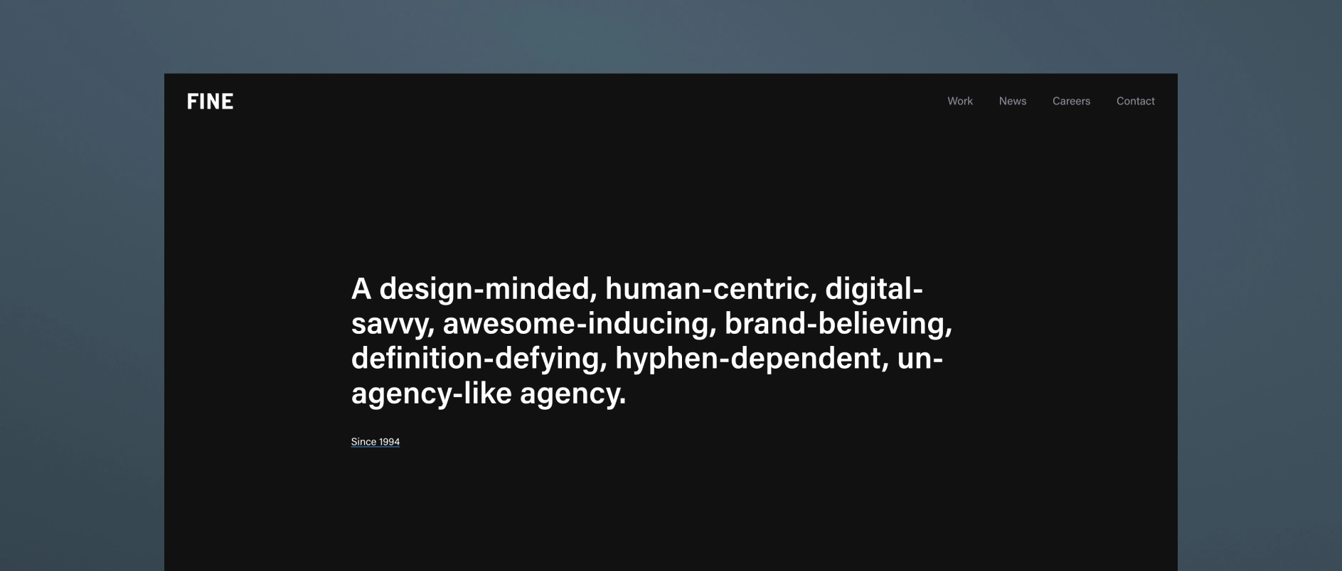
FINE is a high-end creative agency known for big-idea brand thinking, striking visual identity systems, and highly polished, immersive digital experiences. While cross-industry in scope, their design sensibility often appeals to real estate investment firms seeking a more expressive, high-aesthetic brand presence.
Best for real estate investment managers who need: A bold, visually differentiated identity that elevates the firm beyond traditional finance conventions.
4. Conway + Partners
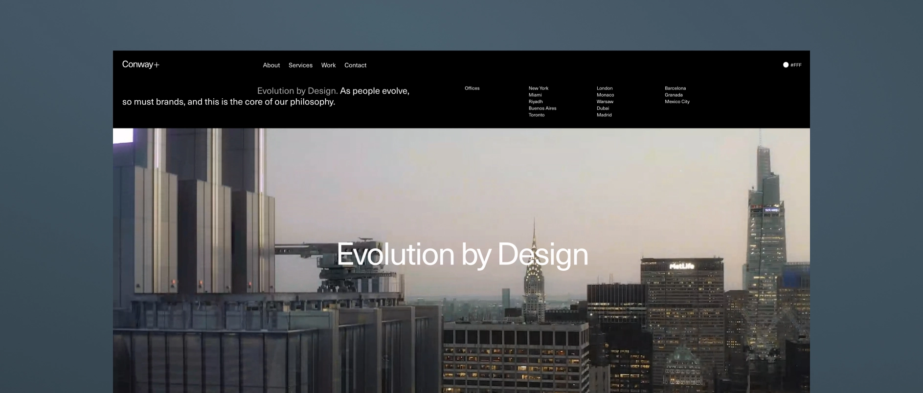
Conway + Partners is a real estate-focused branding agency that builds strategic brand identities for developers, property platforms, and investment-led real estate businesses.
Best for real estate investment managers who need: A real-estate-native brand strategy and identity system grounded in sector expertise.
5. Built-to-Suit Brands
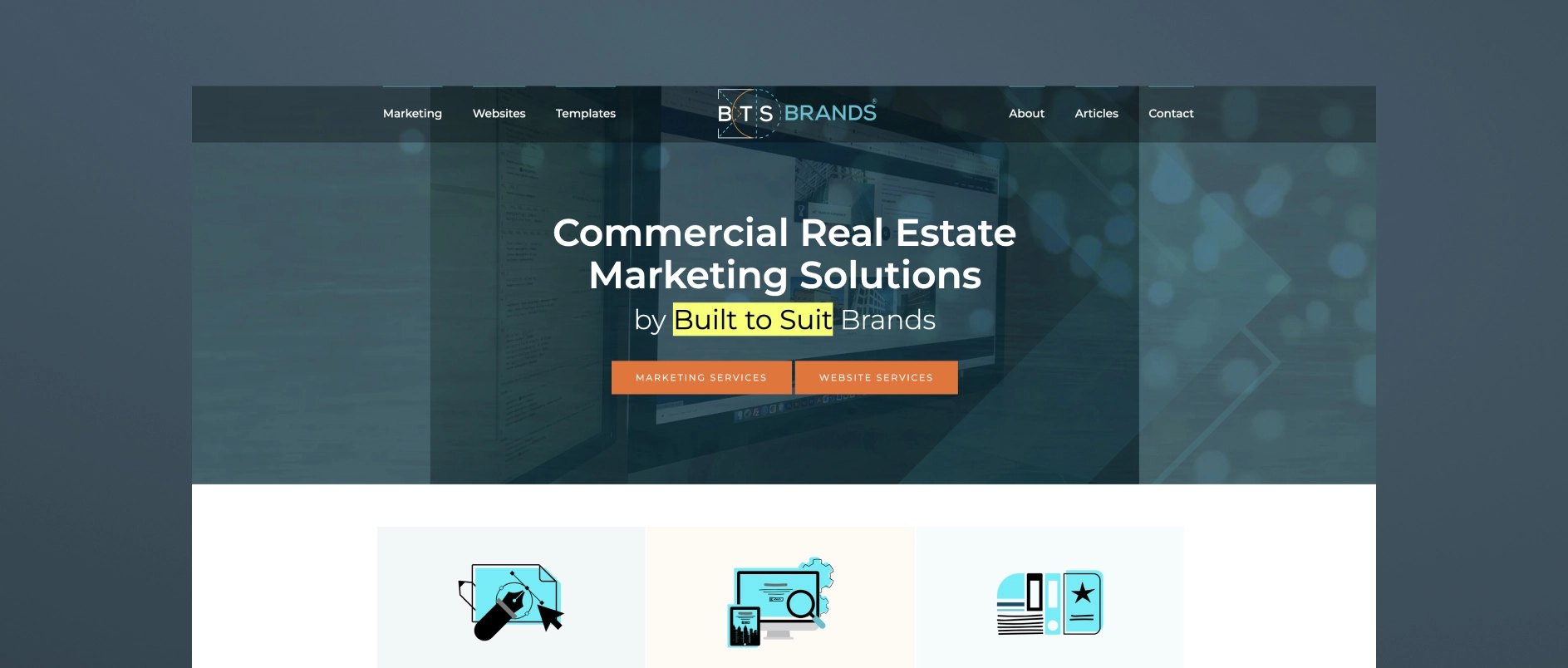
Built to Suit Brands (BTS Brands) focuses on commercial real estate branding and marketing, providing brand identity, website design, offering memoranda, and supporting collateral for real estate platforms.
Best for real estate investment managers who need: CRE-specific branding and marketing execution, particularly for property-focused materials and foundational brand assets.
6. The Durkan Group
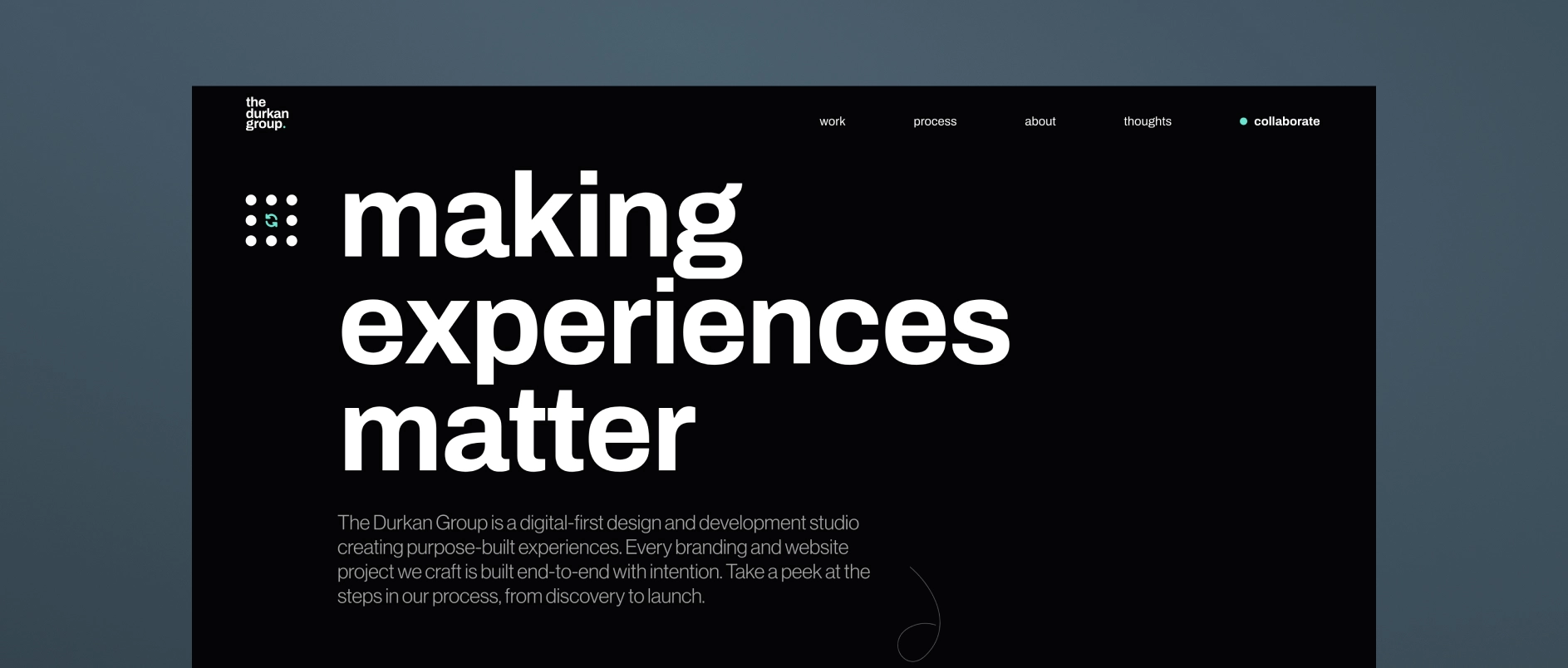
The Durkan Group is a digital-focused design studio specializing in brand identity, UX/UI, and custom website development. They create clean, modern, user-centered digital experiences supported by thoughtful visual systems and structured messaging.
Best for real estate investment managers who need: a prioritized user experience, intuitive navigation, and design-first identity over heavy content-generation or marketing campaigns.
7. Monogram Group
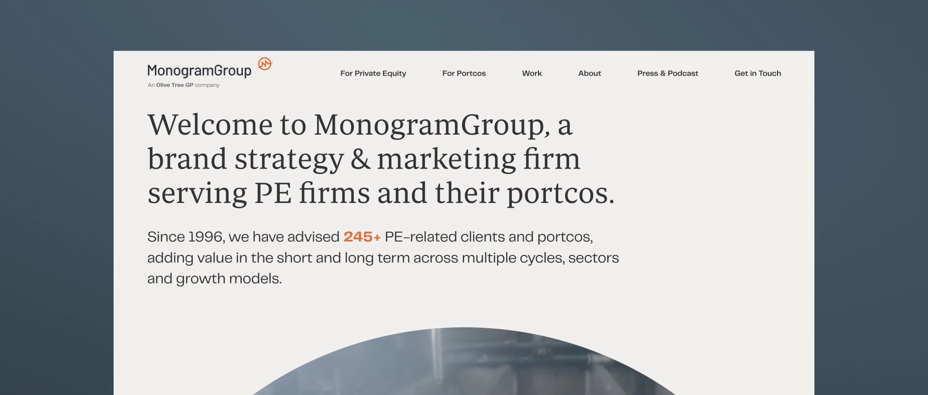
MonogramGroup is a long-established branding agency that works extensively with private equity firms and their portfolio companies. Their work combines brand strategy, messaging development, identity design, and website development.
For real estate private equity firms, MonogramGroup’s experience with investment managers and portfolio branding can support positioning both at the firm level and across portfolio companies or operating platforms.
Best for real estate investment managers who need: Brand strategy and identity support that extends across the full investment lifecycle, including portfolio company branding.
8. Consequently Creative

Consequently Creative is a boutique creative studio that focuses on developing distinctive visual identities, websites, and digital assets. Their work emphasizes storytelling through design and cohesive brand systems.
For real estate investment firms, their design-led approach can help elevate the visual expression of a firm’s brand while creating a more modern and cohesive digital presence.
Best for real estate investment managers who need: A boutique creative partner focused on website design with strong visual storytelling.
9. Clever Design
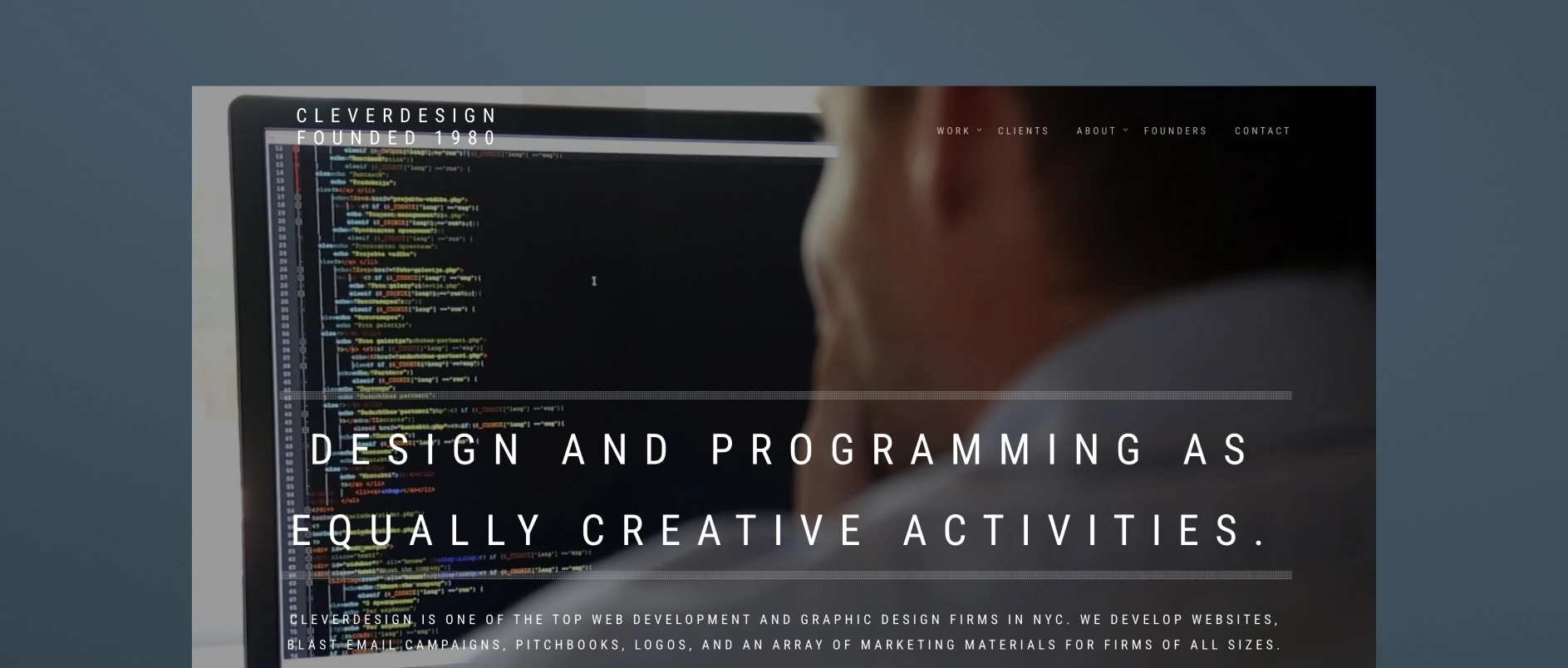
Clever Design is a New York-based firm with decades of experience working with financial services companies, including private equity firms, hedge funds, and investment banks. Their services include website design, brand identity, logo design, presentations, and digital collateral.
For real estate investment managers, Clever Design offers a straightforward, professional approach to building brand assets and digital platforms aligned with financial-sector expectations.
Best for real estate investment managers who need: a clean, professional, and finance-sector–tailored website or brand identity rather than full-scale content, marketing, or narrative support.
10. DeSantis Breindel
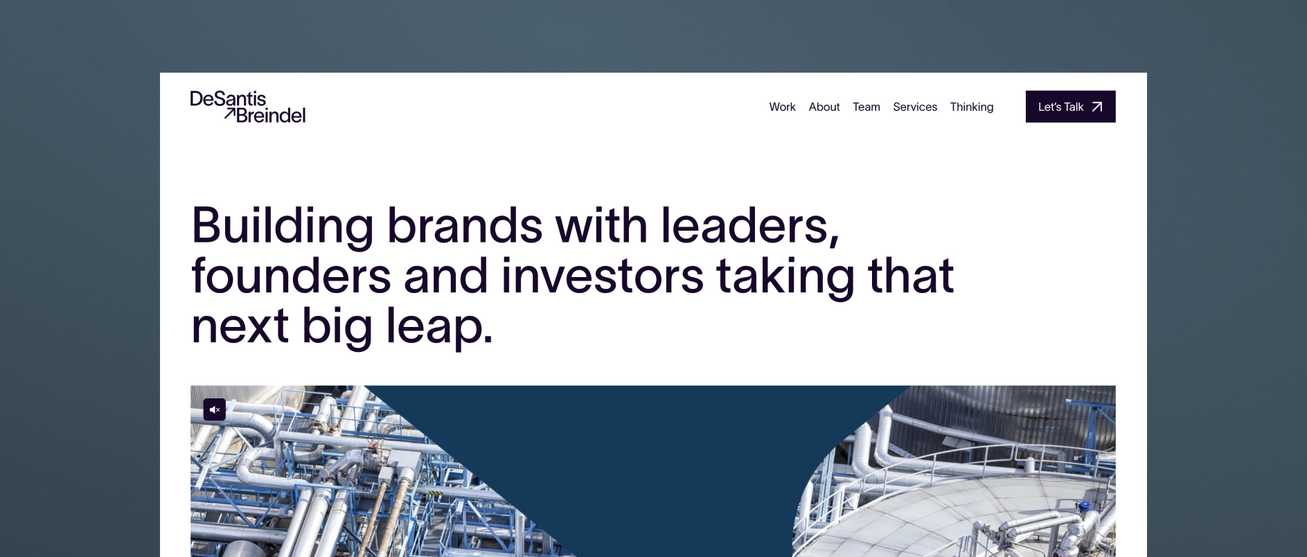
DeSantis Breindel is a brand strategy consultant that works primarily with financial services firms, asset managers, and other complex B2B organizations. Their work often centers on helping leadership teams clarify how their firms are positioned and described in the market, particularly during periods of strategic change, growth, or repositioning.
Their engagements typically focus on corporate brand strategy and messaging, helping organizations articulate their value proposition and competitive differentiation at a high level.
Best for real estate investment managers who need: Outside perspective on corporate brand positioning or messaging refinement.


An Annual General Meeting (AGM) deck is one of the most operationally complex documents a private equity firm produces each year.
It must communicate strategy, performance, attribution, portfolio activity, market context, and forward outlook. It must satisfy existing limited partners while remaining appropriate for prospective allocators. It must evolve year over year without losing continuity.
Design in this context is not about visual enhancement. It is about structural control.
However, structural control does not mean uniformity across firms. Every AGM deck must reflect the firm’s brand identity — its positioning, tone, and visual language. Institutional does not mean generic. A well-designed AGM expresses brand credibility through disciplined application of the firm’s typography, color system, imagery standards, and visual hierarchy.
Below are the core design best practices that consistently differentiate institutional-quality AGM decks from those that feel assembled.
1. Design the System Before Designing Slides
AGM decks fail when they are improved slide by slide.
Institutional presentations are engineered — not decorated.
Before any visual refinement begins, define:
- A margin and grid system
- A disciplined typographic scale
- A clear title hierarchy (H1, H2, body, annotation)
- Chart and data visualization standards
- A portfolio company template system
- A consistent section architecture
Once those rules exist, every slide should conform to them.
Consistency is not achieved through cleanup at the end. It is achieved through systems at the beginning.
A well-constructed system ensures the deck can scale beyond a single AGM cycle. It supports future iterations without structural breakdown, allowing year-over-year evolution while preserving brand continuity.
2. Use Title Strategy, Not Descriptive Headers
AGM slide titles often describe content instead of making assertions.
Weak example:
Fund II Performance
Stronger example:
Fund II Performance Reflects Consistent Sector Execution
A best practice AGM deck uses titles to communicate conclusions, not categories.
Investors scan. Strong titles allow them to follow the logic of the presentation without reading every bullet.
They also support the live speaker.
An AGM deck is not a standalone document. It is delivered in real time by senior leadership. Clear, assertive slide titles allow presenters to anchor their commentary, reinforce conclusions, and control pacing without relying on dense on-slide text. When titles communicate the takeaway, the speaker can expand strategically rather than read mechanically.
Because AGMs are live events, titles function as visual anchors in the room. They help both the presenter and audience maintain narrative flow even if attention momentarily shifts. Strong hierarchy improves both in-room comprehension and post-event review.
3. Separate Narrative from Data
Many slides attempt to combine qualitative commentary and dense tables in the same visual field.
This creates competition.
Best practice:
- Isolate major data tables
- Separate analytical commentary into structured blocks
- Avoid layering explanation directly over performance exhibits
When narrative and numbers compete spatially, clarity declines. When they are structured intentionally, both improve.
This separation also supports live delivery. When the presenter is speaking to a data-heavy slide, the audience should not be forced to read paragraphs simultaneously. Visual focus must align with verbal focus.
4. Standardize Portfolio Company Pages
Portfolio sections are typically the least controlled portion of the deck.
Common issues include inconsistent image ratios, varying metric structures, and uneven logo placement.
A disciplined AGM deck applies:
- One portfolio slide layout
- One metric hierarchy
- One image treatment
- One logo scale
Variations should be driven by material differences in companies, not formatting inconsistencies.
Uniform structure signals repeatable process.
At the same time, portfolio pages should subtly reinforce the firm’s brand language — whether that is minimal and restrained, data-forward, or visually expressive within institutional boundaries. Standardization and brand identity must work together, not against each other.
5. Engineer Performance Tables for Legibility
Performance tables are rarely redesigned. They are exported.
This shows.
Best practice includes:
- Increased row spacing
- Reduced gridline visibility
- Consistent decimal precision
- Right-aligned numerical columns
- Clear footnote formatting
Legibility is not cosmetic. It reduces cognitive load.
When investors must work to decode formatting, attention shifts away from substance.
Additionally, performance tables must be optimized for projection environments. Small font sizes that may work on a laptop screen often fail in large conference rooms. Designing for AGM conditions means stress-testing visibility at scale.
6. Control Color Application
Private equity decks often overuse brand colors in charts and section dividers.
Best practice is restrained application:
- Use neutral tones for structure
- Use brand color selectively for emphasis
- Avoid multi-color charts unless analytically necessary
Color should guide attention, not create visual noise.
Importantly, brand color should reinforce identity — not dominate data. The most effective AGM decks apply the firm’s brand palette with precision: primary color for strategic highlights, secondary tones for hierarchy support, and neutrals for structural clarity.
In a live AGM setting, high-contrast readability is critical. Subtle tonal variations that look elegant on screen may become indistinguishable under projection lighting. Color decisions must be tested for real-world visibility, not just aesthetic appeal.
7. Enforce Spacing Discipline
Spacing inconsistencies accumulate over time.
Misaligned text boxes. Uneven margins. Slight variations in indentation.
These are rarely noticed individually. Collectively, they signal lack of control.
A disciplined AGM deck maintains:
- Identical margins across all slides
- Consistent vertical spacing between elements
- Aligned columns
- Predictable spacing between title and body
Spacing is a structural signal of precision.
In a live setting, spacing also improves scanning speed. Clean alignment allows investors to process information quickly without visual friction.
8. Simplify Section Transitions
Section slides often become graphic experiments.
They do not need to be.
Best practice:
- Minimalist section slides
- Clear labeling
- Consistent typography
- Controlled use of imagery
Transitions should clarify progression, not interrupt tone.
When thoughtfully designed, section transitions reinforce narrative logic — signaling strategic shifts (e.g., Performance, Portfolio, Market Outlook) while maintaining brand continuity.
9. Build for Iteration and Live Performance
AGM decks evolve until presentation day.
Layouts must tolerate:
- Updated performance numbers
- Expanded commentary
- Revised portfolio metrics
If a two-line addition breaks alignment, the design system is too fragile.
Institutional materials require structural flexibility.
Because AGMs are high-stakes live events, last-minute updates are sometimes inevitable. A resilient layout system prevents technical stress and formatting breakdowns in the final hours before presentation.
AGMs are not static documents — they are live communication environments. Decks must be built to perform under real-world technical conditions.
This includes:
- Testing slides in projection mode
- Ensuring adequate font size for large rooms
- Confirming contrast ratios for visibility
- Avoiding overly dense data clusters
- Minimizing reliance on subtle animation
Visuals must support both the presenter and the viewer. Charts should clarify trends instantly. Diagrams should simplify complex processes. Portfolio visuals should reinforce positioning without distracting from metrics.
When narrative logic is supported by intentional visuals, the presenter speaks with greater confidence and the audience retains more information.
10. Conduct a Final Integrity Review
Before finalization, perform a structured audit:
- Are all charts formatted identically?
- Is decimal precision consistent?
- Are all logos scaled proportionally?
- Are footnotes formatted uniformly?
- Does every slide follow the same title hierarchy?
Most design issues are not conceptual. They are mechanical.
Mechanical precision reinforces institutional credibility.
The Underlying Principle
AGM deck design best practices are not about aesthetics or creativity.
They are about control.
Private equity firms communicate discipline in how they invest. Their materials should communicate discipline in how they present.
When structure is consistent, data is engineered, and hierarchy is clear, the design disappears.
That is the objective.
Summary
Private equity AGM deck design best practices center on structural clarity, consistent data formatting, disciplined typography, and engineered presentation systems. Strong AGM materials are built on defined grids, standardized portfolio templates, uniform chart conventions, and revision-resilient layouts. The objective is not aesthetic enhancement but institutional control. When hierarchy is clear and formatting is consistent, investors focus on performance rather than presentation mechanics.


Most private equity Annual General Meeting (AGM) presentations are not deficient in substance. They are deficient in structure.
The investment strategy is clear. The performance data is strong. The portfolio detail is comprehensive. Yet the structure of the AGM presentation often undermines clarity, hierarchy, and coherence.
The Annual General Meeting is rarely the appropriate venue for a private equity brand reinvention. When the initiative begins too close to the AGM deadline, the timing, stakeholder complexity, and size of the presentation make meaningful repositioning unrealistic. Brand strategy requires structured discovery, executive alignment, and deliberate articulation of differentiation. Those conditions are difficult to create under event pressure. We explore that process in greater depth in The Art and Strategy of Private Equity Brand Development, but the distinction is important. Brand development and AGM deck enhancement are separate mandates.
The more relevant question is whether a private equity AGM presentation can be materially elevated structurally, hierarchically, and analytically within the existing brand system.
In most cases, it can.
The Private Equity AGM as a Credibility Instrument
Like a firm’s website or fundraising pitchbook, the AGM presentation functions as capital-facing infrastructure. In Private Equity Pitchbooks: Modernizing the Capital Narrative, we examine how structural clarity and narrative discipline shape investor perception well beyond the numbers themselves.
In the AGM setting, investors evaluate more than fund performance. They evaluate organizational discipline.
They assess:
- How the firm structures information
- How investment performance is contextualized
- Whether attribution aligns with stated strategy
- Whether portfolio commentary reflects repeatable value creation
- Whether communication standards mirror operational rigor
A well-structured AGM presentation reinforces strategic clarity, performance transparency, and institutional control. A poorly structured deck introduces friction into those assessments.
That friction compounds.
And it is avoidable.
Why Private Equity Firms Still Use PowerPoint for AGM Presentations
Private equity firms continue to rely on PowerPoint for AGM materials for practical reasons.
PowerPoint is editable under deadline pressure. It is interoperable across LP organizations. It supports version control. It tolerates late-stage performance updates and commentary revisions.
It was never designed for advanced layout work. That limitation is understood.
The objective is not to replace PowerPoint. The objective is to impose disciplined design systems onto it.
With consistent hierarchy, spacing logic, typography standards, and chart conventions, even PowerPoint can function as an institutional communication tool.
Why AGM Decks Become Overbuilt and Visually Unmanaged
AGM decks rarely decline in quality because of weak investment content. They decline because of accumulation.
Each year adds new portfolio slides, updated attribution tables, additional performance pages, expanded commentary, and incremental disclosures. Very little is removed. Multiple internal contributors build slides under time pressure.
Over time, this results in:
- Inconsistent typography
- Crowded layouts
- Redundant containers and shapes
- Spreadsheet exports inserted without redesign
- Conflicting chart treatments
- Excess line work and visual noise
The issue is not the data.
It is the absence of curation.
Institutional investors are highly sensitive to visual signals of order. If a private equity presentation appears unmanaged, the implied question becomes whether other internal processes are similarly unmanaged.
That inference may be subconscious.
It still affects perception.
How to Modernize an AGM Deck Without Rebranding the Firm
Most private equity firms want the AGM presentation to feel more contemporary and more coherent. They do not want it to feel like a rebrand.
That instinct is correct.
A brand system defines boundaries. It does not prohibit refinement. Within an existing identity, there is substantial room to improve hierarchy and legibility without changing logos, color systems, or core brand assets.
Effective AGM modernization typically includes:
- Recalibrating typography for clearer hierarchy
- Enforcing consistent margin and spacing systems
- Standardizing chart and graph treatments
- Reducing unnecessary containers and background elements
- Simplifying section breaks
- Aligning data tables to institutional formatting standards
The most meaningful upgrades are often subtractive.
Text-heavy slides are not inherently problematic in private equity communications. Undifferentiated text is. When strategy articulation, investment theses, and portfolio commentary are clearly tiered between primary assertions and supporting rationale, comprehension improves.
Performance pages require the same discipline. Fund returns, gross and net IRR, MOIC, attribution analysis, and position-level summaries must follow consistent formatting conventions. Harmonized presentation increases trust.
Professional data presentation signals operational rigor.
Modernization should feel measured. Cleaner typography, disciplined color usage, and restrained imagery signal currency while preserving gravitas.
Process Before Production in Large AGM Decks
A private equity AGM deck often exceeds one hundred slides. Without early alignment on visual direction, revision cycles multiply quickly.
A disciplined process begins with a small set of representative slides that define:
- Typographic hierarchy
- Chart language
- Data formatting rules
- Margin logic
- Section architecture
- Visual tone
Once the system is approved, scaling becomes implementation rather than experimentation.
This approach protects timeline integrity and reduces unnecessary rework.
Engineering an AGM Deck That Survives Real-World Conditions
AGM materials are dynamic until presentation day. Performance numbers update. Commentary shifts. Leadership refines language.
A properly structured AGM template anticipates that reality.
Layouts should tolerate moderate copy expansion. Data tables should update without breaking alignment. Internal teams should be able to work within the template without degrading hierarchy.
If the presentation collapses under normal revision pressure, it was not engineered properly.
Durability is part of institutional design.
The Strategic Insight That Often Emerges
AGM modernization frequently surfaces a secondary realization. While reviewing slides, firms sometimes discover that strategy articulation lacks sharp differentiation or that thematic hierarchy has drifted.
The AGM deck becomes diagnostic.
It reveals where messaging is diluted, where sector focus is unclear, or where value creation claims are not sufficiently substantiated.
Handled correctly, those observations inform future fundraising decks, private equity website development, and broader brand positioning without forcing premature strategic change under deadline constraints.
Our Perspective on Private Equity AGM Deck Design
At Darien Group, we treat AGM presentations as institutional infrastructure.
The objective is not aesthetic embellishment. It is structural clarity.
We introduce order, enforce hierarchy, elevate legibility, and ensure the deck performs under operational pressure.
We work exclusively with private equity firms and investment managers. That specialization matters. Understanding fund structures, attribution frameworks, portfolio construction, and LP expectations cannot be approximated by a generalist design agency.
An effective AGM presentation does not compete with its content.
It reinforces credibility.
If the investment information is strong but the structure undermines clarity, the solution is not visual spectacle.
It is disciplined execution.
Summary
A private equity AGM deck does not require rebranding to improve. It requires structure, hierarchy, and disciplined design systems applied within the existing brand framework.
When executed properly, AGM modernization:
- Improves LP comprehension
- Reinforces institutional credibility
- Reduces friction in capital conversations
- Signals operational rigor
- Preserves brand continuity
In private equity communications, order is not cosmetic.
It is strategic.


Infrastructure investing has always been a relationship-driven category, yet digital presence now shapes first impressions in ways that were not true even five years ago. LPs conduct more pre‑meeting research online; management teams often review a firm’s website before returning a call; and advisors form early opinions based on design, hierarchy, and clarity.
For infrastructure managers, the challenge is distinct. Many strategies span complex asset classes, diverse subsectors, and multidecade horizons. There is a natural impulse to explain everything at once. This often leads to dense pages, unclear prioritization, and inconsistent messaging.
This post outlines what infrastructure firms should emphasize first, why those elements matter, and how to structure a homepage that provides clarity within the first ten seconds of exposure.
Start With the Three Things Visitors Want to Know Immediately
Across our work with transportation, energy, utilities, digital infrastructure, and real asset managers, site analytics reveal a consistent pattern. New visitors quickly scan for answers to three questions:
- What do you focus on?
(Strategy, sectors, geography, asset types) - How experienced are you?
(Team, track record, heritage, reputation) - Why should I trust you with this category?
(Credibility signals, clarity, specialization)
The homepage should address these questions directly. Many firms begin instead with long narratives, rotating banners, or abstract mission statements. Those elements are fine later in the story, although they rarely provide the orientation visitors need early in the interaction.
Lead With Strategic Focus Before Scale
Infrastructure firms often position themselves by describing the scale of the market or the breadth of their capabilities. This approach sometimes creates the perception of generalism. A clearer pathway is to establish strategic focus early, followed by the ways the firm executes within that focus.
A simple structure works well here:
- Category: transportation, digital infrastructure, renewable energy, etc.
- Approach: credit, equity, hybrid, value-added, core-plus
- Mandate characteristics: geography, deal profile, subsector considerations
- Investment posture: long-term ownership, operational engagement, risk orientation
The goal is not to overwhelm, but to clarify. Visitors should understand at a glance where the firm plays.
Show Visual Proof of Scale Early
Infrastructure is a tangible category, which means the homepage benefits from tangible cues. Photography of ports, rail yards, terminals, data centers, logistics facilities, or similar assets quickly conveys scale and seriousness. These images serve a functional purpose: they reinforce that the firm operates in capital-intensive, real-asset environments.
A table summarizing effective visual elements helps guide discussions:
Visual cues often communicate what text cannot convey quickly.
Sequence Information Based on Visitor Intent
Homepage content should follow a predictable information hierarchy. The structure below works well for most infrastructure managers and feels natural for a variety of audiences.
1. Strategy Overview
A concise articulation of what the firm does.
2. Sector or Asset Focus
A high-level summary of the areas where the firm has depth.
3. Track Record or Experience Cues
Curated examples of transactions, partnerships, or representative assets.
4. Team Introduction
Photos, roles, or a link to the full team page.
5. Approach or Philosophy
Brief statements describing how the firm works with management teams, investors, and operating partners.
6. Optional: Thought Leadership or Insights
Only if the firm has content that reinforces expertise.
This sequence prioritizes clarity. Visitors can explore deeper pages as needed, but the homepage should function as a structured overview.
Consider a Single-Scroll Homepage for Emerging Firms
For newer infrastructure managers, a single-scroll homepage often provides the right balance of clarity and flexibility. It allows the firm to present a cohesive snapshot without requiring extensive subpages that may not yet have sufficient content.
A single-scroll page typically includes:
- A headline and short strategic descriptor
- A brief overview of specialization
- Representative visuals
- A small set of curated proof points
- A concise team introduction
- A clear call to engage or learn more
This approach helps early-career managers look polished from day one while reserving room for future expansion.
Closing Thought
Infrastructure investors and management teams operate in environments that reward precision. They expect the same from the firms they consider partnering with. A homepage that is concise, visually disciplined, and logically structured communicates those qualities immediately.
The most successful infrastructure websites follow a simple principle: provide enough clarity for the visitor to understand the firm’s identity and relevance, while leaving room for deeper exploration on internal pages.
When that balance is achieved, the digital presence reinforces the firm’s strategy rather than competing with it.


Sector specialization has become one of the clearest differentiators in private markets. Investors value managers who understand the nuances of a specific industry, the operating realities behind the numbers, and the long-term drivers that shape performance. Transportation and infrastructure firms are often especially strong here, because the category is too complex to approach as a generalist.
Specialization, however, brings a communication challenge. LPs want depth, but they also want reassurance that a firm’s opportunity set is sufficient, that the strategy is not overly concentrated, and that the specialization is intentional rather than limiting. When firms do not control the narrative, specialization can appear narrow rather than focused.
In Darien Group's work across infrastructure mandates, the most effective firms are those who position specialization as a strategic advantage that expands opportunity rather than constrains it. This post outlines a framework for communicating specialization with precision and balance.
Why Specialization Requires Careful Messaging in Infrastructure
Transportation and infrastructure are broad ecosystems. Ports, terminals, logistics networks, rail operations, intermodal facilities, maritime services, road transport, and aviation each behave differently and operate under distinct regulatory, labor, and economic conditions. Within this diversity, a specialized investor can build meaningful advantages.
Some LPs, however, perceive specialization as concentration risk, if it is not explained clearly. Many firms respond to this by listing every adjacent subsector, which dilutes the message and creates confusion.
A stronger approach is to communicate specialization as a deliberate choice that enhances performance, access, and insight. A managing partner in a recent discovery interview described it this way:
“Transportation is big and small at the same time. You can focus deeply without ever running out of opportunity.”
That framing gives specialization scale. The narrative should support it.
Use a Flywheel to Show How Specialization Works in Practice
Specialization gains credibility when it is presented as a system rather than a label. One structure we often use is a flywheel that illustrates how expertise compiles over time.
The Specialization Flywheel
Each component reinforces the others. When presented clearly on a website or in a pitchbook, the flywheel helps audiences understand that specialization is dynamic and expansive, not limiting.
Explain the Strategic Rationale Behind Specialization
Investors often respond well to clarity of purpose. Firms that articulate why they specialize tend to avoid concerns about concentration. Examples include:
- Information advantage: Understanding industry benchmarks, cost structures, and regulatory environments.
- Operational insight: Recognizing early the indicators of performance, safety quality, or management capability.
- Opportunity quality: Receiving inbound deal flow from operators who prefer partners with industry fluency.
- Underwriting discipline: Evaluating risk and value through a consistent set of sector-informed criteria.
These reasons are concrete and measurable, which helps maintain credibility.
Position Specialization as Scalable
Specialized firms sometimes hesitate to speak too narrowly about their focus, fearing they will appear constrained or overly technical. A better approach is to demonstrate how specialization expands outward in logical, adjacent ways.
Three methods work particularly well:
1. Show adjacency
Explain how expertise in one area naturally connects to others.
2. Show deal volume across sub-verticals
This demonstrates opportunity size without overstating breadth.
3. Show market size and demand drivers
Macro trends such as supply chain modernization, onshoring, and freight demand growth help contextualize scale.
These moves reassure LPs that the firm’s specialization is both strategic and sufficiently expansive.
Closing Thought
A clear specialization narrative supports investment committees, differentiates the firm from generalists, and strengthens trust with management teams who value partners who “speak their language.” It also helps the firm maintain internal coherence, because the brand aligns with the actual strategy.
The goal is not to appear broad. The goal is to make the depth of expertise visible, legible, and strategically grounded.
When specialization is presented as a system, not a constraint, it becomes one of the firm’s most durable advantages.


Investment banks have one of the most unusual digital challenges in professional services. They are high‑trust, high‑stakes advisors operating in a category where almost every firm sounds the same. Yet when we review websites across the industry, the gap isn’t just in the language. It’s in the structure.
Many banks simply don’t give visitors the pages, pathways, or hierarchy they need to understand the firm quickly. In an environment where founders, sponsors, and strategic buyers often form first impressions digitally, website architecture needs to do as much work as messaging.
This post breaks down the foundational pages every investment bank needs, regardless of size, sector, or specialization.
Why Website Structure Matters More for Investment Banks Than Most Realize
Investment banking is a category defined by information asymmetry. Prospective clients want to know:
- Does this firm understand my sector?
- Do they have the team depth to run my process?
- What outcomes have they delivered?
- How do they actually work with clients?
However, they rarely ask these questions explicitly. They infer the answers by how the site is built.
From our work with investment banks, four patterns consistently emerge:
- Founders want reassurance the firm has handled situations like theirs.
- Sponsors want proof of repeatability and specialization.
- Management teams want to see the people behind the pitch.
- Buyers want confidence in clarity and professionalism.
The right set of pages addresses all four.
The Five Essential Pages Every Investment Bank Needs
1. About Page: The Anchor of Credibility
The About page is usually the second-most-visited page on any bank’s site and often risks being too brief, too broad, or too generic.
A strong About page should clearly address:
- What the firm believes (values, orientation, and approach)
- How the firm works (philosophy, engagement model)
- Why the firm wins (sector focus, execution track record, differentiation)
- What clients can expect (senior attention, process architecture, communication style)
2. Industry Verticals: The Proof of Specialization
Specialization is one of the strongest differentiators in today’s mid-market M&A landscape. But many banks bury their sector expertise or present it as a simple list.
A robust verticals structure should:
- Offer individual pages or sections for each sector
- Highlight patterns of expertise (recurring themes, value drivers, buyer ecosystems)
- Include representative tombstones or case summaries
- Translate expertise into practical insight (“Here’s how deals in this industry behave”)
A simple but powerful table often helps:
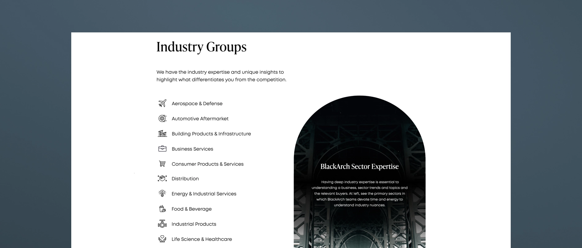
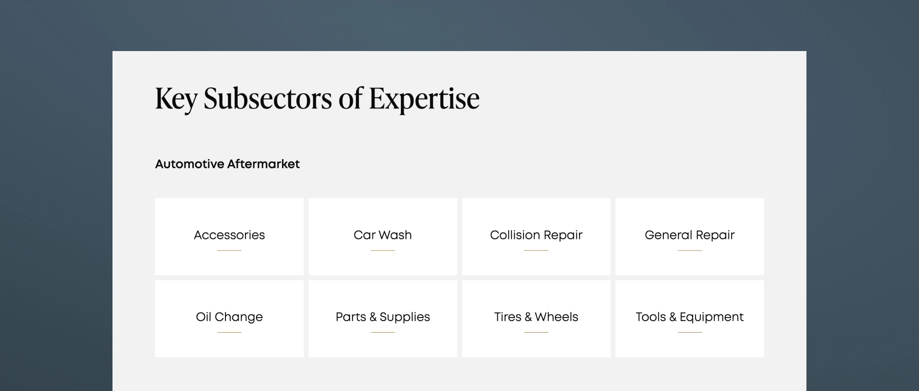
Take a look at middle-market investment bank, BlackArch Partner's website. The firm's "Expertise" page features both a high-level snapshot of their industry groups as well as clickable full pages for each sector. The internal pages feature market perspective, key subsectors, selected transactions and case studies, and a call to action to contact the dedicated sector team.

3. Transaction Experience: More Than a Tombstone Wall
Tombstones are a core part of banking history, but a grid of logos isn't enough to tell a meaningful story.
A strong transaction experience section does three things:
- Shows breadth and repeatability across sectors and transaction types
- Allows filtering (by sector, deal type, or year) to help visitors find relevance
- Incorporates case narratives to show how the firm thinks, not just what it has closed
The difference in perception between tombstones alone and tombstones paired with narratives is dramatic. The latter transforms activity into competence.
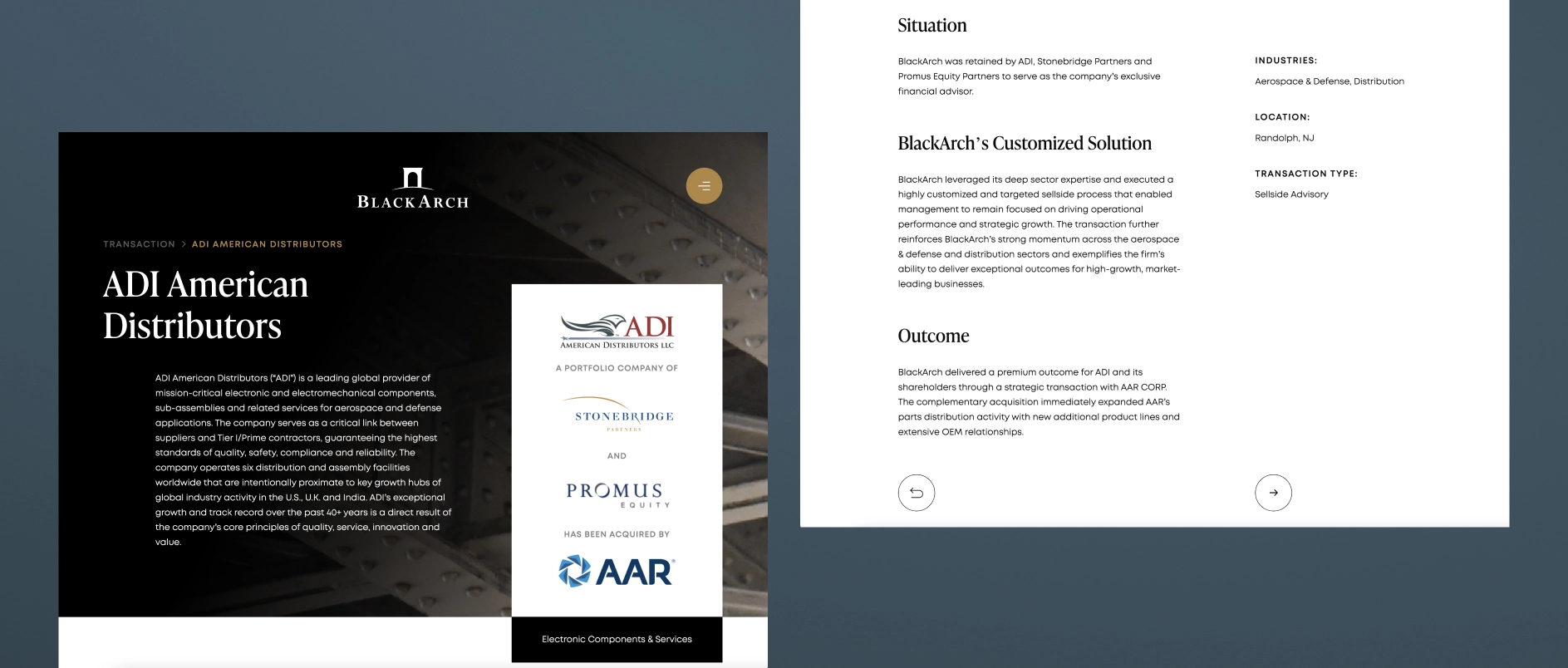
BlackArch Partners takes an intentional approach here as well. Clean filtering, search capabilities, and buildout of select transactions into full case studies.
4. Team Page: The Most Underestimated Source of Trust
Banking is relationship-driven. People make the decisions, run the processes, and drive the outcomes. Yet the industry’s team pages are often generic and inconsistent.
High-performing team pages include:
- Professional photography (aligned, modern, consistent)
- Clear bios with sector focus, transaction experience, and relevant history
- Logical grouping (leadership, bankers, operating specialists, advisory roles)
- Signals of stability including tenure, growth, continuity
Founders and sponsors profile teams the same way investors profile GP teams: they look for cohesion and credibility.
5. How We Work: The Page Most Banks Don’t Realize They Need
This page, sometimes called Process, Philosophy, or Approach, is the one that transforms a site from informative to persuasive. It answers a simple but critical question:
“What is it like to run a process with you?”
A strong How We Work page includes:
- Process pillars (e.g., preparation, positioning, outreach, negotiation)
- What differentiates the firm’s execution
- How the team collaborates internally
- How they communicate with clients
This page is invaluable to founder-led businesses, who often lack context for how M&A processes unfold. It builds comfort early, which increases conversion.
The Optional Sixth Page That Increasingly Matters: Insights
Middle-market investment banks don't need a fulsome content engine, but two to four thought pieces per year can:
- demonstrate sector authority
- support SEO
- reinforce specialization
- give bankers content to use in outreach
- shape early impressions for founders and sponsors
This page is optional, but for many firms, increasingly strategic.
Closing Thought
The power of these five (or six) pages isn’t in any one page individually. It’s in how they form a structured, intuitive story:
- Who you are
- What you specialize in
- What you’ve accomplished
- Who’s doing the work
- How you work
When investment banks build their sites around these pillars, perception shifts. The firm feels:
- clearer
- larger
- more sophisticated
- more intentional
- more trustworthy