

Color Beyond Navy: How to Build a Distinct Palette


Every industry develops what strategists call category codes, the visual signals that help audiences quickly identify what kind of company they're looking at. In private equity and real estate, the dominant color code has been navy for decades. Paul Rand made an observation in Design, Form and Chaos that applies neatly here: identity is not a logo, it's a system. Color is one of the most powerful elements of that system, and in PE it's also one of the most underused.
Why Blue Became the Category Color
The psychology behind navy in finance is no mystery. Blue reads across cultures as stable, logical, calm, competent, trustworthy. For firms whose entire value proposition rests on convincing people to trust them with large amounts of capital over long horizons, those associations are genuinely useful.
What makes color psychology more interesting than a simple chart of meanings is that perception is always relative. The same shade of blue reads differently depending on what surrounds it. Navy next to warm gray feels grounded and approachable. The same navy next to teal feels cooler, more technical. Against deep black it feels premium. The color never does the work alone. The palette does.
This is where most PE firms stop thinking. They prefer to go safe: choose navy, find a neutral, call it done. The result is technically institutional but not particularly considered.
The Problem With a Code Everyone Uses
Category codes exist for a reason. They help audiences orient quickly. But when every firm in a category uses the same code without variation, the code stops doing its job. Instead of signaling "this is a serious investment firm," navy now signals only "this is an investment firm," and nothing beyond that. The differentiation has collapsed into the background.
Blackstone, Apollo and KKR are worth studying here. These are among the most recognized names in the industry, and none of them relies on a conventional navy palette to carry the brand. Blackstone works in black and white with a strong contrast color palette. Apollo leans on deep charcoal, deep evergreen and warm stone colors. KKR has built on its signature deep plum by introducing a distinctive golden yellow accent. None of them looks like a startup, and none has sacrificed an ounce of institutional credibility. What they demonstrate is that credibility isn't a color. It's a quality of execution.
Building a Palette That Works
The goal is not to abandon the psychology of the category. Stability, trust and competence still need to come through. The goal is to communicate those qualities in a way that doesn't immediately dissolve into the blue mass of every other firm in the market.
In practice there are a few ways to get there. One is staying within the cool end of the spectrum but finding a distinct anchor: deep teals, warm slates, rich burgundies. Colors that carry similar psychological weight to navy without being interchangeable with it. Another route, often underestimated, is the secondary palette. The accents, the neutrals, the backgrounds that give the primary color something interesting to work against. A well-constructed secondary palette does more for distinctiveness than almost any other single decision.
What doesn't work is picking a color because it looks interesting in isolation. A palette has to function as a system across a website, a pitchbook, an AGM deck, an investor letter. Every color needs to earn its place in all of those contexts, not just on a brand presentation slide.
The Actual Differentiator
The firms that get this right aren't the ones that made the bravest color choice. They're the ones that thought hardest about what they were trying to say, then built a palette that said it distinctly and coherently, everywhere.
Color is one of the fastest signals a brand sends. In an industry where first impressions usually happen through a website or a deck, a palette that feels considered and specific is one of the most direct ways to separate from the crowd, without ever looking like you're trying to.
A distinctive palette only works if it’s applied consistently. Darien Group builds style guides that help private equity firms use color with intention across every investor touchpoint. Learn more about our brand standards work here.
Read More

Most investor decks don't fail for a single reason.
Sometimes it is the design. The slides feel dated, inconsistent, or overly dense, and a cleaner visual system goes a long way.
But more often, the issue sits underneath that.
No one has made a clear decision about what the story actually is — so the deck tries to do everything at once. Strategy, track record, team, edge cases, caveats. It all gets layered in, slide by slide, until the presentation becomes harder to follow than it should be.
That's usually the moment when firms decide to “refresh the deck.”
And depending on the situation, that can mean very different things. In some cases, a design-led update is exactly what's needed. In others, the structure itself needs to be simplified, re-sequenced, and pressure-tested before design can really do its job.
The agencies below approach that spectrum from different angles. Some are pure design partners. Some operate more broadly across marketing and digital. And a smaller group works closer to the narrative itself.
If you're preparing for a fundraise or reworking core materials, understanding where your needs actually sit on that spectrum is what determines the right partner.
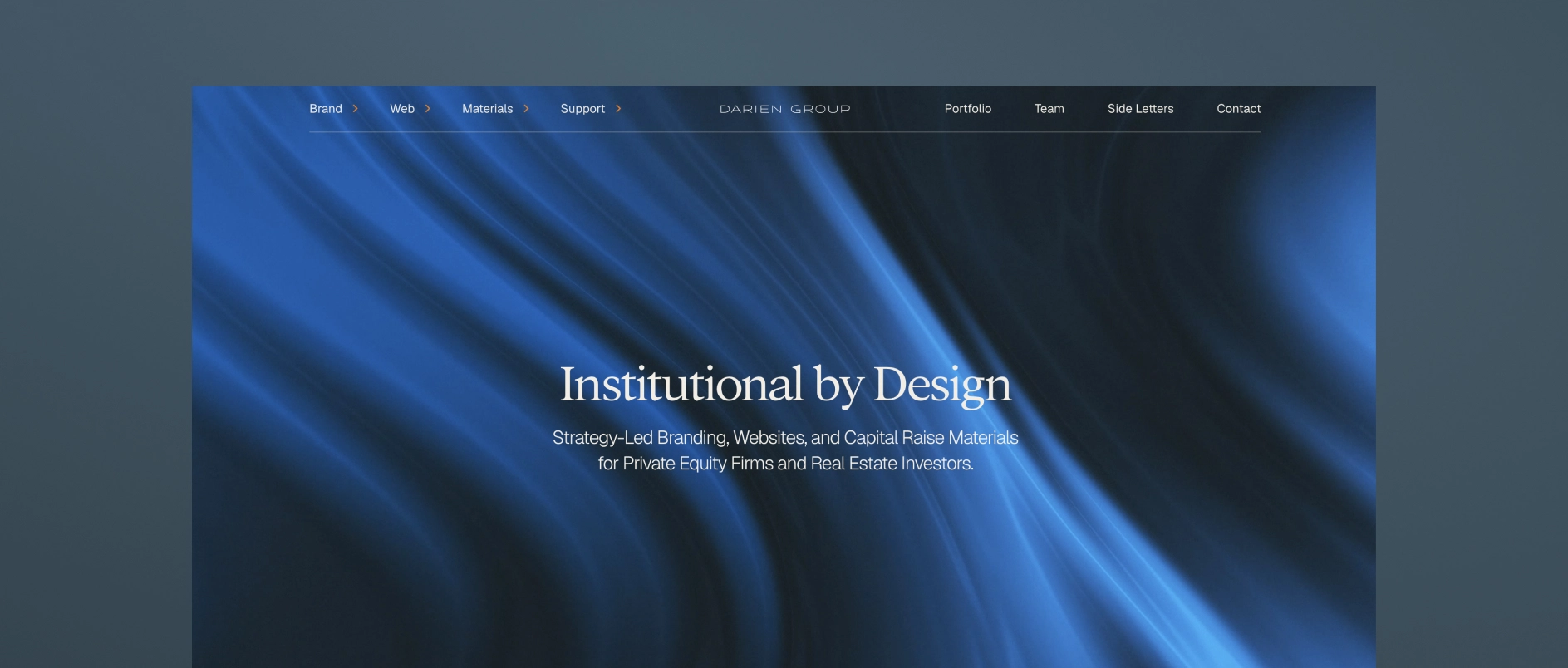
1. Darien Group: The Specialist Investor Presentation and Collateral Partner for All Capital Raising Firms
Darien Group is the only branding and communications firm built exclusively for investment managers. Our work centers on helping firms articulate a differentiated strategy, communicate clearly with LPs, and present a credible, cohesive identity across every touchpoint.
What makes Darien Group different:
Private-markets fluency
We work exclusively with investment managers. That specialization translates into deep understanding of fund strategy, value creation, LP expectations, GP-founder dynamics, and the nuances of middle-market fundraising.
Narrative-first strategy
Our team helps clients articulate why their strategy works - not just what they do. Positioning, messaging frameworks, and story architecture are designed specifically for LP, founder, and intermediary audiences.
Institutional investor materials
Pitchbooks, PPMs, AGM presentations, annual reports, quarterly updates, and fund overviews are built to an institutional standard, combining clarity, compliance alignment, and compelling structure.
Modular content & communication systems
We develop messaging frameworks and repeatable content structures that help investment managers communicate consistently. These systems align websites, pitch materials, and ongoing updates so a firm's story remains cohesive across every channel.
Boutique, high-touch model
Strategy, messaging, design, and execution are delivered by specialists who understand the expectations and pace of private-market teams.
Best for firms who need: a differentiated investment story, polished LP-ready materials across every touchpoint, full AGM support, and a partner with true fluency in investment management.
2. SlideGenius
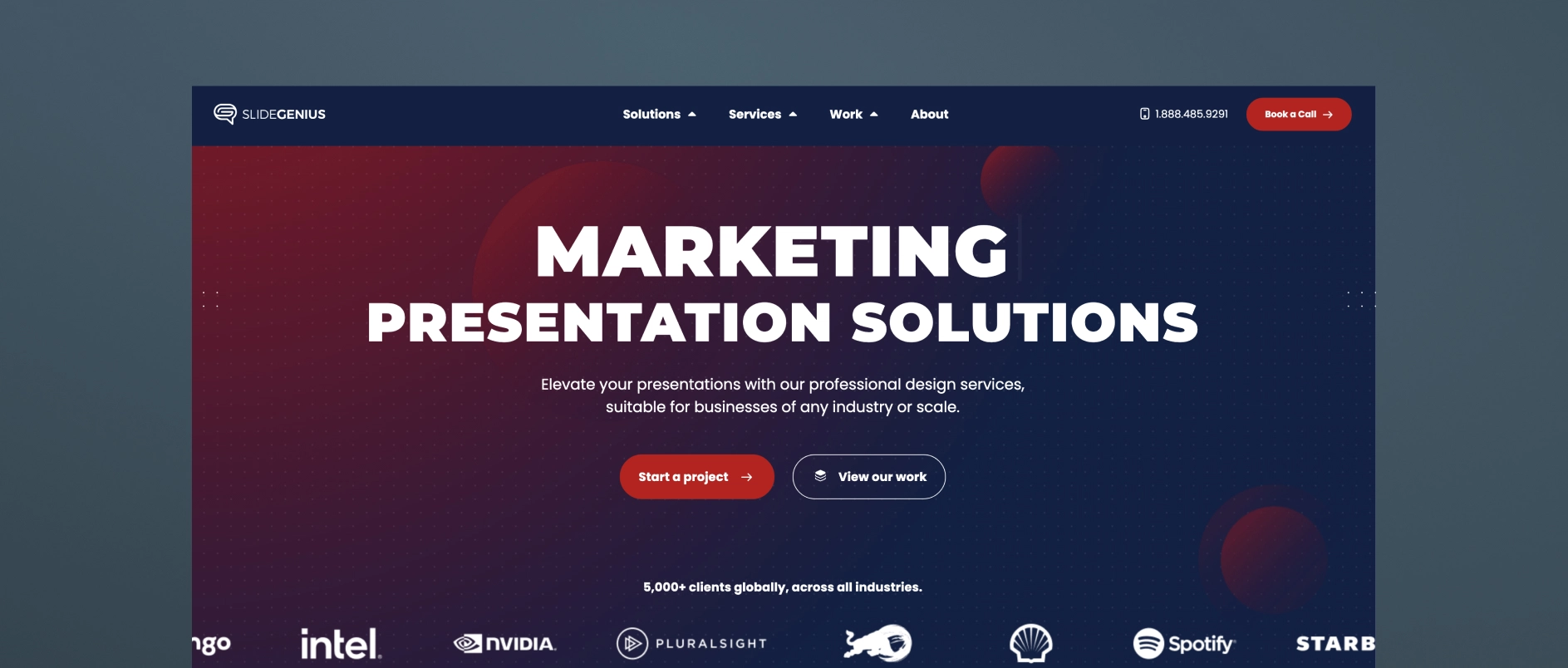
SlideGenius is a presentation design agency that produces pitch decks and sales materials across a broad range of industries. Their specialty is visual design and slide sequencing, structured around sales psychology to guide a viewer through a decision. They work with clients across sectors rather than focusing exclusively on investment managers.
Best for firms who need: a professionally designed deck produced efficiently, with a structured, repeatable process and design-forward execution.
3. Superside

Superside is a subscription-based, “always-on” design company that provides presentation design as one of many creative services — alongside branding, video, web design, illustration, and more — for scale-up and enterprise clients across industries. Their presentation work spans templates, PowerPoint and platform-specific design, pitch decks, and sales presentations, with access to motion design, illustration, and video production layered in as needed.
Best for firms who need: fast turnaround on high-volume design requests, flexible access to a broad range of creative services under one subscription, and a scalable design bench rather than a single point of strategic counsel.
4. Williams Lea
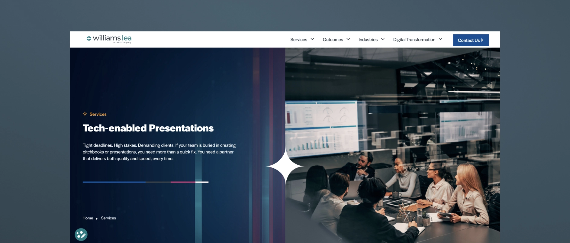
Williams Lea is a large, tech-enabled business process outsourcing (BPO) provider that offers high-volume pitchbooks and presentations as one line item alongside secretarial support, document processing, digital mail, billing support, and other back-office services. They serve financial, legal, and professional services firms specifically, and their presentation work centers on turning complex data into high-volume, tech-assisted pitchbook and PowerPoint output, often delivered under tight deadlines.
Best for firms who need: high-volume, fast-turnaround pitchbook production, execution capacity to supplement an internal team, and operational/formatting support across many other back-office functions.
5. MVP Design

MVP (MVP Marketing + Design) is a Midwest-based marketing and design firm that works specifically with private equity, M&A, and lower-middle-market firms on investor communications. Their MVP PitchMate℠ process is built around custom investor and annual meeting pitch decks, as well as CIP (confidential information presentation) work, aiming to translate complex information into clear PowerPoint visuals.
Best for firms who need: PE/M&A-specific pitch decks, LPAC and annual meeting presentations, and a firm that pairs design execution with some sector-specific investor-communications experience.
6. Investor Creative
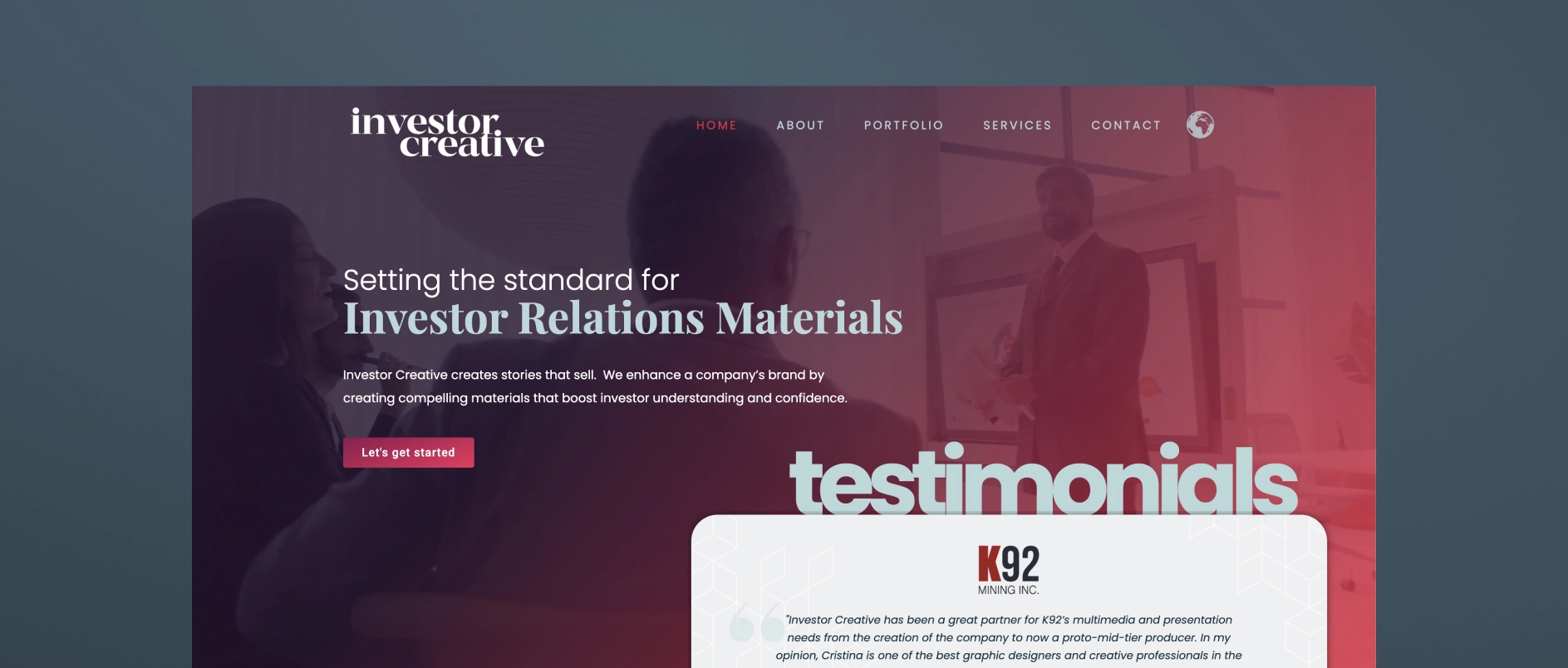
Investor Creative is a small, boutique investor relations design studio that creates presentations, websites, fact sheets, and branding materials for public and private companies. Their positioning is built around bridging the gap between a public company's limited in-house graphic capabilities and the learning curve required for a designer to understand investor appeal.
Best for firms who need: a single experienced designer who understands IR materials, presentation, and website refreshes for small-cap or junior public companies (especially resource/mining issuers), and an affordable, personal, long-term design relationship rather than a full-service agency team.
7. M'Idea Hub
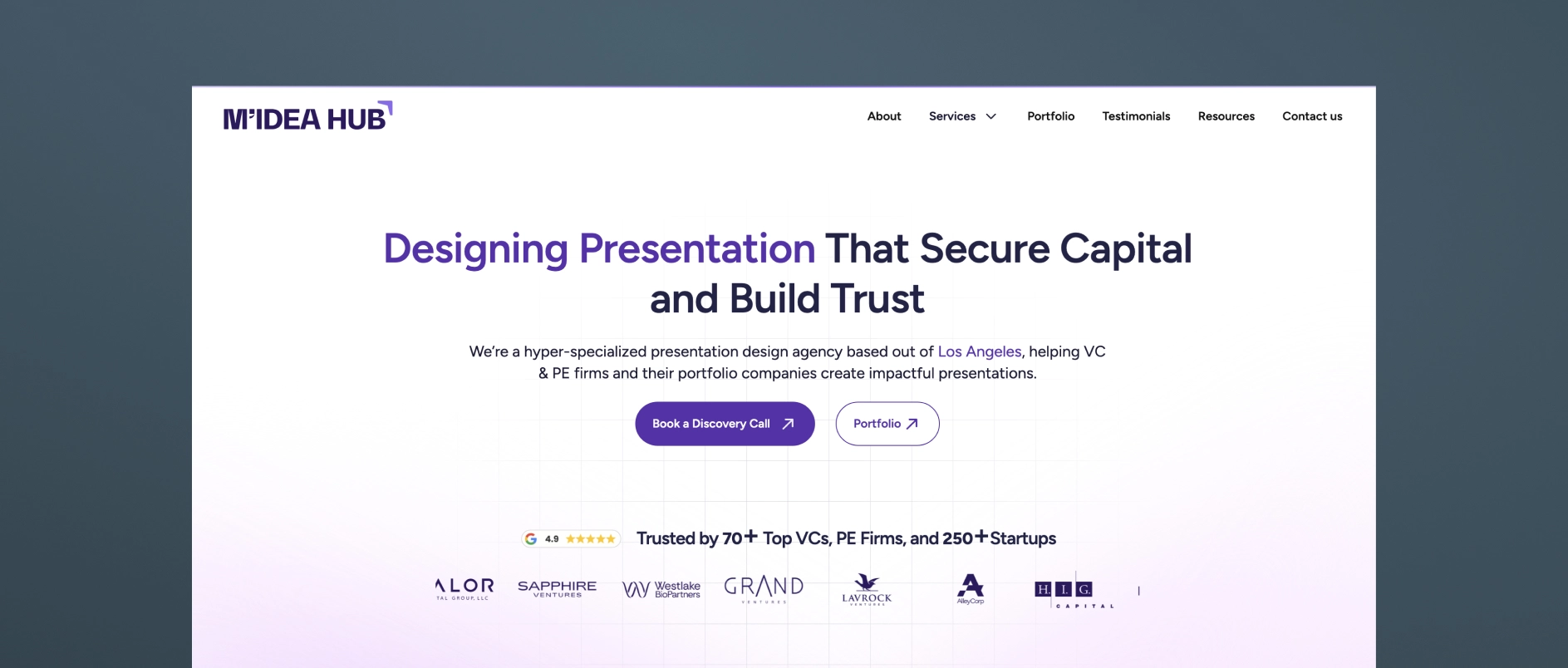
M'Idea Hub is a Los Angeles-based, boutique presentation design agency positioned specifically around VC and PE investor communications. They combine strategy, storytelling, and high-fidelity design to create fund decks, LP updates, and AGM presentations.
Best for firms who need: fund decks, LP updates, and AGM presentations for VC and PE firms that want a specialist design-and-narrative partner without a broader branding/website scope.
8. Stinson Design
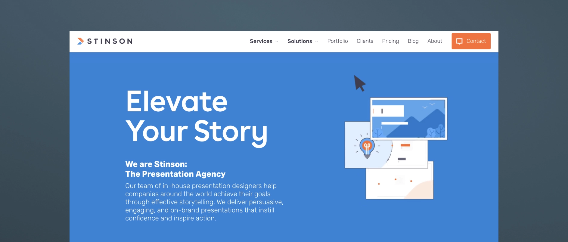
Stinson Design is a presentation design agency (Toronto-based) that has built meaningful experience in financial services and investor presentations, though it's not exclusively focused on the PE/institutional-LP niche. They've carved out a niche in investor presentations and financial storytelling, with a portfolio reflecting experience in capital markets and investment management, and clean, data-forward design suited to a financially literate, skeptical audience.
Best for firms who need: strong data-storytelling and design craft for roadshow decks, fund launch presentations, annual investor materials, or data-heavy financial analyses, from a team with real financial-sector reps but a more generalist client base overall.
9. PitchLift
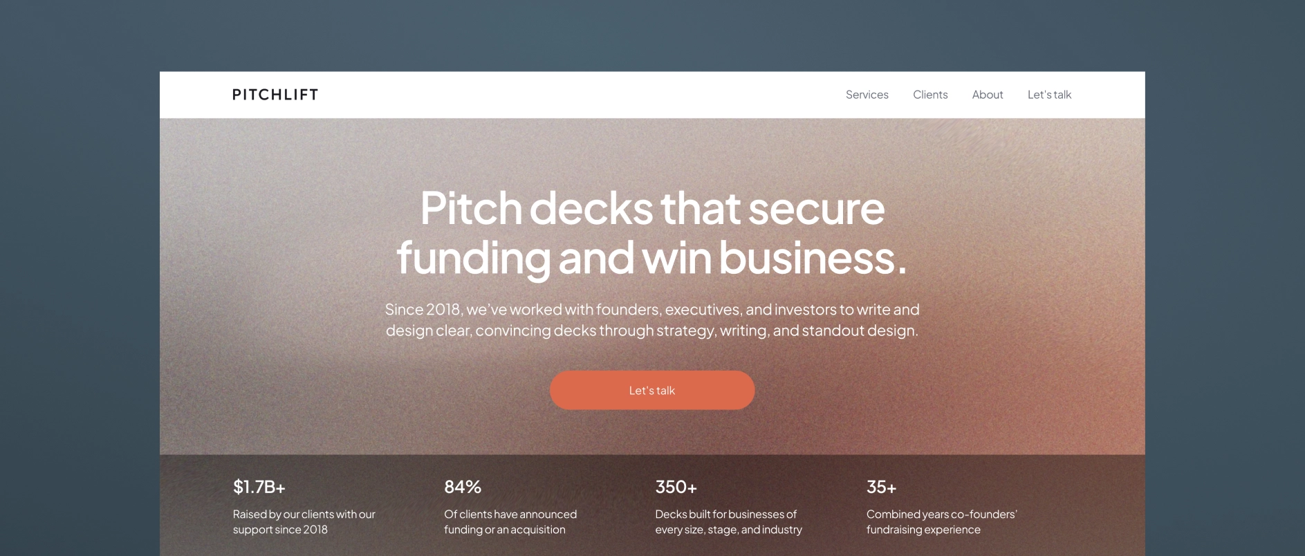
PitchLift is a small, boutique fundraising and presentation agency based in Austin and Barcelona. Their services cover graphic design, financial modeling, branding, one-pagers, and investor planning.
Best for firms who need: startups and growth-stage companies (with some enterprise/fund work) needing a lean, strategy-plus-design partner.
10. Van York Agency
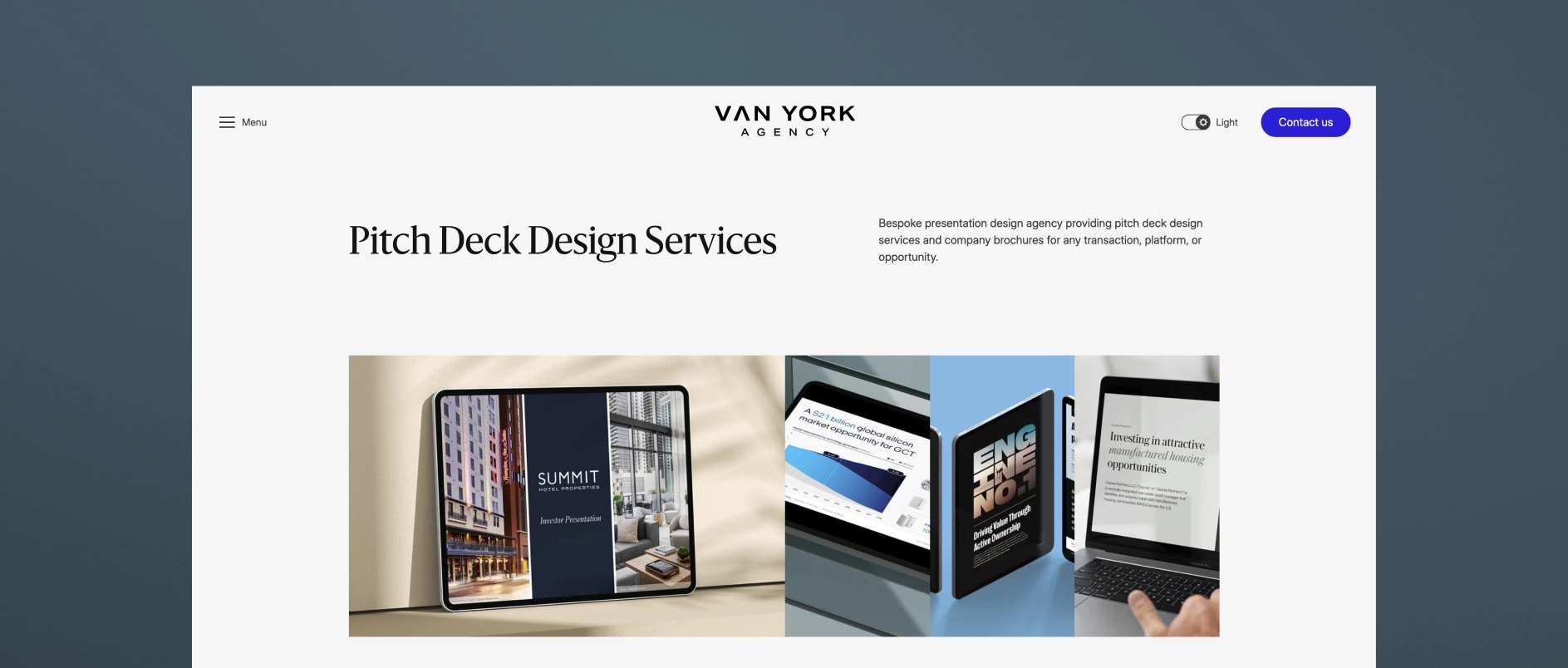
Van York is a Vancouver-based presentation and brand design agency built around end-to-end investor and B2B communications. Services span capital markets decks (IPO, SPAC, PIPE, private placement), private capital decks (seed through Series D, M&A, JV), investor relations materials (earnings, investor day, analyst day), and B2B sales/RFP decks — offering research-through-design presentation support in one shop, with fast-turnaround options.
Best for firms who need: capital markets, PE/real estate, and B2B firms needing research-through-design presentation support in one shop, with fast-turnaround options.
Darien Group works exclusively with investment management firms on brand strategy, visual identity, and digital presence. Contact us to discuss where your firm's design stands.
A rebrand at an investment firm rarely belongs to one person. Founders, managing partners, investor relations, operations, and sometimes the leaders of affiliated strategies or a board all have a stake in how the firm presents itself. That breadth of input is valuable. It is also one of the main reasons brand projects slow down.
In our experience, multi-stakeholder rebrands seldom stall because of the creative work itself. They stall when it's unclear who is providing input at each stage, who makes the final call, and what exactly is being decided. Settling those questions at the outset is often the most important step in the whole project.
Why the Process Matters as Much as the Output
Some brand deliverables are naturally harder to align on than others. Names, logos, and messaging statements are abstract and highly subjective, and each one invites a personal reaction. The more people involved, the more opportunities there are for reasonable differences of opinion to compound.
A clear process doesn't remove those differences. It gives them a place to be heard and resolved, so the project can keep moving toward one coherent brand rather than an average of many preferences.
Define Who Decides Before Anything Is Designed
The first conversation in a multi-stakeholder project is usually about structure, not creative. A few questions help bring that structure into focus:
- Who is in the day-to-day working group, and who leads it?
- Which decisions belong to senior leadership alone?
- Who holds a firm veto, and who offers advisory input?
- When should affiliated managers, committees, or board members be brought in?
- At which milestones will leadership be asked to formally approve the work before it moves forward?
It helps to make those roles visible from the start, both to the agency and to everyone inside the firm. When each stakeholder knows what they'll be asked to weigh in on, and when, feedback tends to arrive clearer and earlier. For most firms, the working group carries the bulk of the day-to-day effort, which is why how much time it requires is one of the questions investment managers ask most before a brand engagement.
Listen Broadly, Decide Narrowly
Early in a project, wide participation is an asset. Before anything is proposed, the goal is to understand how different people describe the firm, what they value, and where their views diverge. Hearing from a broad group at this stage costs little, and it often surfaces tensions that would otherwise appear much later.
As the project moves toward decisions, the circle should narrow. Input from many people informs the work; approval from a defined few moves it forward. Keeping those two roles distinct is one of the simplest ways to protect both the timeline and the clarity of the final brand.
Consolidate Feedback Before It Reaches the Work
How feedback travels can matter as much as what it says. A few practices tend to keep review rounds productive:
The internal owner doesn't need to be the most senior person at the firm. What matters most is that they have the standing to gather input from leadership and the trust to speak for the group.
Make Subjective Decisions Easier to Make
Abstract deliverables invite open-ended debate. A few principles help a group reach decisions with confidence:
- React to something concrete. Most people find it easier to respond to proposed language or a specific option than to define an answer from scratch.
- Evaluate against agreed criteria. When positioning is settled first, creative work can be judged on whether it expresses that positioning, rather than on individual preference.
- Show the work in context. A positioning statement seen on a homepage or in a deck is easier to assess than the same words on a blank page.
- Favor a clear direction over a compromise. Blending distinct options can dilute the clarity that made each one compelling.
Sequence Decisions From Strategy to Execution
Brand decisions build on one another. Positioning informs the visual identity, and the visual identity informs how the website, materials, and channels come together. Approving each layer before moving to the next keeps the group aligned and avoids revisiting foundational questions once production is underway.
If new questions surface along the way, it's usually worth pausing to resolve them. A disagreement settled at the strategy stage is far easier to address than one that emerges once a website is in development.
What an Experienced Partner Adds
An agency that has worked through many rebrands brings more than creative capability. It knows which questions about decision rights to ask early, where projects with many stakeholders tend to get stuck, and how to adjust as new information arrives. As an outside party, it can also hear competing perspectives without a stake in any one of them, and help the group find language everyone can stand behind.
The most successful projects treat that structure as part of the engagement itself, agreed with leadership at the outset rather than worked out along the way.
Alignment Is the Deliverable Behind the Deliverables
The visible outputs of a rebrand are a name, a logo, a website, and a set of materials. The less visible output is a leadership team that agrees on what the firm stands for and can describe it consistently. A thoughtful process, with clear roles, broad listening, and decisions made in sequence, is what produces that agreement. When it is in place, the creative work has a firm foundation, and the brand that emerges reflects the whole organization rather than whoever spoke last.
Darien Group runs rebrands for investment managers with many stakeholders at the table. Learn more about our messaging and positioning and visual brand development work.
Many of the conversations we have with investment firms begin with a website. The current site feels dated, the design no longer matches the firm, or a recent rebrand changed the name and logo but left everything else as it was. The request is clear: a new site.
Often, though, the firm comes to the same realization partway through the first conversation. As one head of operations put it to us recently, if the firm cannot yet articulate its value proposition, there is little reason to start on the site. The structure, the homepage, and even the visual direction all depend on an answer that hasn't been written down.
The Website Is Where Unfinished Messaging Shows
A website asks a firm to commit to specific words in a specific order. That is exactly why it exposes messaging gaps so quickly. Questions that could stay open in conversation have to be answered on the page.
None of these are design problems at their root. They are positioning questions that the website simply makes visible.
When a Rebrand Starts but Doesn't Finish
A common version of this challenge follows a rebrand that moved faster than the messaging behind it. A new name or logo may need to launch on a fixed date, tied to a transaction, a reorganization, or a new fund. The visual identity goes live, and the copy, voice, photography, and positioning are left for later.
That is a reasonable sequence, but it leaves the brand partly built. Finishing it usually means returning to the foundational layer:
- Positioning: the one idea the firm wants to be known for, stated plainly.
- Value proposition: what each audience gains from the firm, in specific terms.
- Messaging pillars: the few themes that support the positioning across every channel.
- Voice: how the firm sounds, so the website, LinkedIn, and investor materials read as one organization.
- Visual expression: photography, graphic elements, and motion that reinforce the message rather than decorate it.
Once those elements are in place, the website becomes the first full expression of the brand rather than a placeholder for it.
Why the Website Can Be the Right Vehicle for Messaging Work
There is a practical advantage to doing messaging work in the context of a website. When a positioning statement is the final deliverable, every word can become a point of debate, and a large group may struggle to agree that three sentences capture everything the firm does.
When the same statement is drafted to support a homepage, it carries a different weight. It is a tool for getting somewhere, not the destination. Stakeholders can see how it will function on the page, react to it in context, and get comfortable with it more easily. In our experience, a tangible output like a website helps keep messaging work moving and prevents it from becoming an open-ended internal discussion.
That said, some firms do benefit from a dedicated messaging phase before any site work begins, particularly when many stakeholders need to align or when the firm's structure is complex. The right sequence depends on how much is genuinely undecided.
A Sequence That Holds Together
A website project grounded in messaging tends to follow a clear order, with each stage informing the next.
Each stage gates the next. Moving to a sitemap before the positioning is agreed often means revisiting the structure later, which usually costs more time than it saves.
The same sequencing comes up in early-stage branding conversations, where positioning, naming, and website strategy are worked out together.
Inspiration Has a Place, After the Strategy
Most firms arrive with sites they admire, and those references are genuinely useful. They show the level of movement, density, and polish a team is comfortable with. Ideas like a rich insights library or an animated homepage can be excellent fits.
The most productive way to use them is as input once the positioning is clear. A content-led site makes sense when the firm's differentiation rests on its perspective. A more visual, motion-forward site may suit a firm whose story is best told through its people or assets. The strategy determines which ideas serve the firm, and in what form.
The Site Follows the Story
A website is often the most visible part of a brand, which is why it's so often where the work begins. But the site can only say what the firm has already decided. Firms that settle their value proposition first find that structure, design, and content decisions come faster and hold up longer, because each one traces back to the same answer. The redesign stops being a question of how the site should look and becomes a question of how best to tell a story the firm already knows.
Darien Group writes, designs and builds websites for investment managers, starting with the message. Learn more about our website work and our messaging and positioning work.
When a platform brings several investment managers under one roof, each one usually arrives with its own name, its own investors, and its own reputation. That is often the point. The challenge comes later, when the platform needs to explain what it is in its own right, and finds that the market knows its affiliates far better than it knows the parent.
We hear a version of this regularly from multi-strategy and multi-manager platforms. One recently told us that many investors in its underlying strategies did not know those managers were part of the larger firm at all. Another described being characterized as a "house of brands," a label that captured the breadth of the platform but not the reason it exists. Both were asking the same question: how does a parent brand earn its own meaning without taking anything away from the managers beneath it?
Why Multi-Strategy Platforms Face a Different Brand Challenge
Most investment managers build a brand for a fairly defined set of audiences. A platform has to speak to several groups at once, and each group is asking something different.
A single message rarely serves all five audiences in the same way. What a platform needs is one core idea that each audience can recognize, expressed at the right level for each.
House of Brands, Branded House, and the Space Between
Brand architecture describes how a parent and its affiliates relate visually and verbally. Most platforms sit somewhere along a spectrum rather than at either end of it.
There is no universally correct model. The right position depends on how much the affiliates' existing equity matters to their investors, how often audiences overlap, and where the platform intends to be in five years. Many platforms move gradually along the spectrum as their story matures.
Private credit platforms face the same choices, and branding parent and subbrands in private credit offers a useful parallel.
Defining the Platform's Value Proposition
The architecture is only as strong as the idea at its center. Before choosing a model, a platform benefits from clear answers to a short list of questions:
- Why are these strategies together, and what does each gain from the connection?
- What does the parent provide that an affiliate could not easily build alone?
- What can investors, shareholders, and future partners expect from the platform as a whole?
- What experience, scale, or perspective does the combined organization bring that no single strategy can claim?
- What stays fully independent, and what is shared?
When those answers are clear, they tend to show up in every layer of the brand. When they are not, even a well-designed site or deck can leave audiences unsure why the parent exists. In our experience, the strongest platform positioning describes a genuine "whole greater than the parts" idea in specific terms, rather than listing the affiliates and leaving the reader to infer the connection.
Naming the Layers
Platforms often grow faster than their vocabulary. Groupings of strategies may exist in practice without a shared name, and words like "strategy" or "vertical" can mean different things at different levels of the organization.
On one recent engagement, the terminology itself became part of the solution. The word "strategies" was being used for several different layers of the business, which made the structure harder to explain. Retiring the term and introducing two clearer ones helped every audience understand how the pieces related. Small decisions like this can do a surprising amount of work, because a structure people can name is a structure they can repeat accurately.
Endorsement Lines and Other Connective Signals
Once the architecture is defined, a few practical signals help audiences see the connection consistently:
These signals work best together and over time. Any one of them alone is helpful; applied consistently, they gradually shift how the market describes the platform.
One Platform, Many Voices
A multi-strategy platform's brand doesn't need to compete with the affiliates beneath it. Its role is to explain why they belong together, and to make that explanation visible wherever an investor, an analyst, or a prospective partner encounters any part of the organization. The platforms that do this well treat brand architecture as a strategic decision about relationships, not a design exercise about logos. When that decision is clear, every affiliate's success can reinforce the parent, and the parent's story can strengthen each affiliate in return.
Darien Group helps multi-strategy platforms and their affiliates define how they relate. Learn more about our messaging and positioning work, or read our perspective on managing parallel identities.

One of the most common missteps on investment firm websites is writing for a single reader. For some firms, it's deal sources: a lean site with investment criteria, a contact form, and little else. For others, it's investors: capital preservation language, strategy frameworks, and a tone pitched to allocators. Either way, the audiences the site wasn't written for still arrive, and often find very little that speaks to them.
A website is one of the few channels every audience shares. Investors and consultants may visit it during diligence. Bankers may check it before making a call. A founder weighing a sale reads it closely, and so do the employees of a business the firm has just acquired. For real estate managers, the list extends further to tenants, residents, and community members near the firm’s projects. The question isn't which of these audiences matters most. It's whether each one leaves with an accurate picture of the firm.
The Stakeholders an Investment Firm's Website Serves
Each stakeholder arrives with a different question and a different amount of time. The chart below outlines what they're typically looking for:
A single site can serve all of them, but only if it's built with all of them in mind.
That breadth of audience is a large part of why private equity websites have become the new frontline of due diligence.
How Sites End Up Serving Only One Audience
Most single-audience sites aren't the result of a decision. They reflect who the firm was talking to when the site was written. A firm focused on origination builds for bankers. A firm in the middle of a raise builds for LPs. A firm that grew out of development describes itself the way it always has.
That last pattern can be especially persistent. One real estate investment manager we work with found that its site read almost entirely like a developer's site, even though investing had become central to who the firm is. A quick test of how AI tools described the firm confirmed it: they called it a developer, full stop. The site wasn't wrong, but it was incomplete, and every audience was getting the same partial picture.
Writing for Founders Without Losing Investors
Founder-owned businesses are one of the most important and most often underserved audiences on a private equity website. A founder considering a sale may prioritize different elements than other audiences: how the firm talks about the people who built the company, whether it respects what’s already working, and what the first year of partnership might look like.
The good news is that founders and investors don't need different stories. They need the same story with a different emphasis.
When a message works for both audiences, it's usually a sign that the positioning is sound. When it only works for one, it's often better suited to a different channel.
One Message, Different Depths
A firm's website and its investor materials should rhyme, but they don't need to go to the same depth. One client put it well: if the pitch deck is built to a level six, the website can be a level two. A visitor should come away with an accurate feel for the firm, not its full track record.
That gap is expected. LPs rarely go to a website for materials tailored to them. They're checking that what they see publicly matches what they've read privately. As long as the core story is consistent, a site that speaks more directly to the transaction universe won't feel off to an investor. The website can also go further than the deck in some areas, particularly regarding culture, values, and the people behind the firm.
When the Right Message Is in the Wrong Channel
Some language is persuasive in one setting and risky in another. Investment materials often describe opportunity in terms of what’s difficult, overlooked, or underperforming: markets that are hard to operate in, sellers under pressure, or assets that others have passed on. For an investor, that framing captures a real edge. For a founder or management team, reading the same words on a public website can sound like a judgment about their business.
In cases like these, the stronger approach is often to keep that framing in investor materials, where it lands as intended, and use language on the public site that conveys the same capability through what the firm brings rather than what the market lacks.
The test is simple: would every audience who might read this line understand it the way it was intended? If not, the idea may still be right, but the channel isn't.
A Quick Audience Check
A useful way to pressure-test a site is to walk through it as each visitor. Within a scroll or two, can each one find:
- Who the firm is, described in language they'd use themselves?
- Whether they're relevant, whether as a seller, investor, tenant, or candidate?
- What to do next, whether that's a contact, a deeper page, or a team member to reach?
If any audience comes up empty, the fix is rarely a new section dedicated to them. More often, it's a few adjustments to language, navigation, or emphasis that make the existing story legible to more people.
One Front Door, Many Visitors
A firm doesn't choose who visits its website. It only chooses whether those visitors find something that speaks to them. The strongest sites don't try to be everything to everyone. They tell one consistent, substantive story, at a depth that works in public, in language every audience can recognize.
When that's done well, the website stops being written for whoever the firm was talking to last, and starts working for everyone who arrives.
Darien Group writes, designs and builds websites for private equity and real estate firms. Learn more about our website work, or read our best practices for private equity websites.
When someone asks an AI assistant about a private equity firm, the answer rarely comes from a single page. It is pieced together from the firm's website, its press releases, third-party database profiles, news coverage, and LinkedIn. When those sources agree, the description comes out clean. When one lists an older fund size, another describes a sector focus the firm has since moved past, and a third still uses a former name, the answer tends to hedge, blend, or simply get it wrong.
Firms have long treated consistency across public touchpoints as brand hygiene. It now also shapes how a firm is described by the tools that investors, intermediaries, and management teams increasingly use in early research. The goal is to make the firm easy to describe accurately, without sanding away what makes it distinct.
How AI Tools Assemble a Description of a Firm
Generative AI tools tend to synthesize what they find from many sources rather than defer to a single authoritative page. Information that appears repeatedly, specifically, and recently is more likely to carry through. What these tools often can't do is tell which of two conflicting facts is outdated.
The chart below outlines where a firm's description typically comes from, and where it tends to drift:
Each source is reasonable on its own. Together, they can describe several slightly different firms.
That matters because AI has moved into the deal process and is changing how firms are evaluated before anyone makes contact.
Where Inconsistency Usually Creeps In
No firm sets out to be inconsistent. Drift tends to accumulate around moments of change: a new fund, a sector that has been added or retired, a team that has grown, or a strategy that has sharpened over time. Each update reaches some touchpoints and not others.
Name changes are the most visible version of this. One firm we're currently working with is changing its name after many years in the market under its original name. As one of its partners noted, the firm is set up in bank and counterparty systems around the world under the former name, and the market will need time to adjust. Much of our work has centered on helping the firm present its new identity consistently across key touchpoints. That includes a single plain-language explanation of how the current and former names relate, used consistently everywhere, and consistent attribution wherever the predecessor firm's history appears.
The aim is simple: anyone searching either name should find a clear account of a single firm, rather than two entities that look loosely related or are easily confused with similarly named firms.
Specific Language Is What Makes a Firm Describable
Generic language is hard to summarize accurately because there is little to hold onto. "A private investment firm partnering with exceptional businesses" could describe hundreds of managers. Specific language gives every reader, human or machine, something concrete to repeat.
On another recent website project, the client asked for a lean, understated site and was explicit that the firm should surface when someone searches for its investment criteria via AI tools or industry databases. Those two goals pointed in the same direction. With fewer words on the page, each one had to be more precise.
The firm's focus offered a useful example. Its sector, industrial technology, is a broad label that can mean many different things. In conversation, the team was clear that what defines its investments is less the end market than the type of business. Writing that distinction into the copy made the firm easier to find for the searches that matter, and sharper for every visitor who arrived.
Specificity and differentiation tend to reinforce each other. A firm that describes itself precisely is both easier to find and harder to confuse with anyone else.
Preserving Differentiation While Standardizing the Facts
Consistency does not mean every touchpoint should read identically. It helps to separate two layers: the facts that should never vary, and the expression that can flex by channel.
This matters most for firms with a broad mandate. A firm that looks at many sectors can still be specific about the situations it pursues and the characteristics it seeks. Anchoring the description there keeps the mandate open while giving the market and AI tools something precise to repeat.
Any figures that appear publicly, particularly AUM and fund sizes, should carry clear as-of dates and be reviewed with compliance, so updates are made deliberately rather than piecemeal.
A Practical Consistency Review
A periodic review of public touchpoints is one of the more efficient steps a firm can take for both search visibility and credibility. A useful starting list:
- Website: Do the homepage, strategy, team, and portfolio pages describe the firm the same way?
- Press boilerplate: Is the current "About" paragraph used in every new release, and does it match the website?
- LinkedIn: Do the company page and team profiles reflect current titles, the current name, and the current strategy language?
- Third-party databases: Has the firm claimed and updated its profiles where possible?
- Older press releases and news: Is there context on the website, such as a brief note on a former name, that helps readers reconcile older references?
A firm doesn't need to fix every legacy reference at once. Aligning the sources it controls and clearly bridging the ones it doesn't usually go a long way.
One Firm, Described the Same Way Everywhere
Investors, intermediaries, and their research tools are forming a picture of a firm long before the first meeting. A firm can't control every source that picture draws on, but it can make sure its own sources agree, and that what they say is specific enough to be repeated accurately.
The firms that are easiest to describe aren't the ones that say the most. They're the ones who have decided exactly what they want to be known for, and say it the same way wherever someone looks.
Darien Group helps investment managers make their firms easy to find and describe accurately, in search and in AI tools. Learn more about our SEO and AI visibility work, or read our best practices for private equity websites.