.jpg)
Best Practices for Private Equity Websites (2026)


What Makes a Private Equity Website Effective in 2026?
An effective private equity website in 2026 does three things simultaneously: it communicates the firm's investment thesis clearly to prospective LPs, it builds credibility with management teams evaluating the firm as a partner, and it performs well in AI-driven search environments where a growing share of early-stage research now happens.
Most PE firm websites fail on at least two of these three dimensions. They either communicate well to institutional LPs but ignore management teams, or they look credible but are structured in ways that make them invisible to generative AI research tools, or they address both audiences but bury the thesis under generic language and a logo grid.
The firms getting this right are treating their websites as frontline capital-raising assets - not digital business cards.
Why Have the Standards for Private Equity Websites Risen So Dramatically?
Three forces have converged to raise the bar.
LP due diligence now begins online. Institutional allocators, family offices, and wealth managers conduct significant digital research before reaching out to a GP. They are reading the firm's website, its team bios, and its thought leadership - and forming a strong preliminary view before its IR team knows they exist. A poor first digital impression may mean no call at all.
The private/public market convergence is expanding the audience. As private equity firms move into wealth management channels, defined-contribution platforms, and retail-access structures, the audiences evaluating PE websites now include financial advisors and individual investors alongside institutional LPs. These audiences evaluate firms differently and expect more accessible communication.
AI search tools have changed how research begins. Generative AI assistants increasingly answer investor questions directly rather than returning lists of links. PE firms whose websites are structured with clear content, specific language, and proper technical architecture are being surfaced as authoritative sources. Firms with vague or generic content are becoming invisible.
What Are the Most Important Pages on a Private Equity Website?
Every PE website needs five core pages, or sections, to communicate effectively with its key audiences.
Homepage. The homepage should answer “why this firm” within the first scroll. It should communicate the investment thesis, signal the firm's sector or strategy focus, and give each audience type a clear path forward. It is not a place for history or a logo grid - those come later.
Strategy or approach page. This page unpacks the investment thesis in detail: sourcing approach, target profile, decision criteria, and value creation framework. This is the page institutional LPs evaluate most carefully. Specificity here is a significant differentiator.
Portfolio page. The portfolio page should demonstrate thesis consistency and value creation, not just list logos. Case studies or sector-organized portfolio presentations outperform logo grids by a significant margin in terms of credibility and engagement.
Team page. The team page is where trust is either built or lost at the individual level. Bios should communicate operating experience and judgment, not just credentials.
Contact page. The contact page should reinforce the firm's identity and make the next step feel specific and human. A bare form with no context is a missed opportunity at precisely the moment a motivated prospect is deciding whether to reach out.
What Should the Homepage of a Private Equity Website Lead With?
The homepage should lead with the investment thesis - not the firm's history, founding year, or fund count.
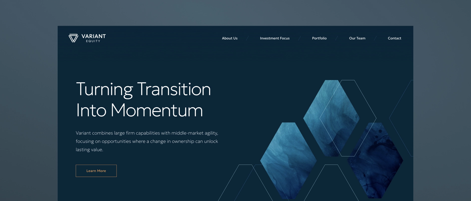
Most PE homepages default to leading with the firm's credentials: “Founded in 2005. $3B AUM. 45 investments.” This information is not unimportant, but it answers the wrong question. A sophisticated visitor does not need to know how long the firm has been operating before understanding why it exists and what makes it the right partner.
What a visitor needs first is a clear answer to three questions: what does this firm believe, where does it invest, and how does it create value? That is an investment thesis, and it should be the organizational principle of the homepage - not a section buried below the fold.
The homepage headline should express a point of view. The supporting copy should make the thesis specific. The visual design should reinforce it. Everything on the page should work together to answer “why this firm” before it asks the visitor for anything.
How Should a Private Equity Website Present the Portfolio?
A PE website should present the portfolio as proof of the thesis, not as a list of credentials.
A row of portfolio company logos communicates very little. It does not show what the companies have in common, what role the firm played in their development, or what pattern the portfolio represents. For a management team evaluating the firm as a potential partner, a logo grid tells them nothing about what working with this firm is actually like.
The best portfolio presentations in 2026 do several things differently:
- Organize by thesis or sector rather than chronology or deal size, showing a consistent pattern of focus
- Include brief case context - two or three sentences about the situation, the firm's approach, and the outcome
- Highlight value creation levers - operational improvements, strategic pivots, add-on acquisitions, management team development
- Filter or tag by industry, geography, or deal type so different visitors can find the most relevant examples
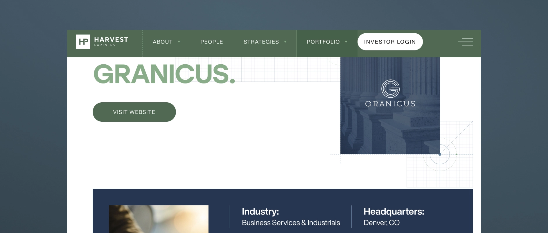
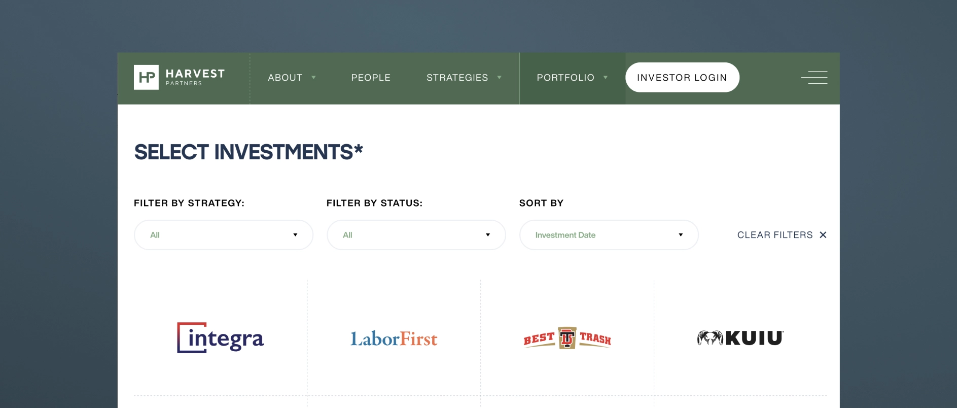
For firms with confidentiality constraints, thesis-level commentary, anonymized case studies, and sector analysis can achieve the same effect without disclosing sensitive deal information.
How Should Private Equity Firm Team Bios Be Written?
PE firm team bios should communicate judgment and operating experience, not just credentials.
The default approach - a third-person bio listing degrees, former employers, and board memberships - has become a signal of effort avoidance. It tells a prospective LP nothing about how this person thinks. It tells a management team nothing about what it would be like to be in a difficult situation with this person on the other side of the table.
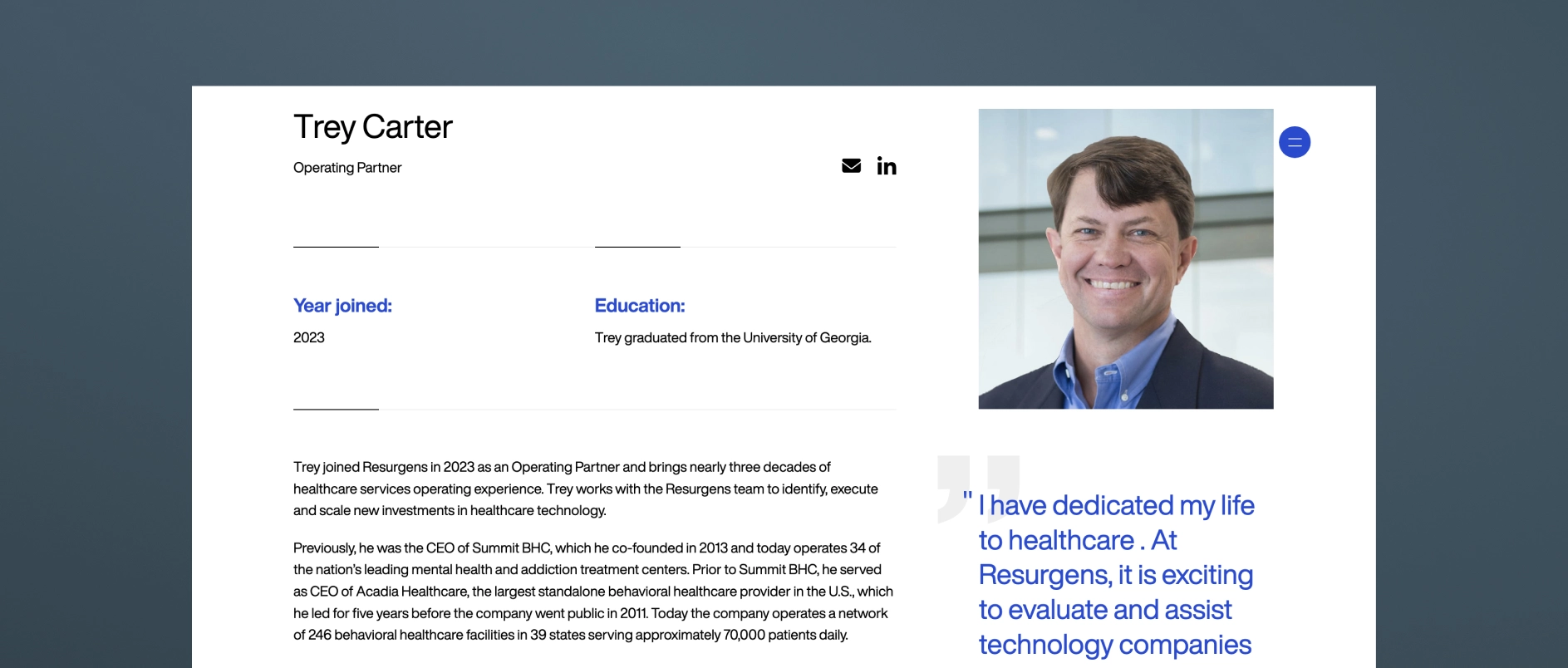
Effective PE team bios in 2026 share these characteristics:
- Written with a genuine voice, even in third person, that reflects the individual's personality and perspective
- Specific about operating experience in terms that are meaningful to management teams: not just “led the acquisition of X” but “guided a founder-led business through its first institutional ownership cycle”
- Honest about area of focus and what the person is specifically good at — not attempting to present every partner as a generalist expert in everything
- Accompanied by photography that feels real: candid, professional, human — not a stiff headshot against a grey backdrop
The team page is the moment on the website where the people behind the capital become real. The best ones make a visitor feel like they understand who they would be working with.
What is AI Search Optimization for Private Equity Websites?
AI search optimization (also called AEO - Answer Engine Optimization) is the practice of structuring website content so it can be understood, extracted, and cited by generative AI research tools.
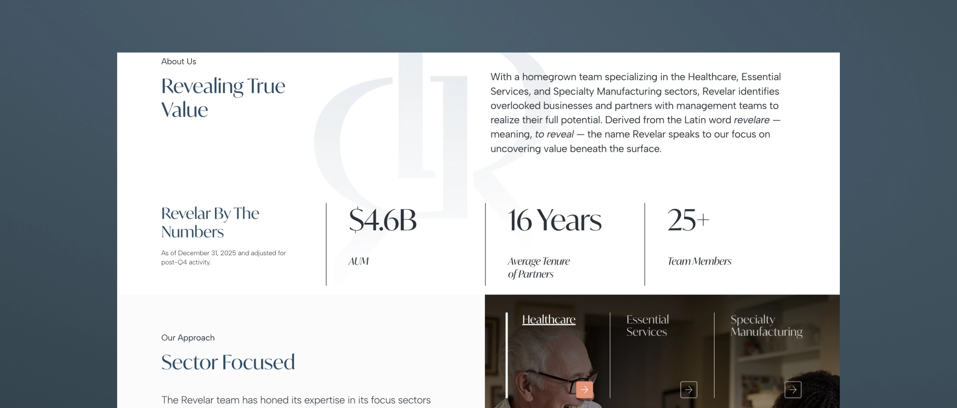
In 2026, a growing share of research into PE firms happens through AI assistants — tools like Perplexity, ChatGPT, and Google's AI Overviews — that synthesize information from across the web and return direct answers rather than link lists. These tools favor content that is:
- Clearly structured with descriptive headings that read like questions or answers
- Modular - organized in short, self-contained sections that can be extracted independently
- Specific - containing concrete, accurate information rather than generic claims
- Well-formatted - with FAQ sections, numbered lists, and defined terms that AI tools can parse easily
- Technically sound - with proper schema markup, fast load times, and clean HTML hierarchy
PE firms that adapt their content for AI search are increasingly being cited as authoritative sources. Firms that don't are losing early-stage visibility to competitors who show up in AI-generated research summaries.
What Design Principles Apply to Private Equity Websites in 2026?
Private equity website design in 2026 follows five core principles.
Restrained sophistication. The aesthetic should feel like the firm: disciplined, clear, authoritative. Deep anchor colors, refined typography, generous clean space. Design that is impressive without being ostentatious.
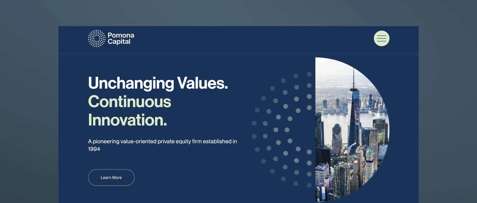
Typography as a primary communication tool. In an industry where most communication happens through words, typeface selection and typographic hierarchy are the most important design decisions. Generic system fonts undermine the credibility that everything else is trying to build.
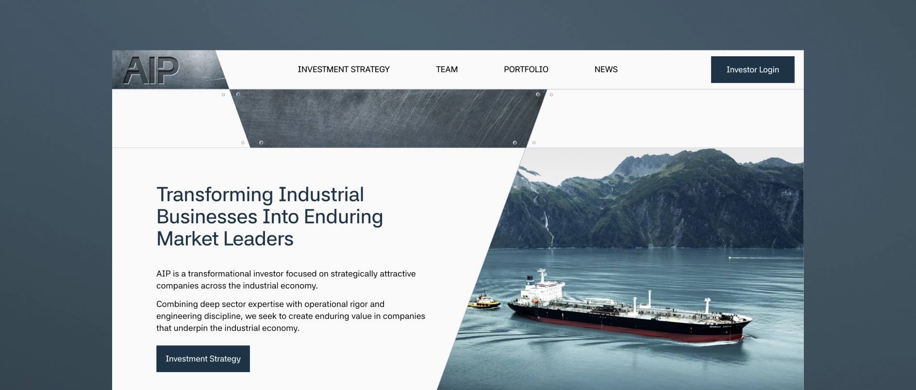
Imagery as evidence, not decoration. Stock photography of handshakes and skylines communicates nothing. Authentic team photography and real portfolio company imagery communicate genuine presence and operational depth.
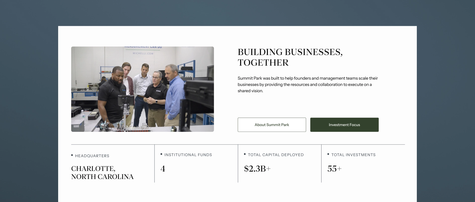
Mobile-first performance. A significant share of LP research now happens on mobile devices, including during travel and between meetings. PE websites that are clearly built for desktop and awkward on mobile are unintentionally communicating that the firm has not thought carefully about its audience.
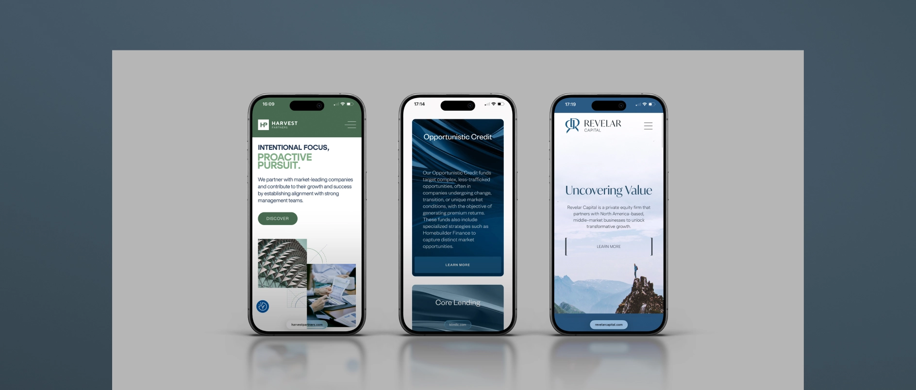
Speed and technical hygiene. Page load time, Core Web Vitals scores, and clean HTML structure affect both user experience and search performance. Technical quality is part of the design standard, not separate from it.
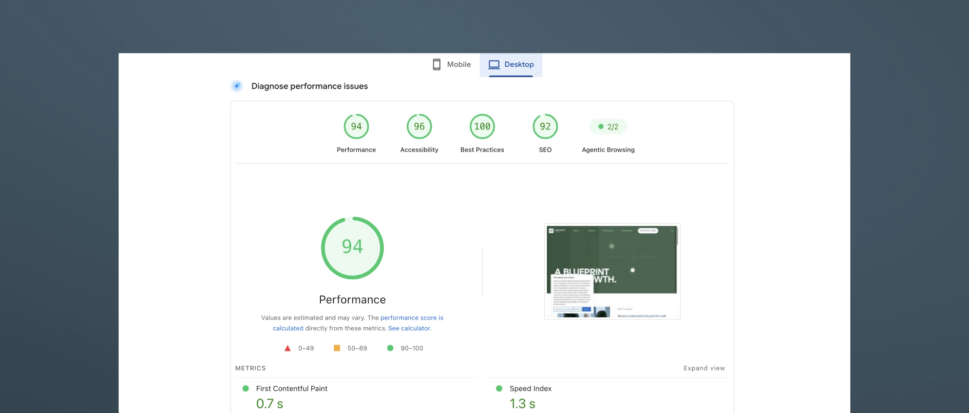
All websites done by Darien Group.
What Are the Most Common Mistakes on Private Equity Websites?
The homepage leads with history rather than the thesis. Founding year and AUM are credentials. They are not positioning. Leading with them signals that the firm has not done the work of articulating what makes it genuinely different.
The portfolio is a logo grid. As discussed above, logos without context prove nothing and differentiate nothing.
Bios are third-person credential lists. A bio that reads like a LinkedIn export tells a visitor nothing about the person. Judgment, voice, and specific expertise are what build trust.
There is no thought leadership, or it reads like a press release. Quarterly market updates and fund announcements are not thought leadership. They are content placeholders. Real thought leadership requires a point of view.
The site is not structured for AI search. Generic, unstructured content is increasingly invisible to the tools investors use for early-stage research.
There is no mobile optimization. If the site breaks or feels awkward on a phone, the firm is failing a meaningful share of its audience at first impression.
The contact page is just a form. A motivated prospect who reaches the contact page is already considering engagement. A bare form, without reinforcement of the firm's identity, is a missed opportunity for persuasion.
How Often Should a Private Equity Firm Update Its Website?
A PE firm's website should be reviewed for major updates on a 2-5 year cycle, with ongoing maintenance between reviews.
Ongoing updates (as they happen): New portfolio additions, team changes, thought leadership posts, and fund announcements should be reflected promptly. Outdated information damages credibility quickly - especially if an LP or management team notices a personnel change or portfolio update that is not reflected on the site.
Annual review: Assess whether the investment thesis language remains accurate and differentiated. Review the performance of thought leadership content. Evaluate design against current category standards.
Major redesign triggers: A new fund launch, a significant strategic pivot, a rebrand, or a substantial change in target audience are all appropriate triggers for a more comprehensive website overhaul.
Private Equity Website Best Practices Checklist:
Use this checklist to evaluate a current website or scope a new project.
Strategy and content
- Homepage communicates investment thesis within the first scroll
- Strategy or approach page explains sourcing, decision criteria, and value creation framework
- Portfolio page demonstrates thesis consistency, not just logos
- Team bios communicate judgment and experience, not just credentials
- Thought leadership content published within the last 90 days
- Content is structured for AI search: clear headings, modular sections, FAQ content
Design and experience
- Typography is distinctive and legible at all sizes
- Color palette is intentional and consistent across all pages
- Imagery is authentic - real team photography, real portfolio context
- Site performs well on mobile devices
- Page load time meets Core Web Vitals standards
Audience and architecture
- LPs can find strategy and team information within two clicks
- Management teams can understand the firm's value-add approach quickly
- Contact page reinforces the firm's identity and makes the next step clear
Darien Group works exclusively with investment management firms on brand strategy, visual identity, and digital presence. Contact us to discuss where your firm's design stands.
Read More