

Is AI Getting Your PE Firm Wrong? Check Your Footprint


When someone asks an AI assistant about a private equity firm, the answer rarely comes from a single page. It is pieced together from the firm's website, its press releases, third-party database profiles, news coverage, and LinkedIn. When those sources agree, the description comes out clean. When one lists an older fund size, another describes a sector focus the firm has since moved past, and a third still uses a former name, the answer tends to hedge, blend, or simply get it wrong.
Firms have long treated consistency across public touchpoints as brand hygiene. It now also shapes how a firm is described by the tools that investors, intermediaries, and management teams increasingly use in early research. The goal is to make the firm easy to describe accurately, without sanding away what makes it distinct.
How AI Tools Assemble a Description of a Firm
Generative AI tools tend to synthesize what they find from many sources rather than defer to a single authoritative page. Information that appears repeatedly, specifically, and recently is more likely to carry through. What these tools often can't do is tell which of two conflicting facts is outdated.
The chart below outlines where a firm's description typically comes from, and where it tends to drift:
Each source is reasonable on its own. Together, they can describe several slightly different firms.
Where Inconsistency Usually Creeps In
No firm sets out to be inconsistent. Drift tends to accumulate around moments of change: a new fund, a sector that has been added or retired, a team that has grown, or a strategy that has sharpened over time. Each update reaches some touchpoints and not others.
Name changes are the most visible version of this. One firm we're currently working with is changing its name after many years in the market under its original name. As one of its partners noted, the firm is set up in bank and counterparty systems around the world under the former name, and the market will need time to adjust. Much of our work has centered on helping the firm present its new identity consistently across key touchpoints. That includes a single plain-language explanation of how the current and former names relate, used consistently everywhere, and consistent attribution wherever the predecessor firm's history appears.
The aim is simple: anyone searching either name should find a clear account of a single firm, rather than two entities that look loosely related or are easily confused with similarly named firms.
Specific Language Is What Makes a Firm Describable
Generic language is hard to summarize accurately because there is little to hold onto. "A private investment firm partnering with exceptional businesses" could describe hundreds of managers. Specific language gives every reader, human or machine, something concrete to repeat.
On another recent website project, the client asked for a lean, understated site and was explicit that the firm should surface when someone searches for its investment criteria via AI tools or industry databases. Those two goals pointed in the same direction. With fewer words on the page, each one had to be more precise.
The firm's focus offered a useful example. Its sector, industrial technology, is a broad label that can mean many different things. In conversation, the team was clear that what defines its investments is less the end market than the type of business. Writing that distinction into the copy made the firm easier to find for the searches that matter, and sharper for every visitor who arrived.
Specificity and differentiation tend to reinforce each other. A firm that describes itself precisely is both easier to find and harder to confuse with anyone else.
Preserving Differentiation While Standardizing the Facts
Consistency does not mean every touchpoint should read identically. It helps to separate two layers: the facts that should never vary, and the expression that can flex by channel.
This matters most for firms with a broad mandate. A firm that looks at many sectors can still be specific about the situations it pursues and the characteristics it seeks. Anchoring the description there keeps the mandate open while giving the market and AI tools something precise to repeat.
Any figures that appear publicly, particularly AUM and fund sizes, should carry clear as-of dates and be reviewed with compliance, so updates are made deliberately rather than piecemeal.
A Practical Consistency Review
A periodic review of public touchpoints is one of the more efficient steps a firm can take for both search visibility and credibility. A useful starting list:
- Website: Do the homepage, strategy, team, and portfolio pages describe the firm the same way?
- Press boilerplate: Is the current "About" paragraph used in every new release, and does it match the website?
- LinkedIn: Do the company page and team profiles reflect current titles, the current name, and the current strategy language?
- Third-party databases: Has the firm claimed and updated its profiles where possible?
- Older press releases and news: Is there context on the website, such as a brief note on a former name, that helps readers reconcile older references?
A firm doesn't need to fix every legacy reference at once. Aligning the sources it controls and clearly bridging the ones it doesn't usually go a long way.
One Firm, Described the Same Way Everywhere
Investors, intermediaries, and their research tools are forming a picture of a firm long before the first meeting. A firm can't control every source that picture draws on, but it can make sure its own sources agree, and that what they say is specific enough to be repeated accurately.
The firms that are easiest to describe aren't the ones that say the most. They're the ones who have decided exactly what they want to be known for, and say it the same way wherever someone looks.
Darien Group helps investment managers make their firms easy to find and describe accurately, in search and in AI tools. Learn more about our SEO and AI visibility work, or read our best practices for private equity websites.
Read More

Many of the conversations we have with investment firms begin with a website. The current site feels dated, the design no longer matches the firm, or a recent rebrand changed the name and logo but left everything else as it was. The request is clear: a new site.
Often, though, the firm comes to the same realization partway through the first conversation. As one head of operations put it to us recently, if the firm cannot yet articulate its value proposition, there is little reason to start on the site. The structure, the homepage, and even the visual direction all depend on an answer that hasn't been written down.
The Website Is Where Unfinished Messaging Shows
A website asks a firm to commit to specific words in a specific order. That is exactly why it exposes messaging gaps so quickly. Questions that could stay open in conversation have to be answered on the page.
None of these are design problems at their root. They are positioning questions that the website simply makes visible.
When a Rebrand Starts but Doesn't Finish
A common version of this challenge follows a rebrand that moved faster than the messaging behind it. A new name or logo may need to launch on a fixed date, tied to a transaction, a reorganization, or a new fund. The visual identity goes live, and the copy, voice, photography, and positioning are left for later.
That is a reasonable sequence, but it leaves the brand partly built. Finishing it usually means returning to the foundational layer:
- Positioning: the one idea the firm wants to be known for, stated plainly.
- Value proposition: what each audience gains from the firm, in specific terms.
- Messaging pillars: the few themes that support the positioning across every channel.
- Voice: how the firm sounds, so the website, LinkedIn, and investor materials read as one organization.
- Visual expression: photography, graphic elements, and motion that reinforce the message rather than decorate it.
Once those elements are in place, the website becomes the first full expression of the brand rather than a placeholder for it.
Why the Website Can Be the Right Vehicle for Messaging Work
There is a practical advantage to doing messaging work in the context of a website. When a positioning statement is the final deliverable, every word can become a point of debate, and a large group may struggle to agree that three sentences capture everything the firm does.
When the same statement is drafted to support a homepage, it carries a different weight. It is a tool for getting somewhere, not the destination. Stakeholders can see how it will function on the page, react to it in context, and get comfortable with it more easily. In our experience, a tangible output like a website helps keep messaging work moving and prevents it from becoming an open-ended internal discussion.
That said, some firms do benefit from a dedicated messaging phase before any site work begins, particularly when many stakeholders need to align or when the firm's structure is complex. The right sequence depends on how much is genuinely undecided.
A Sequence That Holds Together
A website project grounded in messaging tends to follow a clear order, with each stage informing the next.
Each stage gates the next. Moving to a sitemap before the positioning is agreed often means revisiting the structure later, which usually costs more time than it saves.
Inspiration Has a Place, After the Strategy
Most firms arrive with sites they admire, and those references are genuinely useful. They show the level of movement, density, and polish a team is comfortable with. Ideas like a rich insights library or an animated homepage can be excellent fits.
The most productive way to use them is as input once the positioning is clear. A content-led site makes sense when the firm's differentiation rests on its perspective. A more visual, motion-forward site may suit a firm whose story is best told through its people or assets. The strategy determines which ideas serve the firm, and in what form.
The Site Follows the Story
A website is often the most visible part of a brand, which is why it's so often where the work begins. But the site can only say what the firm has already decided. Firms that settle their value proposition first find that structure, design, and content decisions come faster and hold up longer, because each one traces back to the same answer. The redesign stops being a question of how the site should look and becomes a question of how best to tell a story the firm already knows.
Darien Group writes, designs and builds websites for investment managers, starting with the message. Learn more about our website work and our messaging and positioning work.
What Makes a Private Equity Website Effective in 2026?
An effective private equity website in 2026 does three things simultaneously: it communicates the firm's investment thesis clearly to prospective LPs, it builds credibility with management teams evaluating the firm as a partner, and it performs well in AI-driven search environments where a growing share of early-stage research now happens.
Most PE firm websites fail on at least two of these three dimensions. They either communicate well to institutional LPs but ignore management teams, or they look credible but are structured in ways that make them invisible to generative AI research tools, or they address both audiences but bury the thesis under generic language and a logo grid.
The firms getting this right are treating their websites as frontline capital-raising assets - not digital business cards.
Why Have the Standards for Private Equity Websites Risen So Dramatically?
Three forces have converged to raise the bar.
LP due diligence now begins online. Institutional allocators, family offices, and wealth managers conduct significant digital research before reaching out to a GP. They are reading the firm's website, its team bios, and its thought leadership - and forming a strong preliminary view before its IR team knows they exist. A poor first digital impression may mean no call at all.
The private/public market convergence is expanding the audience. As private equity firms move into wealth management channels, defined-contribution platforms, and retail-access structures, the audiences evaluating PE websites now include financial advisors and individual investors alongside institutional LPs. These audiences evaluate firms differently and expect more accessible communication.
AI search tools have changed how research begins. Generative AI assistants increasingly answer investor questions directly rather than returning lists of links. PE firms whose websites are structured with clear content, specific language, and proper technical architecture are being surfaced as authoritative sources. Firms with vague or generic content are becoming invisible.
What Are the Most Important Pages on a Private Equity Website?
Every PE website needs five core pages, or sections, to communicate effectively with its key audiences.
Homepage. The homepage should answer “why this firm” within the first scroll. It should communicate the investment thesis, signal the firm's sector or strategy focus, and give each audience type a clear path forward. It is not a place for history or a logo grid - those come later.
Strategy or approach page. This page unpacks the investment thesis in detail: sourcing approach, target profile, decision criteria, and value creation framework. This is the page institutional LPs evaluate most carefully. Specificity here is a significant differentiator.
Portfolio page. The portfolio page should demonstrate thesis consistency and value creation, not just list logos. Case studies or sector-organized portfolio presentations outperform logo grids by a significant margin in terms of credibility and engagement.
Team page. The team page is where trust is either built or lost at the individual level. Bios should communicate operating experience and judgment, not just credentials.
Contact page. The contact page should reinforce the firm's identity and make the next step feel specific and human. A bare form with no context is a missed opportunity at precisely the moment a motivated prospect is deciding whether to reach out.
What Should the Homepage of a Private Equity Website Lead With?
The homepage should lead with the investment thesis - not the firm's history, founding year, or fund count.
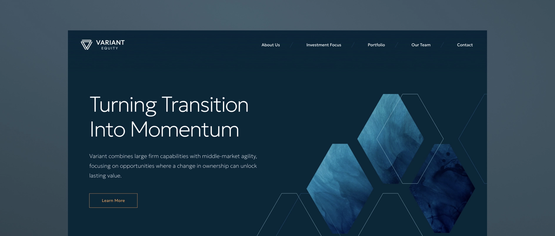
Most PE homepages default to leading with the firm's credentials: “Founded in 2005. $3B AUM. 45 investments.” This information is not unimportant, but it answers the wrong question. A sophisticated visitor does not need to know how long the firm has been operating before understanding why it exists and what makes it the right partner.
What a visitor needs first is a clear answer to three questions: what does this firm believe, where does it invest, and how does it create value? That is an investment thesis, and it should be the organizational principle of the homepage - not a section buried below the fold.
The homepage headline should express a point of view. The supporting copy should make the thesis specific. The visual design should reinforce it. Everything on the page should work together to answer “why this firm” before it asks the visitor for anything.
How Should a Private Equity Website Present the Portfolio?
A PE website should present the portfolio as proof of the thesis, not as a list of credentials.
A row of portfolio company logos communicates very little. It does not show what the companies have in common, what role the firm played in their development, or what pattern the portfolio represents. For a management team evaluating the firm as a potential partner, a logo grid tells them nothing about what working with this firm is actually like.
The best portfolio presentations in 2026 do several things differently:
- Organize by thesis or sector rather than chronology or deal size, showing a consistent pattern of focus
- Include brief case context - two or three sentences about the situation, the firm's approach, and the outcome
- Highlight value creation levers - operational improvements, strategic pivots, add-on acquisitions, management team development
- Filter or tag by industry, geography, or deal type so different visitors can find the most relevant examples
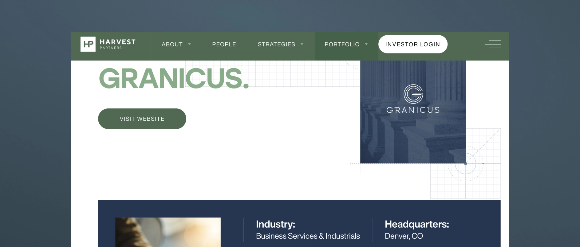
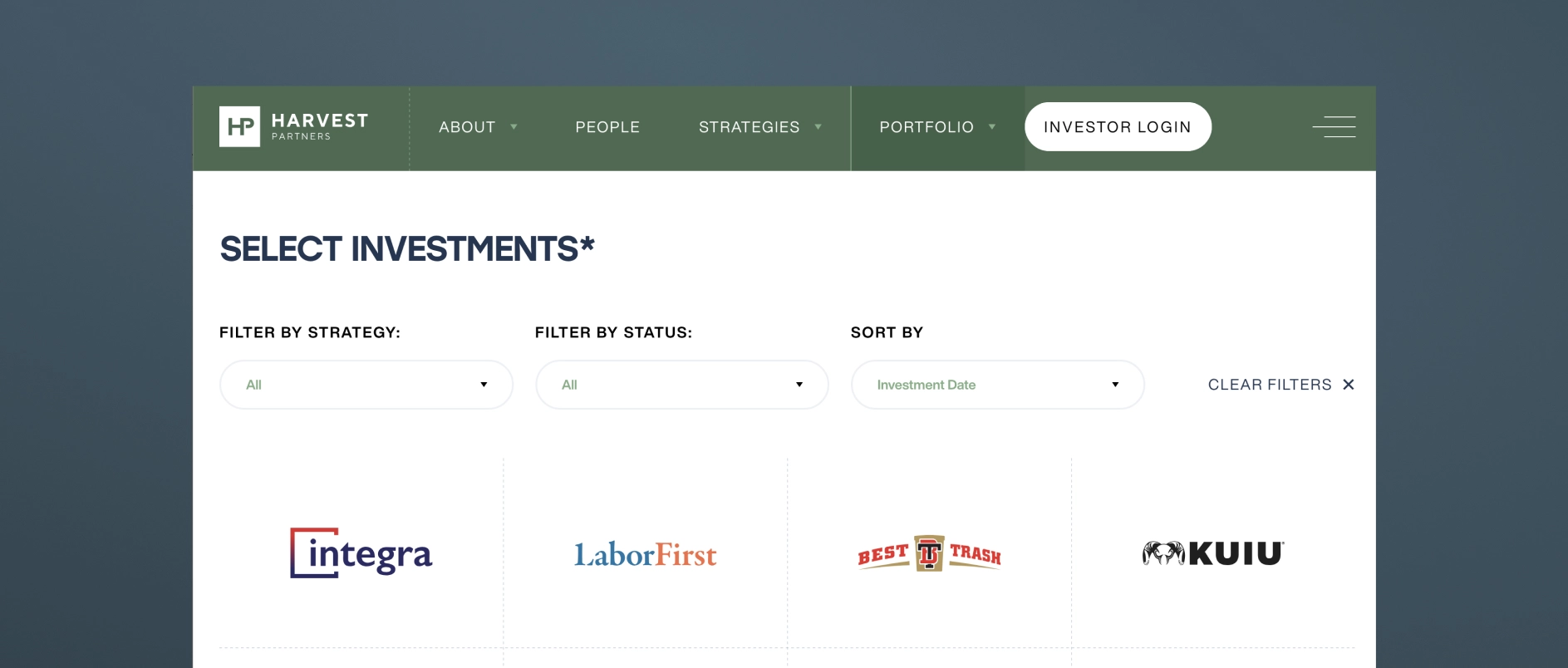
For firms with confidentiality constraints, thesis-level commentary, anonymized case studies, and sector analysis can achieve the same effect without disclosing sensitive deal information.
How Should Private Equity Firm Team Bios Be Written?
PE firm team bios should communicate judgment and operating experience, not just credentials.
The default approach - a third-person bio listing degrees, former employers, and board memberships - has become a signal of effort avoidance. It tells a prospective LP nothing about how this person thinks. It tells a management team nothing about what it would be like to be in a difficult situation with this person on the other side of the table.
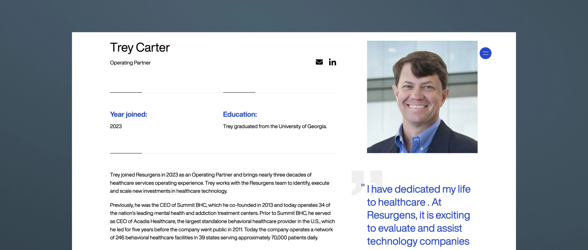
Effective PE team bios in 2026 share these characteristics:
- Written with a genuine voice, even in third person, that reflects the individual's personality and perspective
- Specific about operating experience in terms that are meaningful to management teams: not just “led the acquisition of X” but “guided a founder-led business through its first institutional ownership cycle”
- Honest about area of focus and what the person is specifically good at — not attempting to present every partner as a generalist expert in everything
- Accompanied by photography that feels real: candid, professional, human — not a stiff headshot against a grey backdrop
The team page is the moment on the website where the people behind the capital become real. The best ones make a visitor feel like they understand who they would be working with.
What is AI Search Optimization for Private Equity Websites?
AI search optimization (also called AEO - Answer Engine Optimization) is the practice of structuring website content so it can be understood, extracted, and cited by generative AI research tools.
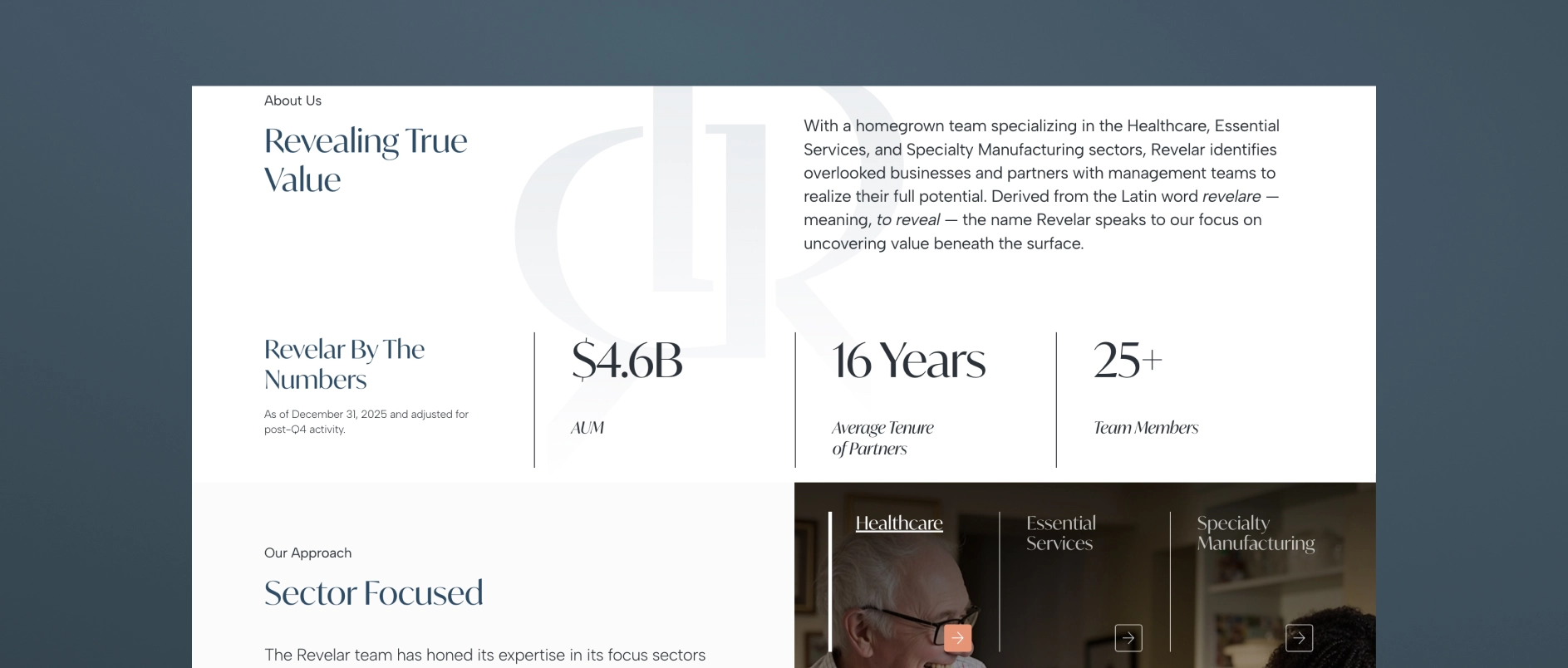
In 2026, a growing share of research into PE firms happens through AI assistants — tools like Perplexity, ChatGPT, and Google's AI Overviews — that synthesize information from across the web and return direct answers rather than link lists. These tools favor content that is:
- Clearly structured with descriptive headings that read like questions or answers
- Modular - organized in short, self-contained sections that can be extracted independently
- Specific - containing concrete, accurate information rather than generic claims
- Well-formatted - with FAQ sections, numbered lists, and defined terms that AI tools can parse easily
- Technically sound - with proper schema markup, fast load times, and clean HTML hierarchy
PE firms that adapt their content for AI search are increasingly being cited as authoritative sources. Firms that don't are losing early-stage visibility to competitors who show up in AI-generated research summaries.
What Design Principles Apply to Private Equity Websites in 2026?
Private equity website design in 2026 follows five core principles.
Restrained sophistication. The aesthetic should feel like the firm: disciplined, clear, authoritative. Deep anchor colors, refined typography, generous clean space. Design that is impressive without being ostentatious.

Typography as a primary communication tool. In an industry where most communication happens through words, typeface selection and typographic hierarchy are the most important design decisions. Generic system fonts undermine the credibility that everything else is trying to build.
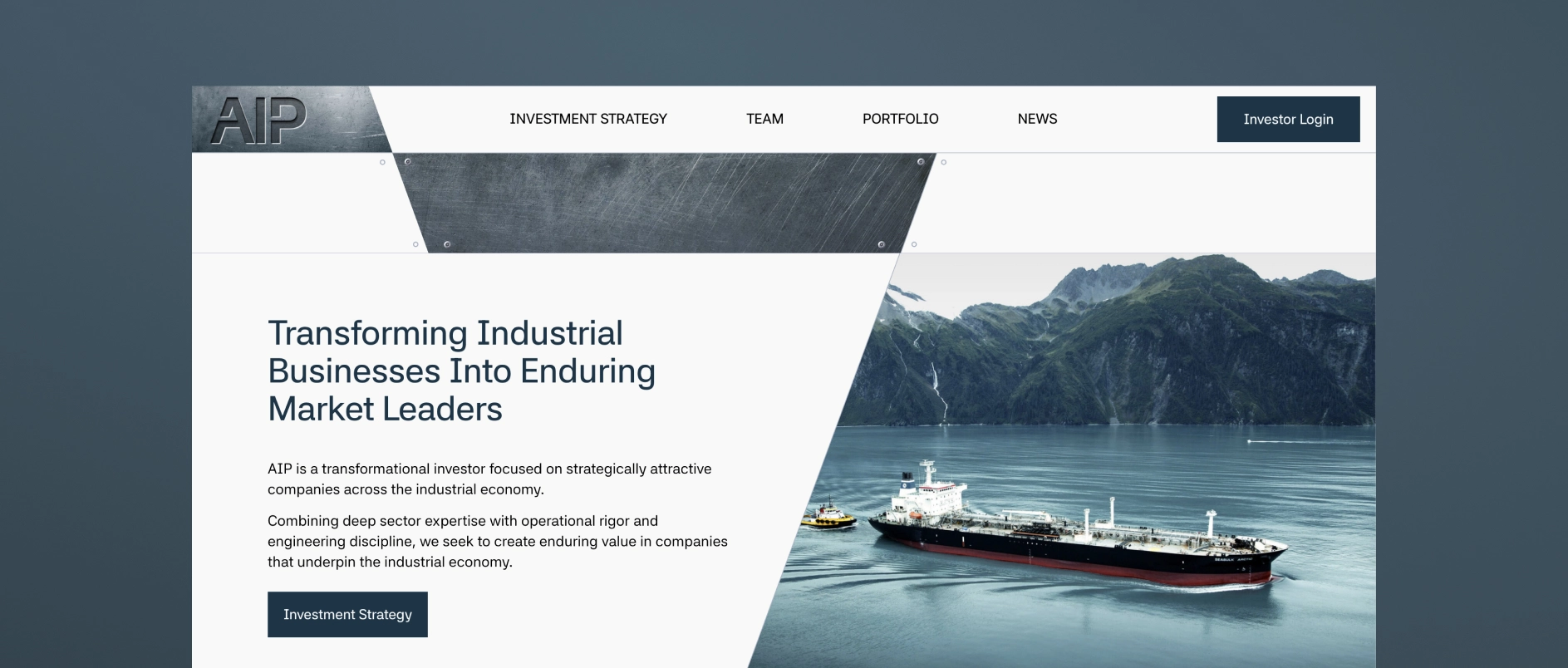
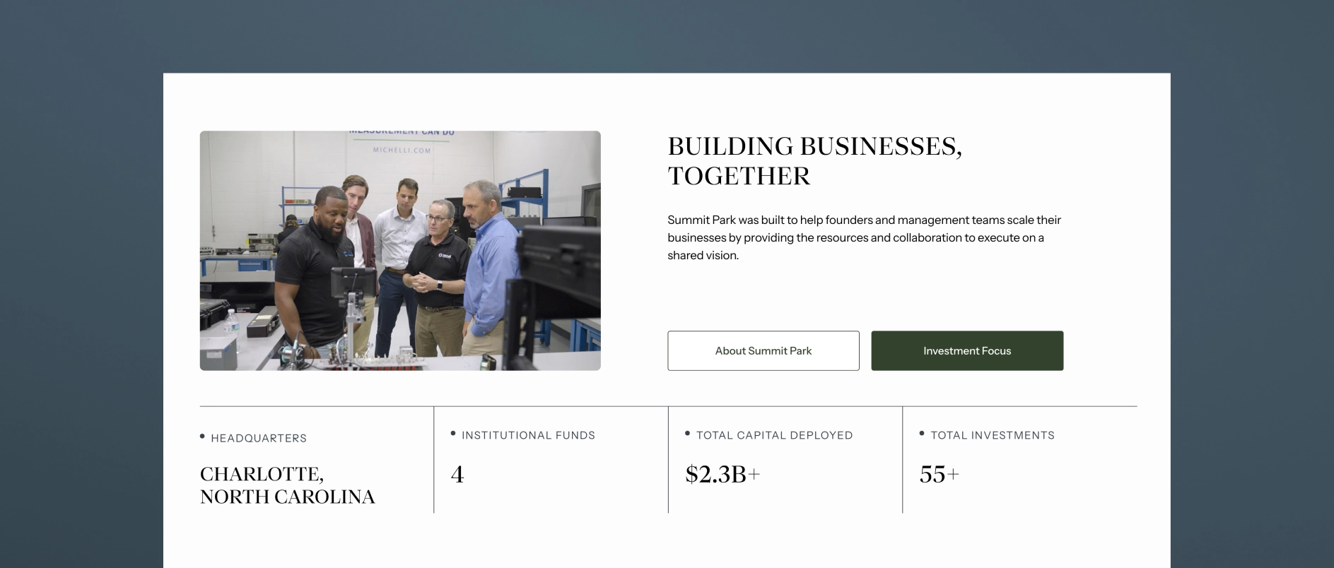
Imagery as evidence, not decoration. Stock photography of handshakes and skylines communicates nothing. Authentic team photography and real portfolio company imagery communicate genuine presence and operational depth.
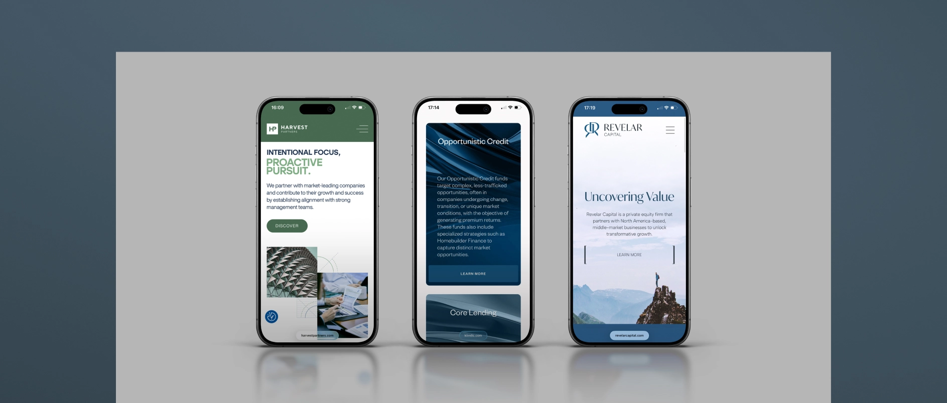
Mobile-first performance. A significant share of LP research now happens on mobile devices, including during travel and between meetings. PE websites that are clearly built for desktop and awkward on mobile are unintentionally communicating that the firm has not thought carefully about its audience.
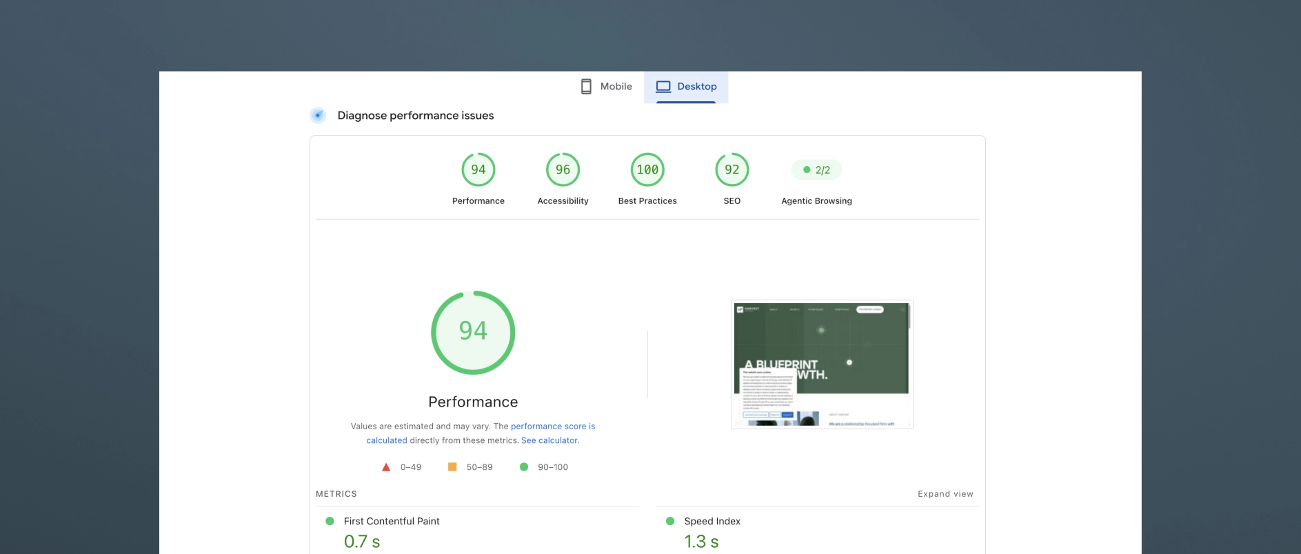
Speed and technical hygiene. Page load time, Core Web Vitals scores, and clean HTML structure affect both user experience and search performance. Technical quality is part of the design standard, not separate from it.
All websites done by Darien Group.
What Are the Most Common Mistakes on Private Equity Websites?
The homepage leads with history rather than the thesis. Founding year and AUM are credentials. They are not positioning. Leading with them signals that the firm has not done the work of articulating what makes it genuinely different.
The portfolio is a logo grid. As discussed above, logos without context prove nothing and differentiate nothing.
Bios are third-person credential lists. A bio that reads like a LinkedIn export tells a visitor nothing about the person. Judgment, voice, and specific expertise are what build trust.
There is no thought leadership, or it reads like a press release. Quarterly market updates and fund announcements are not thought leadership. They are content placeholders. Real thought leadership requires a point of view.
The site is not structured for AI search. Generic, unstructured content is increasingly invisible to the tools investors use for early-stage research.
There is no mobile optimization. If the site breaks or feels awkward on a phone, the firm is failing a meaningful share of its audience at first impression.
The contact page is just a form. A motivated prospect who reaches the contact page is already considering engagement. A bare form, without reinforcement of the firm's identity, is a missed opportunity for persuasion.
How Often Should a Private Equity Firm Update Its Website?
A PE firm's website should be reviewed for major updates on a 2-5 year cycle, with ongoing maintenance between reviews.
Ongoing updates (as they happen): New portfolio additions, team changes, thought leadership posts, and fund announcements should be reflected promptly. Outdated information damages credibility quickly - especially if an LP or management team notices a personnel change or portfolio update that is not reflected on the site.
Annual review: Assess whether the investment thesis language remains accurate and differentiated. Review the performance of thought leadership content. Evaluate design against current category standards.
Major redesign triggers: A new fund launch, a significant strategic pivot, a rebrand, or a substantial change in target audience are all appropriate triggers for a more comprehensive website overhaul.
Private Equity Website Best Practices Checklist:
Use this checklist to evaluate a current website or scope a new project.
Strategy and content
- Homepage communicates investment thesis within the first scroll
- Strategy or approach page explains sourcing, decision criteria, and value creation framework
- Portfolio page demonstrates thesis consistency, not just logos
- Team bios communicate judgment and experience, not just credentials
- Thought leadership content published within the last 90 days
- Content is structured for AI search: clear headings, modular sections, FAQ content
Design and experience
- Typography is distinctive and legible at all sizes
- Color palette is intentional and consistent across all pages
- Imagery is authentic - real team photography, real portfolio context
- Site performs well on mobile devices
- Page load time meets Core Web Vitals standards
Audience and architecture
- LPs can find strategy and team information within two clicks
- Management teams can understand the firm's value-add approach quickly
- Contact page reinforces the firm's identity and makes the next step clear
Darien Group works exclusively with investment management firms on brand strategy, visual identity, and digital presence. Contact us to discuss where your firm's design stands.
Private equity websites are no longer passive reference points. By 2026, they function as evaluation tools — often reviewed before a meeting is scheduled, sometimes without context, and increasingly through intermediated workflows that include AI-assisted research and internal summaries.
This checklist reflects how private equity websites are actually being used today, and what they need to do to remain effective in the year ahead.
1. Clear Firm Description Within the First Screen
A visitor should be able to answer three questions immediately:
- What type of firm is this?
- What does it invest in?
- How is it different from similar firms?
If these answers require scrolling, clicking, or inference, the site is already underperforming. By 2026, clarity at first glance matters more than elegance or storytelling depth.
2. Explicit Strategy and Mandate Definitions
Many firms assume their strategy is self-evident. It rarely is.
Each strategy or vehicle should be described plainly:
- Asset class
- Geography
- Typical deal size
- Role in the capital structure
- How capital is deployed (funds, co-invests, secondaries, etc.)
Avoid internal shorthand. Write as if the reader has no prior context.
3. Logical Structure for Multi-Strategy Firms
For firms with multiple strategies, structure matters as much as content.
Best practices include:
- Separate pages for each strategy
- A clear hierarchy showing how strategies relate to one another
- Language that explains why the platform is structured the way it is
If a sophisticated reader struggles to understand how the platform fits together, the structure needs work.
4. Messaging That Reflects the Current Firm — Not the Founding Version
Many websites reflect who the firm was at launch, not who it is today.
Review the site for:
- Strategies that no longer exist
- Language that undersells scale or maturity
- Positioning that assumes captive capital or limited visibility
A firm that has evolved operationally but not narratively creates confusion rather than confidence.
5. Team Pages That Show Credibility Without Excess Detail
Team pages remain one of the most visited sections of PE websites.
Effective team pages:
- Clearly show roles and responsibilities
- Distinguish leadership from execution
- Avoid long, résumé-style biographies
The goal is orientation, not exhaustiveness.
6. Evidence of Activity Without Over-Disclosure
Private equity firms do not need constant publishing to appear active.
Instead:
- Include selected deals, investments, or partnerships
- Use concise descriptions focused on relevance, not promotion
- Avoid placeholder language (“leading,” “best-in-class,” etc.)
By 2026, precision carries more weight than volume.
7. Website Content That Can Be Read Without Explanation
Assume the site will be encountered without an introduction.
Ask:
- Would this make sense to someone outside our network?
- Could a third party summarize this accurately?
- Are key points explicit or implied?
If the site depends on verbal explanation, it is vulnerable to misinterpretation.
8. Durable Language That Avoids Time-Bound Claims
Claims tied tightly to market conditions age quickly.
Favor:
- Structural advantages over short-term performance
- How the firm operates rather than what it expects
- Enduring principles over temporary narratives
This improves longevity and reduces the need for frequent rewrites.
9. Design That Supports Hierarchy, Not Decoration
Design should make information easier to absorb, not more impressive.
Key considerations:
- Clear typographic hierarchy
- Consistent spacing and layout
- Restraint in animation and visual effects
A site that looks modern but feels disorganized will not age well.
10. Strong Performance, Security, and Accessibility
By 2026, baseline technical standards are non-negotiable.
Ensure:
- Fast load times across devices
- Secure hosting and regular updates
- Accessibility compliance
- Clean code that supports future expansion
These elements are rarely noticed when done well — and immediately noticed when they are not.
11. Hosting and Maintenance Plan in Place
A private equity website should not be a “launch and forget” asset.
Confirm:
- Ownership of hosting and CMS access
- Ongoing maintenance responsibility
- Clear process for updates and fixes
Operational clarity prevents delays and dependency issues later.
12. Preparedness for AI-Assisted Reading
Increasingly, firm websites are parsed by tools that summarize, compare, and extract meaning.
To support this:
- Use clear headings and structured content
- Avoid vague or purely aspirational language
- Make key facts explicit and easy to identify
- Implement backend schema and other AI optimization tools to improve how content is interpreted and summarized
The goal is not optimization for machines alone, but clarity that works for both humans and systems.
13. Consistency With All Firm Materials and Communications
The website should align with every other touchpoint, whether publicly available or shared only with LPs, founders, or intermediaries.
This includes:
- Pitch decks and presentations
- One-pagers, factsheets, and transaction materials
- ESG reports, year-in-review pieces, and recurring publications
Firms should ensure that anyone who encounters the website can expect the same brand, narrative, and positioning across all other materials they may come across. Inconsistency creates confusion and unnecessary follow-up questions.
14. Ability to Evolve Without a Full Rebuild
A well-built site should accommodate:
- New strategies
- Team growth
- Updated disclosures
- Additional content
If every change feels disruptive, the underlying system is too rigid.
Final Check: Does the Website Reduce or Create Work?
A strong private equity website should:
- Answer common questions before they are asked
- Reduce time spent explaining basics
- Support — not complicate — conversations
By 2026, a private equity website cannot be treated as a standalone deliverable. It is one part of a broader communication system that includes investor materials, transaction collateral, reporting, and ongoing content. When that system is coherent, the website reduces friction, answers questions early, and supports better conversations. When it is not, the website becomes another surface where inconsistencies show up.
The firms that get this right are not the ones chasing trends or overproducing content. They are the ones investing in clarity, structure, and durability — so that every touchpoint reinforces the same narrative, regardless of who encounters it or how.
Darien Group works with investment managers to design and maintain those systems. Our role is not just to launch websites, decks, or materials, but to help firms establish a clear narrative and visual foundation that holds together over time and across use cases. In a market where evaluation happens earlier and often without context, that cohesion is no longer optional — it is foundational.

A Frozen Moment in Time
Most private equity websites are treated as static projects. Once launched, they are left to age while only the most obvious updates press releases, portfolio companies, team members — get added. The result is a site that becomes a frozen moment in time. The firm evolves, but the website does not.
The real cost of letting a site grow stale is not always obvious. Outdated design, stale messaging, and misaligned positioning quietly erode credibility. And now, with LLMs reshaping digital visibility, the stakes are higher than ever.
Here are three major risks of letting a website age without meaningful refresh.
1. Design and Message Trends Move On Without You
A five-year-old website will look like a five-year-old website. That does not mean it will look terrible - if it was done well, it may still hold up - but design cues age quickly. Typography, layout, and imagery all carry time stamps.
The same is true of messaging. A site crafted in 2017 often reveals its age in tone and emphasis. Older sites tend to read like pitchbooks repurposed for the web, written almost entirely for LP audiences. Today, best practice is different: private equity websites are first impressions for sellers, management teams, and intermediaries just as much as they are for LPs.
Other motifs give websites away instantly. Glossy team photos used as homepage hero images, or worse, stock photos of businesspeople in conference rooms — these were everywhere five years ago. Today, they look dated. More recently, the “management-friendly” positioning surge has begun to feel tired as well. A claim repeated by everyone is not a differentiator; it is white noise.
Firms that fail to update fall behind industry norms, and their sites signal stasis rather than vitality.
2. The Firm Evolves, the Site Stands Still
Even more costly than design drift is the gap between what the firm has become and what the site still says.
Firms refine sector strategies, launch new funds, expand geographically, and change investor mixes. Operations teams grow, ESG programs take shape, succession brings new leadership forward. Yet the website often remains frozen, updated only at the margins.
The further the site drifts from the firm’s reality, the more damage it does:
- It creates a credibility gap in the market.
- It forces a radical, expensive overhaul when the firm finally decides to catch up.
- It diminishes internal pride, making employees feel their firm is dated or out of touch.
We have seen firsthand how invigorating a new brand can be internally. Younger professionals in particular respond with energy and pride when a refreshed website launches. By contrast, sitting on a seven-year-old brand sends a signal of inertia.
3. Digital Visibility Now Means LLM Readiness
For years, “SEO and digital visibility” was the main argument for keeping sites current. But today the challenge has shifted. The question is no longer just whether your site ranks in Google. It is whether your firm surfaces in LLM-driven queries across platforms like ChatGPT.
This is a frontier where most firms are unprepared. Technical optimization for LLMs is still a developing field. But the implications are clear: firms that do not adapt will lose visibility as search shifts away from static engines and toward AI-driven answers.
The good news: some of this can be retrofitted onto an existing site. The better news: firms that are building new sites now have the chance to bake in LLM readiness from the start. That means:
- Identifying the queries you want to show up in.
- Creating authoritative content that LLMs can surface as reliable.
- Structuring metadata and site architecture with this future in mind.
At Darien Group, we have invested in technical expertise specifically for this challenge. It is not just about traditional SEO anymore - it is about being discoverable in the next era of digital search.
The Hidden Cultural Cost
There is also a softer, but very real, cost of letting branding age too long: culture. Stale, stodgy design signals stagnation. It turns off younger recruits. It makes employees less proud to share the firm’s website. By contrast, a refreshed identity can energize teams and remind them that the firm is dynamic, modern, and growing.
Conclusion: Aging Quietly Is Still Aging
Letting a private equity website age may feel harmless. After all, if the numbers are current and the team page is up to date, what is the harm? The harm is threefold: design and message trends that make you look behind the times, a growing misalignment between your firm and your site, and a looming challenge around LLM visibility that is already reshaping digital discovery.
The website is not just another marketing tool — it is the most public reflection of who you are. Letting it drift out of sync is more than cosmetic. It is a strategic liability.