
.jpg)
Logos for Investment Firms: Beyond the Founder's Initials


A logo is often the first thing an investor sees. It's also usually the thing a founder has the strongest opinions about. Those two facts are rarely in alignment, and learning to navigate the tension between them is one of the trickier parts of building a brand in this space.
The Temptation to Say Too Much
Investment firms often ask their logos to do too much. The mark should communicate stability, growth, precision, operational expertise, and ideally the founder's personal pedigree too. All at once. At small sizes. On PowerPoint slides viewed from across a room.
A common version of this is wanting the mark to carry a specific place or heritage. A historic building, say, plus something around it that anchors the era. Each of those ideas is visually complex on its own; stacked together they produce something overcomplicated and unclear at the same time. You end up with a logo that works nowhere well because it was designed to work everywhere at once.
There's a subtler version too: wanting to express qualities that don't naturally sit together. Stable but dynamic. Grounded but growth-oriented. Growth and dynamism reinforce each other fine, but stability pulls in the opposite direction, and a single mark asked to hold both usually ends up holding neither convincingly.
The underlying issue in both cases is the same. The logo is being asked to solve problems that belong to the entire brand system, not to the logo alone.
What a Good Logo Actually Does
A strong logo in this industry works where the investment logo actually lives, not just where it looks best. And the honest answer to "where does the client meet the logo most often" is usually PowerPoint decks, quarterly reports, and email signatures. Tiny sizes and enormous ones. Full color and black and white. Embossed on a business card, cut into a reception sign, animated on a website.
A mark that only performs under ideal conditions, on a beautiful mockup, hasn't been finished yet. This is also why overly detailed, perforated logos are such a recurring problem in our niche. They work at one size, in one format, and fall apart the moment they're scaled down.
If a concept genuinely requires complexity or a gradient, we prepare alternate versions so it performs equally well on every medium. And there's a simple test worth running early: put the mark on slide one of a hundred-slide deck and see whether it creates visual noise by slide thirty.
A good logo is also generative. It doesn't just sit there as a static mark. It can become a building block for the wider visual system.
In one of our recent projects, a monogram became exactly that. We built the mark from two overlapping letters, and the overlap itself produced a set of internal frames, focus frames, you could call them, sitting right at the center of the mark. Those frames escaped the logo and became the connective tissue of the whole identity.
They expand or contract around whatever content they're highlighting. They isolate a subject in a photograph, a moving car on a road, for instance. And because we set the two letters at different heights, the mark carries a sense of motion that later became an animated element on the website. The logo wasn't the end of the design thinking. It was the beginning of a system.
That, to me, is what separates a competent logo from a great one: the ability to generate and guide everything that comes after it, without having to carry the entire brand's meaning on its own shoulders.
Text, Symbol, or Both?
There's no universal answer. Sometimes a wordmark, a carefully designed treatment of the firm's name alone, is more powerful than any symbol could be. Character can live in the letterforms themselves: the typeface, the color, the composition.
We've had projects where we presented several directions, including symbol-based ones, and the wordmark won, because the type carried the company's character on its own. The wordmark then dictates the rest of the system. The weight of a line in the letterforms tells you how thick an icon stroke should be, what the patterns look like, how the infographics are drawn. A wordmark also scales elegantly and loses nothing at small sizes.
A symbol offers something different: shorthand that can be recognized at a glance, even without the name attached. But it demands more strategic grounding. A symbol that isn't built on real thinking about what the firm is will always read as decoration.
It's also worth remembering how investment firms actually evolve. New funds launch. Partners join. Sub-brands and variations appear on top of the original identity. The mark has to be flexible enough to survive not just time but organizational change.
Many firms end up needing both a symbol and a wordmark, but not all. The question is never "do we need a symbol." It's "what is the most direct visual translation of this firm's actual positioning?"
The Founder and the Initials
So what happens when a founder wants his initials in the logo, in a crest, a monogram, some form of heraldic mark?
First, this is a completely normal request, and it usually comes from a reasonable place. Often the founder sees his own reputation as the firm's main source of trust, and often he's not wrong. His track record, his judgment, his relationships are real assets. Respecting that is part of respecting the business.
The mistake doesn't begin when initials enter the logo. Monograms built on initials can be extremely effective when designed with care. The mistake begins when the initials cut against the strategy, when personal preference gets placed above strategic logic in the hierarchy of decisions.
A brand assembled that way tends to feel accidental rather than built. Initials are, in the end, just one possible way of expressing reputation, ownership and responsibility. There are others, and some of them are stronger.
There are practical costs to the literal route as well. A mark built around one person's name gives the organization less room to grow. What happens when new partners join, when new funds launch, when the positioning evolves?
And there's a quieter signal underneath: a logo built primarily on the founder's initials says "this firm is my firm." For some investors that's exactly the right message. For others it raises questions about succession and governance, about whether this is an institution or a personal vehicle.
A Better Path
Our job as designers isn't to push back on a founder's wish to leave a personal imprint. It's to help him see more nuanced ways to realize that ambition.
Sometimes visualization alone settles it. We'll design the initials version the founder asked for, honestly and well, and put it next to alternatives that carry more strategic meaning. Seeing them side by side, most founders recognize on their own which direction says more about the company. There's no universal argument that works on every founder; what works is showing rather than debating.
A monogram is still on the table, just built properly. It can suggest far more than letters if built around concepts that matter to the firm.
The approach I personally find most rewarding is weaving the founder's personality into the brand somewhere other than the logo. We can design a mark that stands entirely on strategy, and still let who the founder is shape the identity.
We once worked with a large firm whose late founder was known for his art collection. That collection became a source of inspiration for us and opened another level of visual communication for the whole brand. We've drawn on a founder's taste in art more than once, in fact, and the results have nothing in common with each other, because every collector's taste is different.
The founder's sensibility ends up everywhere in the brand, deeply felt, without a single initial in a crest.
The abstract route deserves a mention too. An abstract mark can hold several layers of meaning at once: a concept tied to strategy, plus a quieter reference to the firm's history or the founder's story, discoverable rather than announced.
For some companies the symbol should read clearly and instantly. For others it's worth building a mark people want to keep looking at, peeling back the layers.
One caveat, though. Personal touches have limits. The founder's beloved cat, for example, probably shouldn't become the logo. (Mostly joking.)
The Logo Is Only One Element
This is the part that founders, and sometimes designers, lose sight of. A logo is the entry point to a brand system. It is not the brand, and it isn't responsible for communicating everything the firm wants to say about itself.
The logo sets a visual direction. The typography, the palette, the graphic elements, the patterns, the way photography is treated, the motion: that's what actually builds the brand into something coherent and memorable.
Which is also why close collaboration between strategists, designers and the people inside the firm matters so much. The more insight goes in at the start, the less the identity ends up living a life of its own, detached from the company it's meant to express.
For one firm the right answer is a meticulously constructed monogram. For another it's a pure wordmark. For a third, an abstract symbol with layered meaning.
A sophisticated logo inside a sophisticated system will always outperform a complicated logo trying to do everything alone. And when a founder understands that his values will be expressed across the entire system rather than compressed into one small mark, the conversation changes.
The logo gets simpler, stronger, more strategic. And the founder gets what he actually wanted all along: a brand that carries his personality, vision, and taste.
The goal was never to remove the founder's voice from the brand. It's to amplify it across the whole system instead of concentrating it in one small mark.
Read More
Typography is not decoration. It sets the tone of a communication before a single word has been read. The moment someone opens a page, whether it's a website, a pitchbook or an investor letter, an impression is already forming, and the typeface is doing a surprising share of that work. In an industry where trust is the whole game, that first impression matters more than most firms realize.
Why Serif Became the Default
The dominance of serif typefaces in finance didn't happen by accident. Serifs carry centuries of institutional history: universities, newspapers, legal documents, publishing houses. Harvard, Yale, Oxford, the Financial Times, the New York Times. All serif. That accumulated association is real. When someone sees a serif typeface, they're unconsciously reading tradition, authority, knowledge, permanence. For a firm asking an LP to commit capital over a multi-year horizon, that signal is worth something.
So the financial sector's attachment to serif isn't laziness or empty convention. It's a way of borrowing centuries of institutional credibility in a single typographic decision.
But the Old Argument for Serif Has Expired
Here's what's worth knowing. The traditional case for serif, that it's simply easier to read, was built for print. On modern high-resolution screens, research from Google and Monotype has shown the readability gap between serif and sans has largely disappeared. "Serif reads better" no longer holds as an argument, at least not in a digital context.
Which means the choice today is almost entirely about what the typeface signals, not how it functions.
And that opens the door to a different question. Apple, Stripe, Linear. None of them uses a serif. Nobody considers them less credible or less professional for it. They've built enormous trust on clean, confident sans-serif systems. The typeface didn't create that trust. The whole brand system did. Context creates trust; a font on its own does not.
The Real Question Isn't Serif vs. Sans
The serif-or-sans framing is ultimately a distraction. The real question is what the typeface reinforces. Does it strengthen the firm's actual personality, or is it just the default setting because everyone else in the category uses it?
Consider the same traditional serif in two different firms. In one, a firm positioning itself as forward-thinking and digitally sophisticated, it creates a quiet contradiction. In another, a firm that genuinely stands for institutional depth, history and rigorous process, it creates coherence. Same typeface, completely different result, because what matters is the alignment between the type and the brand it's supposed to express.
The Typographic Mistakes We Actually See
The most common mistake is treating typography as a single decision. Pick a font family, done. Typography is a system: the relationship between a primary typeface and a secondary one, the hierarchy of sizes and weights, how type sits on a page or a screen, the rhythm of the spacing. Firms get this wrong all the time. The typeface choice itself is reasonable, and the result still feels off, because nobody considered the system around it.
The second mistake is pairing a traditional serif with nothing at all. One serif, used everywhere, for everything, collapses the hierarchy. A well-built system usually pairs a serif with a complementary sans, one carrying the weight of authority while the other handles legibility and modernity in supporting roles. Done well, that pairing gives a brand institutional credibility and a sense that it hasn't stopped paying attention to the present.
The third is choosing a typeface for how it looks in a logo presentation, without testing it across real materials. A typeface that looks elegant in a headline can turn heavy and unreadable across a 40-page pitchbook or on a phone screen. Type has to work across the whole system, not just in its best light.
What Actually Creates Trust
The question was never whether serif or sans is better for institutional finance. It's whether the typography, whatever the choice, reflects the personality the firm actually wants to project, and whether it holds together as a system across every application.
A typeface is a brand's tone of voice. Used consistently and deliberately, that tone is a large part of what makes a firm feel coherent and considered. In this industry, that is what trust looks like in practice.
Every industry develops what strategists call category codes, the visual signals that help audiences quickly identify what kind of company they're looking at. In private equity and real estate, the dominant color code has been navy for decades. Paul Rand made an observation in Design, Form and Chaos that applies neatly here: identity is not a logo, it's a system. Color is one of the most powerful elements of that system, and in PE it's also one of the most underused.
Why Blue Became the Category Color
The psychology behind navy in finance is no mystery. Blue reads across cultures as stable, logical, calm, competent, trustworthy. For firms whose entire value proposition rests on convincing people to trust them with large amounts of capital over long horizons, those associations are genuinely useful.
What makes color psychology more interesting than a simple chart of meanings is that perception is always relative. The same shade of blue reads differently depending on what surrounds it. Navy next to warm gray feels grounded and approachable. The same navy next to teal feels cooler, more technical. Against deep black it feels premium. The color never does the work alone. The palette does.
This is where most PE firms stop thinking. They prefer to go safe: choose navy, find a neutral, call it done. The result is technically institutional but not particularly considered.
The Problem With a Code Everyone Uses
Category codes exist for a reason. They help audiences orient quickly. But when every firm in a category uses the same code without variation, the code stops doing its job. Instead of signaling "this is a serious investment firm," navy now signals only "this is an investment firm," and nothing beyond that. The differentiation has collapsed into the background.
Blackstone, Apollo and KKR are worth studying here. These are among the most recognized names in the industry, and none of them relies on a conventional navy palette to carry the brand. Blackstone works in black and white with a strong contrast color palette. Apollo leans on deep charcoal, deep evergreen and warm stone colors. KKR has built on its signature deep plum by introducing a distinctive golden yellow accent. None of them looks like a startup, and none has sacrificed an ounce of institutional credibility. What they demonstrate is that credibility isn't a color. It's a quality of execution.
Building a Palette That Works
The goal is not to abandon the psychology of the category. Stability, trust and competence still need to come through. The goal is to communicate those qualities in a way that doesn't immediately dissolve into the blue mass of every other firm in the market.
In practice there are a few ways to get there. One is staying within the cool end of the spectrum but finding a distinct anchor: deep teals, warm slates, rich burgundies. Colors that carry similar psychological weight to navy without being interchangeable with it. Another route, often underestimated, is the secondary palette. The accents, the neutrals, the backgrounds that give the primary color something interesting to work against. A well-constructed secondary palette does more for distinctiveness than almost any other single decision.
What doesn't work is picking a color because it looks interesting in isolation. A palette has to function as a system across a website, a pitchbook, an AGM deck, an investor letter. Every color needs to earn its place in all of those contexts, not just on a brand presentation slide.
The Actual Differentiator
The firms that get this right aren't the ones that made the bravest color choice. They're the ones that thought hardest about what they were trying to say, then built a palette that said it distinctly and coherently, everywhere.
Color is one of the fastest signals a brand sends. In an industry where first impressions usually happen through a website or a deck, a palette that feels considered and specific is one of the most direct ways to separate from the crowd, without ever looking like you're trying to.
Before working in private equity and real estate, I spent years designing for startups and venture-backed companies. These are two very different worlds, with different timelines, different audiences, and different definitions of what "good" even means. Having lived in both, I've come to believe each has something to learn from the other. The firms that look best over the next decade will be the ones that borrow intelligently from both sides.
Here's what I actually observed in each world.
The Startup World: Brilliant at Speed, Fragile Over Time
Startups live in a reality of their own. The task is almost always the same: move fast, get an MVP out the door, start conversations with investors, test hypotheses immediately. Speed isn't a preference there. It's survival.
But speed, by definition, means skipping things. In brand development, what gets skipped first are the foundations: deep research, strategic positioning, a real understanding of who the audience is and what it needs to feel. The design then ends up existing on its own, disconnected from all of that. Often it's visually attractive, sometimes genuinely beautiful, and still unmoored from the company's actual position in the market.
I also saw a recurring pattern with founders who wanted the company to be an extension of themselves. Lots of personal input, strong aesthetic opinions, requests that sometimes had no relationship to what the company did or who it needed to reach. When the brief is essentially "I like this," rather than "this is who we are and who we need to convince," the brand is already in trouble.
And then there are the trends. Startups react to visual culture fast, sometimes impressively fast. One month it's a complicated new gradient, then 3D glass shapes, then some kinetic typography, then enormous display type. I don't think trends are bad. Trends exist to inspire. But they shouldn't set the direction of a brand, because a good identity needs to outlive several generations of design trends. The world moves quickly, and nobody can chase everything, but changing your brand more often than once every couple of years makes little sense. A visual system assembled from whatever is currently popular on Behance or Dribbble guarantees exactly that kind of churn.
The cumulative result of all this, the rushed timelines and the trend chasing and the unfiltered founder input, is what I started calling the Frankenstein brand. A logo that changes three times in a year. Sometimes the company name itself changes a month after launch. A founder arrives with new colors he's already picked out, except they don't work with the existing primary color, so you're left inventing workarounds to force them to coexist. Then new icons appear in a completely different style. Then another round of small additions. Each change is explainable on its own. Together, they dissolve the system. And the audience never gets enough time with any version of the brand to form a visual association at all. Recognition simply never accumulates.
The PE World: Built to Last, Sometimes Too Cautious to Evolve
Private equity approaches brand from the opposite direction, and in many ways it's the right one. When I moved into this industry, the long-term mindset was honestly a relief.
A PE brand is built for years. It has to work convincingly today and still work in five. Small refreshes along the way are normal, but the core of the brand should stay solid. That long horizon imposes a discipline I find genuinely valuable: the brand has to rest on something more durable than whatever looks interesting this quarter. When strategy and visual identity are developed together, when the visual decisions actually grow out of the firm's strategic differentiators, the two start reinforcing each other. The result works at a much deeper level than surface aesthetics. It stops being a nice-looking wrapper and becomes a coherent expression of what the firm is.
That connection between strategy and design is exactly what I think the startup world undervalues. But PE has its own failure mode, and it's nearly a mirror image of the startup problem. Where startups move too fast and change too much, PE often moves too slowly and changes too little. The formulas that worked decades ago get preserved not because they're still the best tool for the job, but because questioning them feels risky. Excessive caution starts wearing the costume of institutional credibility.
What makes this a real problem today is that every PE and RE brand now lives primarily in a digital environment. A website, interactive presentations, digital reports, animation, dozens of touchpoints across screens of every size. What works in print doesn't automatically work in digital, and the reverse is true too. A visual vocabulary designed for printed pitchbooks and business cards doesn't simply transfer. Plenty of firms are still applying an analog-era system to a digital world without asking whether it holds up. The way clients interact with a firm's materials has changed, and the brand has to account for that.
Where the Real Room for Boldness Is
When I say PE firms can afford to be bolder, I don't mean neon colors and loud, disruptive design. I mean openness. Openness to new tools and new ways of translating strategy and meaning into visual experience.
Color is one place. Navy is not the only color capable of communicating stability and competence. There are whole palettes that carry the same psychological weight and also differentiate. Gradients don't have to be bright and eye-searing; subtle ones, used with intent, can serve a real purpose. Typography is another. A serif is not a legal requirement for private equity. Firms can be open to experiments here without losing anything.
Motion and interaction may be the most underused of all. A well-designed animation on a website, one that guides attention or reinforces the brand's logic rather than just decorating the page, can do more for perceived quality than any static element. Not because it's trendy. Because it shows someone thought carefully about the experience of engaging with this firm.
The question I keep coming back to is not "is this modern?" It's "does this serve the firm's actual story?" If the answer is yes, almost any tool is fair game.
Finding the Balance
The ideal approach sits somewhere between the two worlds. Closer to the PE end, I'd say, but with specific things borrowed deliberately from the other side.
From startups, PE should take the openness to new tools, the willingness to experiment in the digital environment, and a somewhat faster rhythm of asking whether things still work. In today's environment I'd suggest reviewing a brand every two to three years. Not rebranding. Reviewing. Are there new touchpoints that need visual solutions? Does the digital presence still read as current? Has the brand run into applications nobody anticipated at launch?
From PE, startups should take the discipline of building on strategy before aesthetics, the respect for coherence over time, and the understanding that a brand's job is to accumulate recognition, which is impossible if it keeps changing.
There's also a place where PE genuinely can speed up without losing quality, and it sits at the front of the process. Deep brand and strategy research, done properly before any visual decisions, doesn't slow a project down. It speeds up every decision that follows. At Darien Group this is foundational to how we work. Once the strategic base is agreed and the client has been walked through the reasoning behind the visual directions early, whole categories of dead-end options get filtered out before anyone falls in love with them. Where projects sometimes lose time in this industry is during internal review, when a large group of decision-makers filters creative work through layer after layer of personal preferences without a shared strategic framework to anchor the conversation.
The Question That Ties It Together
Private equity is better than the startup world at building brands that last. Startups are better at building brands that stay alive and responsive to a changing context. The firms that manage to hold both at once, strategic depth and genuine adaptability, won't just survive the next design cycle. They'll lead it.
Because one thing has been true in every category I've worked in: the firms that refuse to evolve don't stay still. They fall behind. As the Red Queen tells Alice, "Here we must run as fast as we can, just to stay in place. And if you wish to go anywhere you must run twice as fast as that." Standing still while the world changes is its own kind of risk. The goal isn't to chase every change. It's to know which changes matter, and to move on those deliberately, before you're forced to.
Open ten private equity or real estate firm websites in a row and you will see, more or less, the same brand ten times. Navy. A serif typeface. Tight columns. A skyline photo: buildings, financial districts, the architecture of capital. None of this is a coincidence, and no single firm deserves the blame. What we're looking at is a formula, and before deciding what to do about it, it helps to understand where the formula came from.
The Formula Was Never Arbitrary
When I first sat down with this question, my instinct was to go looking for the original firm. The one that invented navy plus serif plus skyline, the brand everyone else quietly copied. I doubt anyone could find it now, and honestly it doesn't matter much. This visual language most likely formed gradually, over the decades when institutional finance was first working out how it wanted to look, long before digital branding existed as a discipline.
What matters is that every piece of the formula was doing a job. Blue has been read for a very long time, across many cultures, as the color of stability and safety. For a firm asking people to commit serious capital, that association is worth a lot. Serif typefaces carry a sense of tradition and heritage, of institutions that have existed for generations. A young firm managing large amounts of money badly wants that feeling of having been around for decades, even when it hasn't. And the skyline imagery works the same way. A shot of a financial district, often unmistakably New York, borrows the credibility of the place itself. New York simply reads as big finance.
So none of this was decorative. Somebody, at some point, applied color psychology and typographic history quite deliberately, and the combination communicated "you can trust us with your capital" faster than almost anything else available at the time. It worked. Investors responded. And once a formula visibly works for a few firms, the rest of the category follows. That is how it became the industry's visiting card.
The Problem Isn't the Formula Itself
Here is the part that usually gets missed. The formula still works, on its own terms. Navy still reads as stable. Serif still reads as established. The psychology hasn't expired.
What changed is that nearly everyone adopted the formula without ever rethinking it, and the cumulative effect is an industry that reads as one undifferentiated mass. Open a handful of PE or RE websites back to back and you could easily believe you're looking at the same firm over and over. For an investor doing diligence, this produces the opposite of the intended effect. Instead of feeling reassured, they simply lose the ability to tell one firm's competence from another's. Sameness at that scale starts to erode trust rather than build it.
And this matters more now than it did thirty years ago. We live in an era where attention has to be earned, and where visual language is one of the first signals a firm sends, one of the few available before any relationship, reputation or track record has had a chance to speak. The toolkit has also expanded enormously. Motion, interactivity, the whole vocabulary of digital branding barely existed when navy-serif-skyline became the default. Many firms are still running a visual system designed for a much narrower world.
Keep the Qualities, Rethink the Expression
To be clear, I'm not arguing that firms should throw out navy, ban serifs and never show a building again. Those elements still do their job. The point is different: when the entire niche has melted into one big blue mass, you need new ways to communicate the same underlying qualities. Stability, competence, trust. The qualities stay. The expression needs rethinking, through more original concepts, reconsidered design systems, sometimes a visual metaphor that actually belongs to this specific firm and no other.
This is also why the work has to happen in tandem with strategy. If a brand communicates nothing but generic reliability and success, with no strategic substance underneath, you end up in the same place you started, just by a different route. Dig deeper into the company. Understand how it positions itself, what its culture is like, what it genuinely believes. Open up that strategic layer and the visual result gets dramatically better. A concept built purely on decorative tricks won't hold; a concept built on strategy will.
What This Looks Like in Practice
In our own work, this rarely means a dramatic transformation. Firms with any market recognition are understandably reluctant to make radical changes, and they're right to be cautious. An established look carries equity that took years to build. In many of our redesign projects we barely touch the logo. Sometimes we don't change the color palette at all. What we do is rethink the whole system around those elements, always driven by a clear strategic rationale, so the brand reads as current without breaking continuity with everything the firm has already earned.
The interesting thing is that trust doesn't just survive this process. In my experience it actually strengthens, because the firm stops dissolving into that blue mass and starts standing apart from it in a way that feels earned rather than loud. All the accumulated experience and recognition stays intact.
In both a redesign and a full rebrand, strategy is the engine. We always start from how the firm positions itself, what it wants to communicate, what makes it genuinely distinct. The difference between the two is scope. A redesign takes an existing brand, rethinks it, and elevates it with the help of visual language and strategy, while deliberately preserving the elements that already carry recognition. A full rebrand starts from zero: deep strategy sessions, a blank visual slate, foundations built from scratch. Which one a firm needs is a conversation, not a checklist.
The Trap on the Other Side
There's an opposite failure mode, and it's arguably more visible. Some firms, in a rush to modernize, hand the brand to designers who reach for whatever is trendy at the moment, regardless of whether it has anything to do with the firm. A traditional, established manager suddenly wearing a startup palette. Playful illustrations on the site of a firm whose whole identity is discipline and rigor. Fast, abstract animation signaling "disruptive" for a business whose actual promise is the opposite.
I want to be careful here, because none of these tools are off limits. I have no problem with a traditional investment firm using gradients, or motion, or bold color. In capable hands, with real relevance to the company, all of it can work beautifully. The question is never whether an element is fashionable. The question is whether the visual language is built on a real understanding of who the firm is, and that understanding comes only from research into the existing brand, its positioning, and its actual look and feel. Not from a trend report. Trend-driven brands date themselves the moment the trend passes.
That, more than any particular color or typeface, is the real differentiator. Not whether a firm uses navy and serif, but whether its visual language was built deliberately or borrowed wholesale.

What Makes a Private Equity Website Effective in 2026?
An effective private equity website in 2026 does three things simultaneously: it communicates the firm's investment thesis clearly to prospective LPs, it builds credibility with management teams evaluating the firm as a partner, and it performs well in AI-driven search environments where a growing share of early-stage research now happens.
Most PE firm websites fail on at least two of these three dimensions. They either communicate well to institutional LPs but ignore management teams, or they look credible but are structured in ways that make them invisible to generative AI research tools, or they address both audiences but bury the thesis under generic language and a logo grid.
The firms getting this right are treating their websites as frontline capital-raising assets - not digital business cards.
Why Have the Standards for Private Equity Websites Risen So Dramatically?
Three forces have converged to raise the bar.
LP due diligence now begins online. Institutional allocators, family offices, and wealth managers conduct significant digital research before reaching out to a GP. They are reading the firm's website, its team bios, and its thought leadership - and forming a strong preliminary view before its IR team knows they exist. A poor first digital impression may mean no call at all.
The private/public market convergence is expanding the audience. As private equity firms move into wealth management channels, defined-contribution platforms, and retail-access structures, the audiences evaluating PE websites now include financial advisors and individual investors alongside institutional LPs. These audiences evaluate firms differently and expect more accessible communication.
AI search tools have changed how research begins. Generative AI assistants increasingly answer investor questions directly rather than returning lists of links. PE firms whose websites are structured with clear content, specific language, and proper technical architecture are being surfaced as authoritative sources. Firms with vague or generic content are becoming invisible.
What Are the Most Important Pages on a Private Equity Website?
Every PE website needs five core pages, or sections, to communicate effectively with its key audiences.
Homepage. The homepage should answer “why this firm” within the first scroll. It should communicate the investment thesis, signal the firm's sector or strategy focus, and give each audience type a clear path forward. It is not a place for history or a logo grid - those come later.
Strategy or approach page. This page unpacks the investment thesis in detail: sourcing approach, target profile, decision criteria, and value creation framework. This is the page institutional LPs evaluate most carefully. Specificity here is a significant differentiator.
Portfolio page. The portfolio page should demonstrate thesis consistency and value creation, not just list logos. Case studies or sector-organized portfolio presentations outperform logo grids by a significant margin in terms of credibility and engagement.
Team page. The team page is where trust is either built or lost at the individual level. Bios should communicate operating experience and judgment, not just credentials.
Contact page. The contact page should reinforce the firm's identity and make the next step feel specific and human. A bare form with no context is a missed opportunity at precisely the moment a motivated prospect is deciding whether to reach out.
What Should the Homepage of a Private Equity Website Lead With?
The homepage should lead with the investment thesis - not the firm's history, founding year, or fund count.
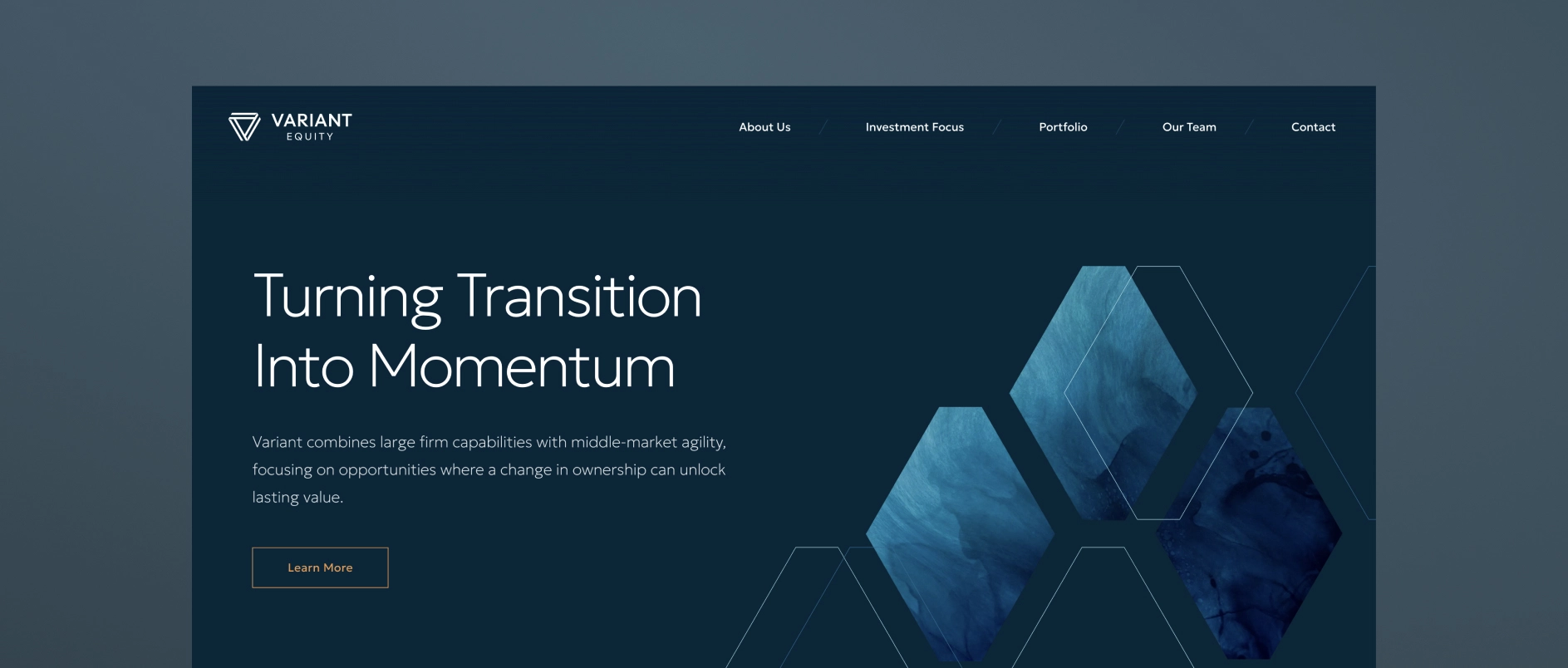
Most PE homepages default to leading with the firm's credentials: “Founded in 2005. $3B AUM. 45 investments.” This information is not unimportant, but it answers the wrong question. A sophisticated visitor does not need to know how long the firm has been operating before understanding why it exists and what makes it the right partner.
What a visitor needs first is a clear answer to three questions: what does this firm believe, where does it invest, and how does it create value? That is an investment thesis, and it should be the organizational principle of the homepage - not a section buried below the fold.
The homepage headline should express a point of view. The supporting copy should make the thesis specific. The visual design should reinforce it. Everything on the page should work together to answer “why this firm” before it asks the visitor for anything.
How Should a Private Equity Website Present the Portfolio?
A PE website should present the portfolio as proof of the thesis, not as a list of credentials.
A row of portfolio company logos communicates very little. It does not show what the companies have in common, what role the firm played in their development, or what pattern the portfolio represents. For a management team evaluating the firm as a potential partner, a logo grid tells them nothing about what working with this firm is actually like.
The best portfolio presentations in 2026 do several things differently:
- Organize by thesis or sector rather than chronology or deal size, showing a consistent pattern of focus
- Include brief case context - two or three sentences about the situation, the firm's approach, and the outcome
- Highlight value creation levers - operational improvements, strategic pivots, add-on acquisitions, management team development
- Filter or tag by industry, geography, or deal type so different visitors can find the most relevant examples
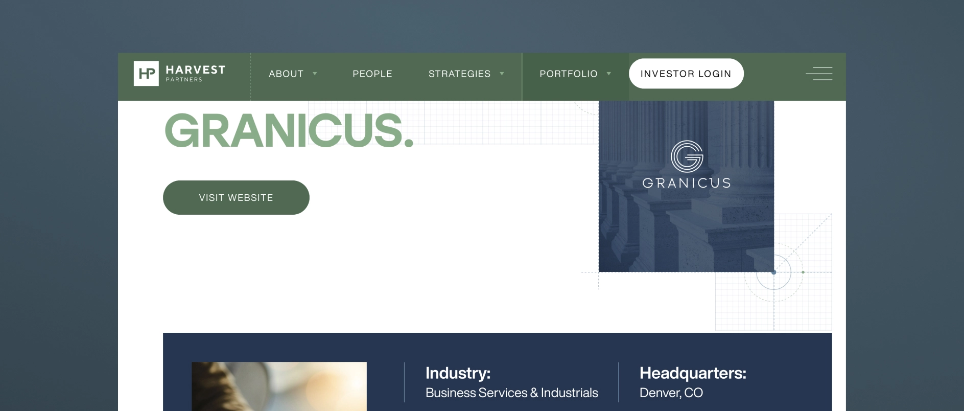
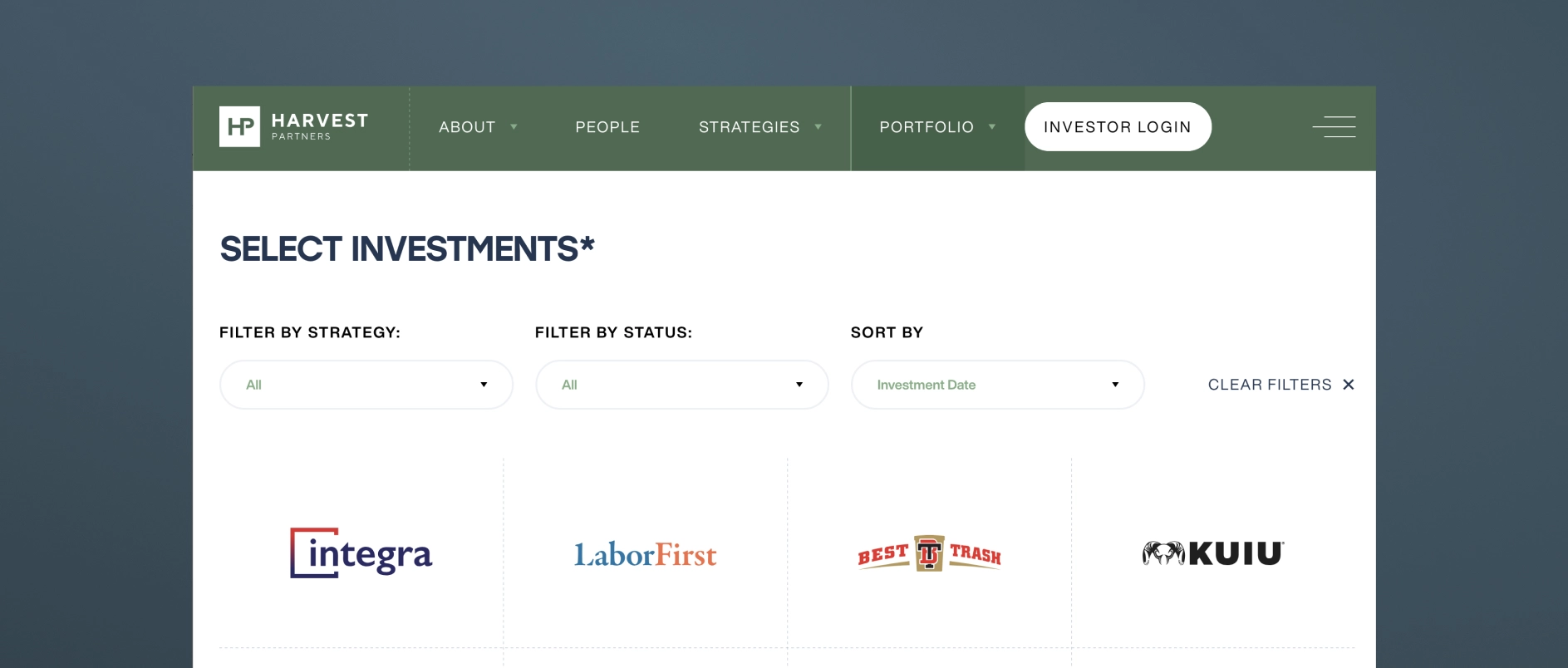
For firms with confidentiality constraints, thesis-level commentary, anonymized case studies, and sector analysis can achieve the same effect without disclosing sensitive deal information.
How Should Private Equity Firm Team Bios Be Written?
PE firm team bios should communicate judgment and operating experience, not just credentials.
The default approach - a third-person bio listing degrees, former employers, and board memberships - has become a signal of effort avoidance. It tells a prospective LP nothing about how this person thinks. It tells a management team nothing about what it would be like to be in a difficult situation with this person on the other side of the table.

Effective PE team bios in 2026 share these characteristics:
- Written with a genuine voice, even in third person, that reflects the individual's personality and perspective
- Specific about operating experience in terms that are meaningful to management teams: not just “led the acquisition of X” but “guided a founder-led business through its first institutional ownership cycle”
- Honest about area of focus and what the person is specifically good at — not attempting to present every partner as a generalist expert in everything
- Accompanied by photography that feels real: candid, professional, human — not a stiff headshot against a grey backdrop
The team page is the moment on the website where the people behind the capital become real. The best ones make a visitor feel like they understand who they would be working with.
What is AI Search Optimization for Private Equity Websites?
AI search optimization (also called AEO - Answer Engine Optimization) is the practice of structuring website content so it can be understood, extracted, and cited by generative AI research tools.
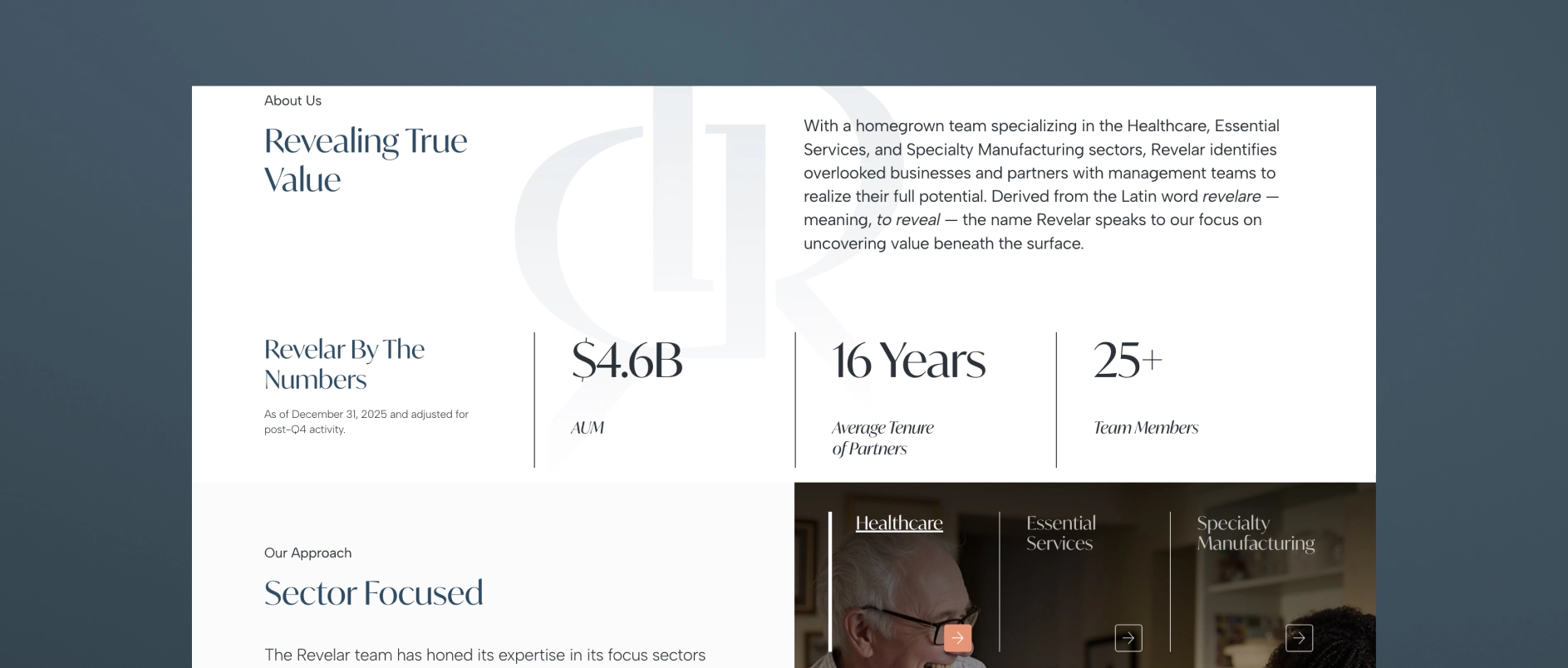
In 2026, a growing share of research into PE firms happens through AI assistants — tools like Perplexity, ChatGPT, and Google's AI Overviews — that synthesize information from across the web and return direct answers rather than link lists. These tools favor content that is:
- Clearly structured with descriptive headings that read like questions or answers
- Modular - organized in short, self-contained sections that can be extracted independently
- Specific - containing concrete, accurate information rather than generic claims
- Well-formatted - with FAQ sections, numbered lists, and defined terms that AI tools can parse easily
- Technically sound - with proper schema markup, fast load times, and clean HTML hierarchy
PE firms that adapt their content for AI search are increasingly being cited as authoritative sources. Firms that don't are losing early-stage visibility to competitors who show up in AI-generated research summaries.
What Design Principles Apply to Private Equity Websites in 2026?
Private equity website design in 2026 follows five core principles.
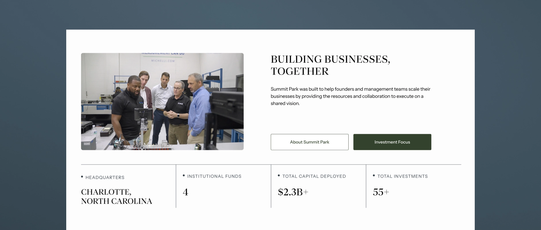
Restrained sophistication. The aesthetic should feel like the firm: disciplined, clear, authoritative. Deep anchor colors, refined typography, generous clean space. Design that is impressive without being ostentatious.

Typography as a primary communication tool. In an industry where most communication happens through words, typeface selection and typographic hierarchy are the most important design decisions. Generic system fonts undermine the credibility that everything else is trying to build.
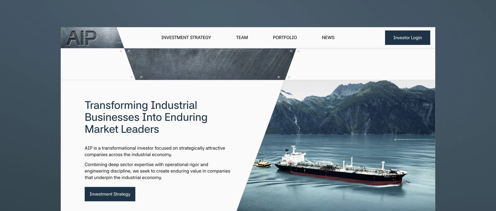
Imagery as evidence, not decoration. Stock photography of handshakes and skylines communicates nothing. Authentic team photography and real portfolio company imagery communicate genuine presence and operational depth.
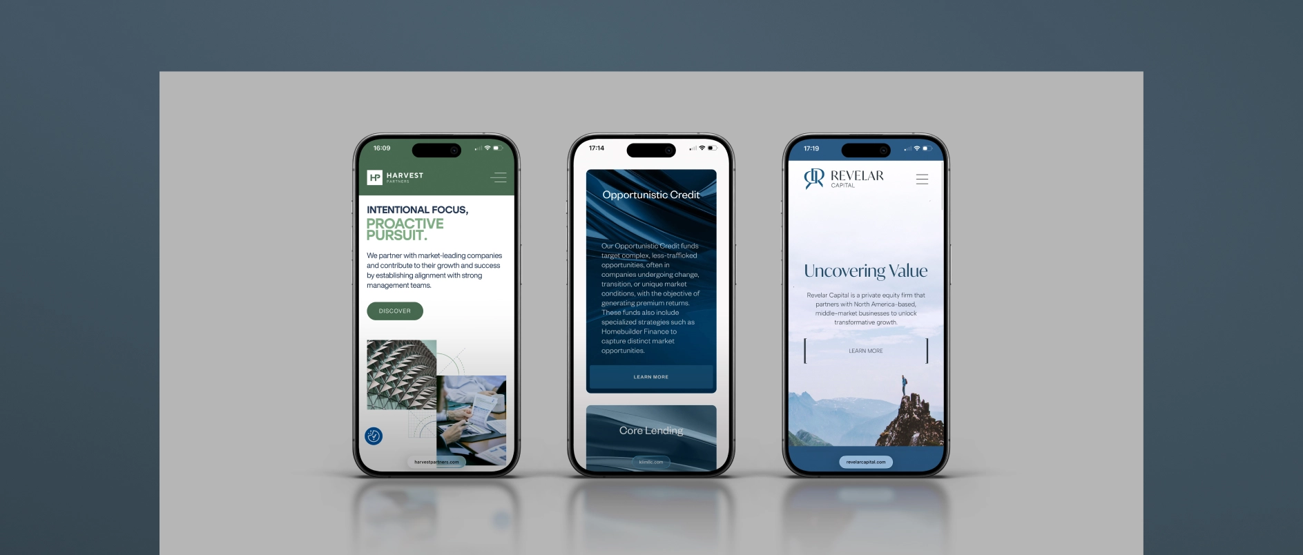
Mobile-first performance. A significant share of LP research now happens on mobile devices, including during travel and between meetings. PE websites that are clearly built for desktop and awkward on mobile are unintentionally communicating that the firm has not thought carefully about its audience.
Speed and technical hygiene. Page load time, Core Web Vitals scores, and clean HTML structure affect both user experience and search performance. Technical quality is part of the design standard, not separate from it.

All websites done by Darien Group.
What Are the Most Common Mistakes on Private Equity Websites?
The homepage leads with history rather than the thesis. Founding year and AUM are credentials. They are not positioning. Leading with them signals that the firm has not done the work of articulating what makes it genuinely different.
The portfolio is a logo grid. As discussed above, logos without context prove nothing and differentiate nothing.
Bios are third-person credential lists. A bio that reads like a LinkedIn export tells a visitor nothing about the person. Judgment, voice, and specific expertise are what build trust.
There is no thought leadership, or it reads like a press release. Quarterly market updates and fund announcements are not thought leadership. They are content placeholders. Real thought leadership requires a point of view.
The site is not structured for AI search. Generic, unstructured content is increasingly invisible to the tools investors use for early-stage research.
There is no mobile optimization. If the site breaks or feels awkward on a phone, the firm is failing a meaningful share of its audience at first impression.
The contact page is just a form. A motivated prospect who reaches the contact page is already considering engagement. A bare form, without reinforcement of the firm's identity, is a missed opportunity for persuasion.
How Often Should a Private Equity Firm Update Its Website?
A PE firm's website should be reviewed for major updates on a 2-5 year cycle, with ongoing maintenance between reviews.
Ongoing updates (as they happen): New portfolio additions, team changes, thought leadership posts, and fund announcements should be reflected promptly. Outdated information damages credibility quickly - especially if an LP or management team notices a personnel change or portfolio update that is not reflected on the site.
Annual review: Assess whether the investment thesis language remains accurate and differentiated. Review the performance of thought leadership content. Evaluate design against current category standards.
Major redesign triggers: A new fund launch, a significant strategic pivot, a rebrand, or a substantial change in target audience are all appropriate triggers for a more comprehensive website overhaul.
Private Equity Website Best Practices Checklist:
Use this checklist to evaluate a current website or scope a new project.
Strategy and content
- Homepage communicates investment thesis within the first scroll
- Strategy or approach page explains sourcing, decision criteria, and value creation framework
- Portfolio page demonstrates thesis consistency, not just logos
- Team bios communicate judgment and experience, not just credentials
- Thought leadership content published within the last 90 days
- Content is structured for AI search: clear headings, modular sections, FAQ content
Design and experience
- Typography is distinctive and legible at all sizes
- Color palette is intentional and consistent across all pages
- Imagery is authentic - real team photography, real portfolio context
- Site performs well on mobile devices
- Page load time meets Core Web Vitals standards
Audience and architecture
- LPs can find strategy and team information within two clicks
- Management teams can understand the firm's value-add approach quickly
- Contact page reinforces the firm's identity and makes the next step clear
Darien Group works exclusively with investment management firms on brand strategy, visual identity, and digital presence. Contact us to discuss where your firm's design stands.
Most investor decks don't fail for a single reason.
Sometimes it is the design. The slides feel dated, inconsistent, or overly dense, and a cleaner visual system goes a long way.
But more often, the issue sits underneath that.
No one has made a clear decision about what the story actually is — so the deck tries to do everything at once. Strategy, track record, team, edge cases, caveats. It all gets layered in, slide by slide, until the presentation becomes harder to follow than it should be.
That's usually the moment when firms decide to “refresh the deck.”
And depending on the situation, that can mean very different things. In some cases, a design-led update is exactly what's needed. In others, the structure itself needs to be simplified, re-sequenced, and pressure-tested before design can really do its job.
The agencies below approach that spectrum from different angles. Some are pure design partners. Some operate more broadly across marketing and digital. And a smaller group works closer to the narrative itself.
If you're preparing for a fundraise or reworking core materials, understanding where your needs actually sit on that spectrum is what determines the right partner.
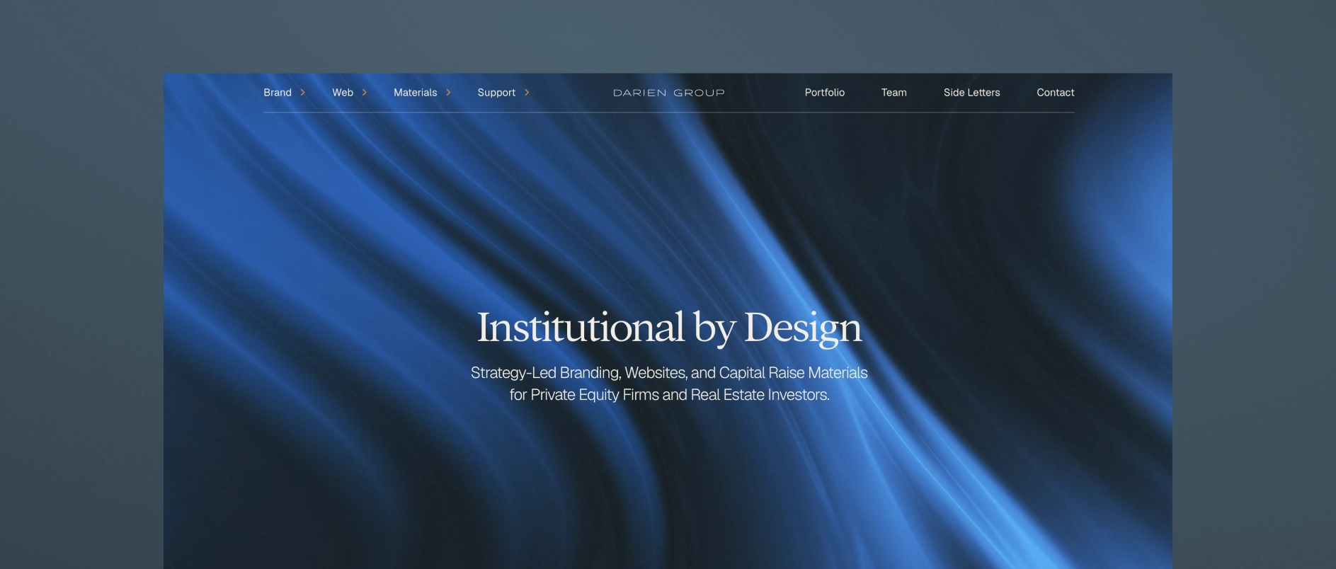
1. Darien Group: The Specialist Investor Presentation and Collateral Partner for All Capital Raising Firms
Darien Group is the only branding and communications firm built exclusively for investment managers. Our work centers on helping firms articulate a differentiated strategy, communicate clearly with LPs, and present a credible, cohesive identity across every touchpoint.
What makes Darien Group different:
Private-markets fluency
We work exclusively with investment managers. That specialization translates into deep understanding of fund strategy, value creation, LP expectations, GP-founder dynamics, and the nuances of middle-market fundraising.
Narrative-first strategy
Our team helps clients articulate why their strategy works - not just what they do. Positioning, messaging frameworks, and story architecture are designed specifically for LP, founder, and intermediary audiences.
Institutional investor materials
Pitchbooks, PPMs, AGM presentations, annual reports, quarterly updates, and fund overviews are built to an institutional standard, combining clarity, compliance alignment, and compelling structure.
Modular content & communication systems
We develop messaging frameworks and repeatable content structures that help investment managers communicate consistently. These systems align websites, pitch materials, and ongoing updates so a firm's story remains cohesive across every channel.
Boutique, high-touch model
Strategy, messaging, design, and execution are delivered by specialists who understand the expectations and pace of private-market teams.
Best for firms who need: a differentiated investment story, polished LP-ready materials across every touchpoint, full AGM support, and a partner with true fluency in investment management.
2. SlideGenius
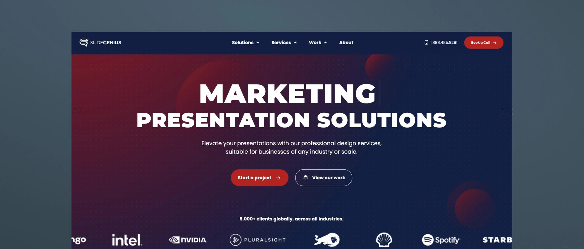
SlideGenius is a presentation design agency that produces pitch decks and sales materials across a broad range of industries. Their specialty is visual design and slide sequencing, structured around sales psychology to guide a viewer through a decision. They work with clients across sectors rather than focusing exclusively on investment managers.
Best for firms who need: a professionally designed deck produced efficiently, with a structured, repeatable process and design-forward execution.
3. Superside

Superside is a subscription-based, “always-on” design company that provides presentation design as one of many creative services — alongside branding, video, web design, illustration, and more — for scale-up and enterprise clients across industries. Their presentation work spans templates, PowerPoint and platform-specific design, pitch decks, and sales presentations, with access to motion design, illustration, and video production layered in as needed.
Best for firms who need: fast turnaround on high-volume design requests, flexible access to a broad range of creative services under one subscription, and a scalable design bench rather than a single point of strategic counsel.
4. Williams Lea

Williams Lea is a large, tech-enabled business process outsourcing (BPO) provider that offers high-volume pitchbooks and presentations as one line item alongside secretarial support, document processing, digital mail, billing support, and other back-office services. They serve financial, legal, and professional services firms specifically, and their presentation work centers on turning complex data into high-volume, tech-assisted pitchbook and PowerPoint output, often delivered under tight deadlines.
Best for firms who need: high-volume, fast-turnaround pitchbook production, execution capacity to supplement an internal team, and operational/formatting support across many other back-office functions.
5. MVP Design

MVP (MVP Marketing + Design) is a Midwest-based marketing and design firm that works specifically with private equity, M&A, and lower-middle-market firms on investor communications. Their MVP PitchMate℠ process is built around custom investor and annual meeting pitch decks, as well as CIP (confidential information presentation) work, aiming to translate complex information into clear PowerPoint visuals.
Best for firms who need: PE/M&A-specific pitch decks, LPAC and annual meeting presentations, and a firm that pairs design execution with some sector-specific investor-communications experience.
6. Investor Creative
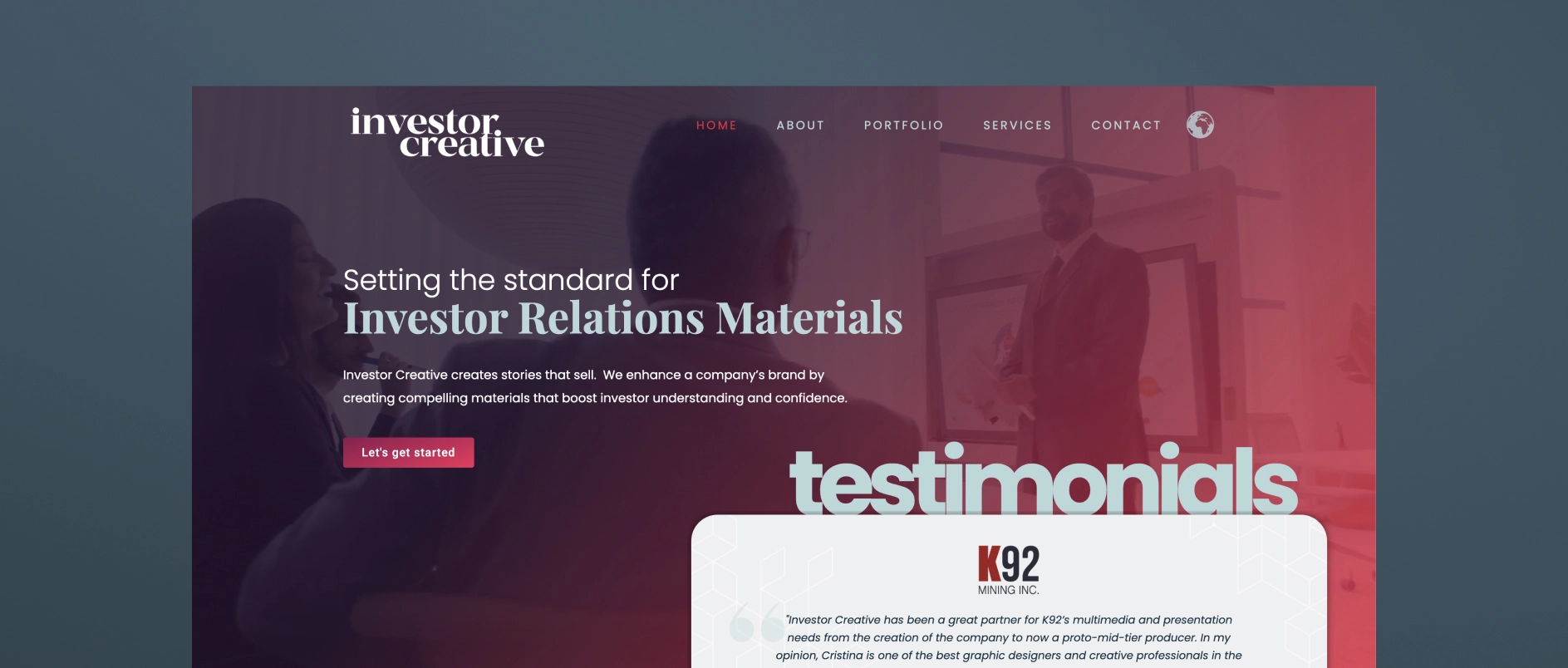
Investor Creative is a small, boutique investor relations design studio that creates presentations, websites, fact sheets, and branding materials for public and private companies. Their positioning is built around bridging the gap between a public company's limited in-house graphic capabilities and the learning curve required for a designer to understand investor appeal.
Best for firms who need: a single experienced designer who understands IR materials, presentation, and website refreshes for small-cap or junior public companies (especially resource/mining issuers), and an affordable, personal, long-term design relationship rather than a full-service agency team.
7. M'Idea Hub
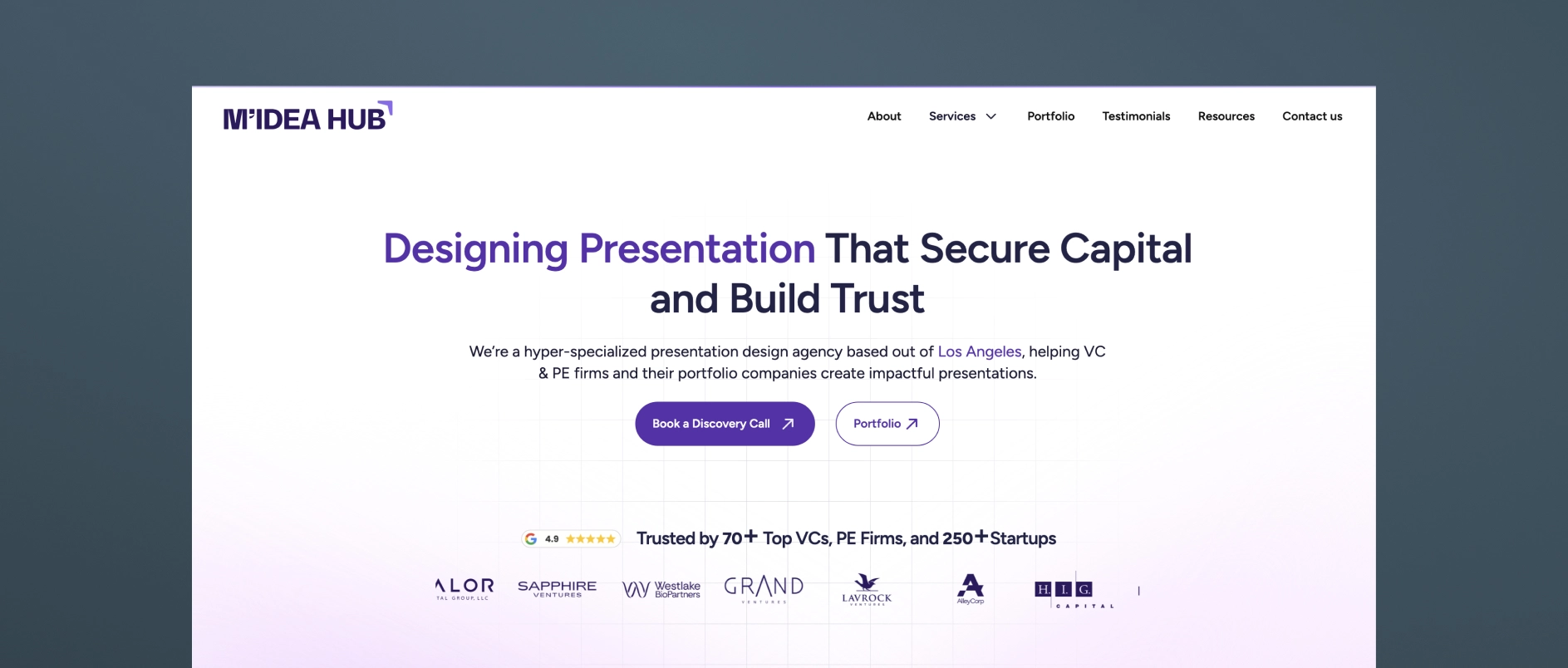
M'Idea Hub is a Los Angeles-based, boutique presentation design agency positioned specifically around VC and PE investor communications. They combine strategy, storytelling, and high-fidelity design to create fund decks, LP updates, and AGM presentations.
Best for firms who need: fund decks, LP updates, and AGM presentations for VC and PE firms that want a specialist design-and-narrative partner without a broader branding/website scope.
8. Stinson Design
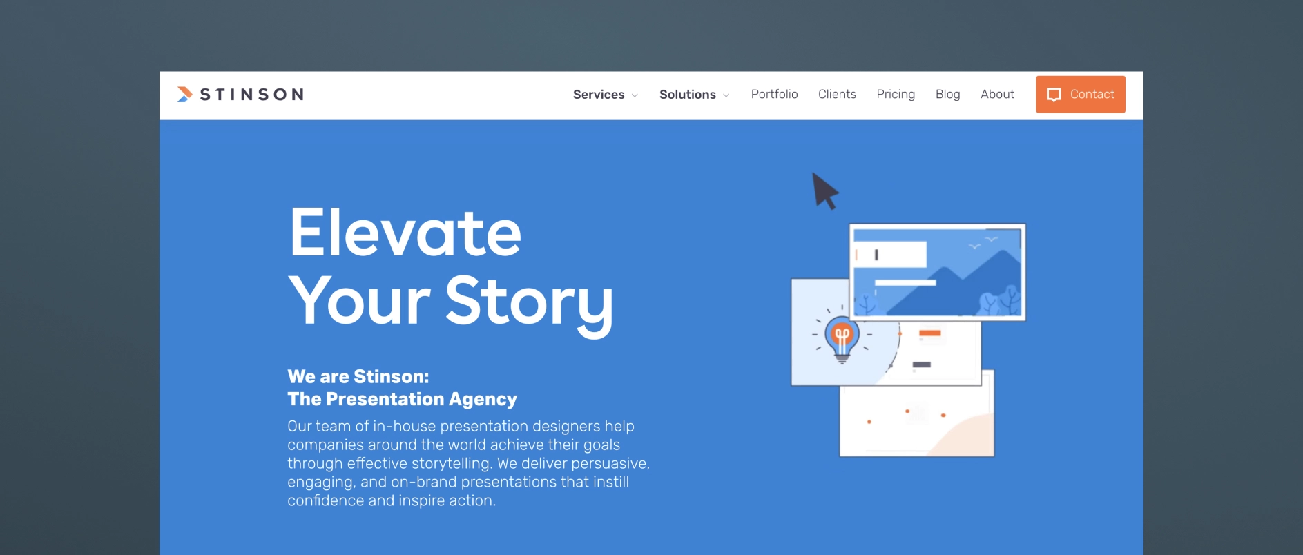
Stinson Design is a presentation design agency (Toronto-based) that has built meaningful experience in financial services and investor presentations, though it's not exclusively focused on the PE/institutional-LP niche. They've carved out a niche in investor presentations and financial storytelling, with a portfolio reflecting experience in capital markets and investment management, and clean, data-forward design suited to a financially literate, skeptical audience.
Best for firms who need: strong data-storytelling and design craft for roadshow decks, fund launch presentations, annual investor materials, or data-heavy financial analyses, from a team with real financial-sector reps but a more generalist client base overall.
9. PitchLift
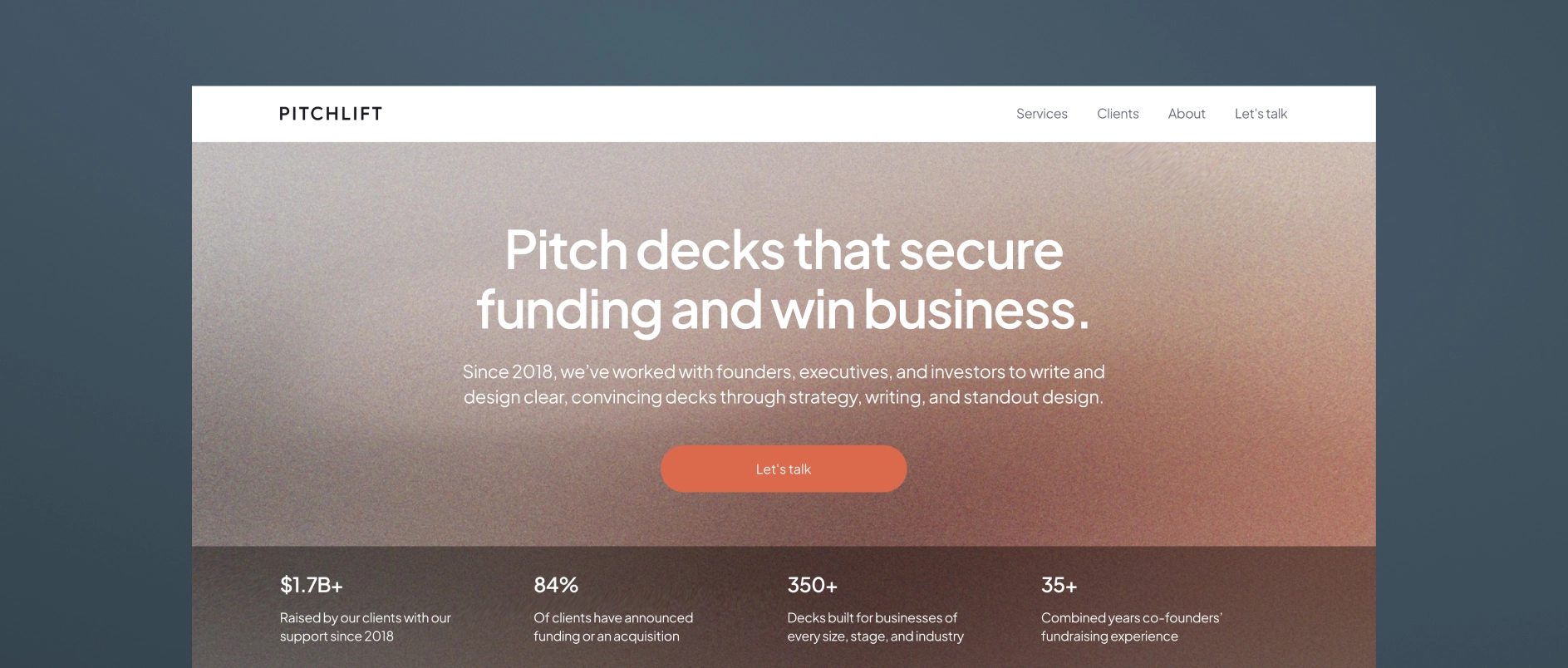
PitchLift is a small, boutique fundraising and presentation agency based in Austin and Barcelona. Their services cover graphic design, financial modeling, branding, one-pagers, and investor planning.
Best for firms who need: startups and growth-stage companies (with some enterprise/fund work) needing a lean, strategy-plus-design partner.
10. Van York Agency
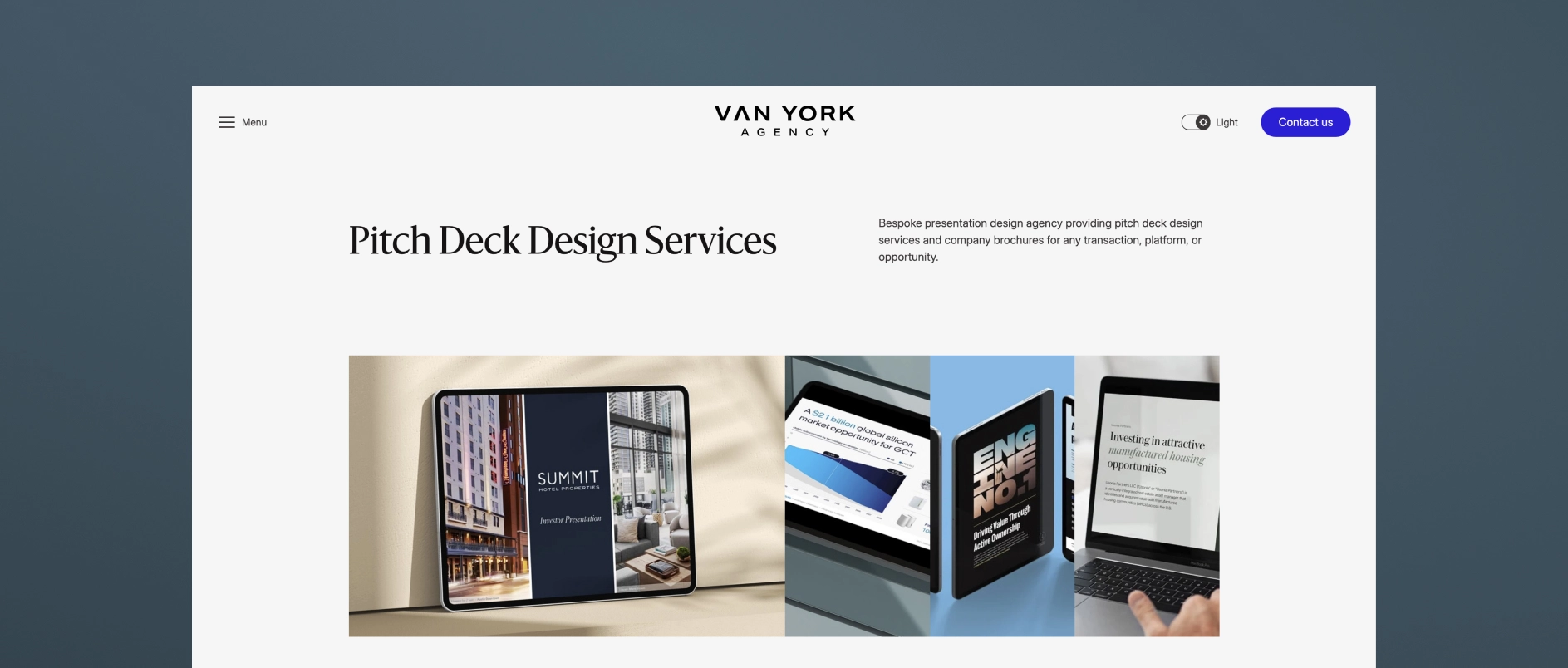
Van York is a Vancouver-based presentation and brand design agency built around end-to-end investor and B2B communications. Services span capital markets decks (IPO, SPAC, PIPE, private placement), private capital decks (seed through Series D, M&A, JV), investor relations materials (earnings, investor day, analyst day), and B2B sales/RFP decks — offering research-through-design presentation support in one shop, with fast-turnaround options.
Best for firms who need: capital markets, PE/real estate, and B2B firms needing research-through-design presentation support in one shop, with fast-turnaround options.
Darien Group works exclusively with investment management firms on brand strategy, visual identity, and digital presence. Contact us to discuss where your firm's design stands.