.jpg)
Design Trends in Private Equity Branding: What's In, What's Out in 2026


What Are the Major Design Trends in Investment Management Branding in 2026?
Investment management design in 2026 is moving away from the unintentional visual conventions that have dominated the category for decades - default color pairings assembled out of habit, globe marks, overstated stock photography, and logo-grid homepages - toward identities that are differentiated, specific, and technically sophisticated.
The shift is being driven by three pressures: more sophisticated audiences who can identify and discount generic presentations, the rise of AI-powered research tools that favor clearly structured, specific content, and a generational wealth transfer that is bringing new investors who respond to a different visual vocabulary of trust.
The firms investing in design as a strategic function are building durable competitive advantages. Firms still relying on category defaults are becoming harder to distinguish from one another.
What Design Approaches Are Becoming Outdated in Private Equity?
Unintentional color palettes with no secondary contrast
Blue is not going anywhere in investment management - and it probably never will. Navy, midnight, and deep cobalt remain among the most credible anchors available to a financial services brand. They carry deep-rooted metaphorical meaning: stability, trust, and long-term orientation. Many firms still design a significant number of blue-led identities, and that is likely to remain true for the foreseeable future.
What is shifting is not the presence of blue. It is the absence of intentionality around everything else. For most of the last thirty years, the default move was blue primary, gold or grey secondary, globe or abstract mark, conservative wordmark - assembled because it felt safe, not because it was chosen. The result is a category where the primary palette is credible but everything around it is interchangeable.
The firms building distinctive identities in 2026 are making deliberate choices about their secondary palette - the accent colors, typographic contrasts, and visual elements that give a blue-anchored identity its character. A deep navy paired with a warm terracotta. A midnight blue alongside a precise sage green. A charcoal-dominant palette with a single high-contrast amber used sparingly and strategically. These combinations still communicate authority. They also communicate that someone made a considered choice - and that considered choice is itself a differentiator in a category full of defaults.
The homepage that leads with the portfolio before positioning
The standard PE and asset manager homepage structure - hero image, tagline, brief firm description, row of portfolio logos - is not going away entirely, and the logo grid is not inherently wrong. Portfolio companies are legitimate proof of activity and sector focus. The problem is structural: when the homepage leads with portfolio before it has established strategy, differentiators, and mission, it answers the wrong question first.
What is shifting is the sequencing and the depth. Leading firms are opening with their investment thesis, their specific value-add, and their overall mission - giving a first-time visitor a clear reason to keep reading before they encounter any portfolio evidence. The portfolio then functions as proof of a position already established, rather than a substitute for one.
The other significant shift is where portfolio detail lives. Rather than compressing every company into a logo or a two-line description on the homepage, more firms are giving portfolio companies their own standalone pages with more detailed context about the business, the partnership, and the value-creation story. This serves multiple audiences better: LPs get thesis evidence with depth, management teams get a sense of what it actually looks like to be a portfolio company, and the firm gains SEO value from pages that can rank independently for company- and sector-specific searches.
Dense materials evolving toward deliberate hierarchy
The institutional investment industry has long treated density as a proxy for credibility, assuming that more information signals greater rigor. That instinct is not wrong. Depth matters, and sophisticated LPs want to know that the substance is there.
What is shifting is the presentation layer. Comprehensive information and scannable design are not in conflict, but they require different things. The content can be thorough; the structure needs to make the most important signals findable quickly. Leading firms are keeping the depth while adding hierarchy: clear section headings, generous white space, and a layout that guides a time-constrained reader to the most important points before asking them to go further. The rigor is still there. It is just no longer hidden inside a wall of text.
Stock photography evolving toward authentic, firm-specific imagery
Stock photography is not inherently problematic; it has served a practical purpose for firms that need to move quickly or work within tight budgets. The issue is specificity, or the lack of it. A handshake across a conference table, a glass-and-steel skyline from altitude, a professional looking satisfied at a laptop - these images could belong to any firm in any sector. They carry no information about who this specific team is, what kind of company they represent, or what the firm's culture feels like.
What is changing is the bar for what passes as sufficient. As authentic team photography and real operational imagery become more common across the category, stock imagery looks more obviously generic by comparison. Firms that have invested in their own photography, real team portraits, real offices, and real portfolio companies communicate genuine presence in a way that stock cannot approximate. The investment required is higher. The return on credibility is higher still.
Desktop-first builds evolving toward performance-first, multi-environment design
Desktop has always been, and remains, the primary environment where LPs conduct detailed research and review materials. A well-designed desktop experience is not something to avoid. What is expanding is the range of environments a firm's website needs to perform in simultaneously.
A significant and growing share of early-stage research now takes place on mobile devices. During travel, between meetings, in the margins of the day. AI search tools are indexing and synthesizing website content in ways that favor fast, cleanly structured pages. Core Web Vitals scores affect search visibility. Firms whose websites were built exclusively for a single environment are underperforming in the others. The evolution is not away from desktop quality; it is toward ensuring that quality carries across every context where a prospective LP or management team might first encounter the firm.
What Design Approaches Are the Leading Investment Management Firms Adding in 2026?
Intentional color systems with deliberate secondary palettes
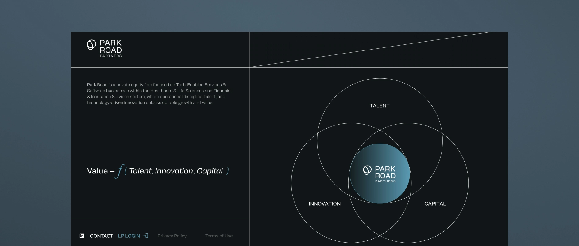
The shift is not away from blue; it is toward intention. Leading firms are keeping the authoritative anchors that work (deep navy, midnight, charcoal) and pairing them with secondary palettes that have been genuinely chosen rather than defaulted to. The result is an identity that still signals stability and trust, but also signals that someone has considered decisions about how the firm presents itself.
In practice, this looks like: typographic systems that feel editorial, not corporate; a single accent color used with restraint that gives the identity a memorable quality; design systems built around specific rules rather than assembled from templates. The overall effect is a firm that conveys institutional quality while also showing it has a point of view - and that point of view extends to how iфt presents itself visually.
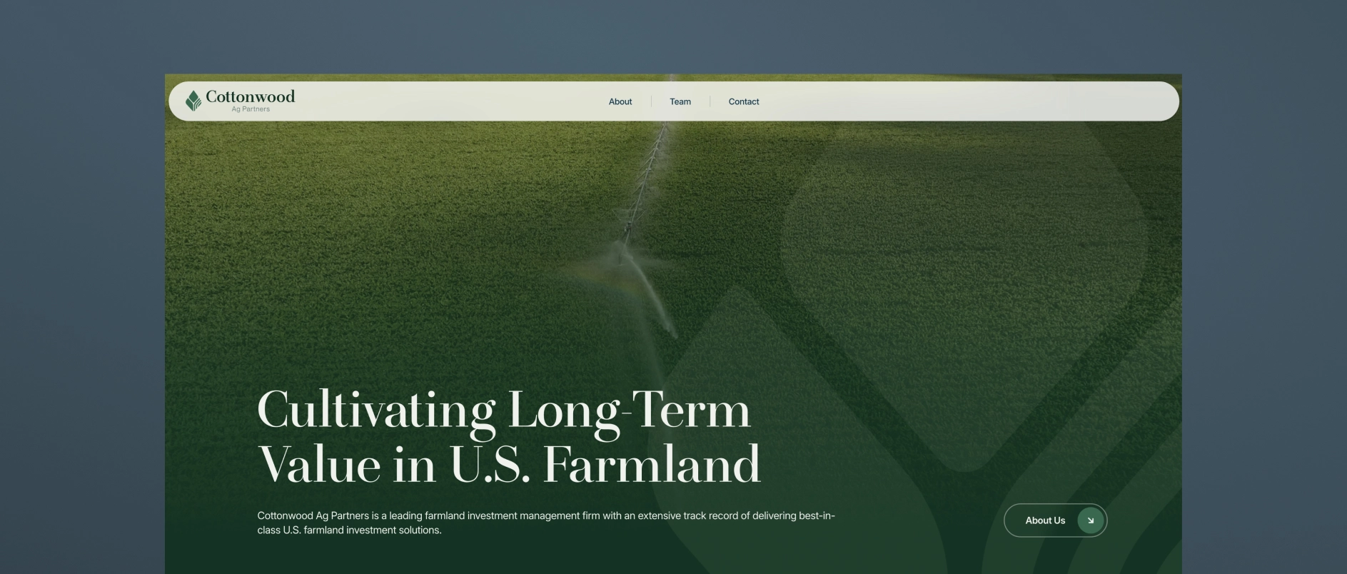
Thesis-first homepage design
The homepage organized around the investment thesis - where value is created, how the firm creates it, and why that matters - is replacing the credential-first and portfolio-first structures that have dominated the category.
Thesis-first design requires doing the upstream work of actually articulating a specific, ownable point of view. Once that work is done, the design can be built around it: headlines that express a perspective, visuals that reinforce the sector or strategy focus, portfolio presentation framed as evidence of the thesis in action.
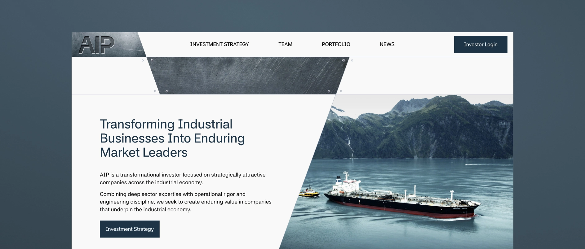
Information hierarchy and deliberate white space
The design trend moving through investment management in 2026 is explicit prioritization. The best materials and websites make deliberate choices about what matters most and design around those choices. Less is on each page. What is there is structured so that the most important points can be absorbed in a single scan.
White space is understood as a design decision, a way of signaling confidence in the content. Firms that design for scannability are not sacrificing depth. They are respecting their audience's time.
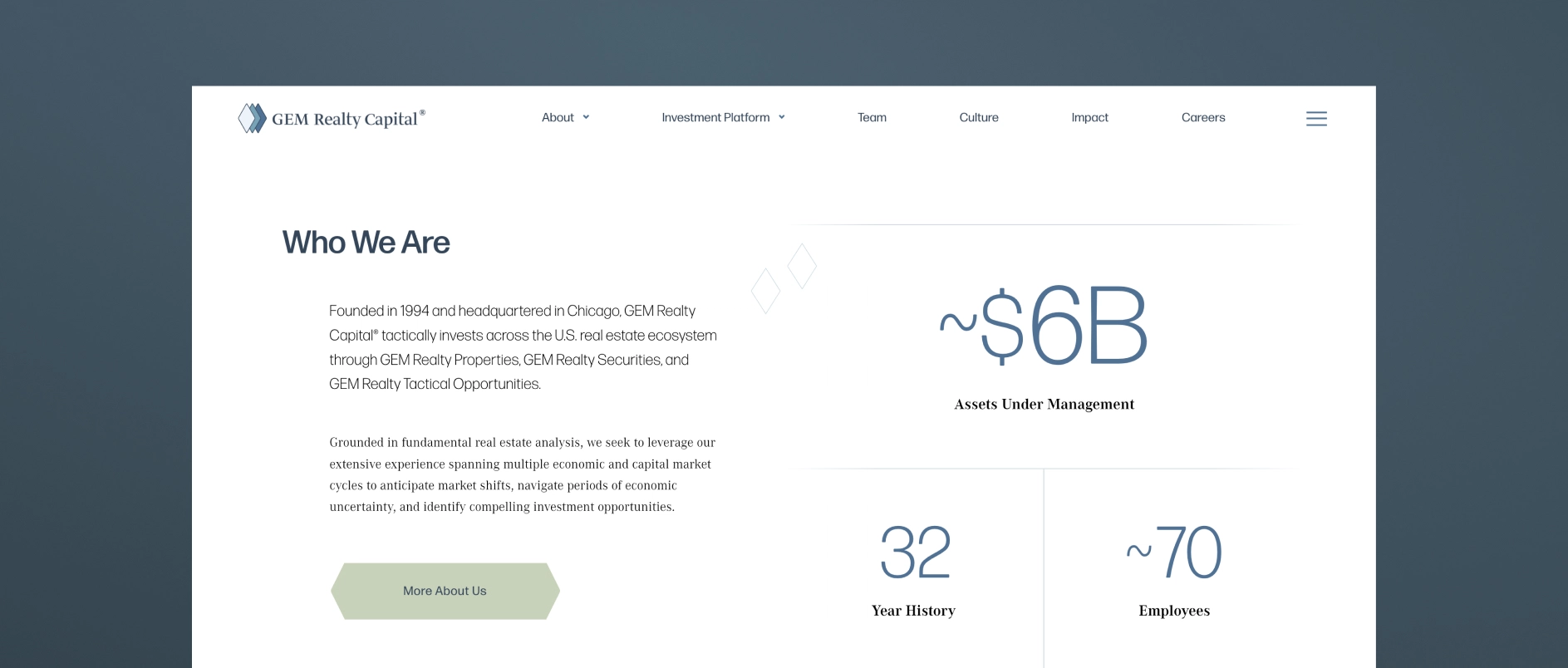
Authentic, high-craft photography
Investment management firms are investing in original photography: real team portraits that feel candid and human, photography of real offices and working environments, and imagery of portfolio companies that communicates genuine operational presence.
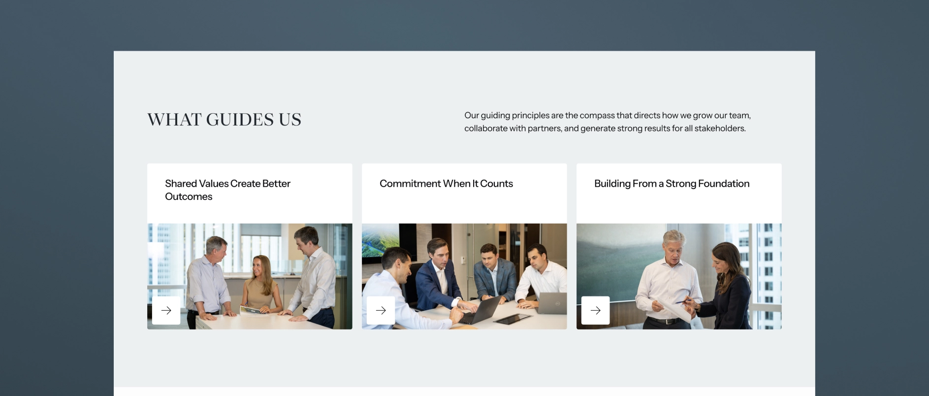
The standard for what looks “professional” has risen. A team photography shoot done well, with good lighting, natural expressions, and an environment that reflects the firm's culture, can sometimes communicate more about the people behind the capital than any number of credential lines in a bio.
AI-optimized content architecture
The design and content decisions that govern website structure are now inseparable from AI search performance. Sites built with clear hierarchy, modular sections, FAQ content, and proper schema markup are the same sites that perform best for human visitors. Clarity of structure is clarity of design. The technical and the visual are aligned.
Custom visual systems over generic icon sets
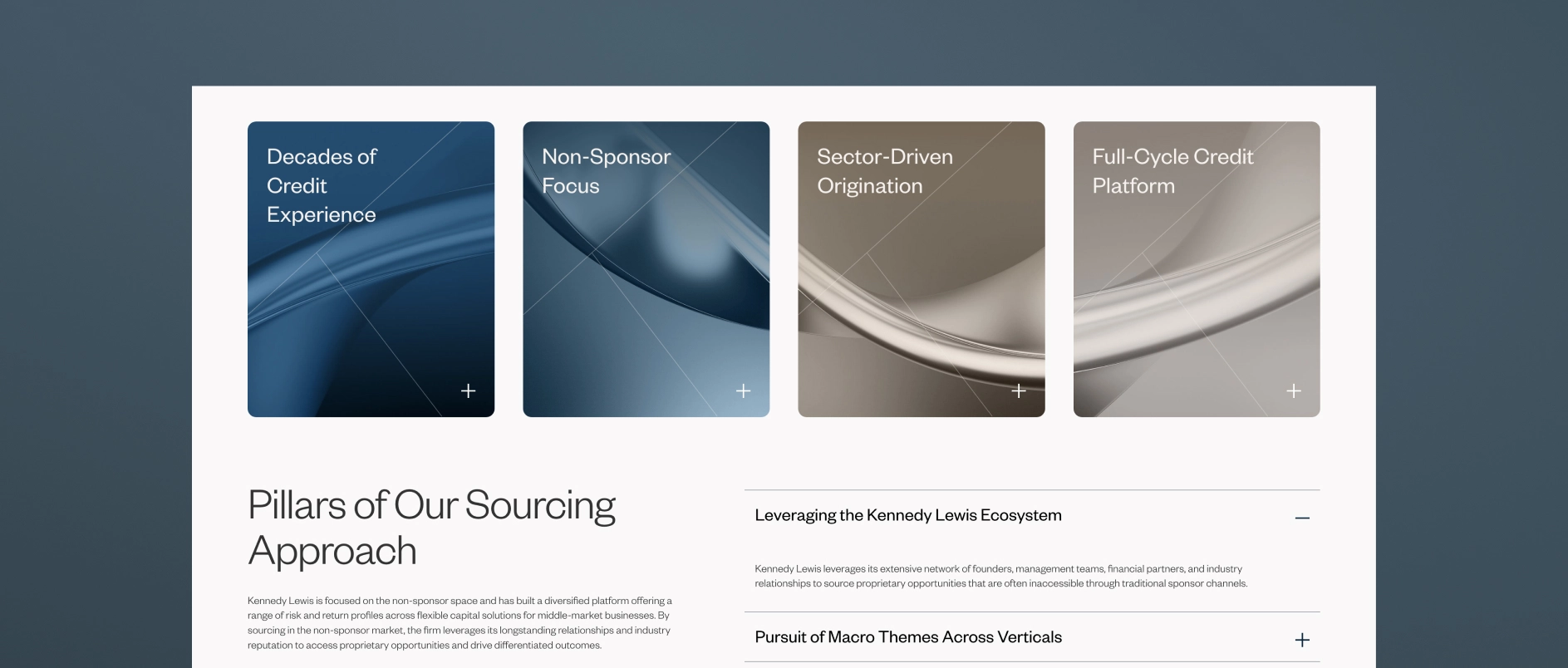
Firms investing in design are building visual systems - iconography, graphic elements, illustration styles, etc. - that are specific to their strategy and sector focus. A firm that invests in industrial businesses uses visual language that references precision and tangible operations. A credit manager communicates differently from a growth equity fund.
Custom visual systems require more upfront investment than licensing an icon set. They produce materials that feel different from the start because they look like they are communicating about something real.
What Are the Design Principles That Remain Constant in Investment Management?
Some design principles do not follow trends. These apply regardless of the year.
Clarity over cleverness. Investment management audiences are sophisticated, time-constrained, and skeptical of anything that feels like it is trying too hard. Design that is surprising in a way that makes the content harder to understand is not good design for this context. Craft should be in service of communication.
Authority without arrogance. The visual language of investment management must balance confidence with accessibility. Design that is too polished or slick can undermine trust by feeling more like marketing than substance. The best investment management design has the quality of a firm that is confident enough not to need to show off.
Consistency as an institutional signal. In an industry where trust is built over long periods, the consistency of a firm's visual identity - the sense that every piece of communication comes from the same source and reflects the same values - is itself a proof point. Inconsistency signals disorder. Consistency signals discipline.
Typography as the primary design vehicle. In an industry where most communication happens through words, typography is the single most important design decision a firm makes. Typeface selection, typographic hierarchy, and spacing communicate personality, authority, and sophistication more directly than any other visual element. Firms that invest in thoughtful typographic systems build visual identities that work at every scale and in every format.
FAQs About Investment Management Design Trends:
How important is mobile design for PE and asset management websites? Increasingly important. A significant share of LP research now happens on mobile devices, including during travel and between meetings. Sites that perform poorly on mobile are failing a growing proportion of their audience at the moment of first impression.
Should investment management firms use dark mode website designs? Dark mode designs can work effectively for certain types of investment managers — particularly those in technology or growth equity where a modern, tech-forward identity is appropriate. For most traditional asset managers and PE firms, light-mode designs with deep typographic contrast better serve the “institutional credibility” signal. The choice should reflect the firm's positioning, not just aesthetic preference.
Is minimalism still the right approach for PE website design in 2026? Yes, but with an important clarification. Minimalism in 2026 means deliberate reduction — making intentional choices about what to include and how to present it. It does not mean sparse or cold. The best PE websites are minimal in the sense that nothing is wasted, but they have warmth, character, and a genuine visual point of view.
How does a PE firm choose between a serif and sans-serif typeface for its brand? The choice should reflect the firm's positioning and audience. Serif typefaces communicate heritage, authority, and long-term orientation - appropriate for established firms with a track record emphasis. Sans-serif typefaces communicate clarity, precision, and forward orientation - appropriate for firms emphasizing operational capability or technology-adjacent strategies. Neither is categorically better; both require thoughtful execution.
What photography style works best for investment management team pages? Natural, documentary-style photography outperforms formal studio headshots for most investment management audiences in 2026. Photos taken in the firm's actual working environment - with real lighting, natural expressions, and some sense of context - communicate more authenticity and trust than staged studio portraits. The goal is to make the people on the team feel real and approachable to prospective partners, while maintaining professional standards.
How often should investment management firms refresh their visual identity? A full visual identity refresh is typically warranted every five to seven years, or when a major strategic shift — new fund strategy, significant leadership change, market repositioning - makes the existing identity misaligned with who the firm has become. Between major refreshes, ongoing attention to design quality in marketing materials, digital presence, and presentation materials maintains brand consistency without the disruption of a full rebrand.
The Design Opportunity in 2026
The foundations of investment management design - authority, clarity, consistency, trust - are not changing. What is changing is the standard for how well those foundations are executed, and the range of environments they need to perform in.
The firms building an advantage in 2026 are not throwing out what works. They are being more deliberate about every choice they make on top of it: the secondary palette that gives their identity character, the content sequencing that earns a first-time visitor's attention, the photography that makes their team feel real, the structural decisions that make their website readable to both humans and machines.
Each of those decisions is one their less deliberate competitors are not making. In a category where most firms still rely on defaults, intentionality compounds.
Darien Group works exclusively with investment management firms on brand strategy, visual identity, and digital presence. Contact us to discuss where your firm's design stands.