.jpg)
How Multi-Market Real Estate Platforms Can Turn Complex Messaging Into a Clear Digital Narrative

Real estate platforms operating across multiple geographies, verticals, and operating models face a unique communication challenge: the more sophisticated the business becomes internally, the harder it is for external audiences to understand quickly and confidently.
Nowhere is this more visible than online.
Websites are often the first place LPs, advisors, consultants, lenders, or operating partners try to understand the structure of a platform. But for multi-market firms, the digital narrative frequently becomes muddled — too much detail too early, unclear strategy distinctions, or navigation that mirrors internal org charts rather than how an outsider evaluates the platform.
What these firms need is not more information. They need a clearer system for translating operational complexity into a structured, intuitive digital experience.
When the architecture is intentional, a multi-market platform can present itself with the same discipline it applies to investment underwriting and execution.
Visitors understand the strategy faster.
They find what they need without friction.
And the narrative that emerges feels confident, coherent, and institutional.
Why Complexity Creates Friction Online
Multi-market firms often run into the same patterns of confusion:
1. Geography, verticals, and strategy blur together.
A platform may operate across regions, asset types, and business lines, but if these distinctions are not clearly defined on the website, audiences end up guessing how the pieces fit.
2. Operational strengths stay buried.
Execution capabilities often sit at the center of what makes these platforms strong — operating partners, vertical integration, repeatable playbooks — yet these elements are rarely surfaced with enough structure or visual clarity.
3. Navigation mirrors the internal org chart instead of audience logic.
Teams think in terms of divisions. Visitors think in terms of first principles: what do I need to understand right now? Those two logics often diverge.
4. Portfolio pages overwhelm instead of orient.
High-volume platforms often display dozens of investments without filters, sequencing, or standardization, forcing users to scroll endlessly rather than interpret the footprint.
These friction points often come from good intentions — firms want to be comprehensive — but without the right design patterns, “comprehensive” becomes “confusing.”
Three Ways Digital Structure Can Bring a Multi-Market Story Into Focus
Drawing from our past work helping real estate platforms refine their digital narratives, three patterns consistently help translate complexity into clarity.
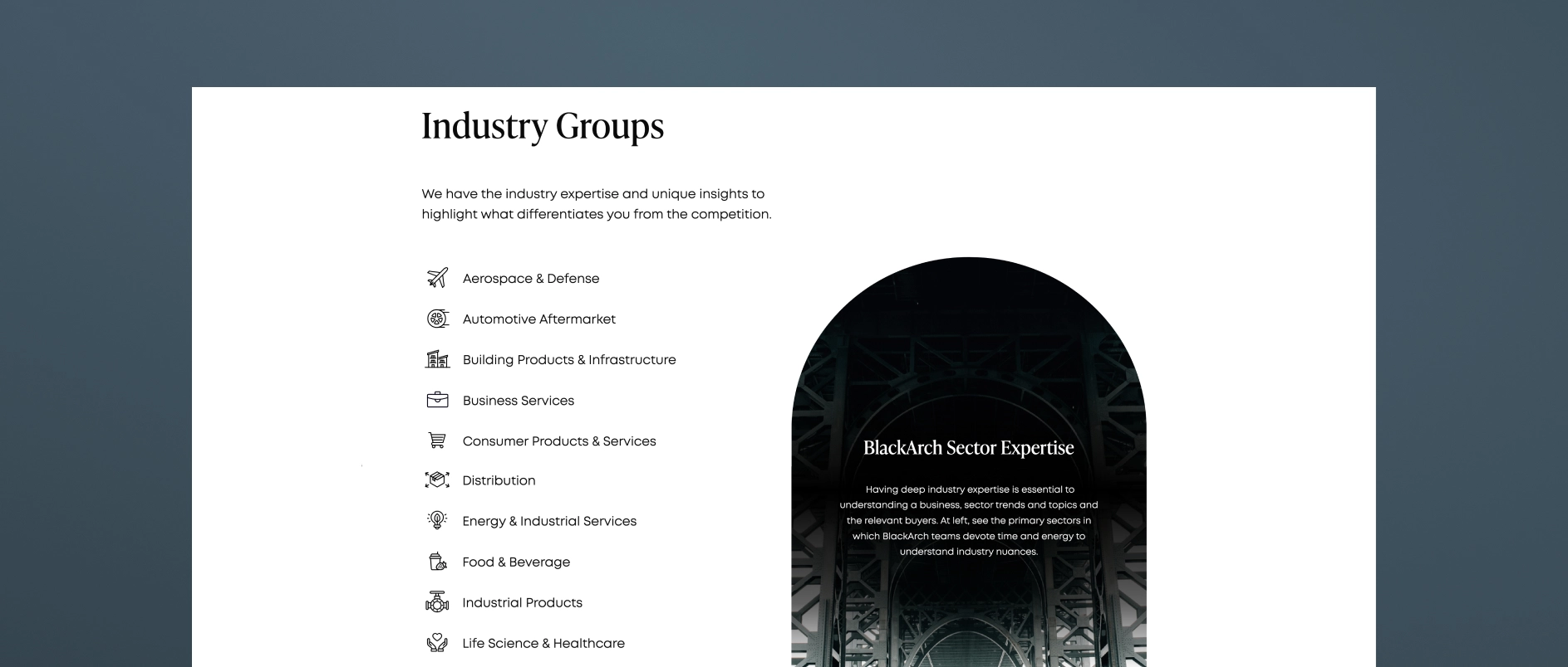
1. Begin With a Clear Organizational Map — Not a List of Strategies
Before diving into offerings, audiences need a mental model of the platform:
What markets does the firm serve? What verticals does it operate in? How do these units relate?
Strong multi-market websites do this upfront.
They often use:
- A simple articulation of the firm’s focus areas
- A visual or textual explanation of how those areas connect
- A clear distinction between investment approaches and operating capabilities
- Light scaffolding that orients without overwhelming (e.g., three pillars, two segments, or a defined ecosystem)
This gives the visitor a frame for interpreting everything that follows — especially important for platforms whose value proposition lies in cross-pollination between markets or business lines.
2. Use Information Hierarchy to Let Each Audience Self-Navigate
Multi-market platforms inevitably serve different stakeholders:
Institutional LPs, HNW individuals, family offices, advisors, partners, lenders, local communities, operators, and prospective talent.
They don’t all need the same depth, and they don’t all start from the same question.
Digital hierarchy helps solve this by sequencing content in a way that allows for intuitive self-selection:
- High-level framing first
- Strategy or vertical-level detail second
- Footprint and portfolio third
- Team composition fourh
- Granular information (team, capabilities, metrics, case studies) available but not obstructive
This kind of hierarchy is one of the strongest signals of maturity. It communicates that the platform understands how audiences evaluate real estate managers, and doesn’t require visitors to forage for clarity.
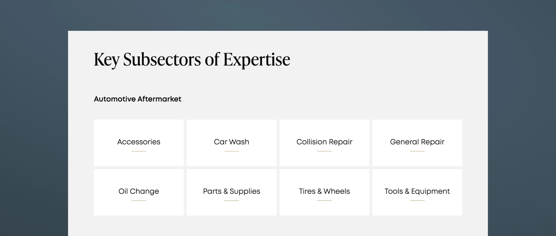
One especially important insight is the value of filterable, standardized portfolio structures. When investments are sortable by geography, sector, or status, and each entry follows a consistent format, users grasp scale and focus at a glance. Applied more broadly, this same logic enhances clarity across the entire site.
3. Present the Portfolio in a Way That Makes the Platform Legible
For multi-market firms, the geographic footprint is often a core part of the story, but it rarely gets the structured treatment it deserves. Instead of scattered references across pages, the strongest platforms:
- Consolidate geographic presence into one coherent visual or section
- Standardize how markets are described
- Connect geography back to the strategy (not just as a map, but as a narrative device)
- Avoid asset-photo overload in favor of selective, purpose-driven visuals
Executives may think of footprint in terms of history or deal volume; visitors need to understand focus, pattern, and repeatability. Design structure is what reveals that.
When to Use Sub-Brands — And When Not To
Some multi-market platforms consider sub-brands for certain verticals or specialized businesses. The question is not whether sub-brands are “good” or “bad,” but whether they help clarify — or complicate — the story.
Sub-brands make sense when:
- A vertical has a distinct operating model
- An approach requires a different disclosure framework
- A specialized audience needs tailored messaging
- There is genuine differentiation in market positioning
In these cases, sub-brands should feel like a natural extension of the parent identity, not a departure from it.
This design principle allows sub-brands to create clarity without sacrificing cohesion. A parent brand establishes authority and continuity, while sub-brands provide specificity where it’s truly needed.
Sub-brands do not make sense when:
- They fragment what should be a unified narrative
- They create confusion internally or externally
- They obscure the core strategy instead of illuminating it
More often than not, platforms benefit from better hierarchy, clearer segmentation, and more intentional UX long before they benefit from formal sub-branding.
"A well-designed sub-brand shouldn’t compete with the parent brand. It should harmonize with it — visually, structurally, and tonally — so the overall ecosystem feels intentional rather than fragmented." — Anastasiia Kharytonova, Head of Design at Darien Group
Why This Matters for Institutional Audiences
Institutional allocators and advisors don’t expect a multi-market story to be simple — they expect it to be coherent. A website that reflects operational discipline signals organizational discipline. A messy, unclear, or overly asset-heavy website signals the opposite.
When multi-market platforms get the digital narrative right, they:
- Reduce interpretive burden
- Highlight strategic focus without oversimplifying
- Make scale legible
- Clarify the roles of each strategy or vertical
- Create consistency across audience groups
- Strengthen perceived maturity
In a category where differentiation is increasingly defined by clarity, not volume, a well-architected digital experience becomes a strategic asset.
The Takeaway: Complexity Isn’t the Problem. Communication Is.
Multi-market real estate platforms have rich, powerful stories, but those stories need structure to land.
A website is more than a brochure. It is the architectural expression of the firm’s strategy.
When the digital environment:
- establishes a clear organizational map,
- uses hierarchy to guide different audiences, and
- presents the footprint in a way that’s genuinely interpretive,
the platform becomes legible, compelling, and institutionally credible.


