

Why “Small but Mighty” Investment Banks Need a More Intentional Digital Presence


In the middle market, many of the smaller investment banks consistently outperform expectations. They win competitive mandates, generate standout outcomes, and deliver senior‑level attention. Yet when we evaluate their digital presence, a surprising pattern emerges: the website often communicates far less scale, sophistication, and capability than the firm actually possesses.
This is not because these teams lack accomplishments. It’s because the mid-market has historically underinvested in digital storytelling. Relationships, reputation, and repeat sponsors carried the brand, but in today’s environment — where founders vet advisors online before taking a meeting, sponsors compare websites when deciding which banker to refer, and junior talent evaluates firms based on digital signals — the website has become a primary proxy for credibility.
The Perception Gap: When Outcomes Say One Thing, but the Website Says Another
Small and mid-sized investment banks tend to have three advantages that larger platforms may struggle with:
- Senior attention and consistency
- Deep specialization in chosen sectors
- Faster, tighter execution with fewer handoffs
But these strengths rarely surface in the digital experience. Instead, many sites rely on:
- a dated visual system,
- an overloaded tombstone grid,
- generic sector descriptions,
- minimal team visibility,
- and undifferentiated claims about “full-service M&A advisory.”
This creates a perception gap between who they are and who they appear to be online.
To close that gap, firms need a digital presence that communicates scale, precision, and institutional polish, even if the firm is intentionally lean.
Digital Signals That Convey Scale (Without Pretending to Be Bigger Than You Are)
The goal isn’t to masquerade as a bulge-bracket bank. It’s to communicate capability in a way that reflects the quality of the actual work.
Below are the digital cues that consistently make mid-sized firms feel larger, more established, and more institutionally credible.
1. Visual Restraint and Modern Aesthetics
Investment banks tend to default to dense pages, long paragraphs, and dated corporate templates. But restraint reads as confidence. Clean whitespace, modern typography, and disciplined color palettes immediately reposition a firm as more sophisticated.
2. Thoughtful Tombstone Presentation
Most banks simply stack transactions into a grid. High-performing firms categorize, filter, or sequence tombstones in ways that tell a more strategic story — by industry vertical, transaction type, or recurring sponsor relationships.
3. Clear Specialization Narrative
The best mid-market firms win because they are sector experts. The site needs to show, not just say, what those sectors are, how deep the expertise runs, and how the firm’s insight drives execution quality.
4. Robust Team Identity
Lean teams are a feature, not a bug. Senior attention is a differentiator. High-quality photography, thoughtful bios, and clear roles communicate stability and hands-on execution.
5. Process Transparency
Founders and sponsors often care as much about how the firm works as what the outcome history is. Even a simple three-step “process philosophy” can dramatically increase perceived institutional maturity.
Take at look at the BlackArch Partners website. This website is a great example of ticking all of the boxes above and truly standing out from the crowd.

How Smaller Firms Accidentally Signal “Boutique” Instead of “High-Caliber Specialist”
“Boutique” is not an inherently negative descriptor, but in investment banking, it carries connotations that don’t always serve firms well — limited resources, lighter coverage, or narrower reach.
Below is a table we often use to help firms understand where signals misfire:
Case Studies, Team Architecture, and Strategic Messaging: The Three Levers That Matter Most
From our work with mid-market banks, we’ve found three elements that disproportionately influence external perception:
1. Case Studies With Strategic Framing
Not just “sold X to Y.” But:
- what the client’s goals were,
- what the market context looked like,
- what differentiated the process,
- what outcome was achieved.
This transforms tombstones into evidence of thinking.
2. Team Architecture That Communicates Coverage and Continuity
When founders or sponsors view a team page, they’re looking for:
- senior involvement,
- sector experience,
- continuity across execution,
- and enough bench depth to run a process without strain.
Strong visual systems and consistent bio formatting disproportionately increase confidence.
3. Messaging That Explains Why the Firm Wins
Most mid-market banks win for one of three reasons:
- tighter execution,
- deeper specialization,
- or cultural alignment with founders.
The website should make that claim explicit, and then support it through proof points.
Closing Thought
The mid-market has a remarkable number of firms that are, in truth, “small but mighty.” Their outcomes rival much larger competitors. Their execution is tighter. Their client relationships run deeper.
The website should reflect that. Not through exaggeration. Through clarity, intentionality, and design discipline.
Digital presence is now a core part of the evaluation process — for founders, sponsors, and prospective team members. A sophisticated firm deserves a sophisticated digital expression.
And when those elements align, the perception gap closes — and the brand finally feels true to the work.
Read More

AI Is Now Embedded in Early Deal Work
As private equity looks toward 2026, artificial intelligence has moved decisively out of the “experimental” category. What began as pilot programs and isolated tools has become embedded in the way many firms approach early-stage deal work. According to Deloitte’s most recent global survey on generative AI in M&A, a majority of corporate and private equity respondents report active use of AI during strategy development, market analysis, target screening, and diligence preparation. Many of these firms are not testing at the margins — they are committing material annual budgets and expecting near-term operational impact.
This shift matters because it changes how preparation happens. Investment teams are using AI to review prior materials, summarize markets, compare targets, and assemble internal perspectives faster than before. Banks and advisors are doing the same. By the time a meeting is scheduled, much of the framing work has already occurred.
AI is not replacing human judgment, but it is shaping the starting point for it.
First Impressions Are Forming Earlier
The most important consequence of AI adoption is not speed, but timing. Evaluation is beginning earlier in the process, often before direct engagement. As AI tools ingest public-facing information — websites, firm descriptions, strategy language — they produce summaries and comparisons that influence where attention is directed.
Private Equity International has documented AI’s growing role across the private markets lifecycle, including fundraising and sourcing. In practice, this means firms are increasingly encountered first through synthesized views rather than conversation. Those synthesized views tend to reward clarity and penalize ambiguity.
By 2026, firms that assume their first real impression occurs in a meeting are likely to be surprised. In many cases, that meeting is already shaped by what was understood — or misunderstood — beforehand.
Why Context-Dependent Positioning Struggles
Many private equity strategies are nuanced by design. They reflect evolution over time, hybrid approaches, or subtle distinctions relative to peers. These narratives often work well in person, where explanation and dialogue fill in gaps.
They work less well when evaluated quickly and comparatively. AI-assisted review does not pause to ask clarifying questions. It extracts what is explicit and moves on. Positioning that relies on implication or assumed familiarity can be flattened or misread.
This does not mean firms should simplify their strategies. It means they should articulate them more deliberately, with fewer assumptions about what the reader already knows.
What Firms Should Be Adjusting Now
The firms adapting most effectively are not increasing volume. They are tightening expression. They are refining how they describe their mandate, where they sit in the market, and what they prioritize — so that those ideas hold up even when read without explanation.
AI has not changed the fundamentals of private equity judgment. But it has moved the point at which judgment begins. Firms that adjust for that reality will find conversations starting further along.
Investment banks have one of the most unusual digital challenges in professional services. They are high‑trust, high‑stakes advisors operating in a category where almost every firm sounds the same. Yet when we review websites across the industry, the gap isn’t just in the language. It’s in the structure.
Many banks simply don’t give visitors the pages, pathways, or hierarchy they need to understand the firm quickly. In an environment where founders, sponsors, and strategic buyers often form first impressions digitally, website architecture needs to do as much work as messaging.
This post breaks down the foundational pages every investment bank needs, regardless of size, sector, or specialization.
Why Website Structure Matters More for Investment Banks Than Most Realize
Investment banking is a category defined by information asymmetry. Prospective clients want to know:
- Does this firm understand my sector?
- Do they have the team depth to run my process?
- What outcomes have they delivered?
- How do they actually work with clients?
However, they rarely ask these questions explicitly. They infer the answers by how the site is built.
From our work with investment banks, four patterns consistently emerge:
- Founders want reassurance the firm has handled situations like theirs.
- Sponsors want proof of repeatability and specialization.
- Management teams want to see the people behind the pitch.
- Buyers want confidence in clarity and professionalism.
The right set of pages addresses all four.
The Five Essential Pages Every Investment Bank Needs
1. About Page: The Anchor of Credibility
The About page is usually the second-most-visited page on any bank’s site and often risks being too brief, too broad, or too generic.
A strong About page should clearly address:
- What the firm believes (values, orientation, and approach)
- How the firm works (philosophy, engagement model)
- Why the firm wins (sector focus, execution track record, differentiation)
- What clients can expect (senior attention, process architecture, communication style)
2. Industry Verticals: The Proof of Specialization
Specialization is one of the strongest differentiators in today’s mid-market M&A landscape. But many banks bury their sector expertise or present it as a simple list.
A robust verticals structure should:
- Offer individual pages or sections for each sector
- Highlight patterns of expertise (recurring themes, value drivers, buyer ecosystems)
- Include representative tombstones or case summaries
- Translate expertise into practical insight (“Here’s how deals in this industry behave”)
A simple but powerful table often helps:
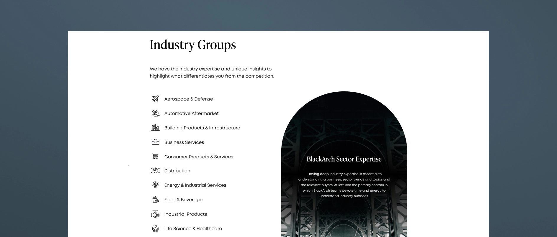
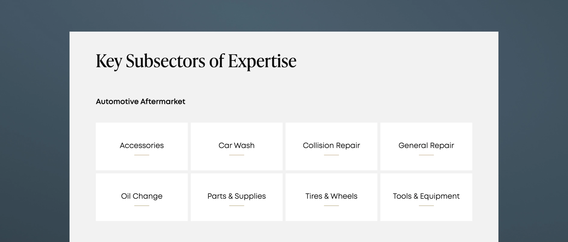
Take a look at middle-market investment bank, BlackArch Partner's website. The firm's "Expertise" page features both a high-level snapshot of their industry groups as well as clickable full pages for each sector. The internal pages feature market perspective, key subsectors, selected transactions and case studies, and a call to action to contact the dedicated sector team.

3. Transaction Experience: More Than a Tombstone Wall
Tombstones are a core part of banking history, but a grid of logos isn't enough to tell a meaningful story.
A strong transaction experience section does three things:
- Shows breadth and repeatability across sectors and transaction types
- Allows filtering (by sector, deal type, or year) to help visitors find relevance
- Incorporates case narratives to show how the firm thinks, not just what it has closed
The difference in perception between tombstones alone and tombstones paired with narratives is dramatic. The latter transforms activity into competence.
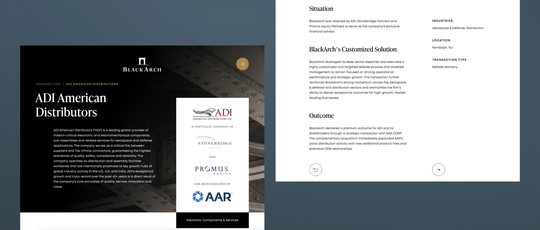
BlackArch Partners takes an intentional approach here as well. Clean filtering, search capabilities, and buildout of select transactions into full case studies.
4. Team Page: The Most Underestimated Source of Trust
Banking is relationship-driven. People make the decisions, run the processes, and drive the outcomes. Yet the industry’s team pages are often generic and inconsistent.
High-performing team pages include:
- Professional photography (aligned, modern, consistent)
- Clear bios with sector focus, transaction experience, and relevant history
- Logical grouping (leadership, bankers, operating specialists, advisory roles)
- Signals of stability including tenure, growth, continuity
Founders and sponsors profile teams the same way investors profile GP teams: they look for cohesion and credibility.
5. How We Work: The Page Most Banks Don’t Realize They Need
This page, sometimes called Process, Philosophy, or Approach, is the one that transforms a site from informative to persuasive. It answers a simple but critical question:
“What is it like to run a process with you?”
A strong How We Work page includes:
- Process pillars (e.g., preparation, positioning, outreach, negotiation)
- What differentiates the firm’s execution
- How the team collaborates internally
- How they communicate with clients
This page is invaluable to founder-led businesses, who often lack context for how M&A processes unfold. It builds comfort early, which increases conversion.
The Optional Sixth Page That Increasingly Matters: Insights
Middle-market investment banks don't need a fulsome content engine, but two to four thought pieces per year can:
- demonstrate sector authority
- support SEO
- reinforce specialization
- give bankers content to use in outreach
- shape early impressions for founders and sponsors
This page is optional, but for many firms, increasingly strategic.
Closing Thought
The power of these five (or six) pages isn’t in any one page individually. It’s in how they form a structured, intuitive story:
- Who you are
- What you specialize in
- What you’ve accomplished
- Who’s doing the work
- How you work
When investment banks build their sites around these pillars, perception shifts. The firm feels:
- clearer
- larger
- more sophisticated
- more intentional
- more trustworthy