.jpg)
Private Equity Website Checklist (2026)


Private equity websites are no longer passive reference points. By 2026, they function as evaluation tools — often reviewed before a meeting is scheduled, sometimes without context, and increasingly through intermediated workflows that include AI-assisted research and internal summaries.
This checklist reflects how private equity websites are actually being used today, and what they need to do to remain effective in the year ahead.
1. Clear Firm Description Within the First Screen
A visitor should be able to answer three questions immediately:
- What type of firm is this?
- What does it invest in?
- How is it different from similar firms?
If these answers require scrolling, clicking, or inference, the site is already underperforming. By 2026, clarity at first glance matters more than elegance or storytelling depth.
2. Explicit Strategy and Mandate Definitions
Many firms assume their strategy is self-evident. It rarely is.
Each strategy or vehicle should be described plainly:
- Asset class
- Geography
- Typical deal size
- Role in the capital structure
- How capital is deployed (funds, co-invests, secondaries, etc.)
Avoid internal shorthand. Write as if the reader has no prior context.
3. Logical Structure for Multi-Strategy Firms
For firms with multiple strategies, structure matters as much as content.
Best practices include:
- Separate pages for each strategy
- A clear hierarchy showing how strategies relate to one another
- Language that explains why the platform is structured the way it is
If a sophisticated reader struggles to understand how the platform fits together, the structure needs work.
4. Messaging That Reflects the Current Firm — Not the Founding Version
Many websites reflect who the firm was at launch, not who it is today.
Review the site for:
- Strategies that no longer exist
- Language that undersells scale or maturity
- Positioning that assumes captive capital or limited visibility
A firm that has evolved operationally but not narratively creates confusion rather than confidence.
5. Team Pages That Show Credibility Without Excess Detail
Team pages remain one of the most visited sections of PE websites.
Effective team pages:
- Clearly show roles and responsibilities
- Distinguish leadership from execution
- Avoid long, résumé-style biographies
The goal is orientation, not exhaustiveness.
6. Evidence of Activity Without Over-Disclosure
Private equity firms do not need constant publishing to appear active.
Instead:
- Include selected deals, investments, or partnerships
- Use concise descriptions focused on relevance, not promotion
- Avoid placeholder language (“leading,” “best-in-class,” etc.)
By 2026, precision carries more weight than volume.
7. Website Content That Can Be Read Without Explanation
Assume the site will be encountered without an introduction.
Ask:
- Would this make sense to someone outside our network?
- Could a third party summarize this accurately?
- Are key points explicit or implied?
If the site depends on verbal explanation, it is vulnerable to misinterpretation.
8. Durable Language That Avoids Time-Bound Claims
Claims tied tightly to market conditions age quickly.
Favor:
- Structural advantages over short-term performance
- How the firm operates rather than what it expects
- Enduring principles over temporary narratives
This improves longevity and reduces the need for frequent rewrites.
9. Design That Supports Hierarchy, Not Decoration
Design should make information easier to absorb, not more impressive.
Key considerations:
- Clear typographic hierarchy
- Consistent spacing and layout
- Restraint in animation and visual effects
A site that looks modern but feels disorganized will not age well.
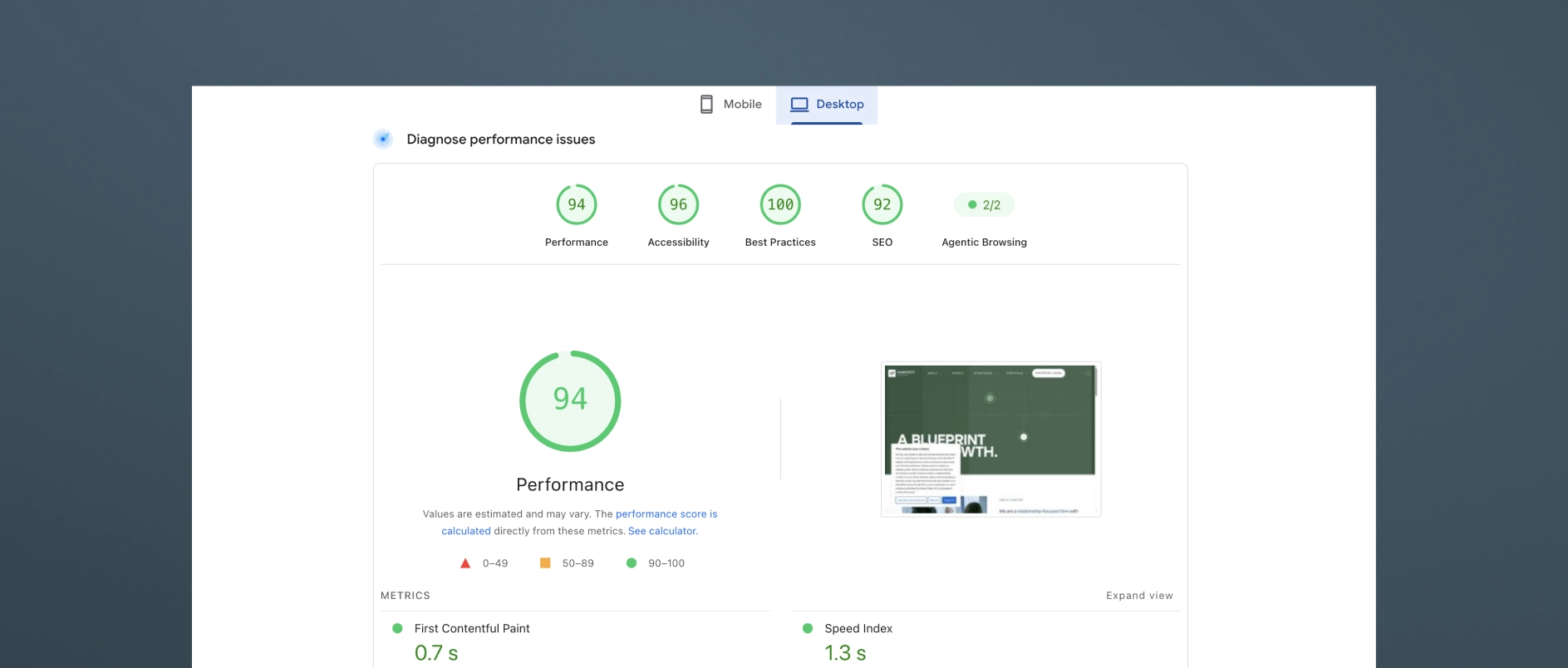
10. Strong Performance, Security, and Accessibility
By 2026, baseline technical standards are non-negotiable.
Ensure:
- Fast load times across devices
- Secure hosting and regular updates
- Accessibility compliance
- Clean code that supports future expansion
These elements are rarely noticed when done well — and immediately noticed when they are not.
11. Hosting and Maintenance Plan in Place
A private equity website should not be a “launch and forget” asset.
Confirm:
- Ownership of hosting and CMS access
- Ongoing maintenance responsibility
- Clear process for updates and fixes
Operational clarity prevents delays and dependency issues later.
12. Preparedness for AI-Assisted Reading
Increasingly, firm websites are parsed by tools that summarize, compare, and extract meaning.
To support this:
- Use clear headings and structured content
- Avoid vague or purely aspirational language
- Make key facts explicit and easy to identify
- Implement backend schema and other AI optimization tools to improve how content is interpreted and summarized
The goal is not optimization for machines alone, but clarity that works for both humans and systems.
13. Consistency With All Firm Materials and Communications
The website should align with every other touchpoint, whether publicly available or shared only with LPs, founders, or intermediaries.
This includes:
- Pitch decks and presentations
- One-pagers, factsheets, and transaction materials
- ESG reports, year-in-review pieces, and recurring publications
Firms should ensure that anyone who encounters the website can expect the same brand, narrative, and positioning across all other materials they may come across. Inconsistency creates confusion and unnecessary follow-up questions.
14. Ability to Evolve Without a Full Rebuild
A well-built site should accommodate:
- New strategies
- Team growth
- Updated disclosures
- Additional content
If every change feels disruptive, the underlying system is too rigid.
Final Check: Does the Website Reduce or Create Work?
A strong private equity website should:
- Answer common questions before they are asked
- Reduce time spent explaining basics
- Support — not complicate — conversations
By 2026, a private equity website cannot be treated as a standalone deliverable. It is one part of a broader communication system that includes investor materials, transaction collateral, reporting, and ongoing content. When that system is coherent, the website reduces friction, answers questions early, and supports better conversations. When it is not, the website becomes another surface where inconsistencies show up.
The firms that get this right are not the ones chasing trends or overproducing content. They are the ones investing in clarity, structure, and durability — so that every touchpoint reinforces the same narrative, regardless of who encounters it or how.
Darien Group works with investment managers to design and maintain those systems. Our role is not just to launch websites, decks, or materials, but to help firms establish a clear narrative and visual foundation that holds together over time and across use cases. In a market where evaluation happens earlier and often without context, that cohesion is no longer optional — it is foundational.
Read More
What Makes a Private Equity Website Effective in 2026?
An effective private equity website in 2026 does three things simultaneously: it communicates the firm's investment thesis clearly to prospective LPs, it builds credibility with management teams evaluating the firm as a partner, and it performs well in AI-driven search environments where a growing share of early-stage research now happens.
Most PE firm websites fail on at least two of these three dimensions. They either communicate well to institutional LPs but ignore management teams, or they look credible but are structured in ways that make them invisible to generative AI research tools, or they address both audiences but bury the thesis under generic language and a logo grid.
The firms getting this right are treating their websites as frontline capital-raising assets - not digital business cards.
Why Have the Standards for Private Equity Websites Risen So Dramatically?
Three forces have converged to raise the bar.
LP due diligence now begins online. Institutional allocators, family offices, and wealth managers conduct significant digital research before reaching out to a GP. They are reading the firm's website, its team bios, and its thought leadership - and forming a strong preliminary view before its IR team knows they exist. A poor first digital impression may mean no call at all.
The private/public market convergence is expanding the audience. As private equity firms move into wealth management channels, defined-contribution platforms, and retail-access structures, the audiences evaluating PE websites now include financial advisors and individual investors alongside institutional LPs. These audiences evaluate firms differently and expect more accessible communication.
AI search tools have changed how research begins. Generative AI assistants increasingly answer investor questions directly rather than returning lists of links. PE firms whose websites are structured with clear content, specific language, and proper technical architecture are being surfaced as authoritative sources. Firms with vague or generic content are becoming invisible.
What Are the Most Important Pages on a Private Equity Website?
Every PE website needs five core pages, or sections, to communicate effectively with its key audiences.
Homepage. The homepage should answer “why this firm” within the first scroll. It should communicate the investment thesis, signal the firm's sector or strategy focus, and give each audience type a clear path forward. It is not a place for history or a logo grid - those come later.
Strategy or approach page. This page unpacks the investment thesis in detail: sourcing approach, target profile, decision criteria, and value creation framework. This is the page institutional LPs evaluate most carefully. Specificity here is a significant differentiator.
Portfolio page. The portfolio page should demonstrate thesis consistency and value creation, not just list logos. Case studies or sector-organized portfolio presentations outperform logo grids by a significant margin in terms of credibility and engagement.
Team page. The team page is where trust is either built or lost at the individual level. Bios should communicate operating experience and judgment, not just credentials.
Contact page. The contact page should reinforce the firm's identity and make the next step feel specific and human. A bare form with no context is a missed opportunity at precisely the moment a motivated prospect is deciding whether to reach out.
What Should the Homepage of a Private Equity Website Lead With?
The homepage should lead with the investment thesis - not the firm's history, founding year, or fund count.
Most PE homepages default to leading with the firm's credentials: “Founded in 2005. $3B AUM. 45 investments.” This information is not unimportant, but it answers the wrong question. A sophisticated visitor does not need to know how long the firm has been operating before understanding why it exists and what makes it the right partner.
What a visitor needs first is a clear answer to three questions: what does this firm believe, where does it invest, and how does it create value? That is an investment thesis, and it should be the organizational principle of the homepage - not a section buried below the fold.
The homepage headline should express a point of view. The supporting copy should make the thesis specific. The visual design should reinforce it. Everything on the page should work together to answer “why this firm” before it asks the visitor for anything.
How Should a Private Equity Website Present the Portfolio?
A PE website should present the portfolio as proof of the thesis, not as a list of credentials.
A row of portfolio company logos communicates very little. It does not show what the companies have in common, what role the firm played in their development, or what pattern the portfolio represents. For a management team evaluating the firm as a potential partner, a logo grid tells them nothing about what working with this firm is actually like.
The best portfolio presentations in 2026 do several things differently:
- Organize by thesis or sector rather than chronology or deal size, showing a consistent pattern of focus
- Include brief case context - two or three sentences about the situation, the firm's approach, and the outcome
- Highlight value creation levers - operational improvements, strategic pivots, add-on acquisitions, management team development
- Filter or tag by industry, geography, or deal type so different visitors can find the most relevant examples
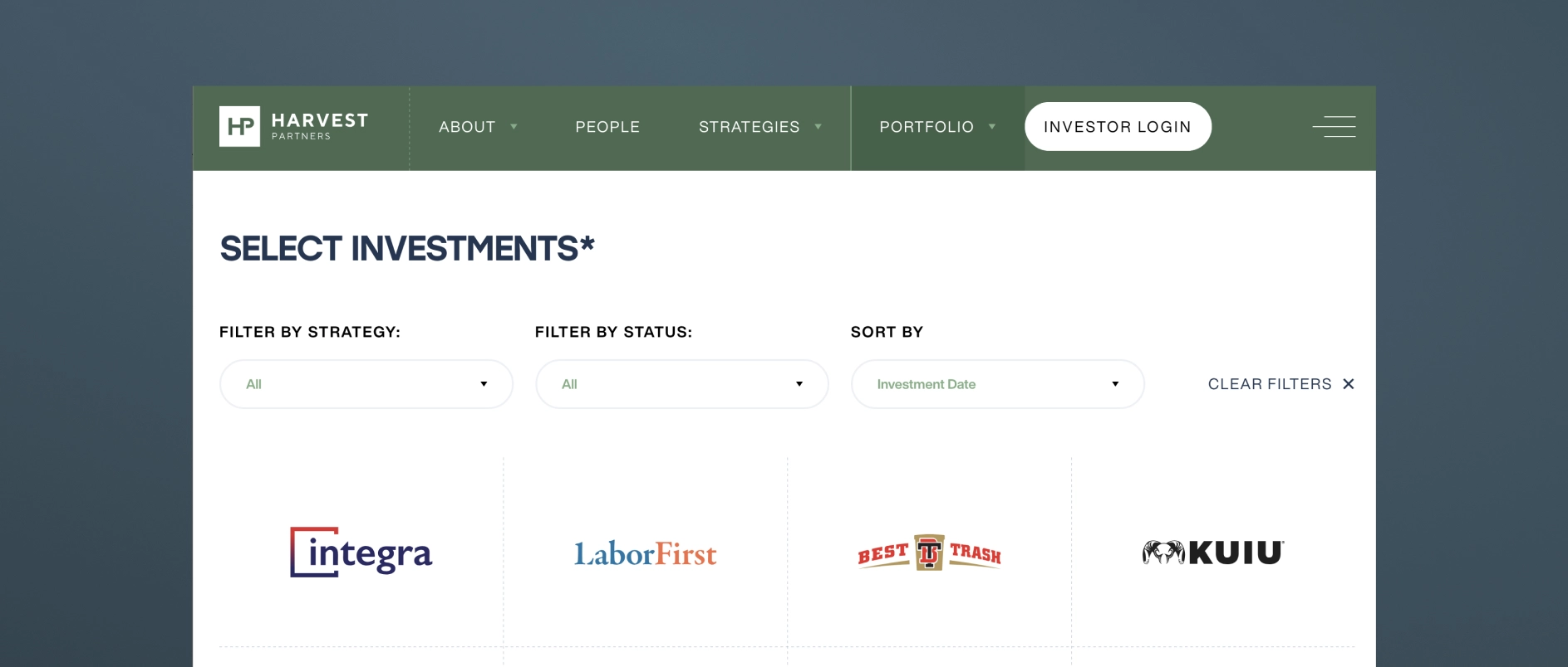
For firms with confidentiality constraints, thesis-level commentary, anonymized case studies, and sector analysis can achieve the same effect without disclosing sensitive deal information.
How Should Private Equity Firm Team Bios Be Written?
PE firm team bios should communicate judgment and operating experience, not just credentials.
The default approach - a third-person bio listing degrees, former employers, and board memberships - has become a signal of effort avoidance. It tells a prospective LP nothing about how this person thinks. It tells a management team nothing about what it would be like to be in a difficult situation with this person on the other side of the table.
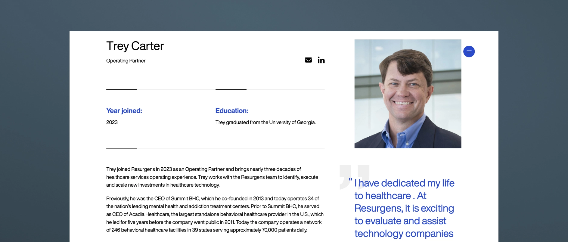
Effective PE team bios in 2026 share these characteristics:
- Written with a genuine voice, even in third person, that reflects the individual's personality and perspective
- Specific about operating experience in terms that are meaningful to management teams: not just “led the acquisition of X” but “guided a founder-led business through its first institutional ownership cycle”
- Honest about area of focus and what the person is specifically good at — not attempting to present every partner as a generalist expert in everything
- Accompanied by photography that feels real: candid, professional, human — not a stiff headshot against a grey backdrop
The team page is the moment on the website where the people behind the capital become real. The best ones make a visitor feel like they understand who they would be working with.
What is AI Search Optimization for Private Equity Websites?
AI search optimization (also called AEO - Answer Engine Optimization) is the practice of structuring website content so it can be understood, extracted, and cited by generative AI research tools.
In 2026, a growing share of research into PE firms happens through AI assistants — tools like Perplexity, ChatGPT, and Google's AI Overviews — that synthesize information from across the web and return direct answers rather than link lists. These tools favor content that is:
- Clearly structured with descriptive headings that read like questions or answers
- Modular - organized in short, self-contained sections that can be extracted independently
- Specific - containing concrete, accurate information rather than generic claims
- Well-formatted - with FAQ sections, numbered lists, and defined terms that AI tools can parse easily
- Technically sound - with proper schema markup, fast load times, and clean HTML hierarchy
PE firms that adapt their content for AI search are increasingly being cited as authoritative sources. Firms that don't are losing early-stage visibility to competitors who show up in AI-generated research summaries.
What Design Principles Apply to Private Equity Websites in 2026?
Private equity website design in 2026 follows five core principles.
Restrained sophistication. The aesthetic should feel like the firm: disciplined, clear, authoritative. Deep anchor colors, refined typography, generous clean space. Design that is impressive without being ostentatious.
Typography as a primary communication tool. In an industry where most communication happens through words, typeface selection and typographic hierarchy are the most important design decisions. Generic system fonts undermine the credibility that everything else is trying to build.
Imagery as evidence, not decoration. Stock photography of handshakes and skylines communicates nothing. Authentic team photography and real portfolio company imagery communicate genuine presence and operational depth.
Mobile-first performance. A significant share of LP research now happens on mobile devices, including during travel and between meetings. PE websites that are clearly built for desktop and awkward on mobile are unintentionally communicating that the firm has not thought carefully about its audience.
Speed and technical hygiene. Page load time, Core Web Vitals scores, and clean HTML structure affect both user experience and search performance. Technical quality is part of the design standard, not separate from it.
All websites done by Darien Group.
What Are the Most Common Mistakes on Private Equity Websites?
The homepage leads with history rather than the thesis. Founding year and AUM are credentials. They are not positioning. Leading with them signals that the firm has not done the work of articulating what makes it genuinely different.
The portfolio is a logo grid. As discussed above, logos without context prove nothing and differentiate nothing.
Bios are third-person credential lists. A bio that reads like a LinkedIn export tells a visitor nothing about the person. Judgment, voice, and specific expertise are what build trust.
There is no thought leadership, or it reads like a press release. Quarterly market updates and fund announcements are not thought leadership. They are content placeholders. Real thought leadership requires a point of view.
The site is not structured for AI search. Generic, unstructured content is increasingly invisible to the tools investors use for early-stage research.
There is no mobile optimization. If the site breaks or feels awkward on a phone, the firm is failing a meaningful share of its audience at first impression.
The contact page is just a form. A motivated prospect who reaches the contact page is already considering engagement. A bare form, without reinforcement of the firm's identity, is a missed opportunity for persuasion.
How Often Should a Private Equity Firm Update Its Website?
A PE firm's website should be reviewed for major updates on a 2-5 year cycle, with ongoing maintenance between reviews.
Ongoing updates (as they happen): New portfolio additions, team changes, thought leadership posts, and fund announcements should be reflected promptly. Outdated information damages credibility quickly - especially if an LP or management team notices a personnel change or portfolio update that is not reflected on the site.
Annual review: Assess whether the investment thesis language remains accurate and differentiated. Review the performance of thought leadership content. Evaluate design against current category standards.
Major redesign triggers: A new fund launch, a significant strategic pivot, a rebrand, or a substantial change in target audience are all appropriate triggers for a more comprehensive website overhaul.
Private Equity Website Best Practices Checklist:
Use this checklist to evaluate a current website or scope a new project.
Strategy and content
- Homepage communicates investment thesis within the first scroll
- Strategy or approach page explains sourcing, decision criteria, and value creation framework
- Portfolio page demonstrates thesis consistency, not just logos
- Team bios communicate judgment and experience, not just credentials
- Thought leadership content published within the last 90 days
- Content is structured for AI search: clear headings, modular sections, FAQ content
Design and experience
- Typography is distinctive and legible at all sizes
- Color palette is intentional and consistent across all pages
- Imagery is authentic - real team photography, real portfolio context
- Site performs well on mobile devices
- Page load time meets Core Web Vitals standards
Audience and architecture
- LPs can find strategy and team information within two clicks
- Management teams can understand the firm's value-add approach quickly
- Contact page reinforces the firm's identity and makes the next step clear
Darien Group works exclusively with investment management firms on brand strategy, visual identity, and digital presence. Contact us to discuss where your firm's design stands.
Most investor decks don't fail for a single reason.
Sometimes it is the design. The slides feel dated, inconsistent, or overly dense, and a cleaner visual system goes a long way.
But more often, the issue sits underneath that.
No one has made a clear decision about what the story actually is — so the deck tries to do everything at once. Strategy, track record, team, edge cases, caveats. It all gets layered in, slide by slide, until the presentation becomes harder to follow than it should be.
That's usually the moment when firms decide to “refresh the deck.”
And depending on the situation, that can mean very different things. In some cases, a design-led update is exactly what's needed. In others, the structure itself needs to be simplified, re-sequenced, and pressure-tested before design can really do its job.
The agencies below approach that spectrum from different angles. Some are pure design partners. Some operate more broadly across marketing and digital. And a smaller group works closer to the narrative itself.
If you're preparing for a fundraise or reworking core materials, understanding where your needs actually sit on that spectrum is what determines the right partner.
1. Darien Group: The Specialist Investor Presentation and Collateral Partner for All Capital Raising Firms
Darien Group is the only branding and communications firm built exclusively for investment managers. Our work centers on helping firms articulate a differentiated strategy, communicate clearly with LPs, and present a credible, cohesive identity across every touchpoint.
What makes Darien Group different:
Private-markets fluency
We work exclusively with investment managers. That specialization translates into deep understanding of fund strategy, value creation, LP expectations, GP-founder dynamics, and the nuances of middle-market fundraising.
Narrative-first strategy
Our team helps clients articulate why their strategy works - not just what they do. Positioning, messaging frameworks, and story architecture are designed specifically for LP, founder, and intermediary audiences.
Institutional investor materials
Pitchbooks, PPMs, AGM presentations, annual reports, quarterly updates, and fund overviews are built to an institutional standard, combining clarity, compliance alignment, and compelling structure.
Modular content & communication systems
We develop messaging frameworks and repeatable content structures that help investment managers communicate consistently. These systems align websites, pitch materials, and ongoing updates so a firm's story remains cohesive across every channel.
Boutique, high-touch model
Strategy, messaging, design, and execution are delivered by specialists who understand the expectations and pace of private-market teams.
Best for firms who need: a differentiated investment story, polished LP-ready materials across every touchpoint, full AGM support, and a partner with true fluency in investment management.
2. SlideGenius
SlideGenius is a presentation design agency that produces pitch decks and sales materials across a broad range of industries. Their specialty is visual design and slide sequencing, structured around sales psychology to guide a viewer through a decision. They work with clients across sectors rather than focusing exclusively on investment managers.
Best for firms who need: a professionally designed deck produced efficiently, with a structured, repeatable process and design-forward execution.
3. Superside
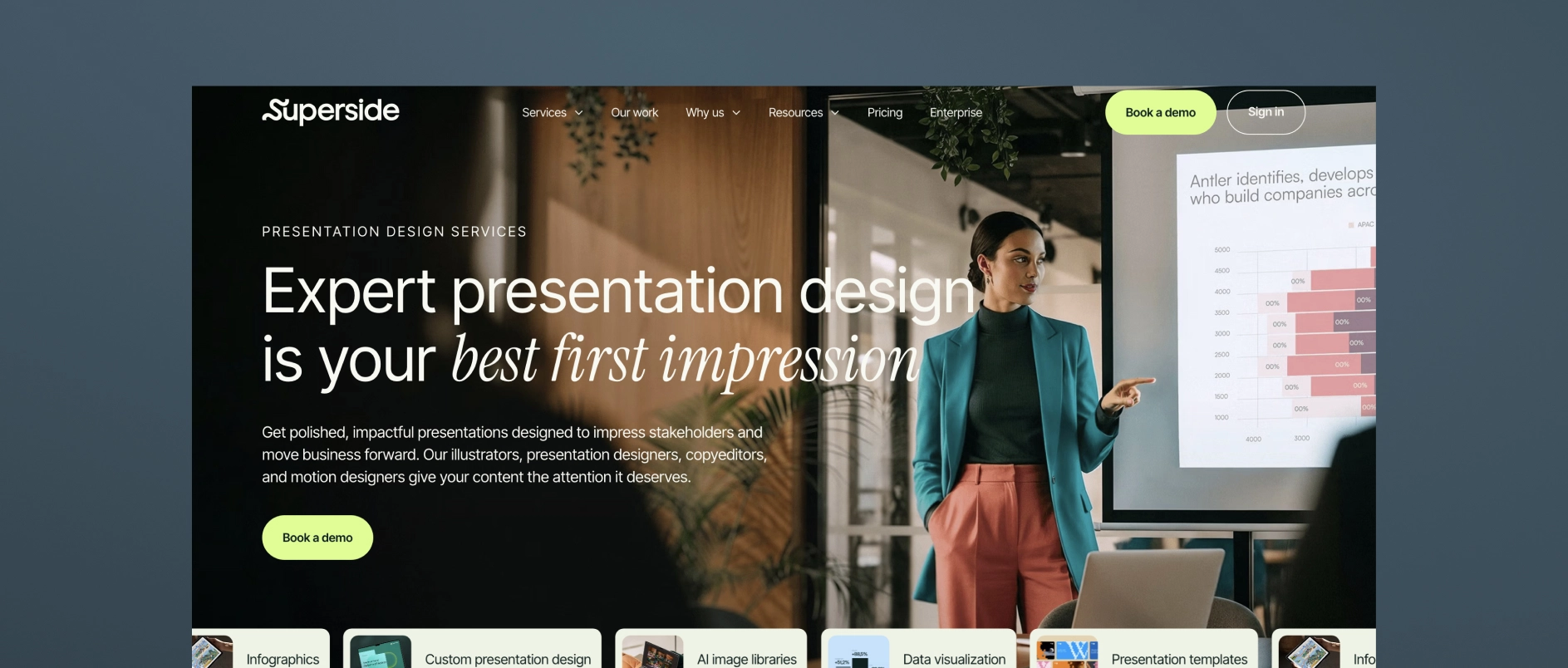
Superside is a subscription-based, “always-on” design company that provides presentation design as one of many creative services — alongside branding, video, web design, illustration, and more — for scale-up and enterprise clients across industries. Their presentation work spans templates, PowerPoint and platform-specific design, pitch decks, and sales presentations, with access to motion design, illustration, and video production layered in as needed.
Best for firms who need: fast turnaround on high-volume design requests, flexible access to a broad range of creative services under one subscription, and a scalable design bench rather than a single point of strategic counsel.
4. Williams Lea
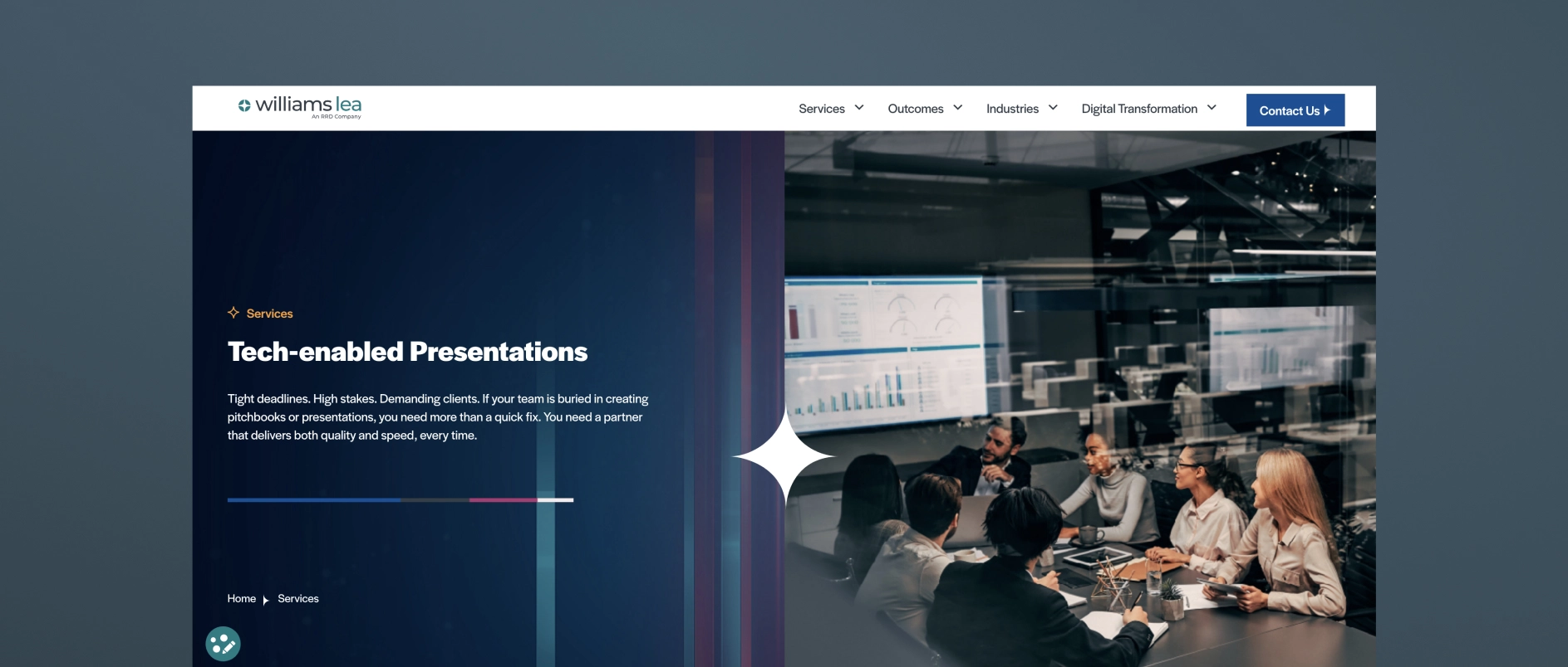
Williams Lea is a large, tech-enabled business process outsourcing (BPO) provider that offers high-volume pitchbooks and presentations as one line item alongside secretarial support, document processing, digital mail, billing support, and other back-office services. They serve financial, legal, and professional services firms specifically, and their presentation work centers on turning complex data into high-volume, tech-assisted pitchbook and PowerPoint output, often delivered under tight deadlines.
Best for firms who need: high-volume, fast-turnaround pitchbook production, execution capacity to supplement an internal team, and operational/formatting support across many other back-office functions.
5. MVP Design
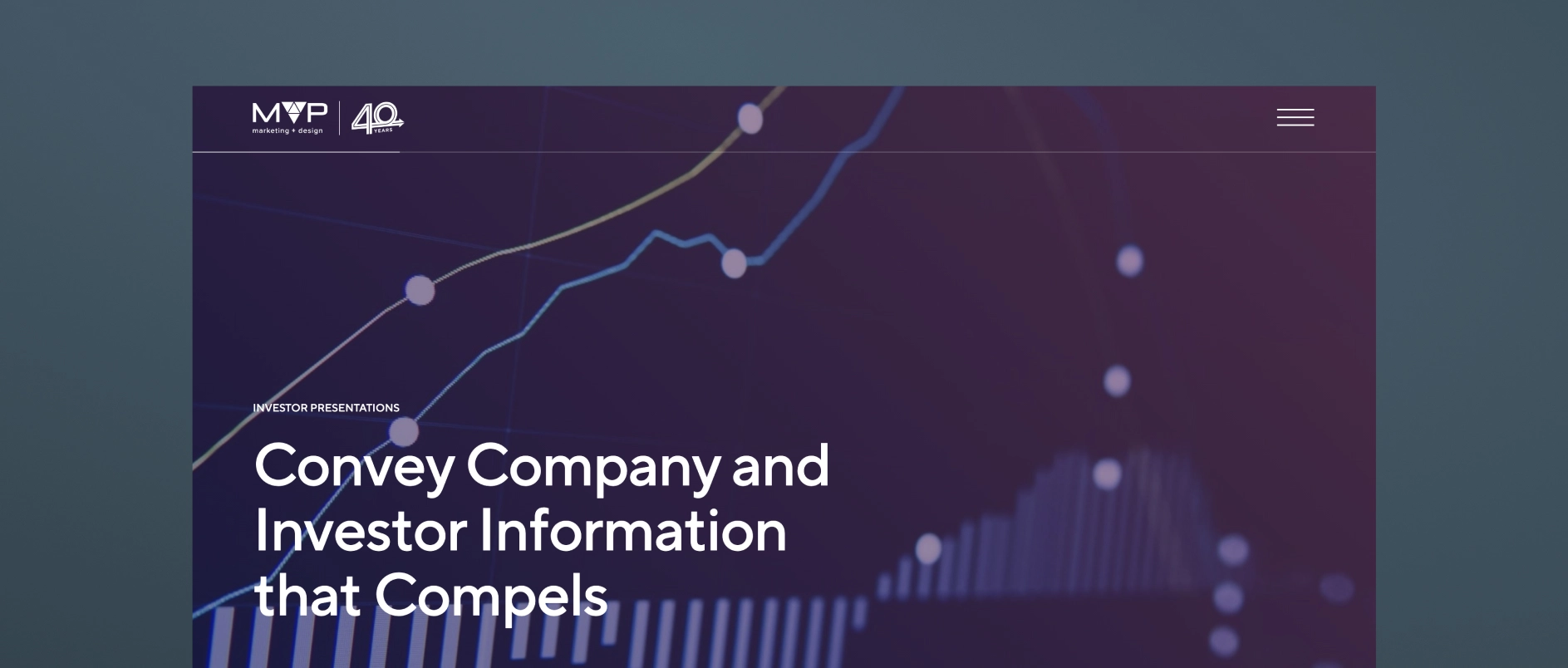
MVP (MVP Marketing + Design) is a Midwest-based marketing and design firm that works specifically with private equity, M&A, and lower-middle-market firms on investor communications. Their MVP PitchMate℠ process is built around custom investor and annual meeting pitch decks, as well as CIP (confidential information presentation) work, aiming to translate complex information into clear PowerPoint visuals.
Best for firms who need: PE/M&A-specific pitch decks, LPAC and annual meeting presentations, and a firm that pairs design execution with some sector-specific investor-communications experience.
6. Investor Creative
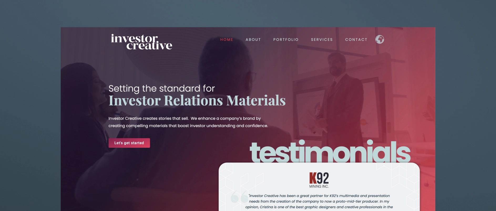
Investor Creative is a small, boutique investor relations design studio that creates presentations, websites, fact sheets, and branding materials for public and private companies. Their positioning is built around bridging the gap between a public company's limited in-house graphic capabilities and the learning curve required for a designer to understand investor appeal.
Best for firms who need: a single experienced designer who understands IR materials, presentation, and website refreshes for small-cap or junior public companies (especially resource/mining issuers), and an affordable, personal, long-term design relationship rather than a full-service agency team.
7. M'Idea Hub
M'Idea Hub is a Los Angeles-based, boutique presentation design agency positioned specifically around VC and PE investor communications. They combine strategy, storytelling, and high-fidelity design to create fund decks, LP updates, and AGM presentations.
Best for firms who need: fund decks, LP updates, and AGM presentations for VC and PE firms that want a specialist design-and-narrative partner without a broader branding/website scope.
8. Stinson Design
Stinson Design is a presentation design agency (Toronto-based) that has built meaningful experience in financial services and investor presentations, though it's not exclusively focused on the PE/institutional-LP niche. They've carved out a niche in investor presentations and financial storytelling, with a portfolio reflecting experience in capital markets and investment management, and clean, data-forward design suited to a financially literate, skeptical audience.
Best for firms who need: strong data-storytelling and design craft for roadshow decks, fund launch presentations, annual investor materials, or data-heavy financial analyses, from a team with real financial-sector reps but a more generalist client base overall.
9. PitchLift
PitchLift is a small, boutique fundraising and presentation agency based in Austin and Barcelona. Their services cover graphic design, financial modeling, branding, one-pagers, and investor planning.
Best for firms who need: startups and growth-stage companies (with some enterprise/fund work) needing a lean, strategy-plus-design partner.
10. Van York Agency
Van York is a Vancouver-based presentation and brand design agency built around end-to-end investor and B2B communications. Services span capital markets decks (IPO, SPAC, PIPE, private placement), private capital decks (seed through Series D, M&A, JV), investor relations materials (earnings, investor day, analyst day), and B2B sales/RFP decks — offering research-through-design presentation support in one shop, with fast-turnaround options.
Best for firms who need: capital markets, PE/real estate, and B2B firms needing research-through-design presentation support in one shop, with fast-turnaround options.
Darien Group works exclusively with investment management firms on brand strategy, visual identity, and digital presence. Contact us to discuss where your firm's design stands.
What Are the Major Design Trends in Investment Management Branding in 2026?
Investment management design in 2026 is moving away from the unintentional visual conventions that have dominated the category for decades - default color pairings assembled out of habit, globe marks, overstated stock photography, and logo-grid homepages - toward identities that are differentiated, specific, and technically sophisticated.
The shift is being driven by three pressures: more sophisticated audiences who can identify and discount generic presentations, the rise of AI-powered research tools that favor clearly structured, specific content, and a generational wealth transfer that is bringing new investors who respond to a different visual vocabulary of trust.
The firms investing in design as a strategic function are building durable competitive advantages. Firms still relying on category defaults are becoming harder to distinguish from one another.
What Design Approaches Are Becoming Outdated in Private Equity?
Unintentional color palettes with no secondary contrast
Blue is not going anywhere in investment management - and it probably never will. Navy, midnight, and deep cobalt remain among the most credible anchors available to a financial services brand. They carry deep-rooted metaphorical meaning: stability, trust, and long-term orientation. Many firms still design a significant number of blue-led identities, and that is likely to remain true for the foreseeable future.
What is shifting is not the presence of blue. It is the absence of intentionality around everything else. For most of the last thirty years, the default move was blue primary, gold or grey secondary, globe or abstract mark, conservative wordmark - assembled because it felt safe, not because it was chosen. The result is a category where the primary palette is credible but everything around it is interchangeable.
The firms building distinctive identities in 2026 are making deliberate choices about their secondary palette - the accent colors, typographic contrasts, and visual elements that give a blue-anchored identity its character. A deep navy paired with a warm terracotta. A midnight blue alongside a precise sage green. A charcoal-dominant palette with a single high-contrast amber used sparingly and strategically. These combinations still communicate authority. They also communicate that someone made a considered choice - and that considered choice is itself a differentiator in a category full of defaults.
The homepage that leads with the portfolio before positioning
The standard PE and asset manager homepage structure - hero image, tagline, brief firm description, row of portfolio logos - is not going away entirely, and the logo grid is not inherently wrong. Portfolio companies are legitimate proof of activity and sector focus. The problem is structural: when the homepage leads with portfolio before it has established strategy, differentiators, and mission, it answers the wrong question first.
What is shifting is the sequencing and the depth. Leading firms are opening with their investment thesis, their specific value-add, and their overall mission - giving a first-time visitor a clear reason to keep reading before they encounter any portfolio evidence. The portfolio then functions as proof of a position already established, rather than a substitute for one.
The other significant shift is where portfolio detail lives. Rather than compressing every company into a logo or a two-line description on the homepage, more firms are giving portfolio companies their own standalone pages with more detailed context about the business, the partnership, and the value-creation story. This serves multiple audiences better: LPs get thesis evidence with depth, management teams get a sense of what it actually looks like to be a portfolio company, and the firm gains SEO value from pages that can rank independently for company- and sector-specific searches.
Dense materials evolving toward deliberate hierarchy
The institutional investment industry has long treated density as a proxy for credibility, assuming that more information signals greater rigor. That instinct is not wrong. Depth matters, and sophisticated LPs want to know that the substance is there.
What is shifting is the presentation layer. Comprehensive information and scannable design are not in conflict, but they require different things. The content can be thorough; the structure needs to make the most important signals findable quickly. Leading firms are keeping the depth while adding hierarchy: clear section headings, generous white space, and a layout that guides a time-constrained reader to the most important points before asking them to go further. The rigor is still there. It is just no longer hidden inside a wall of text.
Stock photography evolving toward authentic, firm-specific imagery
Stock photography is not inherently problematic; it has served a practical purpose for firms that need to move quickly or work within tight budgets. The issue is specificity, or the lack of it. A handshake across a conference table, a glass-and-steel skyline from altitude, a professional looking satisfied at a laptop - these images could belong to any firm in any sector. They carry no information about who this specific team is, what kind of company they represent, or what the firm's culture feels like.
What is changing is the bar for what passes as sufficient. As authentic team photography and real operational imagery become more common across the category, stock imagery looks more obviously generic by comparison. Firms that have invested in their own photography, real team portraits, real offices, and real portfolio companies communicate genuine presence in a way that stock cannot approximate. The investment required is higher. The return on credibility is higher still.
Desktop-first builds evolving toward performance-first, multi-environment design
Desktop has always been, and remains, the primary environment where LPs conduct detailed research and review materials. A well-designed desktop experience is not something to avoid. What is expanding is the range of environments a firm's website needs to perform in simultaneously.
A significant and growing share of early-stage research now takes place on mobile devices. During travel, between meetings, in the margins of the day. AI search tools are indexing and synthesizing website content in ways that favor fast, cleanly structured pages. Core Web Vitals scores affect search visibility. Firms whose websites were built exclusively for a single environment are underperforming in the others. The evolution is not away from desktop quality; it is toward ensuring that quality carries across every context where a prospective LP or management team might first encounter the firm.
What Design Approaches Are the Leading Investment Management Firms Adding in 2026?
Intentional color systems with deliberate secondary palettes
The shift is not away from blue; it is toward intention. Leading firms are keeping the authoritative anchors that work (deep navy, midnight, charcoal) and pairing them with secondary palettes that have been genuinely chosen rather than defaulted to. The result is an identity that still signals stability and trust, but also signals that someone has considered decisions about how the firm presents itself.
In practice, this looks like: typographic systems that feel editorial, not corporate; a single accent color used with restraint that gives the identity a memorable quality; design systems built around specific rules rather than assembled from templates. The overall effect is a firm that conveys institutional quality while also showing it has a point of view - and that point of view extends to how iфt presents itself visually.
Thesis-first homepage design
The homepage organized around the investment thesis - where value is created, how the firm creates it, and why that matters - is replacing the credential-first and portfolio-first structures that have dominated the category.
Thesis-first design requires doing the upstream work of actually articulating a specific, ownable point of view. Once that work is done, the design can be built around it: headlines that express a perspective, visuals that reinforce the sector or strategy focus, portfolio presentation framed as evidence of the thesis in action.

Information hierarchy and deliberate white space
The design trend moving through investment management in 2026 is explicit prioritization. The best materials and websites make deliberate choices about what matters most and design around those choices. Less is on each page. What is there is structured so that the most important points can be absorbed in a single scan.
White space is understood as a design decision, a way of signaling confidence in the content. Firms that design for scannability are not sacrificing depth. They are respecting their audience's time.
Authentic, high-craft photography
Investment management firms are investing in original photography: real team portraits that feel candid and human, photography of real offices and working environments, and imagery of portfolio companies that communicates genuine operational presence.
The standard for what looks “professional” has risen. A team photography shoot done well, with good lighting, natural expressions, and an environment that reflects the firm's culture, can sometimes communicate more about the people behind the capital than any number of credential lines in a bio.
AI-optimized content architecture
The design and content decisions that govern website structure are now inseparable from AI search performance. Sites built with clear hierarchy, modular sections, FAQ content, and proper schema markup are the same sites that perform best for human visitors. Clarity of structure is clarity of design. The technical and the visual are aligned.
Custom visual systems over generic icon sets
Firms investing in design are building visual systems - iconography, graphic elements, illustration styles, etc. - that are specific to their strategy and sector focus. A firm that invests in industrial businesses uses visual language that references precision and tangible operations. A credit manager communicates differently from a growth equity fund.
Custom visual systems require more upfront investment than licensing an icon set. They produce materials that feel different from the start because they look like they are communicating about something real.
What Are the Design Principles That Remain Constant in Investment Management?
Some design principles do not follow trends. These apply regardless of the year.
Clarity over cleverness. Investment management audiences are sophisticated, time-constrained, and skeptical of anything that feels like it is trying too hard. Design that is surprising in a way that makes the content harder to understand is not good design for this context. Craft should be in service of communication.
Authority without arrogance. The visual language of investment management must balance confidence with accessibility. Design that is too polished or slick can undermine trust by feeling more like marketing than substance. The best investment management design has the quality of a firm that is confident enough not to need to show off.
Consistency as an institutional signal. In an industry where trust is built over long periods, the consistency of a firm's visual identity - the sense that every piece of communication comes from the same source and reflects the same values - is itself a proof point. Inconsistency signals disorder. Consistency signals discipline.
Typography as the primary design vehicle. In an industry where most communication happens through words, typography is the single most important design decision a firm makes. Typeface selection, typographic hierarchy, and spacing communicate personality, authority, and sophistication more directly than any other visual element. Firms that invest in thoughtful typographic systems build visual identities that work at every scale and in every format.
FAQs About Investment Management Design Trends:
How important is mobile design for PE and asset management websites? Increasingly important. A significant share of LP research now happens on mobile devices, including during travel and between meetings. Sites that perform poorly on mobile are failing a growing proportion of their audience at the moment of first impression.
Should investment management firms use dark mode website designs? Dark mode designs can work effectively for certain types of investment managers — particularly those in technology or growth equity where a modern, tech-forward identity is appropriate. For most traditional asset managers and PE firms, light-mode designs with deep typographic contrast better serve the “institutional credibility” signal. The choice should reflect the firm's positioning, not just aesthetic preference.
Is minimalism still the right approach for PE website design in 2026? Yes, but with an important clarification. Minimalism in 2026 means deliberate reduction — making intentional choices about what to include and how to present it. It does not mean sparse or cold. The best PE websites are minimal in the sense that nothing is wasted, but they have warmth, character, and a genuine visual point of view.
How does a PE firm choose between a serif and sans-serif typeface for its brand? The choice should reflect the firm's positioning and audience. Serif typefaces communicate heritage, authority, and long-term orientation - appropriate for established firms with a track record emphasis. Sans-serif typefaces communicate clarity, precision, and forward orientation - appropriate for firms emphasizing operational capability or technology-adjacent strategies. Neither is categorically better; both require thoughtful execution.
What photography style works best for investment management team pages? Natural, documentary-style photography outperforms formal studio headshots for most investment management audiences in 2026. Photos taken in the firm's actual working environment - with real lighting, natural expressions, and some sense of context - communicate more authenticity and trust than staged studio portraits. The goal is to make the people on the team feel real and approachable to prospective partners, while maintaining professional standards.
How often should investment management firms refresh their visual identity? A full visual identity refresh is typically warranted every five to seven years, or when a major strategic shift — new fund strategy, significant leadership change, market repositioning - makes the existing identity misaligned with who the firm has become. Between major refreshes, ongoing attention to design quality in marketing materials, digital presence, and presentation materials maintains brand consistency without the disruption of a full rebrand.
The Design Opportunity in 2026
The foundations of investment management design - authority, clarity, consistency, trust - are not changing. What is changing is the standard for how well those foundations are executed, and the range of environments they need to perform in.
The firms building an advantage in 2026 are not throwing out what works. They are being more deliberate about every choice they make on top of it: the secondary palette that gives their identity character, the content sequencing that earns a first-time visitor's attention, the photography that makes their team feel real, the structural decisions that make their website readable to both humans and machines.
Each of those decisions is one their less deliberate competitors are not making. In a category where most firms still rely on defaults, intentionality compounds.
Darien Group works exclusively with investment management firms on brand strategy, visual identity, and digital presence. Contact us to discuss where your firm's design stands.
There is a particular kind of brand problem that does not announce itself. A firm grows, adds a new entity, and for a while, the two coexist without friction. Then something shifts - a fundraise, a strategic pivot, a push toward a new investor segment - and leadership realizes the two brands are not working together as seamlessly as they should, at least not as perceived externally.
This is the dual-brand problem. It comes up more than you might expect in investment management, and when it does, it is more complicated than a typical rebrand. The firm is not starting from zero. It is inheriting its own history.
What Is the Dual-Brand Problem in Investment Management?
The most common version goes like this. A firm launches with a core offering - a fund strategy, a platform, a service - and builds genuine equity in that brand over time. Then, as the business grows, it adds something new. A parallel fund. A capital markets arm. An institutional product alongside a more retail-facing one.
The two entities operate somewhat independently, and for a while, that is fine. But at some point, something shifts, and it becomes clear two “brands” are not working together. The newer entity has been living in something like stealth mode, borrowing credibility from the parent without ever establishing its own presence. The parent, meanwhile, is still being understood by outsiders the way it was understood years ago.
The question is not just how to refresh either brand. It is about how to connect them in a way that serves the business going forward.
Why Investment Firms Underestimate Their Own Perception Gap
One of the most consistent dynamics in dual-brand projects is that the people running the firm underestimate how little the outside world understands what the organization actually does.
This is almost unavoidable. When you have watched a firm grow through every phase, your mental model of it is rich and accurate. It is genuinely difficult to see the blank space that exists in other people's minds. But that blank space is almost always there.
Picture a sophisticated institutional investor who knows the market well, who tracks managers, who has done business adjacent to the firm - and when you describe what the organization does, something does not land. That is not a fluke. That is the brand gap, as it shows up in a real conversation.
The inverse version is equally common: within a particular ecosystem, a firm is very well known. Stakeholders in that world trust the name and understand what it stands for. But the firm is trying to grow beyond that ecosystem and attract a different kind of capital. In that broader market, the equity built in the home ecosystem does not transfer automatically. The story has not been told in a way that resonates with the new audience.
Both versions are addressable. Both require first admitting the gap exists.
Why Messaging Architecture Must Come Before Visual Identity
There is a predictable version of this project that starts in the wrong place. The firm decides it needs to update its look. The website feels dated. The materials have drifted apart. Someone saw a competitor's site and came back with strong opinions about typography.
These are not illegitimate concerns. But if you start a dual-brand project with the visual question, you will produce something that looks better without solving the underlying problem.
The sequence matters. Messaging architecture - what each brand stands for, how the two relate, what the hierarchy is, who each is speaking to, and in what voice - has to precede visual identity work. Not because messaging is more important than design, but because the design needs something to express. If you do not know what you are translating, the translation will not hold.
How Investment Managers Should Think About Repositioning Toward an Institutional Audience
Firms that have built real credibility in one segment of the market and are now trying to be understood as serious institutional players face a specific challenge. Institutional investors have calibrated instincts about what a credible manager looks like, sounds like, and acts like. A firm that built its reputation in a different part of the market may have internalized communication habits - how it describes its process, the language it uses across materials - that were exactly right for the original audience but now need recalibration.
The worst version of this project is when a firm tries to perform an institutional identity it does not actually have. Sophisticated investors see through that immediately, and the cost is worse than the original perception problem.
The better approach is to identify what is genuinely institutional about the firm's work - the rigor, the track record, the quality of the team - and foreground those elements while not abandoning the characteristics that made the firm distinctive. Often, those characteristics are differentiating in the institutional market precisely because most institutional managers do not have them.
The goal is not to sound like everyone else in the space. The goal is to be legible to that audience while remaining recognizably yourself.
What to Expect in a Dual-Brand Engagement
Stakeholder interviews will surface contradictions. The more people you talk to inside the organization, the more you will hear different versions of what the firm is and where it is going. This is not a problem. It is the work. The gaps between how different people describe the firm are exactly where the interesting strategic questions live.
The external view will be more disorienting than expected. Build in time to get honest input from people outside the organization: an IR contact, a placement agent, or a limited partner who will tell you the truth. Their version of your firm will likely differ somewhat from yours.
The emerging brand needs room to carry the legacy. If the parent brand has years of equity, the newer entity will live in its shadow for a while. That is a resource, not a problem. The brand architecture should explicitly address how the two entities relate and what credibility the newer one inherits.
Internal adoption is part of the project. The principals who will use this language in front of investors need to internalize it before it goes external. Not through formal training, but through genuine engagement with the process, workshops, review sessions, and iteration on drafts. The message only holds if the people representing it believe it.
Brand work in investment management has a reputation for being either superficial or overwrought. Done well, it is neither. It is the discipline of forcing clarity about things an organization believes about itself but has not yet learned to say.
For firms managing two brands at once, that clarity is not optional. It is the foundation for everything that follows.
Darien Group works exclusively with investment management firms on brand strategy, visual identity, and digital presence. Contact us to discuss where your firm's design stands.

Most annual meetings fail in the same place. The first half hour is good: the CEO opens, the head of IR frames the year, and there's real energy in the room. Then the portfolio review begins, and it doesn't stop. Company after company, or property after property, same template, same depth, same rhythm, for ninety minutes. By the third one, eyes glaze. By the tenth, the room is on its phones. This is the portfolio death march, and it's the most common thing wrong with an AGM.
It happens because firms treat the annual meeting as a fixed reporting ritual instead of a meeting they design. There is no standard AGM. The right length, the right format, even the right cadence depend on your firm, your book, and your LP base. The firms that inherit last year's structure by default are the ones that produce the meeting everybody endures. The only question that actually matters is whether your AGM reports or tells a story.
Fit the Firm, Not the Calendar
Start with who is in the room on your side. Some firms have principals who can stand up and hold an audience without notes, and for them, the deck can recede while the people carry the meeting. Other firms have excellent investors who aren't natural presenters, and for them, the deck has to do more of the work, carrying the structure and the narrative so the speaker can lean on it. Designing the same meeting for both is a mistake.
Then look at what there actually is to talk about, which changes every year. Is this a mature fund winding toward harvest, or an early one still deploying? Most AGMs cover more than one fund, which changes the shape again. And the meeting isn't only about fund performance: it's one of the better moments you get to talk about the firm itself, the capabilities you're adding, the people you're developing. Whether that's a single slide noting a few promotions or a deliberate account of how the organization is evolving is a real choice, and it should track what's genuinely happening rather than filling a slot.
How much you explain depends on your strategy and your audience. If you run Sun Belt multifamily, most of the people in the room have underwritten a hundred of those deals, and you don't need to teach them the asset class. If you're doing something genuinely esoteric, a specialty platform that's the only one of its kind in most of your LPs' portfolios, you have to take the time to educate, at the AGM and in your fundraise materials and on your website. Match the depth of explanation to how familiar your investors already are, and don't spend the room's attention teaching people what they already know.
From Reporting to Storytelling
Every AGM has a standard cast. The CEO or key principal opens. The head of IR takes a substantive turn. Investment professionals talk through their deals, operations people talk through the portfolio, and the CFO runs the financial review, which is dull and indispensable in equal measure. None of that is optional, and none of it is where the meeting is won.
The meeting is won in what you program around it. The more you can replace one more person standing in front of slides with a different texture, a conversation, a dialogue, a Q&A, the longer the room stays with you. Shoot video case studies that bring portfolio companies to life. Invite portfolio company management to speak on your behalf, which is more persuasive from them than from you. Run a fireside chat or a roundtable where investment professionals actually talk to each other about the market instead of reading to the audience. Some firms hand out clickers and run live audience polls, which is rare in this setting but works when it fits.
The strongest version of this makes the portfolio tangible. Take a hospitality fund that held its annual meeting at a resort the fund itself owned, so LPs slept in rooms their own capital had bought and saw the value-add work in the lobby and the food-and-beverage program in real time, years after the acquisition. That's not available to everyone. You can't walk LPs through an industrials platform that way. But if you have consumer exposure, you can set up a station with the actual products. If your assets don't lend themselves to it at all, you reach for the other tools: roundtables, video, richer market studies, anything that turns reporting into an experience. How you get from reporting to storytelling is the question every one of these meetings is really trying to answer.
On length, stop counting slides. Firms come to us proud that they've cut the deck to some tight number, and every slide has five hundred words on it: ten pounds of material in a five-pound bag. At Darien Group, we'd rather sit through two hundred sparse slides than fifty dense ones. Too long and too short are functions of monotony, not page count. The fix for a meeting that runs long is rarely fewer investments and usually more variation: snapshots for the positions that need them, deep dives for the few that earn them.
The Variables That Matter Less Than You Think
Cadence
Cadence is mostly settled. Annual is the default for roughly nine in ten firms. Every other year exists, but it's usually a small firm without the time to do it yearly rather than a deliberate strategy, and the longer gap just raises the burden to explain more when you finally convene.
The “Investor Day” Label
The investor-day label is mostly a rename. The term comes from the public markets, where a listed company holds an investor or analyst day to lay out its strategy for its shareholders, separate from its required annual meeting. Publicly traded managers hold real investor days for their own stock. When a private fund calls its LP meeting an investor day, it's borrowing the public-markets connotation, which leans more toward a forward strategy and platform than backward portfolio reporting. The name carries a slight posture. It doesn't change what the meeting has to accomplish.
Virtual and Hybrid
Virtual and hybrid have largely receded for funds. Don't confuse this with public-company shareholder meetings, which stayed virtual because they're governance formalities nobody wants to travel for. A fund AGM is the opposite: the one day a year your LPs get the exposure and the touchpoints they need to justify the bet they made on you, and they want to be in the room. Attendance has gone back to strong, which is why there's an AGM season in the spring and the fall, and nobody schedules one in August or near the holidays. Streaming an in-person meeting tends to cannibalize it, forcing you to shorten the agenda for whoever is watching remotely. There is one honest exception: a small, closely held, high-performing firm that sees its handful of LPs constantly can reasonably run a lean ninety-minute review and skip the production. If you're mid-sized or larger, or trying to grow, you need the room.
The Next Fund
Don't redesign the meeting around it. Deliver the thread plainly: that you expect to be back in market in a few quarters once you've deployed the next portion of the current fund, and that you'll be in touch. The macro case you're already making for the current fund does the pre-marketing work for the next one without anyone having to sell.
Reporting or Storytelling
The annual meeting is the one moment each year when everyone who backed you is in a single room, paying attention, deciding in some quiet way whether to do it again. Treat it as a reporting obligation, and it will read as one. Treat it as the best storytelling opportunity you get all year, designed for your firm and your book rather than copied from last year's agenda, and it does work; no quarterly letter can. The format is yours to choose. Most firms forget that.
Designing that meeting (the storytelling version, not the reporting version) is the work Darien Group does with investment managers every AGM season.
Every firm that does deals already knows what disorganization costs in front of its lawyers. Hand outside counsel a stack of unstructured documents and loose instructions, and the invoice reflects it. Tier and tighten that same material before it goes over, and the invoice shrinks. The variable was never the law firm's hourly rate. It was you.
An annual meeting works the same way, and it reveals the same thing. How a manager runs its AGM is a tell for how it runs investor relations the rest of the year. The single biggest determinant of whether the presentation lands, and of what it costs to build, isn't on stage. It's whoever owns the project inside the firm.
The Person Who Decides Isn't on Stage
At a smaller manager, it tends to be a managing partner or one of the top two or three executives. At a mid-sized firm, it's usually the head of investor relations. At a large one, it can be anyone on the IR team. The title matters less than the level. There's a level that works far better than the ones above and below it.
Put the head of IR in the seat, and you waste them. These are expensive people whose time belongs on LP relationships and the senior calls about what the firm is actually saying, not on trafficking edits to slide 84 for two months. Drag them into every detail, and you get a burned-out executive doing a coordinator's job. Put someone too junior in the seat, and you get the opposite failure: they don't have the standing to walk into the CFO's or the head of investments' office and push back, shape, and prosecute the material with people three levels above them. They become a relay, not a filter.
The person who makes this work sits in the middle. Senior enough to take decisions off the MP's plates, to say “I know what she wants here” or “that's not right for our brand” and be trusted on it. Junior enough that running the project is a good use of their time. The best of them have direct access to leadership, so feedback doesn't have to climb two rungs and come back down before it reaches us. At Darien Group, we've watched managers with exactly that person come in under budget, because the process simply ran. We've also watched what happens when no one is in the seat at all: the work still gets done, but it costs a fortune because the agency ends up playing air traffic control that should have happened inside the firm, with junior people executing against directions that the senior people never clearly gave. An executive assistant is better than nobody; at a lot of funds, the assistant who's been there a decade knows more about what's really going on than the analysts do.
What the right person actually does is unglamorous and decisive. Early on, they organize the interface between our strategists and the firm's voices, and get leadership aligned on the look before anyone commits to it. In the middle, they carry sections into the principals' offices, walk them through, and bring back feedback that's consolidated and clear instead of contradictory. It's a game of telephone, and the cleaner the line, the fewer the rounds. Late, it's logistics under pressure: chasing the high-resolution photography, absorbing the venue's last-minute change to the projector specs, knowing which fifteen of a hundred and eighty slides move when the quarter's numbers finally land.
Why Projects Spiral, and What It Says About You
When an AGM project goes sideways, the cause is almost never technical. Version control is a solved problem for any competent shop. The real driver is culture. If a firm is on its sixth round of revisions, something broke upstream, usually feedback that arrived garbled, and usually not the agency's doing. We've done enough of these to know the difference.
Some of these trace to pedigree. A lot of fund leadership came up in investment banking, in a culture where junior labor was effectively unlimited and a 2 a.m. Sunday turn was just Tuesday. That reflex is hard to unlearn when it moves into a fund, and it produces revision cycles that exist because someone can demand them, not because the work needs them.
The rest is prioritization, which is a choice a firm makes, whether or not it admits it. Is the AGM the thing that gets attention this month, or the thing that yields every time a live deal clears its throat? That decision shows up in the output. It's visible to more than your design firm. The annual meeting is the one day a year you have every LP in the room. If you can't find the time or the right internal owner for that, the tendency doesn't stay contained to the AGM. It's the same posture your investors feel in every other interaction with your IR function across the year. You'd better be top-decile on returns, because nothing else is covering for you.
What Good Handling Looks Like on Our End
None of what prevents the scramble is improvised. It comes from knowing, before anyone designs a slide, which formatting questions have to be settled first: the venue's projection specs, the file format they'll actually accept, and whether there's a leave-behind booklet to produce alongside the deck. It comes from staging production, so a late set of marks doesn't blow up the calendar. That kind of pattern recognition is built on hundreds of these assignments in a single industry. You learn to look around corners you've already walked around. No one stands that up in twelve months, which is why we run two separate functions on every engagement: one facing the client, one facing design and production, each catching what the other might drop.
The Hardest Version We've Run
No outline to start. The client wanted to talk through each section, have us build from the conversation, then react to what we built, a method they introduced after the project had already been scoped a different way. Several executives, each owning a section, turned one project into a set of parallel ones. Feedback came late and in fragments. We compressed, we worked the weekends, and the deck came in well past its planned length. It shipped, the client was glad to have it, and they're still a client. It also cost them far more than it had to. The overage bought them nothing except the absence of someone in that internal seat.
The Honest Version
Which returns us to the lawyers. The more organized the client, the less the work costs, in the same way a disciplined deal team spends less on counsel. We used to absorb that difference, which meant our organized clients were quietly subsidizing our disorganized ones, so we repriced to the time the work actually takes. We're now indifferent, in the literal economic sense, to how you use us. Hire us to polish a deck that's already close, or hire us as the scaffolding for an IR function you don't yet have. Both are fine.
What we'll tell you, because it's true, is that at one firm, the overage from running the meeting without an internal owner would have covered a year's salary for the mid-level IR person they were missing. Sometimes the answer is a better agency. Sometimes the answer is a hire. A firm worth working with will tell you which.
That's the question Darien Group works through with every manager before an engagement starts, and it's usually the one worth answering first.