.jpg)
Telling Your Track Record Story When You Can’t Use the Numbers or Names: A Framework for Emerging Managers


For many emerging managers across the investment landscape, the tension between what they can say and what would be most helpful to say is a familiar one. Regulatory limitations, confidentiality agreements, and prior-firm restrictions often prevent teams from sharing the very information that traditionally anchors an investment track record: specific returns, company names, and recognizable milestones.
But even when numbers and names are off-limits, a compelling track record story is still available — and, in many cases, more illuminating. Much of what makes a team credible lies not in individual outcomes, but in the underlying behaviors, patterns, and judgment that shaped those outcomes in the first place. When expressed thoughtfully, these elements can help audiences understand the substance of a team’s experience without relying on restricted data.
The goal is not to recreate a performance table without numbers; it’s to articulate the thinking, discipline, and orientation behind past work in a way that is clear, compliant, and genuinely informative.
1. Start With Patterns, Not Particulars
When specific investments or performance data can’t be disclosed, patterns become an important anchor in telling the story of experience. Patterns describe how the team tends to evaluate opportunity, where instincts have repeatedly led them, and the conditions under which their approach has historically been effective — regardless of asset class or strategy.
Examples of pattern-driven framing include:
- The types of businesses, founders, or situations the team has repeatedly gravitated toward
- Common characteristics of engagements where the team contributed meaningful value
- Strategic inflection points where the team’s involvement was most catalytic
- Themes that emerged consistently across prior roles or investment environments
- Leadership dynamics or market settings that tend to align with the team’s strengths
Patterns communicate worldview — and worldview often conveys more about an investor’s identity than a list of past transactions ever could.
2. Clarify Your Role in the Work (Without Needing a Deal List)
When names and metrics can’t be used, clarity around the nature of your involvement becomes essential. Describing roles, responsibilities, and decision-making contexts offers concrete insight without breaching confidentiality — and applies just as well to public markets, private markets, alternative credit, venture, real assets, wealth advisory, and multi-asset platforms.
This might include statements such as:
- “Supported leadership during the first phases of organizational scaling.”
- “Led diligence in environments with limited initial visibility.”
- “Guided clients through strategic or allocation decisions during uncertain periods.”
- “Played a central role in shaping the sourcing or research approach within a defined vertical.”
These descriptions don’t rely on sensitive information. They simply articulate the kind of work the team has done — and how they tend to show up.
A Helpful Framework for Non-Quantitative Experience Storytelling
This structure helps audiences understand both the shape of the work and the thinking behind it — without requiring restricted data.
3. Use Anonymous Case Studies to Demonstrate Judgment
Anonymous case studies allow teams to communicate complexity and decision-making without revealing specific identities. The purpose is not to reconstruct the specifics of an investment or client engagement, but to illuminate how the team responds to real scenarios.
Effective anonymous case studies often include:
- An initial circumstance (“a founder transitioning from hands-on operator to CEO”)
- The insight that shaped the team’s perspective
- The role the team played through the process
- How the partnership or engagement unfolded
- The key strategic or organizational questions addressed
- The progression of the business or client situation in directional terms
The emphasis is on thought process — not on labeling outcomes as wins or losses.
4. Elevate the Behaviors That Define Your Investing Identity
A purely quantitative track record rarely communicates the full picture of how a team operates. Behaviors do. Describing how the team approaches relationships, makes decisions, or supports stakeholders in uncertain moments can be just as informative as performance data.
Behavior-driven signals might include:
- A steady, measured approach to evaluation and decision-making
- A pattern of supporting leaders, founders, or clients during pivotal transitions
- A long-view mindset that prioritizes durable progress
- A thoughtful, human orientation toward partnership and communication
- A willingness to engage deeply during periods of volatility, ambiguity, or change
These qualities often reflect the same themes embedded in your broader brand narrative — clarity, steadiness, empathy, conviction, or discipline.
5. Build a Track Record Narrative That Lives Beyond Compliance
A strong, non-quantitative track record story should become more than a workaround for disclosure limits; it should be a central pillar of the brand. When structured well, the narrative becomes reusable across client interactions, LP or investor conversations, marketing materials, and internal alignment.
A cohesive track record narrative typically includes:
- Patterns of experience (how the team tends to see opportunity)
- Role clarity (what they actually did)
- Behavioral orientation (how they show up in complex settings)
- Anonymous case studies (how they handle nuance and uncertainty)
- Team philosophy (why they operate in this way)
This structure supports consistency and depth — two qualities that help an emerging manager communicate credibility even without traditional disclosures.
Closing Thought
A compelling track record story doesn’t rely on the names or numbers that many managers are restricted from sharing. The true signal often lies in the consistency of behavior, the clarity of thought, the patterns that recur over time, and the roles a team chooses to take on.
When articulated with intention, these elements form a narrative that is authentic, compliant, and highly differentiated — one that helps audiences understand not just what a team has done, but how it thinks, collaborates, and exercises judgment across a range of investment and advisory settings.
And for many emerging managers, that is the story worth telling.
Read More

Most annual meetings fail in the same place. The first half hour is good: the CEO opens, the head of IR frames the year, and there's real energy in the room. Then the portfolio review begins, and it doesn't stop. Company after company, or property after property, same template, same depth, same rhythm, for ninety minutes. By the third one, eyes glaze. By the tenth, the room is on its phones. This is the portfolio death march, and it's the most common thing wrong with an AGM.
It happens because firms treat the annual meeting as a fixed reporting ritual instead of a meeting they design. There is no standard AGM. The right length, the right format, even the right cadence depend on your firm, your book, and your LP base. The firms that inherit last year's structure by default are the ones that produce the meeting everybody endures. The only question that actually matters is whether your AGM reports or tells a story.
Fit the Firm, Not the Calendar
Start with who is in the room on your side. Some firms have principals who can stand up and hold an audience without notes, and for them, the deck can recede while the people carry the meeting. Other firms have excellent investors who aren't natural presenters, and for them, the deck has to do more of the work, carrying the structure and the narrative so the speaker can lean on it. Designing the same meeting for both is a mistake.
Then look at what there actually is to talk about, which changes every year. Is this a mature fund winding toward harvest, or an early one still deploying? Most AGMs cover more than one fund, which changes the shape again. And the meeting isn't only about fund performance: it's one of the better moments you get to talk about the firm itself, the capabilities you're adding, the people you're developing. Whether that's a single slide noting a few promotions or a deliberate account of how the organization is evolving is a real choice, and it should track what's genuinely happening rather than filling a slot.
How much you explain depends on your strategy and your audience. If you run Sun Belt multifamily, most of the people in the room have underwritten a hundred of those deals, and you don't need to teach them the asset class. If you're doing something genuinely esoteric, a specialty platform that's the only one of its kind in most of your LPs' portfolios, you have to take the time to educate, at the AGM and in your fundraise materials and on your website. Match the depth of explanation to how familiar your investors already are, and don't spend the room's attention teaching people what they already know.
From Reporting to Storytelling
Every AGM has a standard cast. The CEO or key principal opens. The head of IR takes a substantive turn. Investment professionals talk through their deals, operations people talk through the portfolio, and the CFO runs the financial review, which is dull and indispensable in equal measure. None of that is optional, and none of it is where the meeting is won.
The meeting is won in what you program around it. The more you can replace one more person standing in front of slides with a different texture, a conversation, a dialogue, a Q&A, the longer the room stays with you. Shoot video case studies that bring portfolio companies to life. Invite portfolio company management to speak on your behalf, which is more persuasive from them than from you. Run a fireside chat or a roundtable where investment professionals actually talk to each other about the market instead of reading to the audience. Some firms hand out clickers and run live audience polls, which is rare in this setting but works when it fits.
The strongest version of this makes the portfolio tangible. Take a hospitality fund that held its annual meeting at a resort the fund itself owned, so LPs slept in rooms their own capital had bought and saw the value-add work in the lobby and the food-and-beverage program in real time, years after the acquisition. That's not available to everyone. You can't walk LPs through an industrials platform that way. But if you have consumer exposure, you can set up a station with the actual products. If your assets don't lend themselves to it at all, you reach for the other tools: roundtables, video, richer market studies, anything that turns reporting into an experience. How you get from reporting to storytelling is the question every one of these meetings is really trying to answer.
On length, stop counting slides. Firms come to us proud that they've cut the deck to some tight number, and every slide has five hundred words on it: ten pounds of material in a five-pound bag. At Darien Group, we'd rather sit through two hundred sparse slides than fifty dense ones. Too long and too short are functions of monotony, not page count. The fix for a meeting that runs long is rarely fewer investments and usually more variation: snapshots for the positions that need them, deep dives for the few that earn them.
The Variables That Matter Less Than You Think
Cadence
Cadence is mostly settled. Annual is the default for roughly nine in ten firms. Every other year exists, but it's usually a small firm without the time to do it yearly rather than a deliberate strategy, and the longer gap just raises the burden to explain more when you finally convene.
The “Investor Day” Label
The investor-day label is mostly a rename. The term comes from the public markets, where a listed company holds an investor or analyst day to lay out its strategy for its shareholders, separate from its required annual meeting. Publicly traded managers hold real investor days for their own stock. When a private fund calls its LP meeting an investor day, it's borrowing the public-markets connotation, which leans more toward a forward strategy and platform than backward portfolio reporting. The name carries a slight posture. It doesn't change what the meeting has to accomplish.
Virtual and Hybrid
Virtual and hybrid have largely receded for funds. Don't confuse this with public-company shareholder meetings, which stayed virtual because they're governance formalities nobody wants to travel for. A fund AGM is the opposite: the one day a year your LPs get the exposure and the touchpoints they need to justify the bet they made on you, and they want to be in the room. Attendance has gone back to strong, which is why there's an AGM season in the spring and the fall, and nobody schedules one in August or near the holidays. Streaming an in-person meeting tends to cannibalize it, forcing you to shorten the agenda for whoever is watching remotely. There is one honest exception: a small, closely held, high-performing firm that sees its handful of LPs constantly can reasonably run a lean ninety-minute review and skip the production. If you're mid-sized or larger, or trying to grow, you need the room.
The Next Fund
Don't redesign the meeting around it. Deliver the thread plainly: that you expect to be back in market in a few quarters once you've deployed the next portion of the current fund, and that you'll be in touch. The macro case you're already making for the current fund does the pre-marketing work for the next one without anyone having to sell.
Reporting or Storytelling
The annual meeting is the one moment each year when everyone who backed you is in a single room, paying attention, deciding in some quiet way whether to do it again. Treat it as a reporting obligation, and it will read as one. Treat it as the best storytelling opportunity you get all year, designed for your firm and your book rather than copied from last year's agenda, and it does work; no quarterly letter can. The format is yours to choose. Most firms forget that.
Designing that meeting (the storytelling version, not the reporting version) is the work Darien Group does with investment managers every AGM season.
Every firm that does deals already knows what disorganization costs in front of its lawyers. Hand outside counsel a stack of unstructured documents and loose instructions, and the invoice reflects it. Tier and tighten that same material before it goes over, and the invoice shrinks. The variable was never the law firm's hourly rate. It was you.
An annual meeting works the same way, and it reveals the same thing. How a manager runs its AGM is a tell for how it runs investor relations the rest of the year. The single biggest determinant of whether the presentation lands, and of what it costs to build, isn't on stage. It's whoever owns the project inside the firm.
The Person Who Decides Isn't on Stage
At a smaller manager, it tends to be a managing partner or one of the top two or three executives. At a mid-sized firm, it's usually the head of investor relations. At a large one, it can be anyone on the IR team. The title matters less than the level. There's a level that works far better than the ones above and below it.
Put the head of IR in the seat, and you waste them. These are expensive people whose time belongs on LP relationships and the senior calls about what the firm is actually saying, not on trafficking edits to slide 84 for two months. Drag them into every detail, and you get a burned-out executive doing a coordinator's job. Put someone too junior in the seat, and you get the opposite failure: they don't have the standing to walk into the CFO's or the head of investments' office and push back, shape, and prosecute the material with people three levels above them. They become a relay, not a filter.
The person who makes this work sits in the middle. Senior enough to take decisions off the MP's plates, to say “I know what she wants here” or “that's not right for our brand” and be trusted on it. Junior enough that running the project is a good use of their time. The best of them have direct access to leadership, so feedback doesn't have to climb two rungs and come back down before it reaches us. At Darien Group, we've watched managers with exactly that person come in under budget, because the process simply ran. We've also watched what happens when no one is in the seat at all: the work still gets done, but it costs a fortune because the agency ends up playing air traffic control that should have happened inside the firm, with junior people executing against directions that the senior people never clearly gave. An executive assistant is better than nobody; at a lot of funds, the assistant who's been there a decade knows more about what's really going on than the analysts do.
What the right person actually does is unglamorous and decisive. Early on, they organize the interface between our strategists and the firm's voices, and get leadership aligned on the look before anyone commits to it. In the middle, they carry sections into the principals' offices, walk them through, and bring back feedback that's consolidated and clear instead of contradictory. It's a game of telephone, and the cleaner the line, the fewer the rounds. Late, it's logistics under pressure: chasing the high-resolution photography, absorbing the venue's last-minute change to the projector specs, knowing which fifteen of a hundred and eighty slides move when the quarter's numbers finally land.
Why Projects Spiral, and What It Says About You
When an AGM project goes sideways, the cause is almost never technical. Version control is a solved problem for any competent shop. The real driver is culture. If a firm is on its sixth round of revisions, something broke upstream, usually feedback that arrived garbled, and usually not the agency's doing. We've done enough of these to know the difference.
Some of these trace to pedigree. A lot of fund leadership came up in investment banking, in a culture where junior labor was effectively unlimited and a 2 a.m. Sunday turn was just Tuesday. That reflex is hard to unlearn when it moves into a fund, and it produces revision cycles that exist because someone can demand them, not because the work needs them.
The rest is prioritization, which is a choice a firm makes, whether or not it admits it. Is the AGM the thing that gets attention this month, or the thing that yields every time a live deal clears its throat? That decision shows up in the output. It's visible to more than your design firm. The annual meeting is the one day a year you have every LP in the room. If you can't find the time or the right internal owner for that, the tendency doesn't stay contained to the AGM. It's the same posture your investors feel in every other interaction with your IR function across the year. You'd better be top-decile on returns, because nothing else is covering for you.
What Good Handling Looks Like on Our End
None of what prevents the scramble is improvised. It comes from knowing, before anyone designs a slide, which formatting questions have to be settled first: the venue's projection specs, the file format they'll actually accept, and whether there's a leave-behind booklet to produce alongside the deck. It comes from staging production, so a late set of marks doesn't blow up the calendar. That kind of pattern recognition is built on hundreds of these assignments in a single industry. You learn to look around corners you've already walked around. No one stands that up in twelve months, which is why we run two separate functions on every engagement: one facing the client, one facing design and production, each catching what the other might drop.
The Hardest Version We've Run
No outline to start. The client wanted to talk through each section, have us build from the conversation, then react to what we built, a method they introduced after the project had already been scoped a different way. Several executives, each owning a section, turned one project into a set of parallel ones. Feedback came late and in fragments. We compressed, we worked the weekends, and the deck came in well past its planned length. It shipped, the client was glad to have it, and they're still a client. It also cost them far more than it had to. The overage bought them nothing except the absence of someone in that internal seat.
The Honest Version
Which returns us to the lawyers. The more organized the client, the less the work costs, in the same way a disciplined deal team spends less on counsel. We used to absorb that difference, which meant our organized clients were quietly subsidizing our disorganized ones, so we repriced to the time the work actually takes. We're now indifferent, in the literal economic sense, to how you use us. Hire us to polish a deck that's already close, or hire us as the scaffolding for an IR function you don't yet have. Both are fine.
What we'll tell you, because it's true, is that at one firm, the overage from running the meeting without an internal owner would have covered a year's salary for the mid-level IR person they were missing. Sometimes the answer is a better agency. Sometimes the answer is a hire. A firm worth working with will tell you which.
That's the question Darien Group works through with every manager before an engagement starts, and it's usually the one worth answering first.

Real estate capital markets have become more competitive, more institutional, and more brand-aware than ever before. Strategies are more specialized. LP expectations are higher. Operating partners and developers are more selective.
As the asset class matures, real estate investment firms are recognizing that brand, narrative clarity, and digital communication are not aesthetic extras. They are capital infrastructure.
This list highlights branding agencies that understand the distinct needs of real estate private equity, real estate investment managers, developers, and owner-operators. Some focus on institutional investor communications. Others specialize in digital visibility, portfolio storytelling, or experiential brand expression. Each brings something different to the table.
1. Darien Group: The Specialist Branding Partner for All Capital Raising Firms
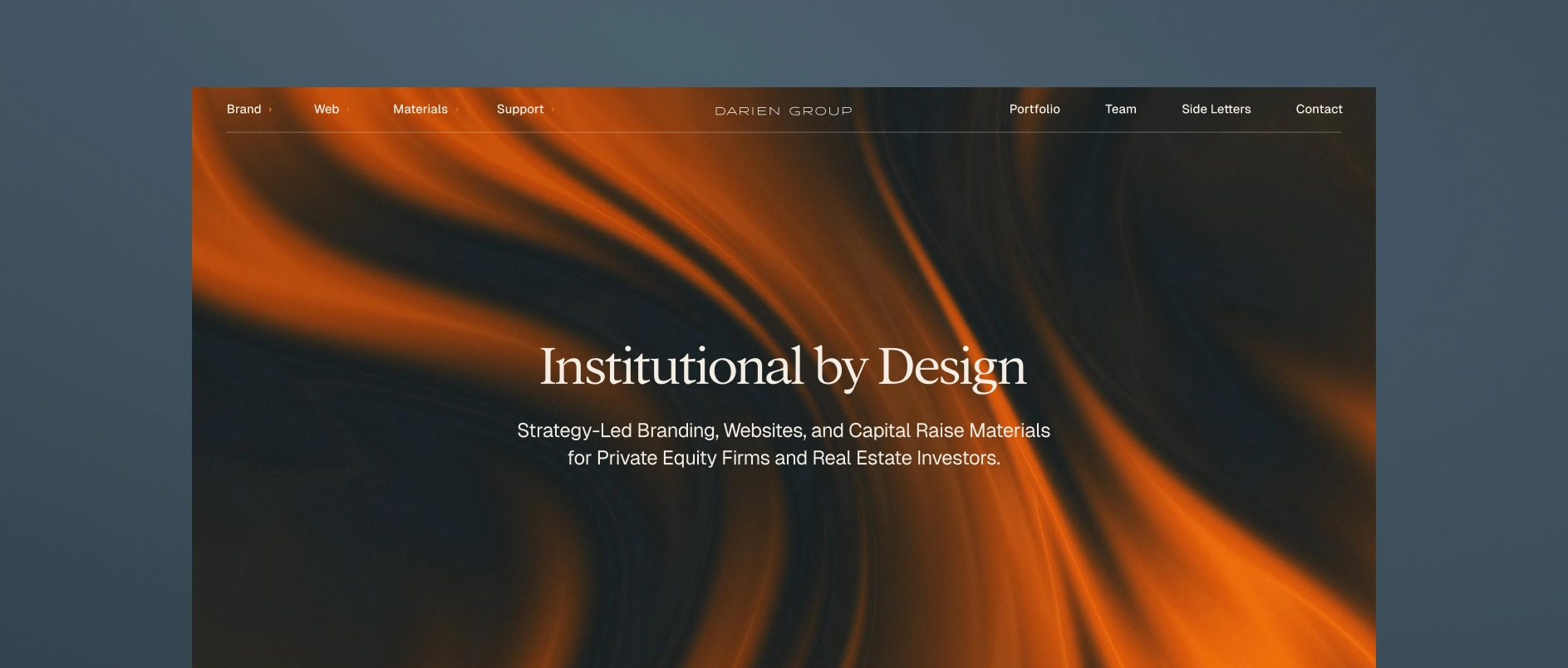
Darien Group is the only branding and communications firm built exclusively for investment managers across private markets, including real estate private equity, real estate credit, infrastructure, and alternative real assets.
Our work centers on helping real estate firms articulate a differentiated investment strategy, communicate clearly with LPs and joint-venture partners, and present a cohesive institutional identity across every touchpoint.
What makes Darien Group different:
Market fluency
We understand fund structures, co-invest vehicles, development strategies, core-plus vs value-add positioning, operator narratives, and institutional capital expectations. That specialization allows us to frame strategies in ways that resonate with LPs and partners.
Narrative-first strategy
We help firms articulate why their investment thesis works, not just where they invest. Messaging frameworks are built for institutional investors, operating partners, brokers, and sellers.
Institutional investor materials
Fundraising decks, AGMs, PPMs, quarterly reports, capital updates, and portfolio case studies are structured to meet institutional standards while maintaining clarity and flow.
Digital platforms built for today’s investors
Websites are designed to support capital formation, partner vetting, and deal sourcing. We develop sector pages, track-record systems, property case studies, leadership bios, and insights hubs that reinforce credibility.
Modular content & communication systems
We develop messaging frameworks and repeatable content structures that help investment managers communicate consistently. These systems align websites, pitch materials, and ongoing updates so a firm’s story remains cohesive across every channel.
Boutique, high-touch model
Strategy, messaging, design, and execution are delivered by specialists who understand the expectations and pace of private-market teams.
Best for real estate investment managers who need: A partner fluent in institutional real estate who can distill a complex strategy into a disciplined, differentiated narrative; produce fundraising and AGM materials that hold up under real LP scrutiny; and build a brand and digital platform that reinforces credibility, maturity, and long-term platform ambition.
2. BlueText
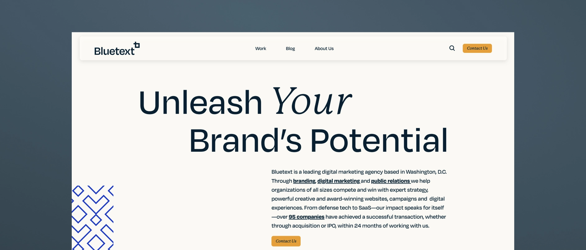
Bluetext is a digital communications agency offering brand strategy, website development, digital marketing, SEO, and demand-generation services. They work with financial and real estate organizations seeking greater visibility and pipeline development.
Best for real estate investment managers who need: Digital visibility, inbound lead support, and ongoing marketing execution alongside brand positioning.
3. FINE
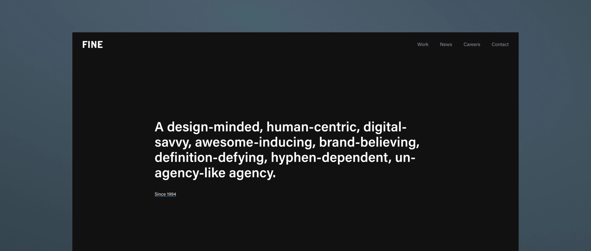
FINE is a high-end creative agency known for big-idea brand thinking, striking visual identity systems, and highly polished, immersive digital experiences. While cross-industry in scope, their design sensibility often appeals to real estate investment firms seeking a more expressive, high-aesthetic brand presence.
Best for real estate investment managers who need: A bold, visually differentiated identity that elevates the firm beyond traditional finance conventions.
4. Conway + Partners
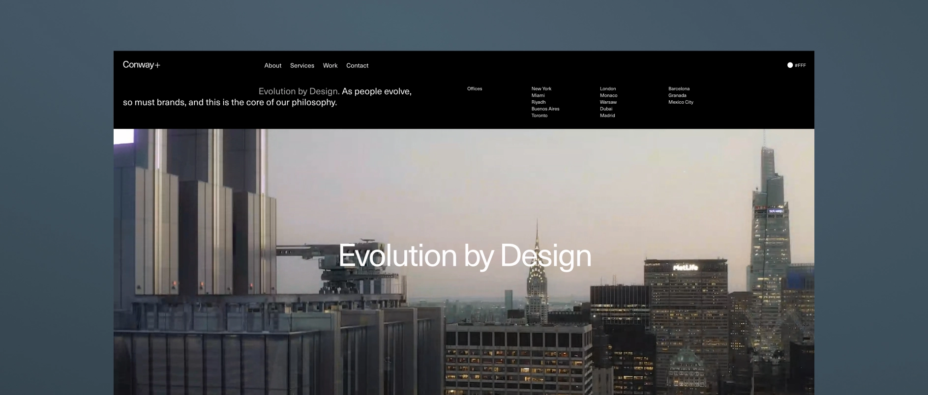
Conway + Partners is a real estate-focused branding agency that builds strategic brand identities for developers, property platforms, and investment-led real estate businesses.
Best for real estate investment managers who need: A real-estate-native brand strategy and identity system grounded in sector expertise.
5. Built-to-Suit Brands
Built to Suit Brands (BTS Brands) focuses on commercial real estate branding and marketing, providing brand identity, website design, offering memoranda, and supporting collateral for real estate platforms.
Best for real estate investment managers who need: CRE-specific branding and marketing execution, particularly for property-focused materials and foundational brand assets.
6. The Durkan Group

The Durkan Group is a digital-focused design studio specializing in brand identity, UX/UI, and custom website development. They create clean, modern, user-centered digital experiences supported by thoughtful visual systems and structured messaging.
Best for real estate investment managers who need: a prioritized user experience, intuitive navigation, and design-first identity over heavy content-generation or marketing campaigns.
7. Monogram Group
MonogramGroup is a long-established branding agency that works extensively with private equity firms and their portfolio companies. Their work combines brand strategy, messaging development, identity design, and website development.
For real estate private equity firms, MonogramGroup’s experience with investment managers and portfolio branding can support positioning both at the firm level and across portfolio companies or operating platforms.
Best for real estate investment managers who need: Brand strategy and identity support that extends across the full investment lifecycle, including portfolio company branding.
8. Consequently Creative

Consequently Creative is a boutique creative studio that focuses on developing distinctive visual identities, websites, and digital assets. Their work emphasizes storytelling through design and cohesive brand systems.
For real estate investment firms, their design-led approach can help elevate the visual expression of a firm’s brand while creating a more modern and cohesive digital presence.
Best for real estate investment managers who need: A boutique creative partner focused on website design with strong visual storytelling.
9. Clever Design
Clever Design is a New York-based firm with decades of experience working with financial services companies, including private equity firms, hedge funds, and investment banks. Their services include website design, brand identity, logo design, presentations, and digital collateral.
For real estate investment managers, Clever Design offers a straightforward, professional approach to building brand assets and digital platforms aligned with financial-sector expectations.
Best for real estate investment managers who need: a clean, professional, and finance-sector–tailored website or brand identity rather than full-scale content, marketing, or narrative support.
10. DeSantis Breindel
DeSantis Breindel is a brand strategy consultant that works primarily with financial services firms, asset managers, and other complex B2B organizations. Their work often centers on helping leadership teams clarify how their firms are positioned and described in the market, particularly during periods of strategic change, growth, or repositioning.
Their engagements typically focus on corporate brand strategy and messaging, helping organizations articulate their value proposition and competitive differentiation at a high level.
Best for real estate investment managers who need: Outside perspective on corporate brand positioning or messaging refinement.
An Annual General Meeting (AGM) deck is one of the most operationally complex documents a private equity firm produces each year.
It must communicate strategy, performance, attribution, portfolio activity, market context, and forward outlook. It must satisfy existing limited partners while remaining appropriate for prospective allocators. It must evolve year over year without losing continuity.
Design in this context is not about visual enhancement. It is about structural control.
However, structural control does not mean uniformity across firms. Every AGM deck must reflect the firm’s brand identity — its positioning, tone, and visual language. Institutional does not mean generic. A well-designed AGM expresses brand credibility through disciplined application of the firm’s typography, color system, imagery standards, and visual hierarchy.
Below are the core design best practices that consistently differentiate institutional-quality AGM decks from those that feel assembled.
1. Design the System Before Designing Slides
AGM decks fail when they are improved slide by slide.
Institutional presentations are engineered — not decorated.
Before any visual refinement begins, define:
- A margin and grid system
- A disciplined typographic scale
- A clear title hierarchy (H1, H2, body, annotation)
- Chart and data visualization standards
- A portfolio company template system
- A consistent section architecture
Once those rules exist, every slide should conform to them.
Consistency is not achieved through cleanup at the end. It is achieved through systems at the beginning.
A well-constructed system ensures the deck can scale beyond a single AGM cycle. It supports future iterations without structural breakdown, allowing year-over-year evolution while preserving brand continuity.
2. Use Title Strategy, Not Descriptive Headers
AGM slide titles often describe content instead of making assertions.
Weak example:
Fund II Performance
Stronger example:
Fund II Performance Reflects Consistent Sector Execution
A best practice AGM deck uses titles to communicate conclusions, not categories.
Investors scan. Strong titles allow them to follow the logic of the presentation without reading every bullet.
They also support the live speaker.
An AGM deck is not a standalone document. It is delivered in real time by senior leadership. Clear, assertive slide titles allow presenters to anchor their commentary, reinforce conclusions, and control pacing without relying on dense on-slide text. When titles communicate the takeaway, the speaker can expand strategically rather than read mechanically.
Because AGMs are live events, titles function as visual anchors in the room. They help both the presenter and audience maintain narrative flow even if attention momentarily shifts. Strong hierarchy improves both in-room comprehension and post-event review.
3. Separate Narrative from Data
Many slides attempt to combine qualitative commentary and dense tables in the same visual field.
This creates competition.
Best practice:
- Isolate major data tables
- Separate analytical commentary into structured blocks
- Avoid layering explanation directly over performance exhibits
When narrative and numbers compete spatially, clarity declines. When they are structured intentionally, both improve.
This separation also supports live delivery. When the presenter is speaking to a data-heavy slide, the audience should not be forced to read paragraphs simultaneously. Visual focus must align with verbal focus.
4. Standardize Portfolio Company Pages
Portfolio sections are typically the least controlled portion of the deck.
Common issues include inconsistent image ratios, varying metric structures, and uneven logo placement.
A disciplined AGM deck applies:
- One portfolio slide layout
- One metric hierarchy
- One image treatment
- One logo scale
Variations should be driven by material differences in companies, not formatting inconsistencies.
Uniform structure signals repeatable process.
At the same time, portfolio pages should subtly reinforce the firm’s brand language — whether that is minimal and restrained, data-forward, or visually expressive within institutional boundaries. Standardization and brand identity must work together, not against each other.
5. Engineer Performance Tables for Legibility
Performance tables are rarely redesigned. They are exported.
This shows.
Best practice includes:
- Increased row spacing
- Reduced gridline visibility
- Consistent decimal precision
- Right-aligned numerical columns
- Clear footnote formatting
Legibility is not cosmetic. It reduces cognitive load.
When investors must work to decode formatting, attention shifts away from substance.
Additionally, performance tables must be optimized for projection environments. Small font sizes that may work on a laptop screen often fail in large conference rooms. Designing for AGM conditions means stress-testing visibility at scale.
6. Control Color Application
Private equity decks often overuse brand colors in charts and section dividers.
Best practice is restrained application:
- Use neutral tones for structure
- Use brand color selectively for emphasis
- Avoid multi-color charts unless analytically necessary
Color should guide attention, not create visual noise.
Importantly, brand color should reinforce identity — not dominate data. The most effective AGM decks apply the firm’s brand palette with precision: primary color for strategic highlights, secondary tones for hierarchy support, and neutrals for structural clarity.
In a live AGM setting, high-contrast readability is critical. Subtle tonal variations that look elegant on screen may become indistinguishable under projection lighting. Color decisions must be tested for real-world visibility, not just aesthetic appeal.
7. Enforce Spacing Discipline
Spacing inconsistencies accumulate over time.
Misaligned text boxes. Uneven margins. Slight variations in indentation.
These are rarely noticed individually. Collectively, they signal lack of control.
A disciplined AGM deck maintains:
- Identical margins across all slides
- Consistent vertical spacing between elements
- Aligned columns
- Predictable spacing between title and body
Spacing is a structural signal of precision.
In a live setting, spacing also improves scanning speed. Clean alignment allows investors to process information quickly without visual friction.
8. Simplify Section Transitions
Section slides often become graphic experiments.
They do not need to be.
Best practice:
- Minimalist section slides
- Clear labeling
- Consistent typography
- Controlled use of imagery
Transitions should clarify progression, not interrupt tone.
When thoughtfully designed, section transitions reinforce narrative logic — signaling strategic shifts (e.g., Performance, Portfolio, Market Outlook) while maintaining brand continuity.
9. Build for Iteration and Live Performance
AGM decks evolve until presentation day.
Layouts must tolerate:
- Updated performance numbers
- Expanded commentary
- Revised portfolio metrics
If a two-line addition breaks alignment, the design system is too fragile.
Institutional materials require structural flexibility.
Because AGMs are high-stakes live events, last-minute updates are sometimes inevitable. A resilient layout system prevents technical stress and formatting breakdowns in the final hours before presentation.
AGMs are not static documents — they are live communication environments. Decks must be built to perform under real-world technical conditions.
This includes:
- Testing slides in projection mode
- Ensuring adequate font size for large rooms
- Confirming contrast ratios for visibility
- Avoiding overly dense data clusters
- Minimizing reliance on subtle animation
Visuals must support both the presenter and the viewer. Charts should clarify trends instantly. Diagrams should simplify complex processes. Portfolio visuals should reinforce positioning without distracting from metrics.
When narrative logic is supported by intentional visuals, the presenter speaks with greater confidence and the audience retains more information.
10. Conduct a Final Integrity Review
Before finalization, perform a structured audit:
- Are all charts formatted identically?
- Is decimal precision consistent?
- Are all logos scaled proportionally?
- Are footnotes formatted uniformly?
- Does every slide follow the same title hierarchy?
Most design issues are not conceptual. They are mechanical.
Mechanical precision reinforces institutional credibility.
The Underlying Principle
AGM deck design best practices are not about aesthetics or creativity.
They are about control.
Private equity firms communicate discipline in how they invest. Their materials should communicate discipline in how they present.
When structure is consistent, data is engineered, and hierarchy is clear, the design disappears.
That is the objective.
Summary
Private equity AGM deck design best practices center on structural clarity, consistent data formatting, disciplined typography, and engineered presentation systems. Strong AGM materials are built on defined grids, standardized portfolio templates, uniform chart conventions, and revision-resilient layouts. The objective is not aesthetic enhancement but institutional control. When hierarchy is clear and formatting is consistent, investors focus on performance rather than presentation mechanics.
Most private equity Annual General Meeting (AGM) presentations are not deficient in substance. They are deficient in structure.
The investment strategy is clear. The performance data is strong. The portfolio detail is comprehensive. Yet the structure of the AGM presentation often undermines clarity, hierarchy, and coherence.
The Annual General Meeting is rarely the appropriate venue for a private equity brand reinvention. When the initiative begins too close to the AGM deadline, the timing, stakeholder complexity, and size of the presentation make meaningful repositioning unrealistic. Brand strategy requires structured discovery, executive alignment, and deliberate articulation of differentiation. Those conditions are difficult to create under event pressure. We explore that process in greater depth in The Art and Strategy of Private Equity Brand Development, but the distinction is important. Brand development and AGM deck enhancement are separate mandates.
The more relevant question is whether a private equity AGM presentation can be materially elevated structurally, hierarchically, and analytically within the existing brand system.
In most cases, it can.
The Private Equity AGM as a Credibility Instrument
Like a firm’s website or fundraising pitchbook, the AGM presentation functions as capital-facing infrastructure. In Private Equity Pitchbooks: Modernizing the Capital Narrative, we examine how structural clarity and narrative discipline shape investor perception well beyond the numbers themselves.
In the AGM setting, investors evaluate more than fund performance. They evaluate organizational discipline.
They assess:
- How the firm structures information
- How investment performance is contextualized
- Whether attribution aligns with stated strategy
- Whether portfolio commentary reflects repeatable value creation
- Whether communication standards mirror operational rigor
A well-structured AGM presentation reinforces strategic clarity, performance transparency, and institutional control. A poorly structured deck introduces friction into those assessments.
That friction compounds.
And it is avoidable.
Why Private Equity Firms Still Use PowerPoint for AGM Presentations
Private equity firms continue to rely on PowerPoint for AGM materials for practical reasons.
PowerPoint is editable under deadline pressure. It is interoperable across LP organizations. It supports version control. It tolerates late-stage performance updates and commentary revisions.
It was never designed for advanced layout work. That limitation is understood.
The objective is not to replace PowerPoint. The objective is to impose disciplined design systems onto it.
With consistent hierarchy, spacing logic, typography standards, and chart conventions, even PowerPoint can function as an institutional communication tool.
Why AGM Decks Become Overbuilt and Visually Unmanaged
AGM decks rarely decline in quality because of weak investment content. They decline because of accumulation.
Each year adds new portfolio slides, updated attribution tables, additional performance pages, expanded commentary, and incremental disclosures. Very little is removed. Multiple internal contributors build slides under time pressure.
Over time, this results in:
- Inconsistent typography
- Crowded layouts
- Redundant containers and shapes
- Spreadsheet exports inserted without redesign
- Conflicting chart treatments
- Excess line work and visual noise
The issue is not the data.
It is the absence of curation.
Institutional investors are highly sensitive to visual signals of order. If a private equity presentation appears unmanaged, the implied question becomes whether other internal processes are similarly unmanaged.
That inference may be subconscious.
It still affects perception.
How to Modernize an AGM Deck Without Rebranding the Firm
Most private equity firms want the AGM presentation to feel more contemporary and more coherent. They do not want it to feel like a rebrand.
That instinct is correct.
A brand system defines boundaries. It does not prohibit refinement. Within an existing identity, there is substantial room to improve hierarchy and legibility without changing logos, color systems, or core brand assets.
Effective AGM modernization typically includes:
- Recalibrating typography for clearer hierarchy
- Enforcing consistent margin and spacing systems
- Standardizing chart and graph treatments
- Reducing unnecessary containers and background elements
- Simplifying section breaks
- Aligning data tables to institutional formatting standards
The most meaningful upgrades are often subtractive.
Text-heavy slides are not inherently problematic in private equity communications. Undifferentiated text is. When strategy articulation, investment theses, and portfolio commentary are clearly tiered between primary assertions and supporting rationale, comprehension improves.
Performance pages require the same discipline. Fund returns, gross and net IRR, MOIC, attribution analysis, and position-level summaries must follow consistent formatting conventions. Harmonized presentation increases trust.
Professional data presentation signals operational rigor.
Modernization should feel measured. Cleaner typography, disciplined color usage, and restrained imagery signal currency while preserving gravitas.
Process Before Production in Large AGM Decks
A private equity AGM deck often exceeds one hundred slides. Without early alignment on visual direction, revision cycles multiply quickly.
A disciplined process begins with a small set of representative slides that define:
- Typographic hierarchy
- Chart language
- Data formatting rules
- Margin logic
- Section architecture
- Visual tone
Once the system is approved, scaling becomes implementation rather than experimentation.
This approach protects timeline integrity and reduces unnecessary rework.
Engineering an AGM Deck That Survives Real-World Conditions
AGM materials are dynamic until presentation day. Performance numbers update. Commentary shifts. Leadership refines language.
A properly structured AGM template anticipates that reality.
Layouts should tolerate moderate copy expansion. Data tables should update without breaking alignment. Internal teams should be able to work within the template without degrading hierarchy.
If the presentation collapses under normal revision pressure, it was not engineered properly.
Durability is part of institutional design.
The Strategic Insight That Often Emerges
AGM modernization frequently surfaces a secondary realization. While reviewing slides, firms sometimes discover that strategy articulation lacks sharp differentiation or that thematic hierarchy has drifted.
The AGM deck becomes diagnostic.
It reveals where messaging is diluted, where sector focus is unclear, or where value creation claims are not sufficiently substantiated.
Handled correctly, those observations inform future fundraising decks, private equity website development, and broader brand positioning without forcing premature strategic change under deadline constraints.
Our Perspective on Private Equity AGM Deck Design
At Darien Group, we treat AGM presentations as institutional infrastructure.
The objective is not aesthetic embellishment. It is structural clarity.
We introduce order, enforce hierarchy, elevate legibility, and ensure the deck performs under operational pressure.
We work exclusively with private equity firms and investment managers. That specialization matters. Understanding fund structures, attribution frameworks, portfolio construction, and LP expectations cannot be approximated by a generalist design agency.
An effective AGM presentation does not compete with its content.
It reinforces credibility.
If the investment information is strong but the structure undermines clarity, the solution is not visual spectacle.
It is disciplined execution.
Summary
A private equity AGM deck does not require rebranding to improve. It requires structure, hierarchy, and disciplined design systems applied within the existing brand framework.
When executed properly, AGM modernization:
- Improves LP comprehension
- Reinforces institutional credibility
- Reduces friction in capital conversations
- Signals operational rigor
- Preserves brand continuity
In private equity communications, order is not cosmetic.
It is strategic.

Infrastructure investing has always been a relationship-driven category, yet digital presence now shapes first impressions in ways that were not true even five years ago. LPs conduct more pre‑meeting research online; management teams often review a firm’s website before returning a call; and advisors form early opinions based on design, hierarchy, and clarity.
For infrastructure managers, the challenge is distinct. Many strategies span complex asset classes, diverse subsectors, and multidecade horizons. There is a natural impulse to explain everything at once. This often leads to dense pages, unclear prioritization, and inconsistent messaging.
This post outlines what infrastructure firms should emphasize first, why those elements matter, and how to structure a homepage that provides clarity within the first ten seconds of exposure.
Start With the Three Things Visitors Want to Know Immediately
Across our work with transportation, energy, utilities, digital infrastructure, and real asset managers, site analytics reveal a consistent pattern. New visitors quickly scan for answers to three questions:
- What do you focus on?
(Strategy, sectors, geography, asset types) - How experienced are you?
(Team, track record, heritage, reputation) - Why should I trust you with this category?
(Credibility signals, clarity, specialization)
The homepage should address these questions directly. Many firms begin instead with long narratives, rotating banners, or abstract mission statements. Those elements are fine later in the story, although they rarely provide the orientation visitors need early in the interaction.
Lead With Strategic Focus Before Scale
Infrastructure firms often position themselves by describing the scale of the market or the breadth of their capabilities. This approach sometimes creates the perception of generalism. A clearer pathway is to establish strategic focus early, followed by the ways the firm executes within that focus.
A simple structure works well here:
- Category: transportation, digital infrastructure, renewable energy, etc.
- Approach: credit, equity, hybrid, value-added, core-plus
- Mandate characteristics: geography, deal profile, subsector considerations
- Investment posture: long-term ownership, operational engagement, risk orientation
The goal is not to overwhelm, but to clarify. Visitors should understand at a glance where the firm plays.
Show Visual Proof of Scale Early
Infrastructure is a tangible category, which means the homepage benefits from tangible cues. Photography of ports, rail yards, terminals, data centers, logistics facilities, or similar assets quickly conveys scale and seriousness. These images serve a functional purpose: they reinforce that the firm operates in capital-intensive, real-asset environments.
A table summarizing effective visual elements helps guide discussions:
Visual cues often communicate what text cannot convey quickly.
Sequence Information Based on Visitor Intent
Homepage content should follow a predictable information hierarchy. The structure below works well for most infrastructure managers and feels natural for a variety of audiences.
1. Strategy Overview
A concise articulation of what the firm does.
2. Sector or Asset Focus
A high-level summary of the areas where the firm has depth.
3. Track Record or Experience Cues
Curated examples of transactions, partnerships, or representative assets.
4. Team Introduction
Photos, roles, or a link to the full team page.
5. Approach or Philosophy
Brief statements describing how the firm works with management teams, investors, and operating partners.
6. Optional: Thought Leadership or Insights
Only if the firm has content that reinforces expertise.
This sequence prioritizes clarity. Visitors can explore deeper pages as needed, but the homepage should function as a structured overview.
Consider a Single-Scroll Homepage for Emerging Firms
For newer infrastructure managers, a single-scroll homepage often provides the right balance of clarity and flexibility. It allows the firm to present a cohesive snapshot without requiring extensive subpages that may not yet have sufficient content.
A single-scroll page typically includes:
- A headline and short strategic descriptor
- A brief overview of specialization
- Representative visuals
- A small set of curated proof points
- A concise team introduction
- A clear call to engage or learn more
This approach helps early-career managers look polished from day one while reserving room for future expansion.
Closing Thought
Infrastructure investors and management teams operate in environments that reward precision. They expect the same from the firms they consider partnering with. A homepage that is concise, visually disciplined, and logically structured communicates those qualities immediately.
The most successful infrastructure websites follow a simple principle: provide enough clarity for the visitor to understand the firm’s identity and relevance, while leaving room for deeper exploration on internal pages.
When that balance is achieved, the digital presence reinforces the firm’s strategy rather than competing with it.