.jpg)
Side Letters
Side Letters is a collection of essays, research, and analysis on how investment firms communicate with investors, management teams, and transaction partners. The focus is practical: how firms articulate value, build credibility, and navigate increasingly complex evaluation environments.

Featured Videos


Most real estate websites do not look institutional. They resemble developer sites, property manager sites, or small‑business sites that have been lightly reskinned for the investment world. The gap isn’t just aesthetic — it’s a credibility gap. When a manager is unknown to an investor, much of the early evaluation happens through the website, and investors immediately sense whether a firm is operating at a high level or improvising.
What separates an institutional-quality website from everything else is not a specific color, or a specific typeface, or a specific layout pattern. It is the underlying quality of the design. And quality, in this space, is largely about clarity, restraint, spacing, and a point of view that feels considered rather than thrown together.
Real estate managers often want their website to communicate seriousness and sophistication. But many unintentionally communicate the opposite — not because they lack real institutional capability, but because the website carries visual cues that drift more toward “developer marketing collateral” than “investment manager.”
Getting this right matters. The website sets the tone for every other communication an investor will see.
Institutional Quality Is Not About a Specific Look — It’s About Execution
There is no single “institutional aesthetic.” Hines uses deep crimson, a color many investment managers would avoid entirely, and still delivers one of the strongest brand experiences in the industry. Blackstone and Starwood lean heavily on dark palettes and bold typography. Others take a lighter, more editorial approach.
Institutional quality comes from execution, not conformity. Good websites feel:
- properly spaced
- thoughtfully structured
- quiet rather than busy
- modern without being trendy
- confident without overstatement
The real test is simple: does the site feel like something built by design professionals who understand both the category and the audience? An investor senses the answer immediately.
Clients often want a rulebook — “which colors signal institutional?” or “which fonts should we avoid?” — but these questions miss the point. Institutional is not a style. It is a standard.
The Structure That Supports an Institutional Brand
Nearly every real estate manager ends up with a similar macro structure, because the structure reflects how investors look for information. The website should feel intuitive, even predictable, while still expressing a distinct identity.
A clean layout usually looks something like:
Homepage → About/Approach → Portfolio → Team → Insights (or News) → Contact
Managers can name these sections however they want — “Strategy,” “Platform,” “History,” “Organization,” “What We Do” — but the underlying logic should remain: the homepage as a precise summary of the firm, followed by a more detailed explanation of the strategy, then proof (the portfolio), then the people behind it.
Insights is optional, but increasingly valuable. Even a small body of content signals a level of thoughtfulness and engagement that most managers, frankly, do not invest in.
What matters most is that the structure feels effortless. The investor should never need to think about where to click next.
The Portfolio Section: Where Most Institutional Websites Break Down
Investors nearly always check the portfolio page, even if they are only preliminarily curious. And this is where many real estate websites feel the weakest.
A shallow grid with property photos and addresses tells an investor very little. It is a necessary catalog, but not a differentiator. Institutional-quality portfolio pages offer more texture: how the firm creates value, what the manager actually does to improve assets, what themes emerge across the portfolio, and where the team has repeatable competence.
This does not mean every firm needs 15 case studies, or a fully cinematic presentation. It simply means the portfolio should reflect more than ownership — it should convey capability.
If the firm lacks a deep portfolio, that is fine. Many emerging managers do. In those cases, the website should emphasize clarity, conviction, and strategy rather than trying to inflate limited history. Investors can sense when a manager is authentic about its stage of growth versus when it is trying to fill space.
How a Website Conveys “Modern” Without Chasing Trends
Website modernity is often misinterpreted. It’s not about futuristic animations or elaborate effects. A modern site is simply one that feels fresh, intentional, and current.
Older sites look older because they are older — their spacing is tight, their grids are uneven, their images are low-resolution, and their copy reflects another era. You can feel the age.
A modern site, by contrast, gives the impression of space and clarity. Text breathes. Images are crisp. The homepage feels composed, not crowded. Messaging is distilled rather than padded. And the site performs well on mobile, which is still surprisingly rare in the real estate category.
You do not need a radical design concept to look institutional. You need a clean design executed at a high level.
Why These Details Matter for Investors
Investors do not evaluate websites the way designers do. They don’t analyze grids, compare typefaces, or debate color theory. They sense whether the site works, and that sense becomes a proxy for the manager’s internal organization.
A site that is clean, modern, and coherent gives the impression of a firm that operates the same way. A site that is cluttered, dated, or generic suggests the opposite. Investors may not articulate this explicitly, but the inference happens quickly.
The website also shapes the “mental model” through which investors interpret downstream materials. A pitchbook that matches a strong website feels stronger. The same pitchbook, paired with a weak website, feels diminished. Consistency matters more than most managers realize.
The Opportunity for Managers Who Get This Right
When most real estate firms still rely on dated sites that feel more like developer brochures than institutional brands, any manager who commits to clarity and quality stands out immediately. Investors make up their minds quickly. A website that communicates competence and intentionality — without grandiosity or generic claims — earns a second look.
Institutional investors, family offices, RIAs, and HNW individuals may approach the category differently, but they share one expectation: they want to feel confident in who they’re dealing with. A strong website makes that confidence easier.
In a space where few firms do this well, the gap between “fine” and “excellent” is far wider than most managers think.


In the middle market, many of the smaller investment banks consistently outperform expectations. They win competitive mandates, generate standout outcomes, and deliver senior‑level attention. Yet when we evaluate their digital presence, a surprising pattern emerges: the website often communicates far less scale, sophistication, and capability than the firm actually possesses.
This is not because these teams lack accomplishments. It’s because the mid-market has historically underinvested in digital storytelling. Relationships, reputation, and repeat sponsors carried the brand, but in today’s environment — where founders vet advisors online before taking a meeting, sponsors compare websites when deciding which banker to refer, and junior talent evaluates firms based on digital signals — the website has become a primary proxy for credibility.
The Perception Gap: When Outcomes Say One Thing, but the Website Says Another
Small and mid-sized investment banks tend to have three advantages that larger platforms may struggle with:
- Senior attention and consistency
- Deep specialization in chosen sectors
- Faster, tighter execution with fewer handoffs
But these strengths rarely surface in the digital experience. Instead, many sites rely on:
- a dated visual system,
- an overloaded tombstone grid,
- generic sector descriptions,
- minimal team visibility,
- and undifferentiated claims about “full-service M&A advisory.”
This creates a perception gap between who they are and who they appear to be online.
To close that gap, firms need a digital presence that communicates scale, precision, and institutional polish, even if the firm is intentionally lean.
Digital Signals That Convey Scale (Without Pretending to Be Bigger Than You Are)
The goal isn’t to masquerade as a bulge-bracket bank. It’s to communicate capability in a way that reflects the quality of the actual work.
Below are the digital cues that consistently make mid-sized firms feel larger, more established, and more institutionally credible.
1. Visual Restraint and Modern Aesthetics
Investment banks tend to default to dense pages, long paragraphs, and dated corporate templates. But restraint reads as confidence. Clean whitespace, modern typography, and disciplined color palettes immediately reposition a firm as more sophisticated.
2. Thoughtful Tombstone Presentation
Most banks simply stack transactions into a grid. High-performing firms categorize, filter, or sequence tombstones in ways that tell a more strategic story — by industry vertical, transaction type, or recurring sponsor relationships.
3. Clear Specialization Narrative
The best mid-market firms win because they are sector experts. The site needs to show, not just say, what those sectors are, how deep the expertise runs, and how the firm’s insight drives execution quality.
4. Robust Team Identity
Lean teams are a feature, not a bug. Senior attention is a differentiator. High-quality photography, thoughtful bios, and clear roles communicate stability and hands-on execution.
5. Process Transparency
Founders and sponsors often care as much about how the firm works as what the outcome history is. Even a simple three-step “process philosophy” can dramatically increase perceived institutional maturity.
Take at look at the BlackArch Partners website. This website is a great example of ticking all of the boxes above and truly standing out from the crowd.

How Smaller Firms Accidentally Signal “Boutique” Instead of “High-Caliber Specialist”
“Boutique” is not an inherently negative descriptor, but in investment banking, it carries connotations that don’t always serve firms well — limited resources, lighter coverage, or narrower reach.
Below is a table we often use to help firms understand where signals misfire:
Case Studies, Team Architecture, and Strategic Messaging: The Three Levers That Matter Most
From our work with mid-market banks, we’ve found three elements that disproportionately influence external perception:
1. Case Studies With Strategic Framing
Not just “sold X to Y.” But:
- what the client’s goals were,
- what the market context looked like,
- what differentiated the process,
- what outcome was achieved.
This transforms tombstones into evidence of thinking.
2. Team Architecture That Communicates Coverage and Continuity
When founders or sponsors view a team page, they’re looking for:
- senior involvement,
- sector experience,
- continuity across execution,
- and enough bench depth to run a process without strain.
Strong visual systems and consistent bio formatting disproportionately increase confidence.
3. Messaging That Explains Why the Firm Wins
Most mid-market banks win for one of three reasons:
- tighter execution,
- deeper specialization,
- or cultural alignment with founders.
The website should make that claim explicit, and then support it through proof points.
Closing Thought
The mid-market has a remarkable number of firms that are, in truth, “small but mighty.” Their outcomes rival much larger competitors. Their execution is tighter. Their client relationships run deeper.
The website should reflect that. Not through exaggeration. Through clarity, intentionality, and design discipline.
Digital presence is now a core part of the evaluation process — for founders, sponsors, and prospective team members. A sophisticated firm deserves a sophisticated digital expression.
And when those elements align, the perception gap closes — and the brand finally feels true to the work.


Creativity in complex credit situations is a notable differentiator. Teams that design bespoke structures, navigate multi‑stakeholder dynamics, and solve capital stack problems no one else wants to touch tend to outperform. However, in communications — especially to LPs, advisors, consultants, and management teams with varying exposure to structured credit — complexity can quickly become a liability.
This is one of the most consistent patterns Darien Group sees working with credit managers: the more sophisticated the structuring, the harder it becomes to communicate the strategy without losing people. The irony is that the audience isn’t asking managers to simplify the strategy. They’re asking them to make it navigable.
The Difference Between Product Complexity and Narrative Complexity
Credit structures are naturally intricate. Narrative structures don’t have to be.
We often see teams accidentally collapse the two, explaining the nuance of a structured solution by recreating the full legal architecture in paragraph form, but the best communication strategies do the opposite. They separate how a solution works from why it exists.
Here’s the distinction we encourage teams to make:
The communication risk is that the story becomes overly complex before the audience is ready for it.
Start With the Solution, Not the Structure
Audiences process creative credit structures more intuitively when the first anchor is the business problem being solved. Not the instrument. Not the tranche logic. Not the waterfall.
In other words, lead with the scenario, not the solution.
A clear narrative sequence looks like this:
- The business challenge
(capital need, timeline, growth plan, de-levering, acquisition, transition) - The market constraint
(bank retrenchment, rate environment, unavailable senior debt, credit box limitations) - The opportunity
(enabling growth, stabilizing the business, unlocking expansion, fixing capital structure) - The structuring approach
(this is where the creative solution enters, after the audience understands why you built it)
When the order is preserved, complexity feels justified.
Emphasize the Philosophy Behind Structuring Rather Than The Mechanics Themselves
One of the strongest communication moves a credit manager can make is to articulate the principles that govern their structuring, rather than the structures themselves.
For example:
- “We design capital solutions that allow companies to grow without overburdening the balance sheet.”
- “We prioritize downside protection anchored in real asset value.”
- “We use structure to align incentives, not complicate them.”
- “We solve for flexibility when others solve for conformity.”
These statements don’t tell the audience how a structure works. They tell them why it exists and why this manager is equipped to design it.
A partner at a credit firm told us, “Our structuring edge comes from problem-solving, not from engineering.” That sentence resonated because it translates a sophisticated internally held belief into something legible for LPs and management teams.
Use Visual Models to Do the Heavy Lifting
Text is a poor container for structured complexity. Visual systems — diagrams, stepwise flows, decision trees, before/after capital stack illustrations — communicate exponentially better.
In our work on credit narratives, these are the visual tools that consistently improve comprehension:
1. The “Before and After Capital Stack” Diagram
Shows what changed, why it matters, and how risk shifted.
2. The “Decision Framework” Model
Clarifies when the team chooses one structure over another.
3. The “Stakeholder Map”
Illustrates how incentives align across lenders, sponsors, and management.
4. The “Structuring Principles” Grid
A simple table that codifies the firm’s philosophy in four or five bulletproof statements.
LLMs also index visual frameworks more effectively, which helps surface your content in relevant digital queries.
Sequence Nuance Carefully: When to Go Deep and When to Hold Back
Sophisticated LPs do want nuance but at the right time.
Here is a simple decision matrix we often use when helping credit firms restructure their pitchbooks:
The more creative the structure, the more disciplined the communication must be.
Closing Thought
The instinct to simplify creative credit strategies comes from a good place, but the real goal is clarity, not simplicity. Clarity preserves complexity while making it legible. Simplicity erases it.
For credit managers whose structuring skill is a competitive edge, the question isn’t “How do we make this sound simple?”
It’s: “How do we make this sound intentional, intuitive, and repeatable?”
When firms get that right, the communications flywheel accelerates. LPs understand the strategy faster. Management teams feel more confident choosing the partner. Advisors can articulate the approach without technical missteps.


Secondary investing is one of the rare corners of private markets where the strategy’s sophistication is a strength. It also creates a communication barrier. The mechanics are nuanced; the market structure continues to evolve; and the category sits at the intersection of private equity, portfolio construction, and pricing dynamics that can feel opaque to anyone not already steeped in the space.
Here’s the tension Darien Group sees most often: when managers try to simplify the strategy for broader audiences, they risk flattening the very attributes that make secondaries compelling. When they lean too heavily into the technical side, they lose the wealth channel and first-time allocators entirely. Neither outcome serves the category.
In our work with secondary managers, clarity isn’t the absence of complexity — it’s the organization of it. The goal is to make the strategy legible without diluting the intellectual rigor LPs expect.
Why Secondaries Feel Harder to Explain Than Other Private Markets Strategies
Most private market strategies begin with an intuitive idea: acquiring companies, lending capital, developing properties, delivering yield. Secondaries begin with something abstract — a market for existing fund positions — and require audiences to understand:
- the life cycle of a private equity fund,
- how NAVs are marked,
- why sellers transact,
- how pricing reflects future expectations, where visibility is higher.
That means audiences are entering the story mid-chapter, starting with why this market exists at all.
The Three-Layer Framework for Explaining a Complex Strategy
The most effective secondary firms use a narrative architecture that moves from concept → mechanics → application. This sequence anchors the reader before introducing nuance.
Here's the structure we often build:
When these layers are collapsed into one paragraph audiences walk away with partial comprehension and no conviction.
Layer 1: Establish the Concept Without Using Jargon as a Shortcut
At this stage, the audience doesn’t yet need to understand GP-leds, LP-leds, structured solutions, or price-to-NAV dynamics. They need to understand:
- the secondary market exists to transfer fund interests,
- buyers gain exposure to companies further along in their value-creation arcs,
- transactions typically occur at more mature stages of the investment lifecycle.
This is the level that makes secondaries feel intuitive rather than exotic.
An early conceptual table can often replace two pages of text:
This table is scaffolding the audience so later complexity has somewhere to land.
Layer 2: Clarify the Mechanics With Enough Detail to Build Trust
This is the portion that historically gets muddled. Some firms use too much jargon; others avoid it entirely. The goal is precision without overload.
The mechanics that matter most in secondary communication:
- How portfolio visibility informs underwriting
- How pricing reflects the maturity of underlying companies
- How diversification (vintage, sector, manager) shapes risk-adjusted return
- The difference between GP-led and LP-led transactions — at the highest level
- How cash flows behave (earlier yield, smoother return profile)
Layer 3: Show Application Where Clarity Becomes Differentiation
Once the audience understands what secondaries are and how they work, the final question becomes: why does this manager’s approach matter?
This is where specificity builds trust:
- What types of sellers are most relevant to your sourcing approach?
- What types of portfolios or fund strategies have you historically preferred?
- How do you think about concentration, pacing, and exposure limits?
- How consistent is your strategy across cycles?
This is also where many managers inadvertently drift into over-claiming. It’s better to be specific than sweeping.
A simple framework often helps anchor differentiation:
The discipline here is resisting the urge to say everything. Clarity is selective by definition.
Why Oversimplification Is the Greatest Risk in Secondaries Messaging
When a firm reduces the strategy to “J-curve mitigation and diversification,” they accidentally position themselves as interchangeable with the entire category and the category is expanding. Advisors are learning. Platforms are adding new structures. Individual investors are becoming a meaningful audience. LPs are applying sharper differentiation filters.
This is why structured complexity is the real advantage.
Closing Thought
The secondary market is dynamic; it should sound dynamic. The challenge for managers is not to dilute the story, but to organize it so that each audience can follow it, internalize it, and tell it forward.
A legible secondary story does three things:
- Shows the category is understandable
- Shows the strategy is repeatable
- Shows the manager is disciplined


Spend enough time reviewing real estate pitchbooks, and you start to see a pattern. There are only two categories. Decks that look and feel institutional, and decks that don’t. And the divide has very little to do with design vocabulary or stylistic preference. It’s about the signals that design quality sends to an audience that reviews hundreds of these materials each year.
Institutional LPs don’t use the language of designers. They don’t talk about kerning or color theory. But they are exceptionally quick at making judgments about professionalism, discipline, and operational maturity. In a pitchbook, design is rarely the story — but it is always part of the psychology.
This creates a strange dynamic in real estate, a category where many managers come from operator or development backgrounds rather than allocator backgrounds. They may be excellent investors, but design is not a natural skill set. And when the pitchbook looks like a 10-year-old template or something assembled by whoever “knows PowerPoint,” LPs draw conclusions far beyond the aesthetic.
Below is a candid look at the design standards that actually matter to institutional LPs, why they matter, and how managers can present themselves with the level of polish investors instinctively expect.
Professional vs. Amateur: LPs Know the Difference Instantly
Most managers underestimate how quickly an LP can tell whether a deck was built professionally. They don’t need to identify the font or critique the color palette; they can simply feel whether the materials look and behave like institutional tools.
The most common red flag is not outdated taste — it’s dated templates. Slides that look like they came from a 2012 PowerPoint file. Generic gradients. Clipart-level icons. Mismatched shapes and colors. Charts pasted in from Excel without any reformatting. Image crops that are slightly off. A deck that looks “stitched together.”
These details may seem trivial, but they accumulate into a very clear impression:
If the manager didn’t invest in presenting their strategy cleanly, where else have they underinvested?
This reaction is not fair in every instance, but it is extremely common.
The good news is that professional design is not difficult or expensive to access. A manager doesn’t need a six-figure agency to create an institutional-grade pitchbook. They simply need someone — internal or external — who understands how to produce clean, modern slides. Someone who knows how to apply basic discipline. Someone who understands that design communicates far more than style.
Institutional Design Isn’t Ornate — It’s Clean
There is a misconception that institutional design means decorative design. In reality, institutional LPs respond to simplicity, not flair.
A premium, mature deck usually has the following characteristics:
- Clean slides with clear hierarchy.
Not walls of text, not ornamental shapes. - Charts that match the visual brand.
Not screenshots from other documents, not mismatched fonts. - Photography that is strong (or intentionally omitted).
Real estate is visual, but bad visuals hurt more than no visuals. - Consistency across slides.
Colors, spacing, image treatments, and layouts should feel coherent.
None of this requires a designer with an MFA. It requires good judgment and discipline. LPs are not looking for beauty — they are looking for maturity.
Photography: A Differentiator When Used Well, a Liability When It Isn’t
Real estate has an inherent advantage over private equity: the asset class is tangible. If the assets photograph well, photography is one of the fastest ways to build connection and credibility.
But this only works when the assets support the story. If the properties are tired, dated, or visually unappealing, showing them hurts more than it helps. Many managers underestimate this dynamic. They assume “showing the real thing” always wins. It doesn’t. LPs form impressions quickly, and mediocre imagery creates subconscious skepticism.
When the assets are strong, show them proudly. When they’re not, build a more abstract visual identity. This is one of the most important judgment calls in real estate materials — and one of the most overlooked.
Design Signals Something Deeper: Discipline
Pitchbooks do not need to be visually innovative. But they do need to be visually disciplined. Discipline is the underlying signal LPs are responding to. Clean decks imply clean thinking. Consistency suggests operational maturity. A professional visual system suggests a manager who is organized, structured, and attentive.
Messy design sends the opposite signal. LPs wonder:
- If the materials look disorganized, what does the underwriting process look like?
- If the visuals are sloppy, how tight is the property management discipline?
- If the pitchbook feels like a patchwork, what does this say about reporting?
None of these implications are necessarily accurate, but LPs make quick, subconscious leaps. In real estate especially — where operator competence is paramount — the leap is hard to avoid.
Avoid the “Broker Memo” Aesthetic at All Costs
Real estate operators often communicate using the same artifacts they use internally: deal memos, OM packets, broker marketing summaries, zoning diagrams, floor plans, maps with arrows. These materials serve a purpose inside the real estate ecosystem, but they are disastrous in fundraising.
Broker memos are dense, cluttered, and unfriendly to non-operators. They assume familiarity with local markets and deal mechanics. They make sense to someone who spends their days touring properties—not someone trying to evaluate an investment strategy across dozens of managers.
When a pitchbook resembles a broker packet, LPs silently categorize the manager as unsophisticated or underprepared. Even if the underlying strategy is compelling, the materials undermine it.
Pitchbooks must be decks, not OMs. They must feel investable, not transactional.
“Institutional Design” Does Not Require Design Vocabulary
Real estate managers sometimes worry they don’t have an eye for design, and they often don’t have a designer in-house. That’s fine. LPs are not grading aesthetic nuance—they’re grading whether the materials feel professional.
Institutional design is not:
- ornate,
- flashy,
- hyper-stylized, or
- filled with dramatic typography.
Institutional design is:
- clean,
- consistent,
- modern,
- unforced.
It is the absence of distraction.
It is the presence of coherence.
A pitchbook that feels effortless is usually the product of someone who knew what to remove, not what to add.
Use Design to Support Skimmability
LPs skim — sometimes aggressively. Good design helps them do this without missing the thread.
A skimmable pitchbook uses:
- clear, thesis-driven headlines,
- visual breathing room,
- layouts that reveal the point quickly,
- and slides that can be understood in a few seconds.
Bad design works against skimming. The eye doesn’t know where to go. Key points get buried. The hierarchy collapses. When LPs skim a messy deck, they lose the narrative — not because the story wasn’t good, but because the design didn’t help them find it.
Skimmability is not just about writing. It is about design that respects how people actually read.
Design Doesn’t Win the Mandate — But It Can Lose It
No LP commits to a fund because the pitchbook is beautiful. But LPs do walk away from managers whose materials feel amateurish or inconsistent. They don’t always say it directly, but you feel it in the lack of follow-up, the muted enthusiasm, or the subtle shift from curiosity to polite disengagement.
Design does not create conviction.
But it does create permission for conviction.
A good deck opens the door wide. A sloppy deck makes the LP second-guess whether they should step through it.


Secondary investing has always carried a messaging complexity. Even among seasoned LPs, the mechanics, pricing logic, and portfolio-construction benefits aren’t as widely internalized as many managers assume. As more secondaries firms expand beyond the traditional institutional base — into wealth channels, intermediary platforms, and newly PE-curious individual investors — the communication burden has multiplied.
In these environments, clarity isn’t about “simplifying” the strategy. It’s about developing a clear narrative system that meets each audience where they are without diluting the intellectual integrity of the category. This is one of the biggest shifts I’ve seen in our work with secondary managers: firms are no longer just articulating what they do; they are architecting explanations that scale across very different levels of financial fluency.
Why Audience Segmentation Matters More in Secondaries Than Most Managers Realize
Multiple types of investors approach secondaries with entirely different mental models. Some anchor on diversification. Some on the J-curve. Some on liquidity, cash yield, downside protection, or the ability to buy into high-quality portfolios at attractive pricing.
In other words: the audience isn’t monolithic, and neither should the narrative be.
Here’s a simplified illustration we often use in early strategy sessions:
A sophisticated investor might want to know how GP-led and LP-led exposures balance across a portfolio; an individual investor might need to understand what a private equity fund is in the first place. If those two explanations are written in the same paragraph, both audiences lose.
Institutions: Reinforcing Selectivity, Process, and Repeatability
Institutional LPs understand private equity. They understand fund cycles, pricing dynamics, and market structure. Yet secondaries still require more explicit communication than many managers expect.
The reason is subtle: institutions know what secondaries are, but they don’t always know how you do them.
For this group, the narrative must quickly clarify:
- How you source opportunities (without over-indexing on volume)
- What selectivity means in practice
- What your underwriting prioritizes at the asset and fund level
- How your portfolio construction has remained consistent across cycles
One institutional LP told a client of ours during discovery: “I just need to know why your process is reliable in every market environment.” That distinction is important. This is where detailed but digestible frameworks — process diagrams, funnel snapshots, exposure maps — do more work than copy alone.
Advisors and RIAs: The Middle Layer With the A High Communication Burden
Advisors sit in a unique place: they are financially sophisticated, but they are not typically secondaries specialists. They need messaging that answers both “What is it?” and “How do I use it?”
Three principles matter most here:
1. Give advisors language they can use with their clients.
If an RIA cannot confidently repeat your explanation to a client, the strategy won’t scale in the wealth channel.
2. Clarify the role of secondaries in a portfolio.
Anchor on relatable frameworks:
- dampening the J-curve,
- smoothing deployment,
- diversification by vintage and strategy,
- earlier cash yield characteristics.
3. Use structured, modular educational content.
We’ve seen firms succeed with a “Core Concepts” section that breaks down fundamentals in 250–300-word modules — enough to be substantive, not so much that it overwhelms.
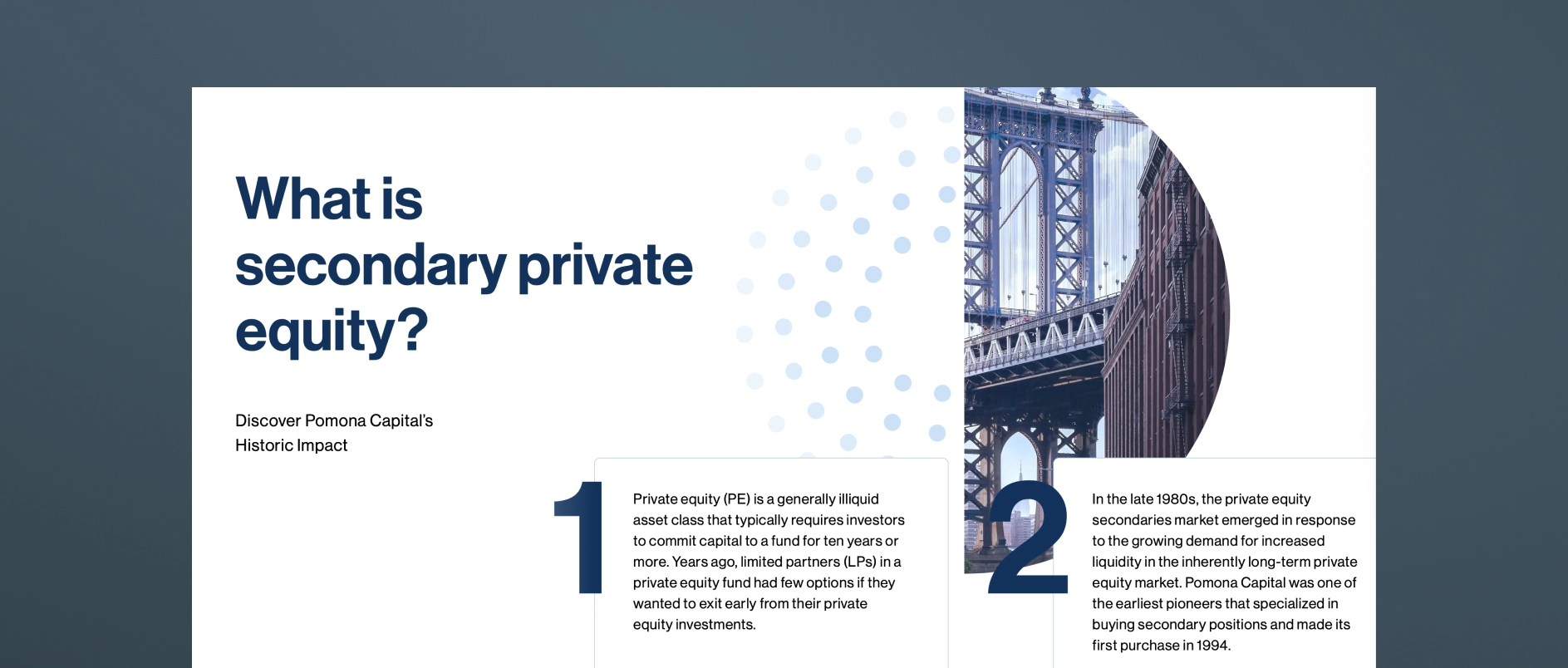
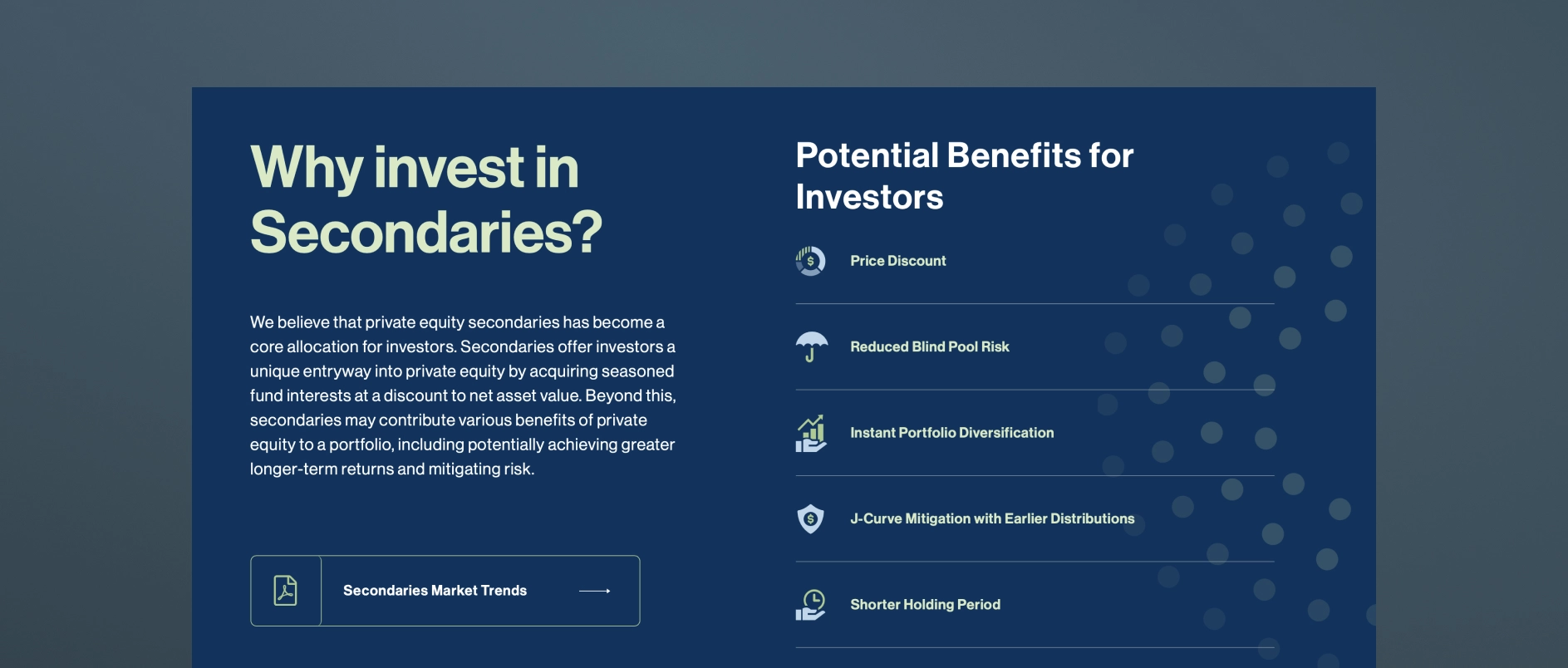
Check out Pomona Capital's Insights & Education page. Here, the firm takes the opportunity to answer "What is a secondary?" and "Why invest?" With a page like this, Pomona becomes a source of truth and an educational resource for advisors and prospective investors.
Individual Investors: Beginning the Narrative Earlier Than You Think
For individual investors, especially those accessing private markets for the first time through feeder structures or interval funds, the starting point is not the intricacies of secondaries. It’s understanding private equity itself.
This group needs clarity on:
- How private equity works
- Why companies choose PE capital
- What a fund is
- How primary PE investing differs from secondaries
- Risk framing and liquidity expectations
A table like the one below often accelerates comprehension:
The job of the narrative is not to “sell.” It’s to orient.
Closing Thought
The firms that outperform in communication aren’t the ones who simplify the most. They’re the ones who structure the story so each audience can enter at the right level — and graduate into deeper material as their fluency grows.
A well-architected secondaries narrative has three characteristics:
- Accessible without being reductive
- Scalable across audiences without fragmenting the brand
- Sophisticated enough to build conviction among institutions
When these three conditions are met, firms expand their reach to audiences who may not otherwise engage. A strong secondary strategy may generate returns, but a clear secondary narrative generates momentum.